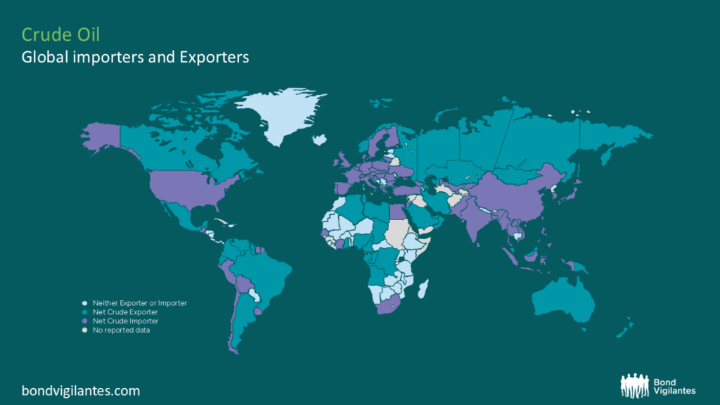
oil
Not all oil-exporting countries are the cracking winners you think.
By Charles de Quinsonas
4 June 2026


The interbank lending rates (Shibor) in China have gone ballistic in the last three days, with the 1 week Shanghai Interbank rate soaring from 2.6% on Monday to 7.3% today. The worrying move has been put down to a combination of Chinese New Year (there is traditionally a bit of a movement around Chinese New Year but not this much) and the most recent increase in Chinese bank Reserve Requirement Ratio (the fourth in three months) catching banks by surprise. Rumours of a rate hike didn’t help either. Following the increase in the Reserve Requirement Ratio, Chinese banks slowed or completely stopped interbank lending, which left some banks desperate for cash to pay the reserves. Domestic news reported that two banks failed to raise enough cash to pay the new reserve requirement ratio so the People’s Bank of China made an unusual reverse repo to these banks (ie took collateral from the banks to make a cash loan).
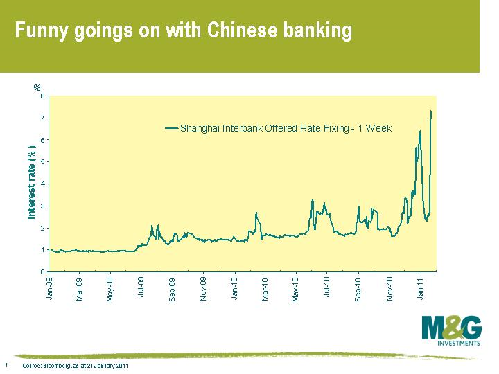
It looks like the spike is being driven by technical factors and should return to more normal levels post Chinese New Year in the second week of February, but unusual bank liquidity events are definitely worth keeping an eye on.
A 1% jump in UK CPI in December meant that the year on year inflation rate in the UK soared from 3.3% to 3.7% year on year, once again beating consensus expectations of 3.4%. No doubt we’ll have the newspapers tomorrow full of talk of a return to the 1970s, and no doubt we’ll also have various MPC members continuing to come out over the next few weeks and months explaining that this inflation problem is (still) temporary.
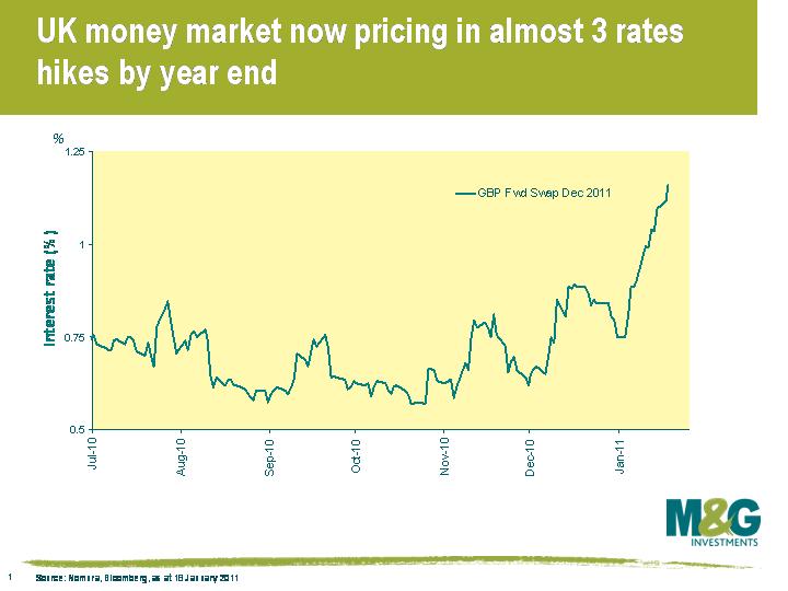
Two charts which I think are interesting. This one shows that the bond market is taking the inflation number seriously, and is now pricing in almost 3 lots of 0.25% rate hikes by the end of this year. The first rate hike is now fully priced in for June.
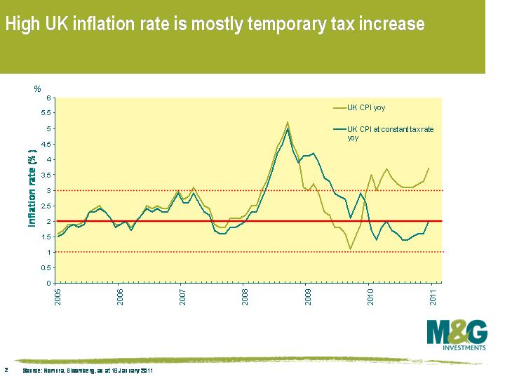
The second chart demonstrates that while the MPC has done a bad job inflation forecasting over the past few years, it still definitely has a point about inflation being temporary. If you measure inflation at constant taxes, then the inflation rate is only 2%, so assuming we don’t see another VAT hike in January 2012, we should see UK inflation fall sharply from the beginning of next year.
That said, UK inflation at constant taxes has still gone from 1.4% yoy in August to 2.0% yoy now, so I wouldn’t relax entirely, but today’s headline inflation figure is nowhere near as bad as it looks. As Jim mentioned in a recent blog, hiking rates could be GDP suicide, and I’d be surprised if UK interest rates went up as much as the market’s expecting.
The reasons behind the ugly scenes in Tunisia are down to a combination of political and economic factors, but at least part of the discontent stems from rising food and energy prices. Public unrest in Tunisia has spread to Jordan, where thousands were protesting against the government over the weekend, and demonstrations are also spreading to Egypt (10 year US$ bonds are down 4% today, and the 30 years US$ bonds down as much as 8%).
The problem these countries face is that food and energy prices are a much bigger percentage of an emerging consumer’s shopping basket than for a developed consumer’s basket. Food and energy therefore carry a much higher weight in domestic consumer price indices within emerging markets, which is something I discussed last year when going over some of the risks to the emerging market story (see here).
As this chart demonstrates, there’s a reasonable correlation between a country’s wealth (as measured by GDP per capita) and the weighting of food and energy in the country’s CPI basket. Poorer countries therefore tend to be those that are most vulnerable to rising commodity prices, so of the major emerging markets I’ve looked at, food and energy constitutes over 60% of the Philippines’ consumer basket, while South Korea, Taiwan and Israel’s inflation indices have a far lower exposure. (Note that the latter countries should probably be considered ’emerged’ rather than ’emerging’ – Taiwan in fact had a higher GDP per capita than France and Japan last year).
While GDP per capita is a good indicator of the degree that a country’s inflation rate is vulnerable to rising food and energy prices, some emerging market countries would likely welcome higher prices if they’re producers of the stuff. This chart from Nomura plots the weighting of the food and energy component in the CPI basket for a range of emerging market countries versus the degree to which the country is an importer or exporter of food and energy, where countries to the right are net importers and countries to the left net exporters. The country that would most likely welcome higher commodity prices is unsurprisingly Russia, while the country that is most exposed is, again, the Philippines, which happens to be the world’s biggest rice importer.
The global growth drivers India and China also flash up as being vulnerable to rising food and energy prices. In India, the inflation rate was 8.4% year on year in December, driven by food prices climbing at 16.9% and today governor Duvvuri Subbarao warned about surging inflation, suggesting further interest rate hikes. China’s official inflation rate is 5.1% year on year, and has only been higher in the last decade from mid 2007 to mid 2008. I wouldn’t be surprised if China’s unofficial inflation rate was higher still, and the authorities have responded by tightening monetary policy and allowing a degree of currency appreciation, both of which should result in weaker Chinese growth.
To an extent, higher food and energy prices are a result of expansionary economic policy in the US combined with a reluctance of emerging market countries (particularly China) to allow their currencies to appreciate versus the US dollar. Would it not be ironic if the very policies that US authorities have pursued to return the US economy to growth then proceed to be the cause of global economic weakness?
Government bonds have been selling off over the past month. Since mid October the 10 year gilt yield has risen from 2.85% to 3.63%, the 10 year bund from 2.25% to 3.00%, and the 10 year US Treasury from 2.40% to 3.40%. The damage has been even greater in peripheral Europe – Spanish 10 year yields are up by nearly 150 bps over that same period. Part of this reflects the return to a “risk on” world, where equity valuations looked compelling as the economic data came in generally stronger than expected, leading to less demand for safe haven assets – especially as those safe haven assets were trading around record low yields.
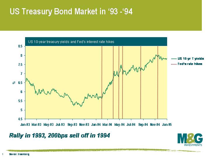
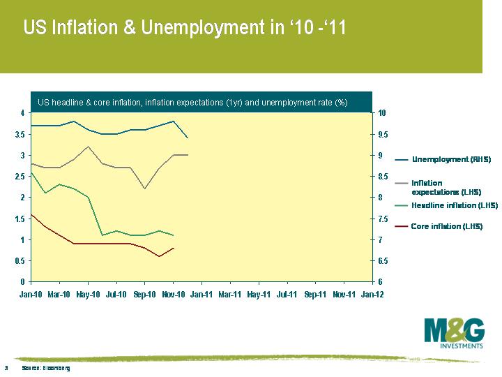
The other important part of the move is about a rise in inflation expectations. This had already started in mid 2010, as commodity price inflation (for example cotton, coffee, energy) had taken off, but the move was exacerbated by the US Fed’s announcement of QE2 in early November. 5 year inflation expectations as derived from TIPS yields have risen from a low of 1.13% at the end of August to 1.95% now. Add to this fears about sovereign creditworthiness (others have now joined us in worrying about the US’s AAA credit rating, and Europe faces its own default crisis) and it is no wonder that bond yields have risen. Might this be a re-run of 1993/1994, when government bonds rallied hard in 1993 before the Fed unexpectedly hiked rates in February 1994, provoking a 200 bps sell off in 10 year Treasury yields?
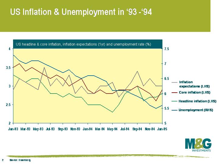
I went back to look at the economic environment at the time, to see how different it was to today. The thing that surprised me was that inflation had been steadily falling throughout 1993, both on a core and a headline measure. It didn’t start to pick up until the second quarter of 1994, after the Fed had hiked.
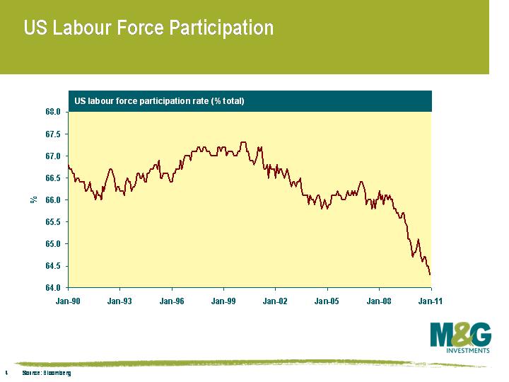
The inflation picture is similar now – the starting point is lower, but actual inflation had been coming down throughout 2010, towards record lows on the core measure. So when the Fed hiked in 1994 they were doing so in a falling inflation environment. What is different is the employment situation. In 1993 the unemployment rate was falling decisively, and was at a much lower level than it is today – i.e. the unemployment rate was falling towards 6.5%, with some estimates of full employment at just under 6%. The US currently has an unemployment rate of over 9%, and whilst it may have come off its peak, it is miles away from full employment. In fact some would argue that the unemployment rate is understated at this point thanks to a significant fall in the labour force participation rate, as discouraged workers stop looking for jobs, the young go back into education, and people retire early. Over the past couple of years the participation rate has fallen from 66% to 64.3%, compared with over 66% in `93/`94.
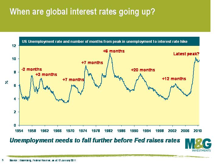
We think the Fed is still massively more worried about the jobs situation than it is about generating inflation. We’ve been following the chart on the left for years – it shows that the Fed’s reaction function means that they wait for unemployment to start falling on a sustained basis before they start to hike. In the last two cycles the lag was a year to twenty months from when the unemployment rate started to fall. You could argue that US unemployment did start to fall towards the end of Q1 last year, which means that the Fed might hike later this year. But in our view the level of unemployment is still way too high, and the fall in the participation rate is too severe. In any case, in the US you can rule out an early 2011 rate hike.
Is that also true in the UK? Unemployment here is sticky too, just below 8% on the ILO measure. And the public sector job cuts are yet to bite. But inflation is very sticky here and the Bank of England has missed its 2% CPI target and been at or above 3% for all of 2010. RPI inflation is at 4.7%! The 2.5% VAT hike will start feeding into retail prices from this month onwards, and utility and petrol prices are rising sharply. The money markets are already pricing in two 0.25% rate hikes in the UK this year, with a small chance that there will be a third rate hike by year end.
Rate hikes would kill core inflation (although remember that mortgage rates are a component of RPI, so that measure of inflation would likely rise with every rate hike) – but they would also be GDP-suicide in this fragile economy, bringing deflation risks back into play. Hopefully the Bank still feels it can target future inflation, and has the confidence to ignore those reacting to current inflation newsflow and calling for imminent rate hikes. But I don’t think that the Bank of England has much breathing room left, and with persistently high current inflation the Bank’s credibility is under attack. I think we’re only one surprisingly robust inflation print away from a UK rate hike. Let the policy errors begin…
The Baltic Dry Index, a measure of commodity shipping costs, is often used as an indicator of global demand, and it has a pretty good relationship with government bond markets too as we’ve discussed previously. The index has received much publicity over the past few years since it very accurately flagged the carnage of Q4 2008. One of the index’s attractions is that unlike financial markets, it’s not subject to speculation (although of course shipping rates are influenced by their own set of demand and supply factors).
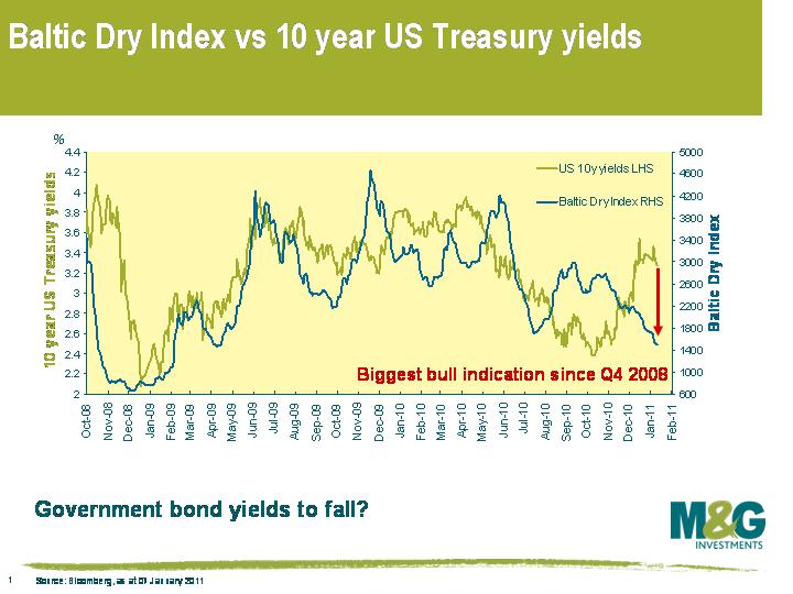
Today the index fell to 1495 points, which is the lowest since April 2009, and the trend is fairly firmly downwards.
We have been musing for a while now the impact of new financial regulations on bank funding and how banks will structure their balance sheets going forward. I speculated a couple of months ago that banks would likely begin to fund themselves by issuing a combination of covered bonds and contingent capital. My sense is that the demand for contingent convertible capital in the market is currently pretty weak, which if I am to be believed, leaves covered bonds as the only option for bank funding.
Yesterday I think we got a glimpse into the future. Several European banks came to the market with covered bonds. Already this year (week) we have had €14.25bn worth of supply, and when you consider that the euro covered bond market usually issues around €150bn of paper a year, it does seem as though it’s a level that may be worthy of some note. Even with about 10% of the normal yearly supply already done, sentiment is that there is a lot more still to come.
It has generally been larger banks that have come to market and such is the desire to issue paper, they seem willing to pay up. Santander, for example launched a 5yr cedulas (Spanish for covered bond) which priced at swaps+225 yesterday. A record wide level.
A preponderance of covered bonds is clearly not good news for senior debt holders, because in the event of a bank liquidation you are further away from the top of the capital structure and therefore have a claim over fewer assets than you would have traditionally had. It will be interesting to see how the covered bond market develops and what happens to spreads – what will dominate? Demand or supply?
This Titanic issuance of covered bonds is more than moving the proverbial deck chairs around to fund the banks. In fact senior and subordinated bond holders are being rearranged further from the safety of government and legal lifeboats.


Sign up to the Bond Vigilantes mailing list to ensure you never miss a great article from our expert Bloggers. We will email all new articles to your inbox, meaning you can stay on top of the world of Bonds.
I confirm that I would like to receive information about Bond Vigilantes and products and services from M&G Securities Limited.
We will use the email address and personal data you have shared with us to send you this information. For existing customers, submitting your contact details and requesting to receive this information from us, will replace any earlier choices you have made in respect of marketing information.
You can unsubscribe from marketing at any time, at which point we will not send any further marketing information to you, by selecting the unsubscribe link in all communications.