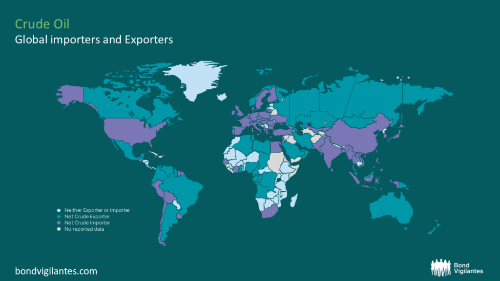
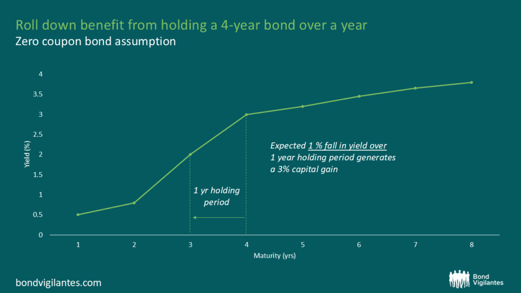
oil
Not all oil-exporting countries are the cracking winners you think.
By Charles de Quinsonas
4 June 2026


There were some reasons to be cheerful in today’s UK economic data – second quarter GDP growth wasn’t quite as bad as previously thought (the economy shrank by 0.4% rather than 0.5%), and stripping out the weak construction sector, the economy is growing at a reasonable (if below trend) rate.
But we also had news that the UK’s current account deficit showed a significant deterioration. The gap between imports and exports grew during the quarter, to a deficit of £20.8 billion – equivalent to 5.4% of GDP. Additionally the first quarter deficit data was revised higher by £4 billion to over £15 billion. The relative strength of the pound is hindering the effort of the UK to rebalance its economy away from consumption and towards manufacturing and exports. On a trade weighted basis, sterling is around a 4 year high – helping to feed our addiction to consumer goods (and as a positive side effect helping keep inflation below the BoE’s letter writing territory for the first time in ages).
The chart below perhaps acts as a warning for those of us who by domicile or asset allocation are exposed to the pound. It shows the UK’s current account position going back to 1955, and you can see that periods when the deficit exceeded around 3% of GDP, a severe weakening of the pound often followed. In the mid 1970s the pound fell by nearly 30% against the Deutsche Mark and US dollar, and big falls also followed in the early 1990s, and in the first wave of the credit crisis. Of course there are other things you can point to in all of these occasions (bad UK banks in 2008, leaving the ERM 20 years ago this month) but if the UK’s safe haven status comes under question (for example if we lose our AAA rating post the Chancellor’s Autumn Statement) that might give the currency markets an excuse to revalue the pound downwards.
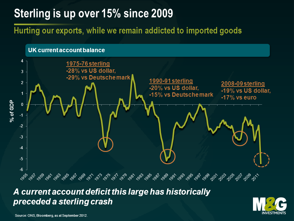
Incidentally, on a purchasing power parity measure (PPP, which looks at the level of exchange rates needed to equalise the price of buying things in different economies) sterling is fair value against the Euro, cheap against the Australian dollar (which looks 23% overvalued – if you’ve been there on holiday and paid a million pounds for a schooner of lager you’ll know that’s true), but 15% dear against the US dollar.
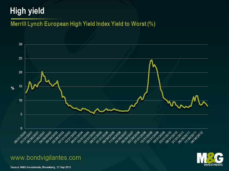
We mentioned late last year that the high yield market had crossed into cheap territory as credit spreads went over 1,000bps. Historically this has proven to be a relatively robust signal to take a constructive view on the market, and it proved so once again. To use a poker analogy, it was like being dealt a full house – the odds were sufficiently in your favour that, even if you didn’t know exactly what would happen, it was worth making a reasonably big bet.
In what’s been a fairly rocky ride, the European high yield market has seen a total return of 20.1%* so far this year, which compares to a 15.8% rise in the S&P 500, a 10.4% for the Euro Stoxx 50 and 4.8% for the FTSE 100. In all honesty, this has been a stronger result than we anticipated, fuelled mainly by the actions of the ECB (most of this year’s returns coming in Q1 on the back of the LTRO programme) Mr Draghi’s commitment to “do what it takes” and other central bank injections of liquidity in what has been an otherwise lacklustre year for economic growth.
So far so good, but the real question is where to now for high yield? Can we see another few months of double digit returns?
To try and answer this, first let’s consider a few of the key valuation signals. In terms of all-in yields, the high yield market is not too far away from multi year lows. The European market is currently yielding around 7.3% to maturity** compared to a 10 year low of 5.3% in February 2005. There is some scope for yields to fall further on this basis, but the scale of the move will not be enough to generate the sort of capital gains we have seen in the last few months.
This means that anyone who buys high yield assets at this point in the cycle looking for large capital gains will probably be disappointed. To generate a further capital return of around 16%, for example, yields would have to fall to around 2% on average. Does this then mean high yield is a screaming sell ? No, not really. To think that high yield is a sell you have to be fearful of either a big rise in underlying government bonds yields, a major re-pricing of credit spreads or both.
In the case of government bond yields, we could well see a rise from current levels, however, the extent of the rise, in my view, will be limited. I don’t think we will see 10 year yields north of 5% for Treasuries, Bunds and Gilts anytime soon as governments and policy makers have made it very clear that they will continue to intervene in the markets to keep long term interest rates lower for longer. Nominal growth and the labour markets are the primary concern, not the risk of higher inflation. This means the potential move up in sovereign yields is likely to be limited and hence capital losses for high yield bonds due to this move will be relatively benign. To put this in context, the modified duration of the European high yield market is currently 3.1 years**, hence if government bond yields rose by 1% across the board, the capital loss would be around 3% all other things being equal. When you add back a credit spread of 6.7%, assuming that you are not hit by a wave of defaults (always a big ‘if’ admittedly), then the total return from high yield would still be positive.
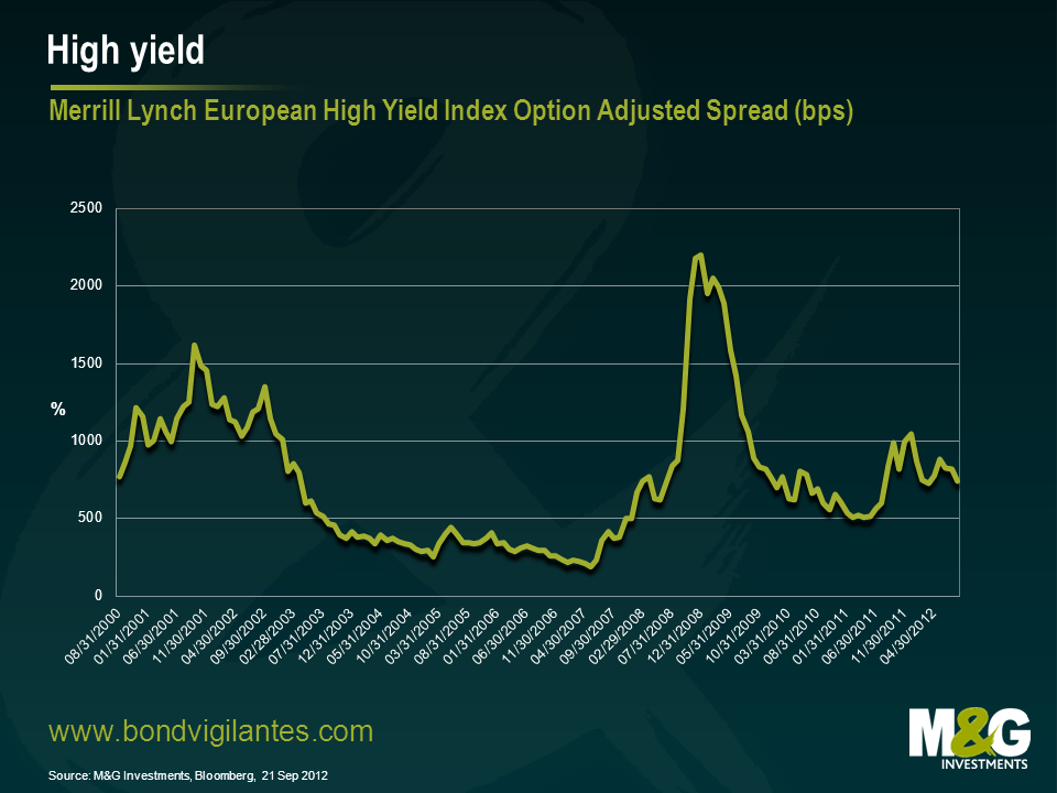
The more important driver of returns for the asset class will be any move in credit spreads and what default rates are likely to be. In contrast to all-in yields in the previous chart, we can see from the chart below, that credit spreads are still a long way off their lows. The incremental yield over government bonds was at 7.4% at the end of August, compared to 1.9% in May 2007. As such, there seems to be plenty of scope for spreads to go tighter, with the potential for some capital gains as they do so.
Does this mean high yield is a screaming buy? Again, no. We have to look at credit spreads in the context of the economic reality for companies in Europe. Much of Europe remains in the grip of low or no growth and credit remains scarce. As such the price of credit (the spread) should reflect that reality. At the end of the day, investors should demand a credit spread that adequately compensates them for the illiquidity inherent in the asset class and a modest rise in default rates. With this in mind, spreads are extremely unlikely to go anywhere near the 2007 level of 1.9% any time soon. There is also the ever present threat of a macro-economic or political curve ball that prompts a general shift in risk appetite and push spreads wider. Nevertheless, when we look at fundamentals and consider the medium term valuation case I think high yield spreads are closer to “fair value” right now.
This leads us to the rather unsatisfying conclusion that whilst the high yield market may not generate big capital returns, there is a case for remaining invested. What I would say though, is that a more defensive approach within high yield portfolios is probably merited in the current environment. The risk/reward trade off between a more aggressive position and a less aggressive position has shifted in favour of the latter. In essence, this means dialling down the “beta” for want of a better phrase.
To revert to the poker analogy, betting on the high yield market right now is like playing a hand with two pairs – you might make money so it’s worth staying in, but it doesn’t feel like the time to go all in and bet the ranch.
*Merrill Lynch Euro High Yield Index total return from 31st Dec 2011 to 21st Sep 2012. Equity market returns year to date as of 21st Sep 2012. Source: Bloomberg, Bank of America Merrill Lynch
** Merrill Lynch Euro High Yield Index as of 21st Sep 2012, Source: Bloomberg, Bank of America Merrill Lynch
The ECB is modelled on the idea of an independent central bank, where decisions are made to enforce economic rather than political discipline. Recently however, its role and mandate seem to be changing.
This move by the ECB to become more an arm of the state is typified by Mr Weidmann’s comments recently. He draws comparisons of the recent potential bond buying announcement, with that of aggressive state financing via the printing of money by non independent central banks.
Not only has the ECB agreed to become more like an arm of the state, it is potentially attempting to become the state. Its bond purchase programme is dependent on a sovereign state meeting certain conditions, which means it is now aiming to have the powers of a state, in terms of controlling net taxation and spending. It would therefore control the printing press and control expenditure. It would then automatically face the tricky political task of switching the printing press off if conditions are not met by its subjected member state. No wonder Mr Weidmann does not approve.
This is not the only way the central bank has become more political recently. By having the explicit aim of saving the euro at all costs it has basically made a political decision. Currency unions are by definition a political construct. Therefore, its recent move to a dual mandate of inflation targeting and saving the euro is a move towards a more politically focused ECB.
One of the problems the ECB faces as a political animal is its construction. It has not exactly been constructed in an efficient, democratic manner. Firstly, one country one vote means proportional representation is out the window, potentially annoying the larger members who do not agree with the policy and have to pick up the bill (Germany). Secondly, the appointment of its council members is undemocratic. Thirdly, council members, as national central bank governors, tend to be economists!
There is always a connection between a central bank and the state that it is theoretically acting in the independent interest of. The ECB is becoming more like the ECP (the European Centre for Politics). Will European governments give it this increasing power? Will it be able to exercise this power correctly?
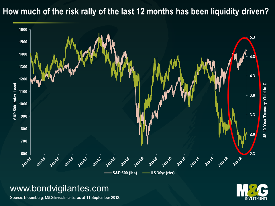
Almost every financial asset seems to have gone up – in the last year, you’d have made money if you’d bought US Treasuries, corporate bonds, gold or even Italian equities. It’s only really emerging market currencies or EM equities that have disappointed. The concept of portfolio diversification and uncorrelated asset classes seems to have gone out of the window, but who cares when everything’s going up, right?
The first chart illustrates this point, showing the S&P 500 (pink line, left axis) against the 30 year US Treasury yield (green line, right axis). US Treasury yields and US equities used to be strongly correlated, but in the last year Treasury yields have collapsed while equities have soared to 2007 levels. The time value of money concept suggests it makes sense for equities to rally if US treasury yields have collapsed, because all else being equal, the present value of a company’s dividends or free cash flow or whatever you’re looking at has increased dramatically owing to the much lower discount rate.
Still, this correlation breakdown bothers me. If it’s correct that everything has rallied on the back of the promise of central bank liquidity, then presumably every asset class can also fall if this liquidity is no longer available.
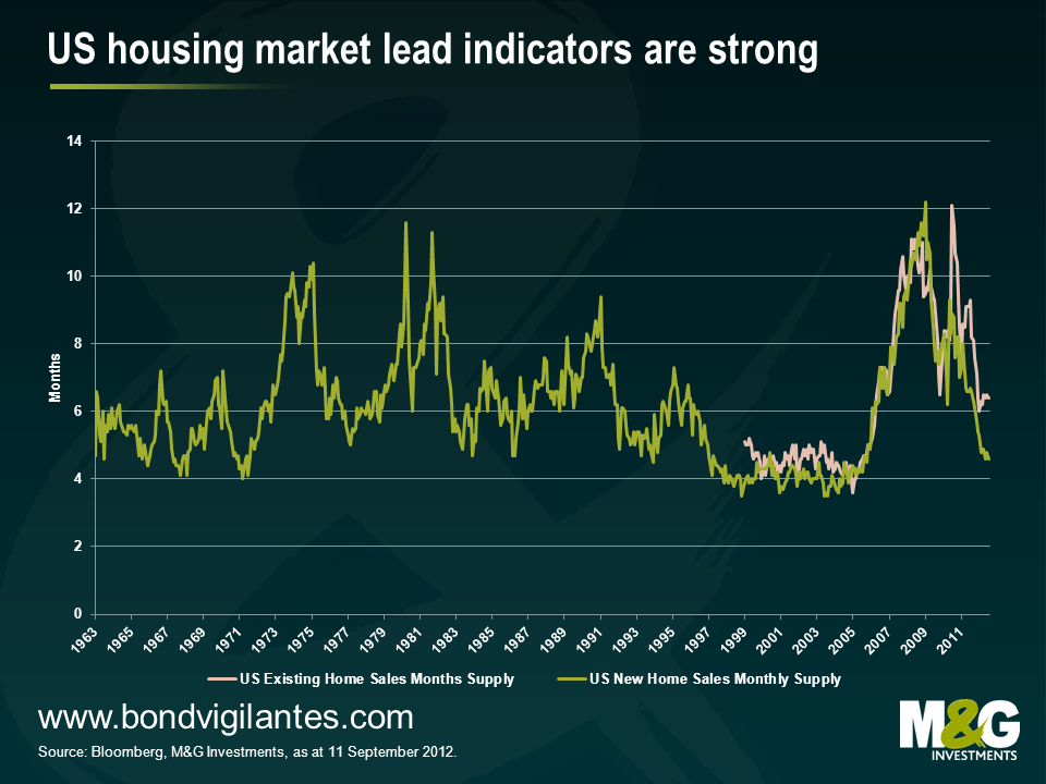
The central bank that seems to me to be closest to running out of policy options appears to be the Fed. Sure, unemployment is falling at a painfully slow rate, but unemployment is a lagging indicator. Probably the most important thing for the US economy is the US housing market. The US consumer may be close to having delevered, and if the housing market rallies, consumers are fine, banks are fine, banks can start lending again and economic growth can return. US house prices are (just) increasing again, and some of the lead indicators are unquestionably bullish. In 2021/12 we focused a lot on measures such as the months supply of houses, which says how long the supply of houses on the market will last at current levels of demand. In 2021/12 we showed that this measure was predicting a US recession (see here), whereas this lead indicator is now suggesting the total opposite – the months supply of new homes (for which there is a much longer history) has only looked more favourable a handful of times in the last 50 years, and is closing in on the go go years of 1997-2005.
This chart also bothers me. The Federal Reserve’s favourite measure of market implied inflation expectations is the 5 year 5 year forward breakeven inflation rate, and inflation expectations have recently risen above 2.8%, the highest in over a year. Admittedly part of the increase in inflation expectations has been due to Bernanke’s comments, but it’s noticeable how much higher inflation expectations are today versus where they were in summer 2010, when the Fed indicated it was getting ready for QE2.
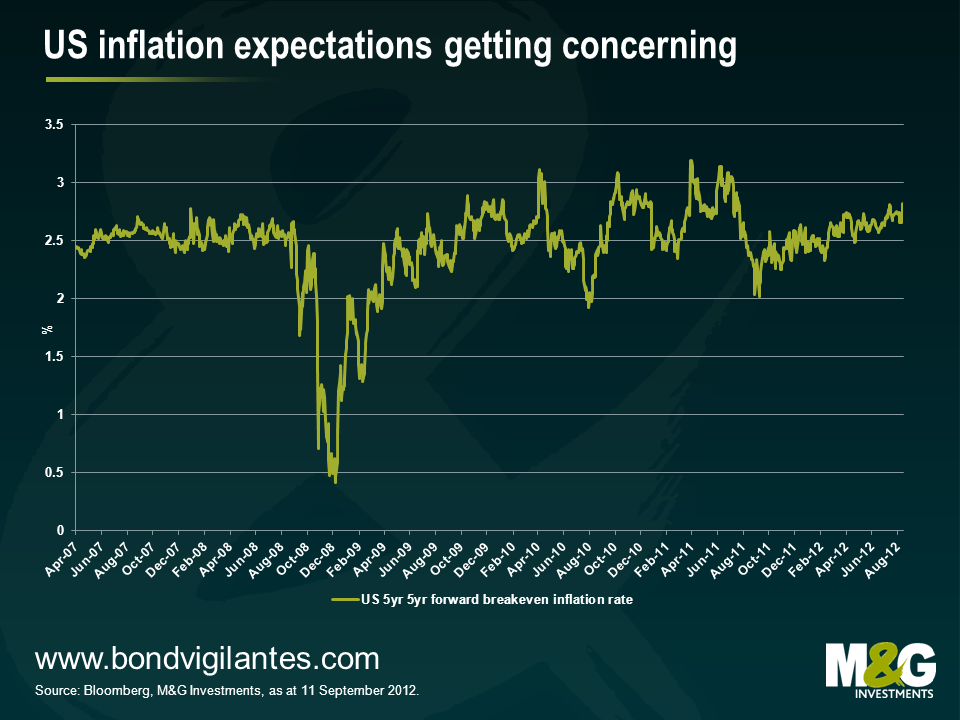
It’s possible that we’ll see additional stimulus from the Fed over the coming months and years, and we are still very far away from a 1970s-style stagflationary environment that would likely see all asset classes really suffer. But the ‘Bernanke put’ is becoming a lot harder to justify, and this could pose problems to both ‘safe haven’ assets as well as risky assets.


Sign up to the Bond Vigilantes mailing list to ensure you never miss a great article from our expert Bloggers. We will email all new articles to your inbox, meaning you can stay on top of the world of Bonds.
I confirm that I would like to receive information about Bond Vigilantes and products and services from M&G Securities Limited.
We will use the email address and personal data you have shared with us to send you this information. For existing customers, submitting your contact details and requesting to receive this information from us, will replace any earlier choices you have made in respect of marketing information.
You can unsubscribe from marketing at any time, at which point we will not send any further marketing information to you, by selecting the unsubscribe link in all communications.