oil
Not all oil-exporting countries are the cracking winners you think.
By Charles de Quinsonas
4 June 2026


As has been widely reported, last week the Bank of England and HM Treasury extended their Funding for Lending Scheme (FLS). The FLS was originally launched in July last year with the intention of stimulating lending in the real (non-financial) economy. Under this scheme a bank or building society borrows UK Treasury Bills and hands over eligible assets as collateral. The fee they are charged (effectively the interest rate) and the amount they can borrow are determined by how much they have increased their lending. The bank or building society can then either repo their T-Bills for cash or, more cheaply/likely, just use them to replace cash in their liquidity buffer. The more they lend the more they can borrow at the lower rate.
The BoE and HM Treasury have hailed the scheme as a success. But on what measure?
Today we received news that mortgage approvals had another weak month in March, increasing only slightly to 53,500. Mortgage approvals have been flat at around 50,000 per month since early 2010 and, considering last week’s extension to the programme incentivises SME lending more, it doesn’t look like the cheaper funding has spurred the desired increase in lending.
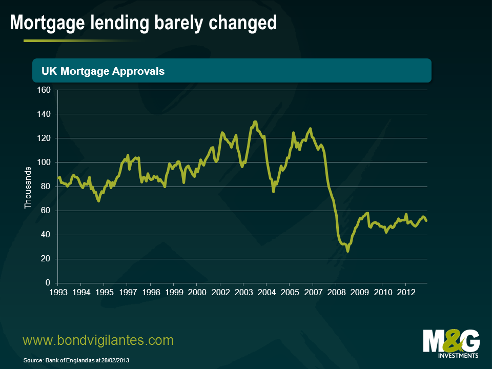
Further, with the average mortgage rate in the UK at around 4% and banks able to borrow at what the Bank of England estimates to be 0.75%, the lower rates clearly aren’t being passed on to the man on the street either. Assuming banks’ net interest margins aren’t the measure on which this programme is judged I think it’s fair to say it hasn’t been a huge success.
Unless that is, you happen to be an investor in asset backed securities. The UK Residential Mortgage Backed Securities (RMBS) market has rallied significantly since the FLS was first announced. Granted, most risk assets have rallied since last summer – partly down to Mario Draghi’s now famous speech – but I think that the UK RMBS sector has had an extra boost from the FLS.
Rather than issue RMBS, the banks and building societies have preferred to pledge their mortgage stock with the FLS which has provided a technical support for the market. The graph below shows the spread on an index of short dated, AAA, UK prime mortgage deals. As you can see they began their rally last summer and have been hovering around 50bps since the autumn. The lack of supply – we haven’t had a new public deal since last November – has certainly been supportive for spreads.

The Bank of England and the Treasury claim that the scheme has been a success mainly on the grounds that things would have been worse without it. Clearly we’ll never know. Whether things are better or not the FLS appears to have done almost exactly the opposite of what it set out to do. It was established to provide support to the non-financial sector, but as far as I can tell, to date it has actually made the financial sector marginally healthier and better off.
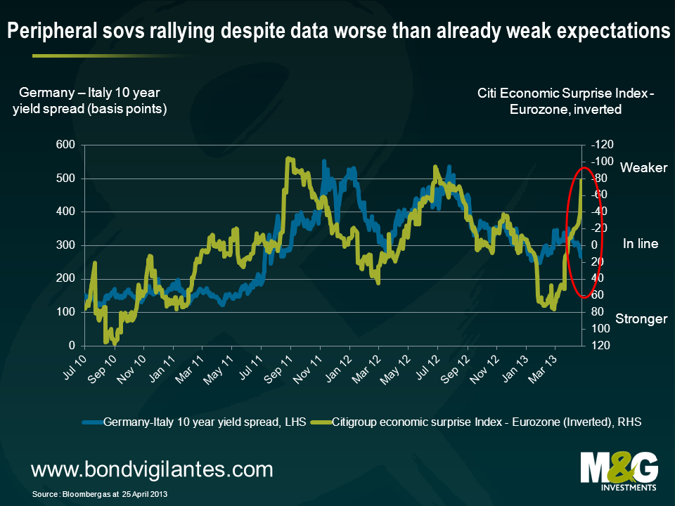
Earlier this week, 5 and 10 year Spanish yields fell to the lowest levels since Q4 2010. The rally was no doubt kick started by Mario Draghi’s “do whatever it takes to preserve the euro” comment, and was given further fuel by the improvement in Eurozone economic data over the latter half of 2012, which was probably due in part to Draghi. However, the peripheral rally has continued this year in the face of a significant deterioration in economic data in recent months. Economic fundamentals and valuations are currently moving rapidly in opposite directions.
The chart below illustrates this – on the left axis is the Italian 10 year yield spread over Germany, and on the right axis is Citi’s Eurozone Economic Surprise Index (so if the green line moves up, data is coming in weaker than expectation).
I continue to doubt whether Spain in particular is solvent, where I’d define insolvency as being where a country’s public debt/GDP ratio increases indefinitely. Yes, the ECB can throw liquidity at Spain to keep the debts rolling over, and yes, many other developed countries are arguably in the same boat – Japan’s public debt/GDP ratio is quickly rising towards 300%, which makes Spain’s public debt burden look relatively puny. But as we’ve seen with Greece, sovereign Eurozone debt can and will be restructured when a country is deemed insolvent, and as previously argued in a comment in 2010, this is where Spain appears to be heading.
Focusing on Spanish long term debt dynamics, it’s worth recapping that the change in a country’s government debt/GDP ratio is a function of three variables, namely:
Spain’s public debt/GDP ratio has been soaring because of all three of the above variables. Taking each of these variables in turn, the chart below plots Spain’s nominal GDP growth against its 6 year nominal borrowing cost (strictly speaking it should be the average interest cost that goes into the formula, which for Spain is currently about 4% – I’ve taken the yield on Spain’s 6 year maturity as a proxy). A borrowing cost of 4% was fine from 2001 to 2007, as Spain was able to generate nominal GDP growth of between 7 and 9%. It’s not so fine now.
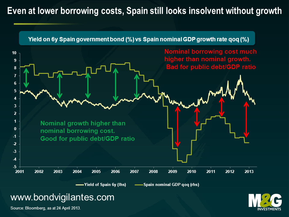
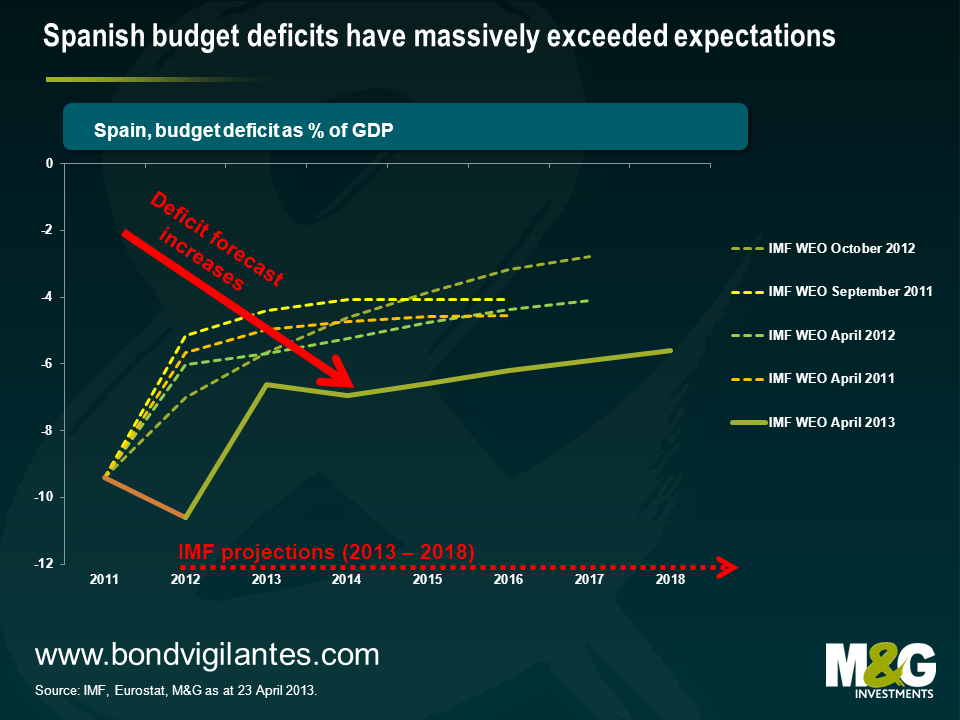
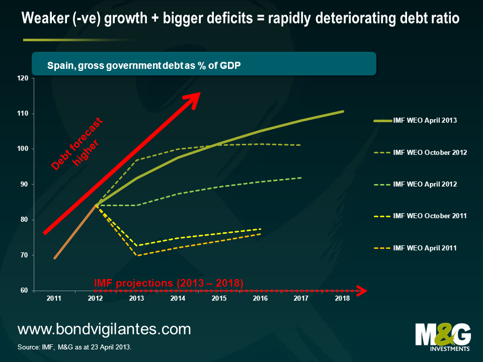
Given that Spain’s borrowing costs are higher than its nominal growth rate, it needs to run a primary surplus if it is to stabilise its public debt/GDP ratio (as per point 2). But Spain is actually running a huge budget deficit (averaging 10.2% since 2009), and is therefore running a large primary deficit. The chart below shows how the IMF has steadily increased its forecast for Spain’s budget deficits since 2011.
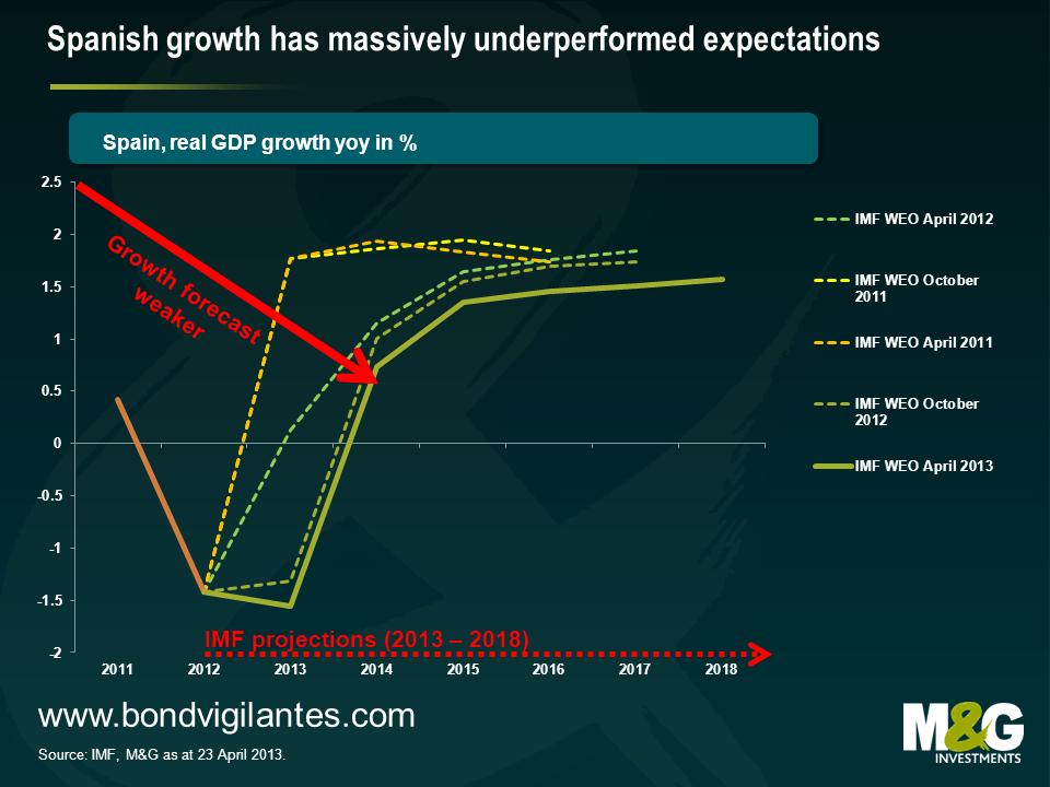
Part of the reason why the IMF has forecast larger and larger deficits is down to its growth forecasts being hopelessly optimistic. The chart below shows how in 2011, the IMF thought Spain would be growing at a tidy 2% by now, when instead Spain remains mired in a slump (yesterday it was announced that the unemployment rate hit a record 27.2% in Q1). Most forecasters’ long term growth estimates are simply countries’ long run historical averages, but given Spain’s high private and public debt levels, as well as deteriorating demographics, Spain’s long run potential growth rate may be as little as +1% per annum.
What about the third point about the debt/GDP ratio, namely stock flow adjustments? Our Spanish banks analyst Ed Felstead believes it isn’t inconceivable that even some of the banks that have been recapitalised by the state will need additional recapitalisations, despite the transfer of their most toxic real estate developer loans and assets to Sareb, Spain’s ‘bad bank’. Non Performing Loan (NPL) ratios at the now ‘clean’ banks remain high and revenue generation remains low on falling margins. Any further deterioration in asset quality on non-real estate developer loans will result in the banks having to take more provisions, which will lead to losses, with no way to replace the lost capital. This deterioration is likely given the state of the Spanish economy mentioned above, along with Sareb asset sales putting pressure on asset prices, and potential new borrower-friendly legislation on foreclosures and arrears.
So in the absence of a miraculous return to growth, Spain’s borrowing costs will continue to exceed its growth rate, large budget deficits will remain a feature, and it’s easy to see how further bank recapitalisations will be necessary. The IMF is no longer forecasting that Spanish debt levels will level off but will continue rising for the foreseeable future, and that’s even with what appears to be over-optimistic mean reverting GDP growth assumptions. Peripheral Eurozone bonds, and Spain’s in particular, look vulnerable to a sell off.
Stefan took some time off over Easter for a quick holiday in Zimbabwe and, as always, he remained on the lookout for economic insights.
As the only country to experience hyperinflation this millennium, Zimbabwe can certainly provide valuable lessons. From late 2008 its inflation was estimated to be running at a staggering 489,000,000,000% on an annual basis. The economy collapsed, and the population suffered food and fuel shortages, amid a mad dash for foreign currency.
Zimbabwe’s experience is particularly pertinent at a time when central banks are experimenting with unprecedented levels of monetary easing. At times, politicians may view inflation as a convenient way to reduce exorbitant debt burdens but inflation is a dynamic force and Zimbabwe’s cautionary tale teaches us to be careful what you wish for…
Investors in government bonds – historically seen as a low volatile and safe asset class – have had to get to grips with assessing credit risk as well as duration risk in their portfolios. It is simply no longer the case that investors can safely lend to a government without first assessing the government’s willingness and ability to pay back the borrowed sum. This has had a large impact on government bond market returns over the past three years, the results of which are shown below.
Given the fall in yields in developed bond markets, it is unsurprising to see long duration assets like UK index-linked gilts and government bonds performing very well. For example, a broad based measure of the UK index-linked market has generated a 40% total return for investors since the end of March 2010. This is despite the UK losing its prized AAA credit rating this year. Even more surprising is the fact that the big buyer in the gilt market – the Bank of England – has not spent a single penny on a UK index-linked gilt. To date, all £332bn of government bond purchases have been in the gilt market. One investor that did buy index-linked gilts was the Bank’s £3bn pension fund, which had a 95% allocation to index-linked gilts and corporates as at February 2012.
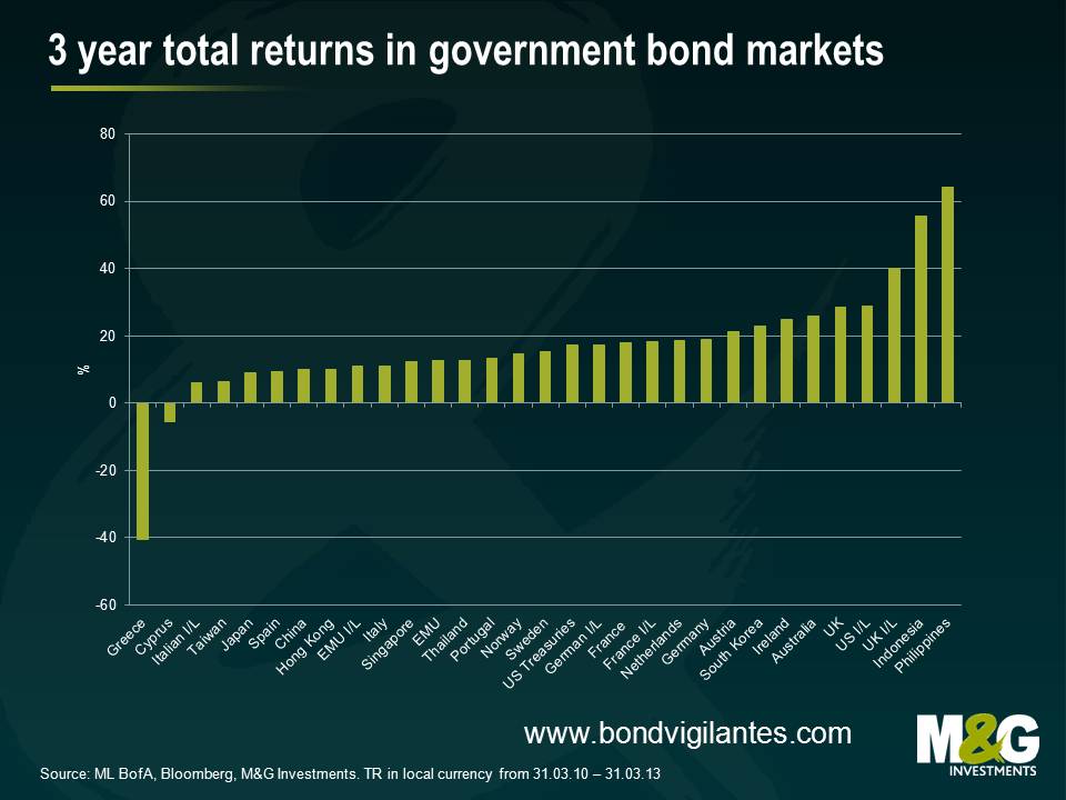
Looking elsewhere, those that were willing to take some credit risk were handsomely rewarded in European government bond markets. For example, investors in Irish debt generated a return of 25% over the past three years. This compares favourably to Europe’s true “risk-free” asset, German government bunds, which generated a total return of 19%. That said, it was not all smooth sailing for peripheral bond investors. Just ask investors in Greek debt, who suffered a 40% loss. Investors in Cypriot government debt fared somewhat better, losing 6% over the three years. Unfortunately for investors seeking protection from Italian inflation, Italian index-linked government bonds generated a return of only 6%. This was below the increase in Italian inflation of 9% over the three year period and is the result of investors becoming more pessimistic about the Italian growth outlook.
Overall, the gold medal for government bond 3 year returns goes to the Philippines with equity-like performance of 64%. The bond market has benefited from purchases by foreign investors, largely due to its relatively strong fundamentals. The combination of a relatively high yield, strong growth and low inflation has been a magnet for government bond investors.
This analysis isn’t much of a guide for what is going to happen over the next three years. Going back to March 2010, I can’t remember many forecasting that Ireland would outperform Germany in government bond markets or that UK linkers would outperform their Italian equivalents by over 30% . So should we be worried about what the consensus is saying now? Isn’t 20/20 hindsight a wonderful thing.
Corporate bonds have had an incredible run over the past few years. A combination of sub-par growth, the sovereign crisis in Europe and massive amounts of QE on a global scale has driven government bond yields down to historically low levels. At the same time, corporate bond spreads have tightened significantly from the crazy levels we saw in 2009. This has meant double-digit annualised returns from parts of the investment grade market (as you can see from the chart Richard posted yesterday), albeit with some spread volatility in ‘risk-off’ periods.
How do corporate bonds generate similar returns from here? Well, there’s no doubt it’s going to be difficult. Given the duration of the iBoxx £ Corporate index of just under 8 years, we’d need to see yields fall roughly 1% further. So, either 10 year gilt yields would have to rally to less than 1% (from today’s 1.7% level) with spreads staying broadly flat, or spreads would need to tighten significantly with gilt yields stable (or of course any other combination of gilt yield/credit spread moves equivalent to about a 1% fall in overall yield).
Focussing purely on the credit spread and using history as a guide, there certainly is room for further tightening – for example, the spread of the BofA Merrill Lynch BBB Sterling Corporate & Collateralised index was 292bps at the end of March, 191bps wider than the pre-crisis tight of 101bps at the end of May 2007. But what could be the catalyst for such a tightening of spreads?
In the latest version of our Panoramic series we look at what drives the relationship between corporate and government bond pricing, how this has been changing over time and what might ultimately lead to corporates trading at even tighter levels than before the financial crisis.
Back in 2009 the Bank of England (the Old Lady of Threadneedle Street) began buying a portfolio of investment grade bonds to provide funding to UK corporates, to aid liquidity in the corporate bond market and to supplement their QE purchases of gilts. Last Friday this investor sold its last corporate bonds.
This has been a great success from a profit point of view. The attached chart shows the total return of an index of non-financial corporate bonds over the period of the bank’s purchases and sales as well as an indication of their total holdings.
I believe its actions helped stabilise the corporate bond market in the UK by providing a backstop bid, therefore helping to reduce the cost of funding at the margin for issuers, and would have added to the effects of QE. However, empirically measuring these effects is hard to do – corporate bond markets that experienced no domestic support from their central banks appear to have performed similarly, and the debate on the true effectiveness of QE remains.
What is the primary lesson we have learned? I think it is that state intervention can work where markets are priced inefficiently. This is illustrated by the large profits the bank has made by buying an out of favour asset class from the private sector. It is probably a good base to have the state intervene where markets are inefficient, for example in areas such as healthcare, defence, law and order, and infrastructure. The danger comes when the state interferes to the detriment of an efficient market. From an economic point of view, aggressive trade barriers are the first thing that comes to mind where there would be a great deal of consensus from the left and right side of politics. Other actions may depend on your economic or political view. The best current example of this is the single European currency experiment. Does it aid a free market via price transparency and low transaction costs, or does it hinder efficiency by having one single interest rate and exchange rate for such diverse economies ?
The Old Lady’s portfolio of corporates has served her and the UK well because she bought them at cheap levels from distressed sellers. Unfortunately, this investor has a significantly bigger portfolio of gilts. The carry and mark to market on these looks great. However, turning this unrealised gain into a realised profit still remains a challenge. If she comes to sell, her position is likely to drive the market against her.

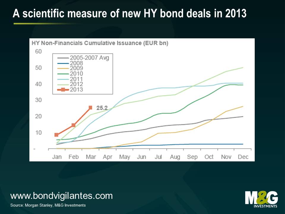
The volume of new bond deals in the European high yield market has been very strong this year. One (unscientific) measure of this has been the growing pile of bond prospectuses on the desk; already the 2013 pile is more than halfway up the 2012 pile after just three months.

A marginally more robust measure is the data below published by Morgan Stanley. The year to date number of €25.2 bn is running well ahead of last year as more and more companies take advantage of lower yields and looser financing conditions in the wider credit markets to term out their debt and reduce interest costs.
Whilst this is generally good for the long term development of the high yield market in terms of depth and diversification, at this point in the cycle there are a few factors that are beginning to cause us to pause for thought.
In brief they are:
We believe that on a case by case basis there are still some attractive opportunities. Nevertheless this is very much a seller’s market. The terms are arguably more attractive for the issuers of bonds rather than the buyers. Accordingly, when looking at new deals, now is the time for a healthy dose of cautious discrimination – caveat emptor.
*B of A Merrill Lynch Euro High Yield Index yield to maturity 02/04/13


Sign up to the Bond Vigilantes mailing list to ensure you never miss a great article from our expert Bloggers. We will email all new articles to your inbox, meaning you can stay on top of the world of Bonds.
I confirm that I would like to receive information about Bond Vigilantes and products and services from M&G Securities Limited.
We will use the email address and personal data you have shared with us to send you this information. For existing customers, submitting your contact details and requesting to receive this information from us, will replace any earlier choices you have made in respect of marketing information.
You can unsubscribe from marketing at any time, at which point we will not send any further marketing information to you, by selecting the unsubscribe link in all communications.