Economy
100 Days of Milei
By Michael Talbot
19 March 2024

Halloween is around the corner and that can only mean one thing… scary chart time. Every year around this time, we highlight economic variables and statistics that could give central bankers nightmares. If stuff like non-performing loans, bad forecasts and big numbers scare you then it is probably time to turn off your computer screen and forget you ever saw this blog. The following is not for the faint hearted.
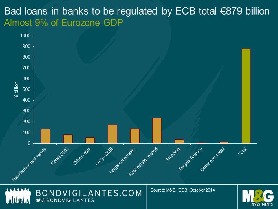
1. Eurozone bad debt is 9% of GDP
We’ve been waiting for the European Central Bank (ECB) asset quality review (ACR) and stress test results for some time now and they were finally released last week. Essentially, the AQR tested 130 European banks in order to find out how well the lenders could weather various degrees of economic downturn. The banks represented a combined 82% of bank assets in the Eurozone.
To cut a long story short, 25 banks failed either the AQR or the stress test. There hasn’t been much action in the bond market as those banks that failed were expected to do so. Importantly, the capital shortfall identified by the tests was only €7bn. This is an amount that appears manageable and banks with shortfalls must prepare capital plans within the next two weeks.
The scary part of the AQR was buried on page 67 of the report in a table that identifies non-performing exposures on the banks’ balance sheets (otherwise known as bad debts). When the European Banking Authority applied its definition of non-performing exposure rather than the commercial banks’ own internal definitions, bad debts skyrocketed by 18.3% to €879.1bn. This equates to almost 9% of Eurozone GDP.
What terrifies us about the bad debt revision is that non-performing loans are a lagging indicator. Things are probably far worse than €879.1bn of write-offs. And with the Eurozone possibly sliding into deflation (a scenario that was not tested in the AQR) and flirting with recession, we have to wonder whether bad loans will top the €1 trillion mark in the not-too-distant future. Given the large excess of bad debt that needs to be worked off in the European banking system, we are not surprised that bank loan growth in Europe is so weak. The answer could be a European bad bank.
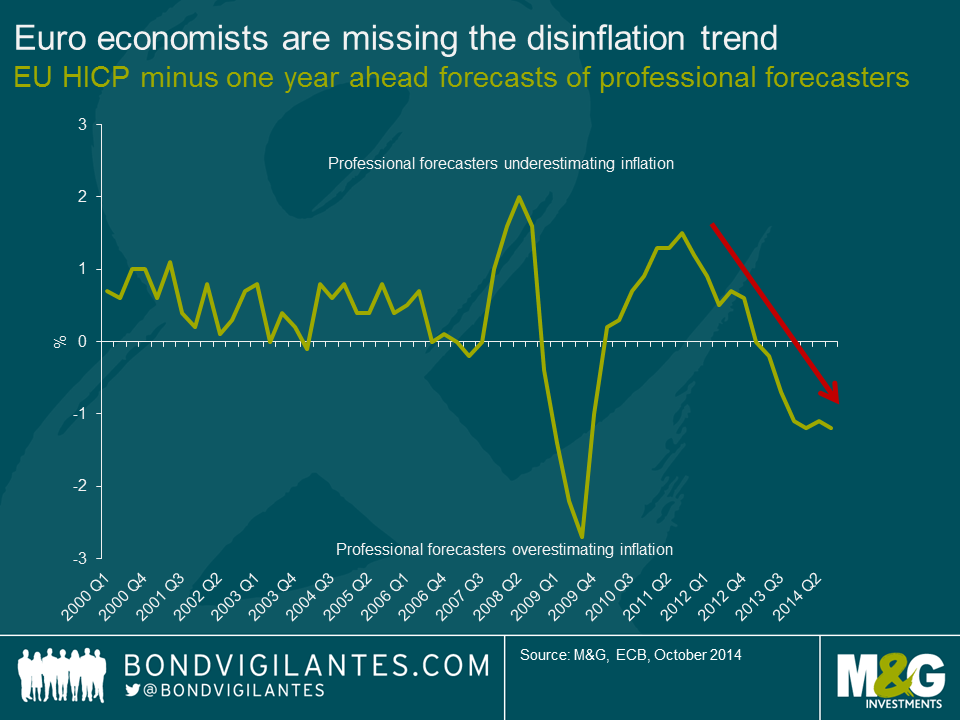
2. Professional economists are getting worse at forecasting inflation
Since 1999, the ECB has surveyed over 75 professional economists employed by banks and financial institutions across the European Union on a quarterly basis. It does this in order to assess expectations about future economic developments and hopefully get a head-start on understanding whether they are losing policy credibility or not.
The ECB survey asks for a point forecast from the economist for inflation, real GDP growth and unemployment over different time horizons. An important question asks the economists for their inflation expectations in 12 months’ time. The ECB is looking to see whether these expectations are starting to become “unanchored”. That is, whether the forecasts are beginning to deviate substantially from the ECB’s price stability target of inflation close to 2%.
Comparing the 12 month ahead forecasts against actual inflation outcomes suggests that professional economists are seriously overestimating inflation outcomes. From 2000 until 2007, economists actually did a pretty good job of forecasting inflation. Over this period, the economists that were surveyed underestimated inflation by around 0.5%.
In 2008, all hell broke loose. Remember that the economists were making their March 2008 forecasts 12 months earlier in March 2007 so we should cut them some slack. However, economists failed to see the large spike in inflation as the oil price rose throughout 2007 and 2008 resulting in an underestimation of inflation a whopping 1.7% throughout 2008. From 2008 onwards, professional economists have been poor at forecasting inflation 12 months ahead, sometimes overestimating and sometime underestimating inflation.
What is frightening in the chart below is the fact that since 2013, economists have consistently overestimated inflation in the EU. When are European economists going to start asking themselves – “What am I missing?” The very real possibility that the Eurozone enters into a deflationary period is currently the world’s biggest problem and those tasked with monitoring the threat are missing it completely.
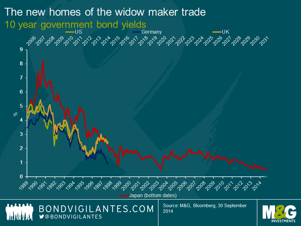
3. The new widow maker trade
The following extract is from a piece I wrote earlier in the year entitled “The Yield-Dampeners”.
For investors, one trade that has always lost money, over any reasonable time period, has been the shorting of Japanese government bonds (JGBs). This trade, unique in its consistency, developed its own name: “the widow maker”. Over the past 24 years, JGB yields have fallen relentlessly from a peak of around 8% in 1990 to around 0.62% today. Despite the great monetary experiment of “Abenomics”, the widow maker is alive and kicking.
History might not repeat itself but it does rhyme. As shown in the accompanying chart, US, German and UK government bonds yields are following an eerily similar path to JGBs in the early 90s. The question has to be asked: is shorting developed market government bonds the new widow-maker trade?
For government bond investors or anyone short duration in their bond portfolio, the below chart is terrifying. What if the developed world is entering into a period of secular stagnation? What if returns on risk-free assets are permanently lower? What if central banks are unsuccessful in their attempts to avoid deflation?
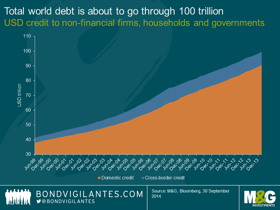
4. Total world debt equals $99,620,935,229,797.10
For the first time in history, world debt is about to burst through the 100 trillion US dollars barrier. That is pretty difficult to comprehend. So I did a quick search and came up with the following facts in an attempt to visualise the enormity of 1/100th of the world’s outstanding debt, 1 trillion US dollars. So here goes:
It is simply astonishing that the world has added another $20 trillion in debt since June 2009, a time when the global economy was recovering from a devastating financial crisis which was caused in-part by excessive leverage. Unfortunately, the financial system seems to be addicted to debt. Central banks have facilitated this addiction through quantitative easing and ultra-low monetary policy, forcing savers into riskier investments in the hope of generating a positive real return.
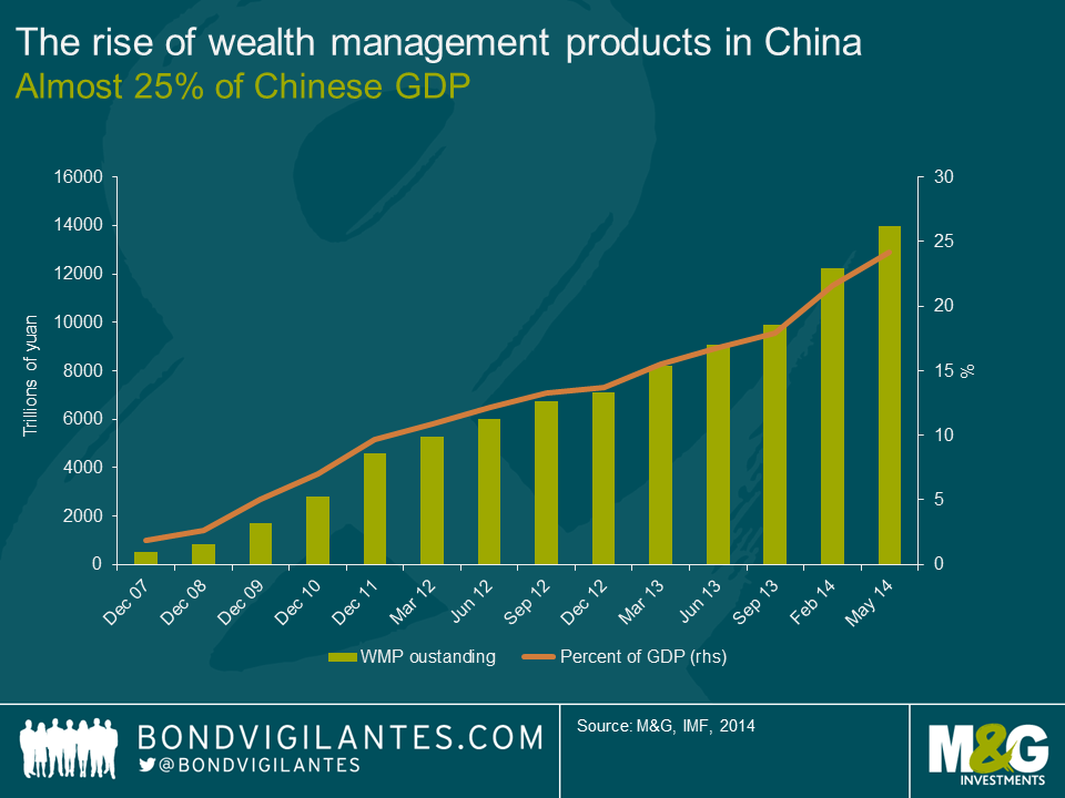
5. The rise of wealth management products in China
At 14 trillion yuan, the amount of money in Chinese wealth management products (WMP) is roughly the same size as Brazil’s entire economy (USD 2.2 trillion). Wealth management products look like time deposits to investors but aren’t necessarily guaranteed by the banks that issue them. Most invest in bonds and money markets though some use stocks, derivatives and loans to bolster returns for clients. The assets backing some WMPs are real estate or infrastructure investments.
The problem is many investors in WMPs probably don’t know what they bought and are attracted by the high rates of interest. Most Chinese investors simply do not know that WMPs are not real deposits. The vast majority of investors probably don’t actually dig around the product’s prospectus enough to find out what the actual assets are that are underpinning these investment vehicles. Often, the assets are real estate and given the Chinese real estate market has experienced a sharp downturn in recent months the pressure to deliver the stated return on the WMP is growing every day on the Chinese banks. WMPs are the world’s biggest trick or treat game.
Chinese banks have relied on WMPs to increase their deposit base. Banks then take those deposits and make real estate loans. It’s a vicious circle of doom for when the Chinese property market eventually corrects (just like the Japanese property market in the 1992). Should investors begin to lose confidence in the banks and withdraw from WMPs en-masse, a liquidity crunch would be the most likely scenario. Because of the scale and prevalence of WMPs, banks would be expected to cover losses and pay investors principal plus interest on products that had been guaranteed. These products are too big to fail. The question is to what degree this would impact the financial system and whether the smaller banks could handle a run on wealth products.
Five scary charts. Each more terrifying than the next. Hopefully all those central bankers and economists that have read this post will be able to get some sleep tonight. Don’t say I didn’t warn you.
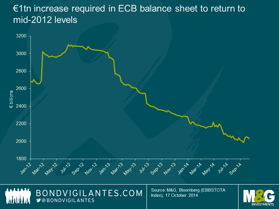
With the European Central Bank (ECB) purchasing €1.7bn of covered bonds last week, the Eurozone’s “QE-lite” programme has well and truly begun. Although the focus to date has been on covered and asset backed bonds, an article from Reuters last week spurred the market, due to a rumour that the ECB would soon be considering an extension to include secondary market corporate bond purchases. Although quickly dismissed by officials, considering that the ECB has previously stated that it wants to return its balance sheet to where it was in 2012 to boost demand (which in doing so would approximately equate to €1 trillion of asset purchases), many dispute that this can be achieved via covered bond and asset backed purchases alone. Given the notion that sovereign bond QE would essentially amount to central bank financing of governments, the next best alternative is likely to be corporate bonds i.e.“QE-plus”.
If QE-plus were to occur, which Eurozone countries would benefit the most? Assuming that the ECB will aim to purchase an equal spread of EUR denominated debt issued by Eurozone companies, I have filtered the Merrill Lynch Euro Non-Financial Index for these and reweighted to get a proxy for a theoretical ECB corporate bond buying universe. Next, I calculated a Eurozone GDP contribution for each individual country (note: Cyprus, Greece, Latvia and Malta have been excluded from the analysis as they were not included in the original index) and the difference between the two (i.e. the demand pick-up) has been measured in order to determine who could be the main winners and losers in a QE-plus world. Although this is a highly hypothetical approach, the results are nevertheless interesting. Constituting 21.7% of Eurozone GDP, but potentially representing 39% of all ECB corporate bond purchases, the 17.5% demand pick-up for France makes it the clear winner. The Netherlands is the only other country to witness a demand for its bonds in excess of its contribution to Eurozone GDP. All other member countries appear to suffer, especially Germany which represents over a quarter of Eurozone GDP, but ends up at the bottom of the table. For Estonia and Luxembourg the balance looks roughly correct. The periphery all witness less than proportional demand pick-ups, but Italy and Portugal look to suffer the most.

Adding a layer and assuming that the ECB would rule out the purchase of government owned entities – e.g. utility and industrial companies – in line with its opposing stance on central bank financing governments, gives us a further refined universe. Most countries continue to be benefit less than they’re due (owing to France’s gain) but on a smaller scale, excluding Belgium and Finland who are worse off. The main exception to this is Spain, which joins France and the Netherlands as a net beneficiary from ECB corporate bond purchases. The other key outlier is Estonia which previously was deemed just-right, but now loses out due to it no longer having any qualifying bonds in the new bond universe (its previous contribution to the index was via a government owned utility company).
Again I warn that this blog is highly theoretical in its approach, however the findings do provide food for thought. Though the ECB may aim for a uniform and decentralised approach, there will undoubtedly be political winners and losers (and this is not a clear-cut core versus periphery debate). This is especially true if the ECB continue to caveat their QE programme which acts only to reduce their potential investment universe. If the ECB are serious about overcoming the prospect of years of deflation, they should do away with QE-lite or even QE-plus and target the biggest, most liquid bond market via full-scale sovereign bond QE.
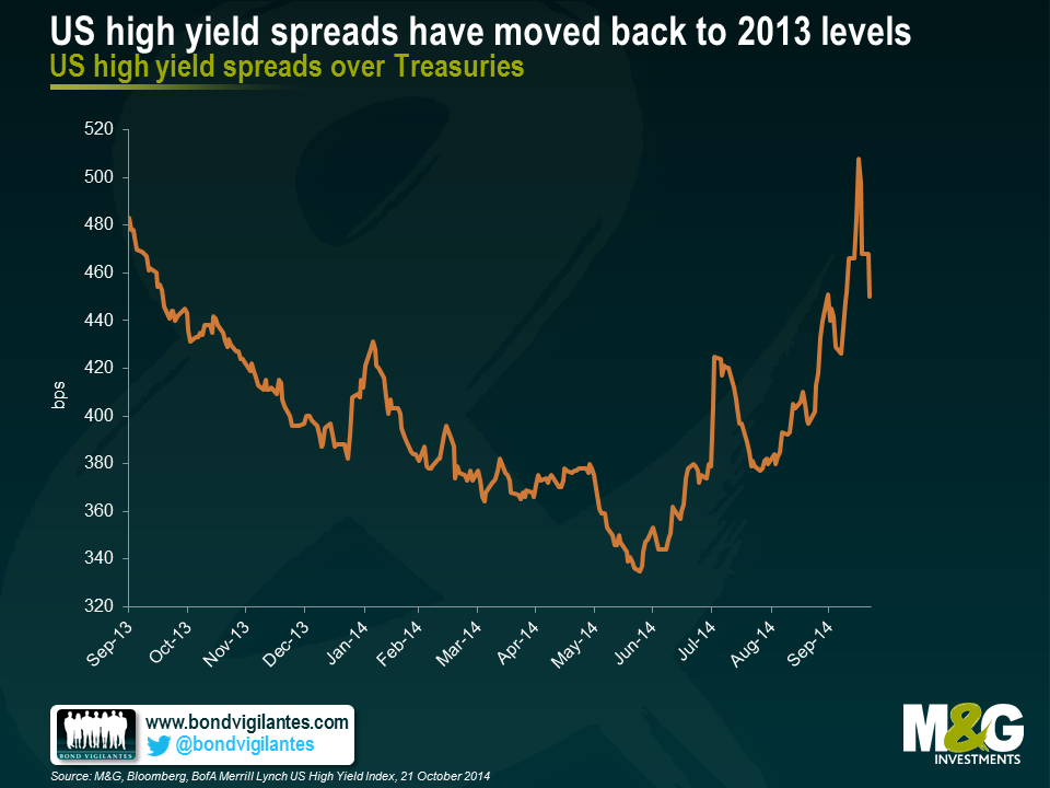
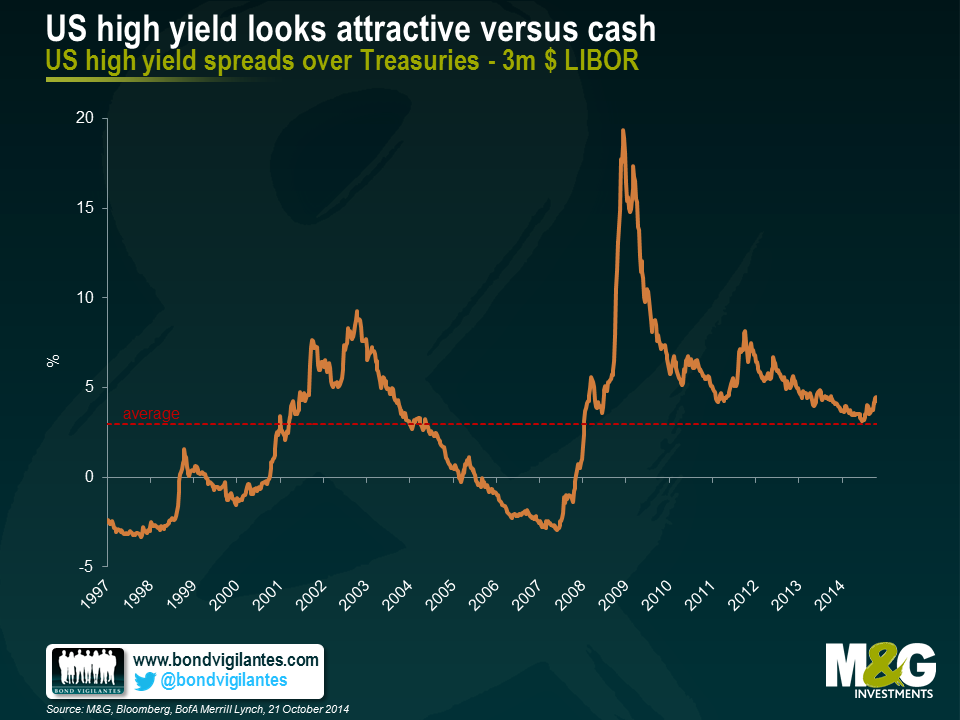
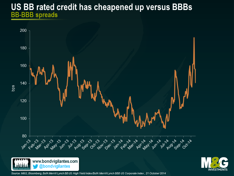
Global growth concerns, fears of a less accommodative Fed, and limited high yield market liquidity coupled with complacent and crowded investor positioning has served to reprice the US high yield market over the past few months. Following on from the worst quarterly performance in Q3 2014 for some three years, the US high yield market arguably now offers a significantly more attractive entry point. Whilst acknowledging that the market has moved faster over the past few days than I was able to write this blog, here are ten reasons why US high yield could be considered a buy at these levels:
I blogged last year about the state of the US labour market and given the recent release of September’s initial jobless claims data, this seems like a good time to revisit these ideas.
US Initial Jobless Claims is an unemployment indicator which tracks the number of people who have filed jobless claims for the first time, representing the flow of people receiving unemployment benefits. The September headline figure of 288,000 is strikingly low and is the lowest reported month end figure since January 2006. Still, this understates the current strength of the labour market as when adjusting to take into account the working population, jobless claims as a percentage of the US labour force is now at multi-decade historical lows.
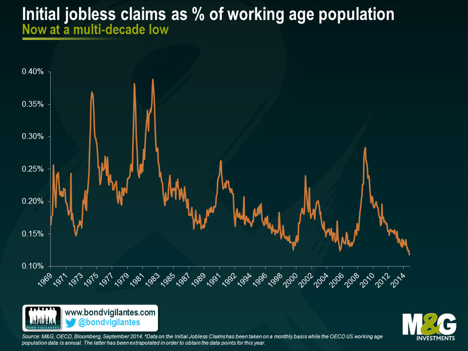
Initial Jobless claims data has been taken on a monthly basis whereas the OECD US working age population data is annual. Therefore what is particularly important to note is that the latter figure for 2014 is not yet available and so the 2013 data has been extrapolated and kept stale since year end. As a result, the graph is more conservative than reality since 2014 population growth to date has not been incorporated. If it were, the fall in this indicator would be even more pronounced.
Traditionally monetary policy has worked with the Fed tightening as the economy picks up steam and jobless claims fall. What is remarkable today is that the Fed hasn’t even begun to tighten interest rates. In the past, the Fed would have already ended the tightening cycle by the time jobless claims fell to the levels we see today.
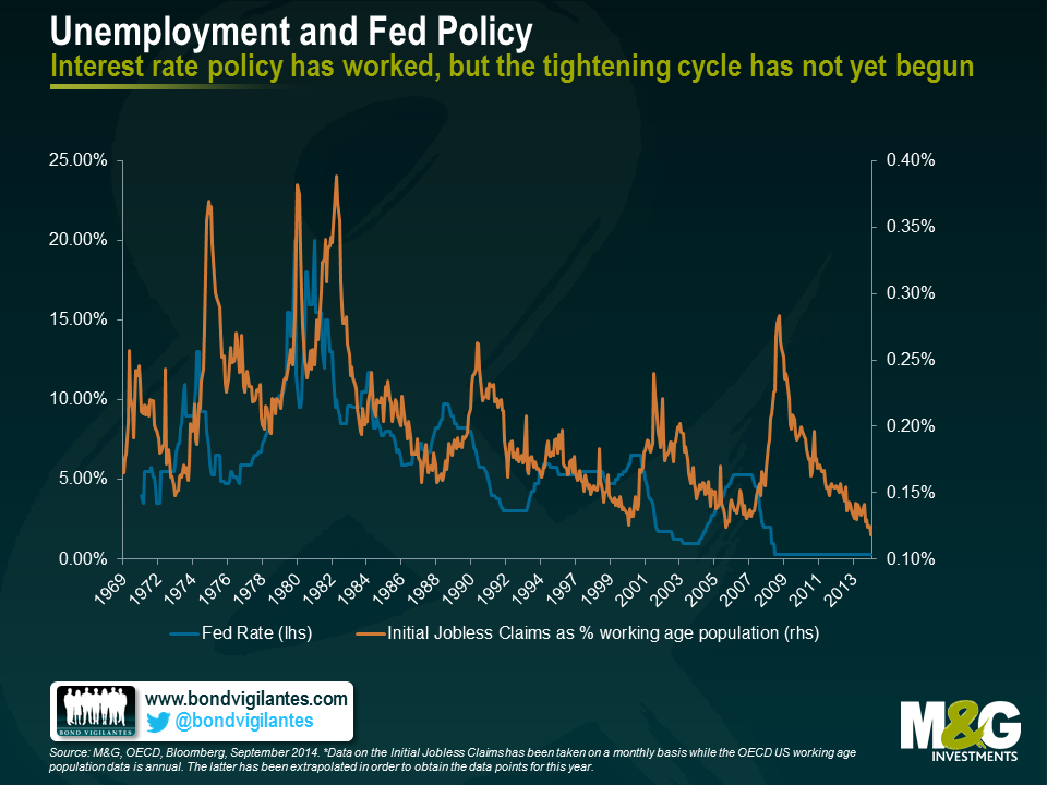
Time and again the Fed has stressed that rate decisions will be data dependent and on Tuesday and Wednesday next week the FOMC are due to decide on whether or not it ends its QE program. Given the above, it seems that the US economy is continuing its healthy response to the stimulus provided and momentum in the US labour force is gathering pace in a positive direction. With more people working and fewer claiming unemployment benefits, the downward trajectory of this indicator – as well as other labour market indicators – surely helps to paint a positive macro picture. However, the risk-off wobble in markets last week has left many questioning whether the volatility experienced will have any bearing on the QE decision. Considering however that the trigger was the underperformance of US Retails Sales data, it can perhaps be argued that this is a typically volatile number in itself and the data release therefore triggered an overreaction in bond markets (exacerbated by capitulations, technical trading level breaches etc).
If the FOMC is in agreement that the market response was overdone, one should expect their decision to be based on the fundamentals and the picture of an overall improving economy. If true to their rhetoric, markets should expect to see an end to asset purchases, right on schedule.
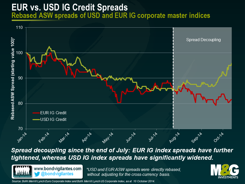
The decoupling of European and U.S. yields has been one of the key bond market themes in 2014 and therefore a much-discussed topic in our blog and elsewhere. Over the past two and a half months, however, a second type of transatlantic decoupling has emerged, this time with regards to credit spreads.
Let’s first have a look at the relative year-to-date (YTD) performance of USD and EUR investment grade (IG) credit. Both data series in the chart below were rebased, i.e., set to a common starting value of 100. With some minor exceptions, spread levels of both indices have been tending downwards fairly consistently over the year until late July. From this point onwards, a decoupling has been taking place. Whereas EUR IG asset swap (ASW) spreads have further tightened, USD IG ASW spreads have significantly widened.
Considering the divergent economic momentum over the past months, this development seems at first glance somewhat counterintuitive. The economic recovery in the U.S has been notable with 2.6% real GDP growth (Q2 2014, yoy) and a remarkable decline in unemployment rate from 10% (Oct. 2009) to 5.9% (Sep. 2014). In contrast, the Eurozone’s economy has been fairly stagnant with an anaemic real GDP growth of 0.7% (Q2 2014, yoy) and a persistently high unemployment rate of 11.5% (Aug. 2014). Against this backdrop, one might expect that U.S. corporations are in a much better position in terms of growth and profitability prospects than their European competitors, and should therefore be in general less risky bond issuers. Investors should in turn demand higher risk premiums for EUR IG credit. Therefore, USD spreads should have tightened relative to EUR spreads. So why is it exactly the other way round? Why have EUR IG spreads outperformed USD IG spreads over the past two and a half months?
First of all, from a methodological point of view, one could argue that European bond issuers suffering severely from the economic malaise have probably been downgraded into high yield territory by now, and thus cannot adversely affect IG index credit spreads. Apart from this technical side note, three reasons come to mind:
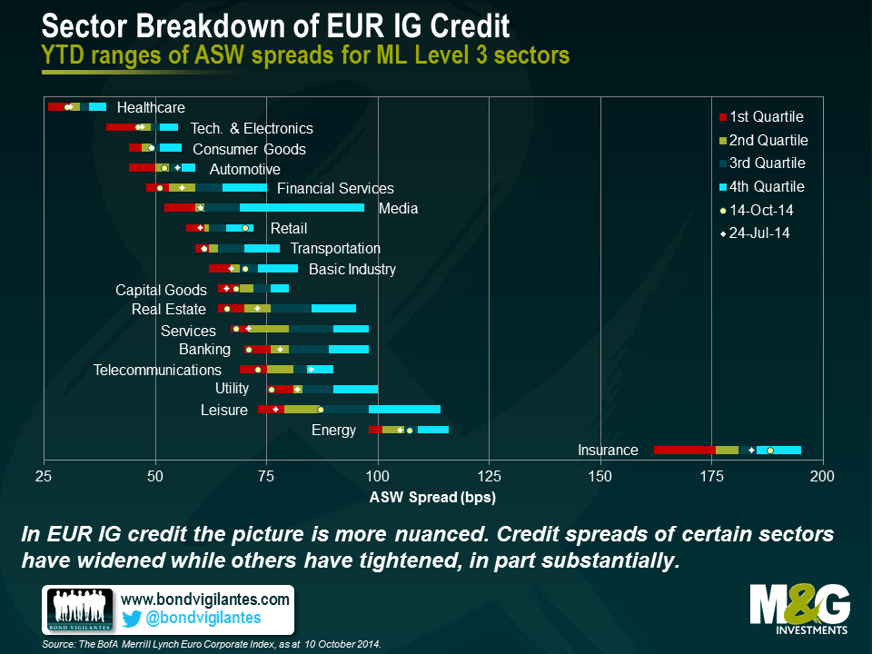
Now let’s add some more granularity by decomposing the overall index credit spread levels into individual sector spreads. The chart below shows YTD ranges of ASW spreads for USD IG corporate bond sectors (ML Level 3). All bars are subdivided into four sections, which we refer to in the following as quartiles, each of which containing 25% of the YTD spread readings. Dots and diamonds mark current sector spreads (14 Oct.) and spread levels at the start of the decoupling (24 Jul.), respectively.
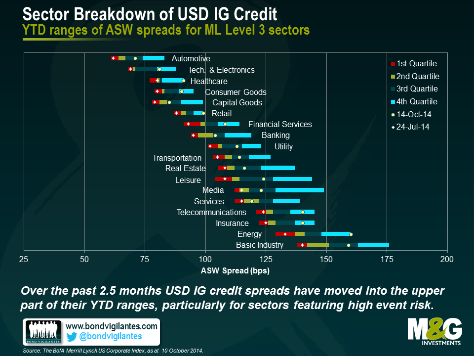
It is striking that over the past two and a half months all USD IG sector spreads have widened. In the vast majority of cases, spread levels have risen from 1st quartile values near the bottom end of the YTD ranges right into 3rd or even 4th quartile positions. The spread widening has been particularly pronounced for sectors which have recently experienced an elevated level of event risk in the form of actual or rumoured M&A activity (namely healthcare, energy and telecommunications). This leads to another important point: It becomes more and more clear that the U.S. economy has entered a new phase of the business cycle, whereas Europe is still well behind the curve. American companies are increasingly taking on balance sheet risk, for example in the form of M&A, to pursue growth opportunities. Consequently, fixed income investors demand a spread premium for USD IG credit to be adequately compensated for this additional risk exposure.
In terms of EUR IG credit, the picture is more nuanced. Credit spreads of certain sectors have widened (e.g., retail, leisure and insurance) while others have tightened (e.g., healthcare, financial services and telecommunications). This pattern, or rather the absence of a clear pattern, suggests that there are sector-specific factors overlaying the more general reasons listed above. Let’s focus on financials, for example. Banking and financial services credit spreads have substantially tightened and are currently deep in the first quartile of their YTD ranges. This is in very good agreement with a supportive ECB and reduced refinancing costs, which are a particularly important concern for financial bond issuers. In contrast, the already high insurance credit spread has widened into the 4th quartile. One explanation for this contrarian behaviour would be that lingering uncertainties around the approaching implementation of the Solvency II Directive, which selectively affect the European insurance companies, simply eclipse favourable central bank policies and supply side dynamics.
So what are the implications of spread decoupling on the relative attractiveness of USD vs. EUR IG credit? Well, the situation resembles the old Treasuries vs. Bunds debate; it ultimately comes down to the question whether one considers the current decoupling trend sustainable or not. If one genuinely believes that the divergence in terms of economic recovery, central bank policy and credit supply continues to progress, the case in favour of EUR IG credit could easily be made. The prospect of further EUR IG spread tightening, and hence capital appreciation, would outweigh lower spread and yield levels. We have in general preferred USD IG credit for quite a while now, precisely because of the higher average spreads compared to EUR IG credit, even when taking the cross-currency basis into account. Although the decoupling has certainly not worked in our favour in recent times, it has simultaneously strengthened the relative value argument. We are now obtaining an even bigger spread pick-up when investing in USD vs. EUR IG bonds than two and a half months ago. The currently low absolute level of EUR IG spreads makes the upside potential appear rather limited going forward. Finally, the global nature of corporate bond markets is likely to prevent an ever-increasing decoupling. If EUR IG spreads continue to fall relative to USD IG spreads, companies worldwide would try to minimise their borrowing costs by issuing EUR instead of USD denominated bonds. This trend would reverse current supply side imbalances and thus counteract the decoupling.
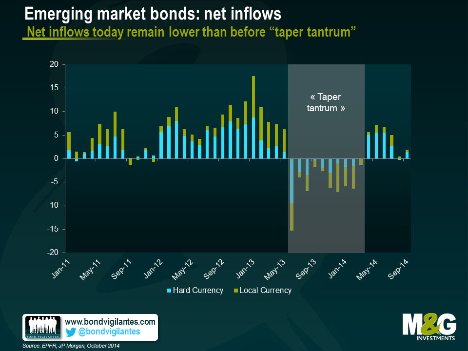
Last week I attended the IMF’s Annual Meetings in Washington D.C, where I had a series of very interesting meetings with government officials and other world financial leaders. The underlying theme behind most of the discussions was that emerging market countries continue their adjustment into a new phase characterized by less abundant liquidity and lower commodity prices. This adjustment process has thus far held a reasonably steady course, as the asset class has posted respectable returns year to date, part of that driven by lower US yields and part driven by the tightening of spreads and carry. Currencies, which is one of the main channels of adjustment to this new environment have been depreciating, which is something I had highlighted earlier in the year.
Looking into 2015, concerns are shifting from US rates into more specific EM factors. A slowdown of growth in China and other countries was the main concern voiced through the meetings. This reflects an uneven global recovery, where the US is unable to fully offset the growth drag coming from the Eurozone and Japan. Additionally, geopolitical events and country specific structural issues have also contributed to the slowdown.
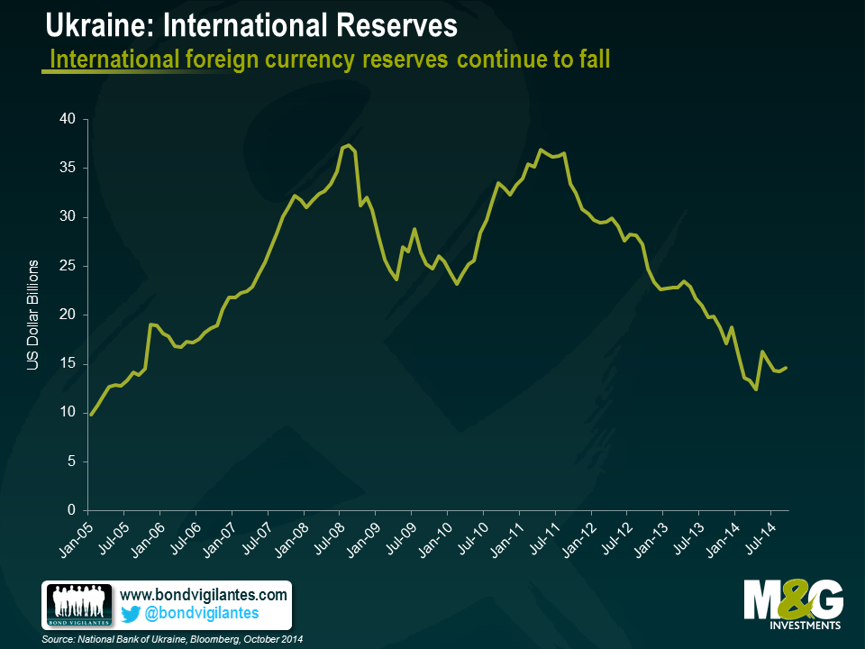
In Ukraine, expectations of a restructuring through a voluntary maturity extension seems widely expected, despite the supportive rhetoric coming from IMF officials, suggesting that additional funding may be provided given the higher financing required as a result of the country’s worse than expected conflict. Despite the supportive rhetoric, I remain cautious on the credit at these levels, with the view that there can be contagion arising from defaults of state owned banks in the years ahead as they will have access to Hryvnia liquidity from the Central Bank, but no preferential access to USD given Ukraine’s weak international reserve position.
Venezuela’s default expectations seem lower than implied by market prices. I believe the disconnect reflects the uncertain recovery value on the credit compared to prior emerging market restructurings. The amount and seniority of additional claims, such as dollar claims by importers, airlines, compensations for past nationalization of assets by the state and state arrears make the recovery exercise a difficult one.
Argentina will face a difficult year ahead given its stagflation and declining reserves, though it has a slight advantage versus the two other distressed credits in the sense that a new administration is likely to pursue more orthodox economic policies than the current administration. Still, the country’s legal dispute with the holdouts will extend well into next year and there is also the risk that a bond acceleration on the Defaulted Par bonds makes this situation even more complex.
Brazil’s upcoming second round elections on October 26 will be critical. Foreigners are more sceptical that the pro-market Aecio Neves could win. I see the elections a little less binary than the markets. Aecio’s ability to push reforms through Congress can disappoint, given Brazil’s fragmented party structure. At these levels, however, I see more upside in asset prices and particularly local rates should he win, than I see downside should Dilma be re-elected.
As for Russia, its ability to maintain its investment grade rating largely depends on how long with the conflict with Ukraine will last. Relations with the West, particularly with the US have hit bottom and are at the lowest point since the Cold War. US authorities remain quite relaxed in terms of maintaining their sanctions for a very long time if needed. I remain cautious on the credit, but believe that spreads already reflect the deterioration in capital flows, international reserves and the recent decline in oil prices. Credit risk between the sovereign and select state champions such as Gazprom or the larger state owned banks should continue.
In terms of overall asset allocation, there is little consensus on what will outperform next year, whether it is external debt, local debt or corporates. More of a consensus, however, is the fact that return expectations are conservative, with low single digits expected. Reflecting this, inflows into the asset class are expected to remain positive, but materially below levels seen before 2013.
In local currency bonds, I believe the recent rally in US rates and fall in commodity prices warrants adding duration in some countries. Various EM Central Banks are willing to allow for additional currency weakening without the need to tighten monetary policy. They believe that any pressures on inflation will be perceived by economic agents to be temporary, particularly in countries such as Chile where an output gap exists, or in countries such as Colombia that have been tightening policy.
I expect returns to be more muted in hard currency next year and the gap between hard and local currency bond returns should not be as wide as this year’s. In addition, country selection remains key and we have already been witnessing this differentiation over the last few years.
We saw further evidence of the strengthening US labour market on Friday. In September, 248,000 new jobs were added and the unemployment rate fell below 6% for the first time in six years. Headline unemployment rates in Europe, by contrast, have been more dismal, with the latest numbers coming in at 11.5% across the Eurozone for August.
Less encouraging for the US was the participation rate falling to its lowest level since 1978. The participation rate measures the number of people either employed or actively looking for work as a share of the working-age population. One really has to look at both the unemployment and the participation rates together as they give a fuller feel of what’s going on. Take this, admittedly, extreme example: an economy could look like it has full employment (zero unemployment), but if its participation rate is zero, no one is actually working.
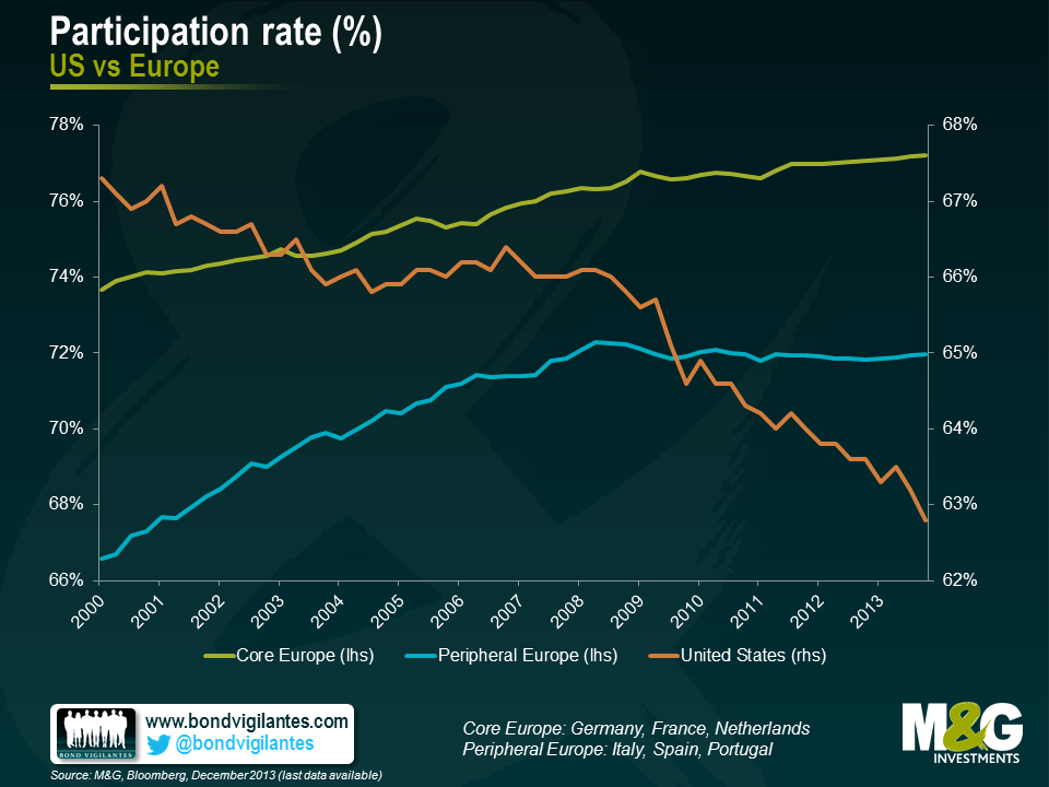
The falling US participation rate has been widely discussed as it is one of the measures that Janet Yellen, the Chair of the Federal Reserve, has consistently pointed to when answering questions on the strength of the US economy. It may be happening for a whole host of reasons, including discouraged workers giving up their job search, some opting for early retirement, or others choosing to stay in – or return to – some form of education. Participation rates in Europe however have had less airtime, so I am grateful to Erik Nielsen of Unicredit for highlighting the situation there.
So, in Europe, while unemployment numbers make for pretty sober reading, the participation rate itself has been on a generally upward trajectory. This is true for both core and peripheral Europe (see chart), so it’s not just a case of German data masking lacklustre numbers elsewhere. Again, the reasons for this are diverse, but may include a greater proportion of women joining the labour force in recent years, and an increase in the pension age in some countries.
To assess the true situation in various countries and the relative progress each has made, we have held their participation rates constant at their 2000 levels and plotted how the subsequent unemployment data would have looked if the number of people in the workforce had remained at the same levels as at the turn of the century.
As the charts below show, the results are illuminating. Headline unemployment in Italy was running at 12.5% at the end of 2013 (the latest reading available), but once the 2000 participation rate is applied this falls to 8.7%, a fall of some 3.8 percentage points. The same is true for Spain, where the difference is a mighty 13.3%. In the US (where we have more recent data) , in sharp contrast, the current headline level of 5.9% unemployment actually rises to 12.5% when the 2000 participation rate is applied.
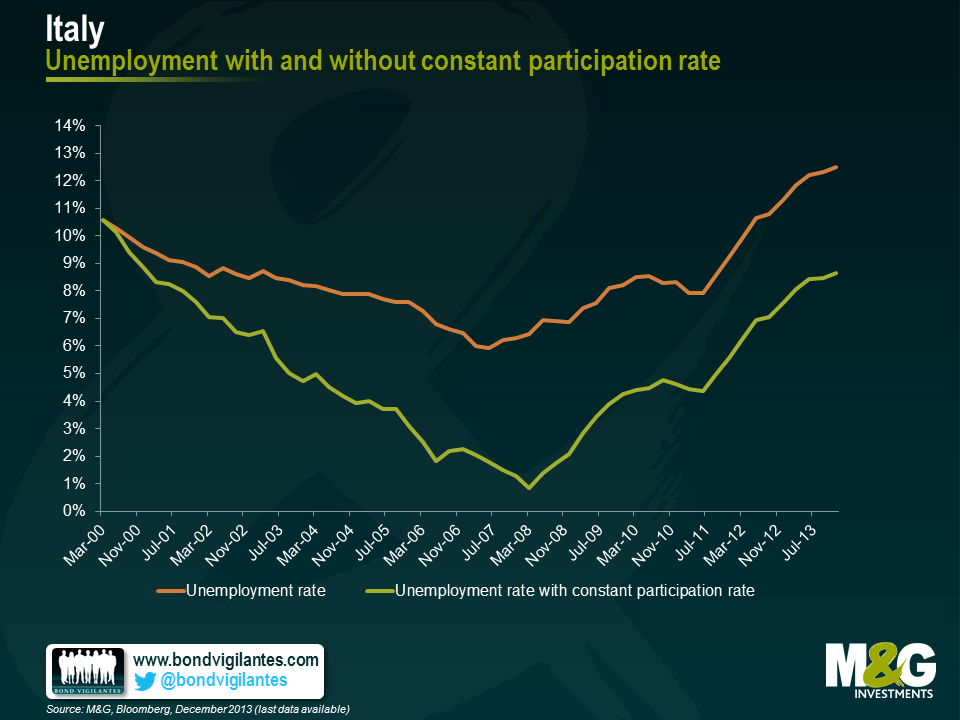
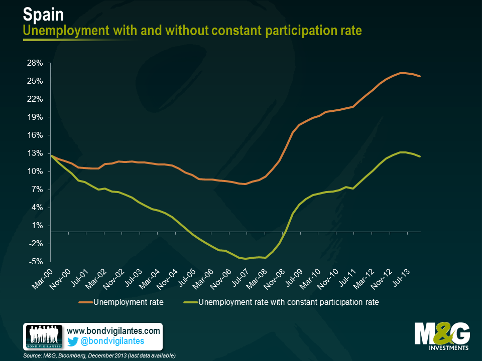
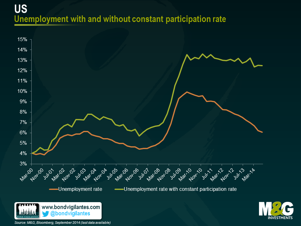
I was rather surprised to see the extent of this divergence and that the US is actually in a worse position relative to where it was in 1999 than peripheral Europe. I remain unconvinced as to whether the Eurozone is entering a period of stronger growth or whether its economy will actually come to resemble that of Japan. But these charts definitely move me closer towards the former.
One of the most commonly reported themes in financial markets today is the fear of disinflation/deflation, and how monetary authorities need to take economic action to avoid becoming the “next Japan”. In February I commented on the fact that the fear of disinflation and deflation is not as logically straight forward as you may think. I think the common assumption that developed economies do not want to end up like Japan is also worth investigating.
Japan is commonly seen as the modern poster child of ineffective monetary and government policy. The policy errors of the Japanese authorities in the 1990s are seen as having resulted in a depressed economy that has stood still over the last 25 years. This view has partly come about as financial markets often simply judge an economy by observing how its equity market performs. Given the crash in the Nikkei from over 40,000 in the early 1990s to around 16,000 today, equity market performance as a measure of Japanese economic health has become engrained in the market’s psyche.
In reality the strength of economies should be measured by their economic output and not equity market performance. In this regard, at first glance the national data bear out that Japan has lagged most countries in terms of nominal and real economic growth.
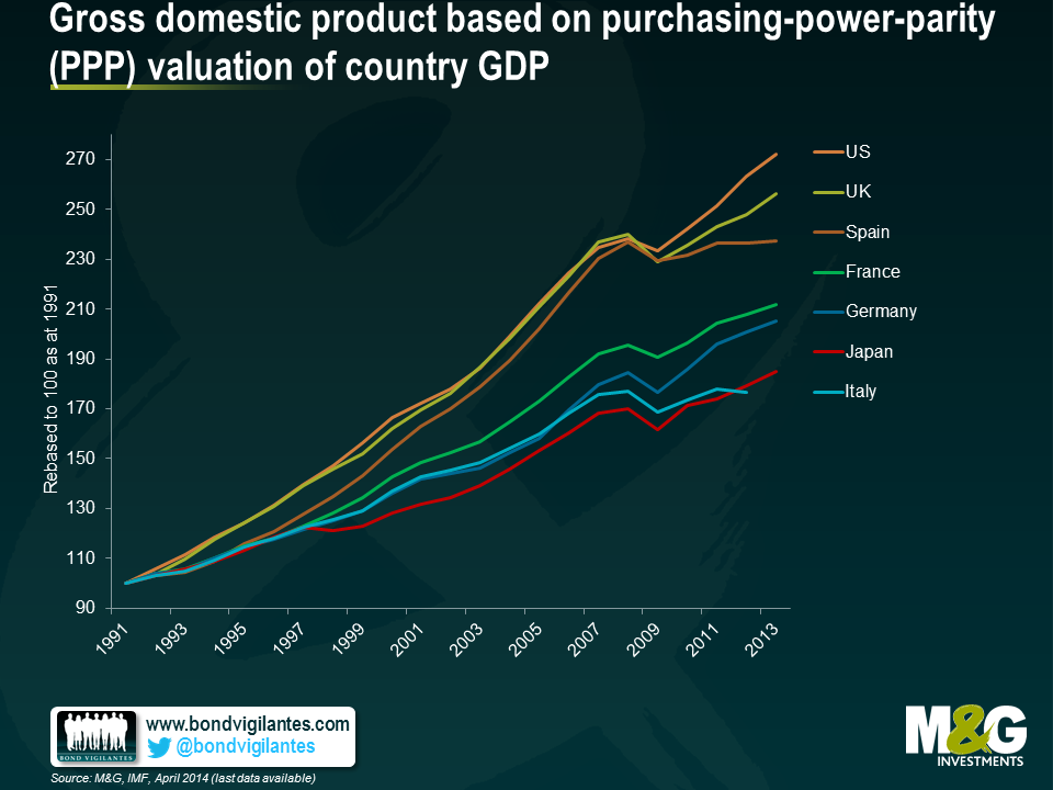
The simple measures of nominal and real GDP are often regurgitated as to why we do not want to end up like Japan. But from an economist’s point of view, what matters most is GDP per head. The fact that one country grows more than another is not to be celebrated economically if it is in fact engendered solely by an increase in population.
Below is a chart of real GDP per capita. It shows that Japan has not been an economic failure from a local point of view. Rather, the Japanese economic experience has actually been quite positive in terms of increasing living standards for the average Japanese citizen over the last 25 years.
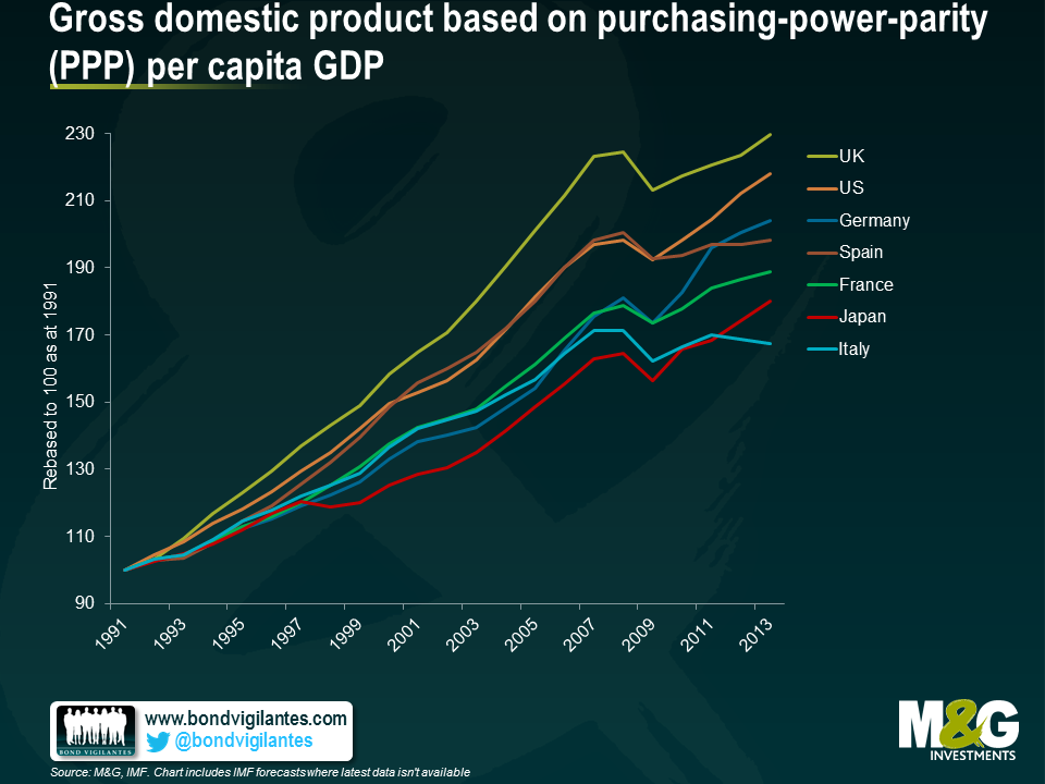
However the chart above shows Japan still lagging; no wonder economists still fear a Japanese outcome. Nevertheless I believe that a truer measure of GDP should not only be correlated to the number of people in its national boundaries, but should be seen in the context of the shifting function of the long term demographics of the population. A country with a baby boom will experience strong GDP in the boom, and weaker GDP at the end of a population bulge. Workers retire; consumption and investment fall. In order to take into account the true GDP per head, one has to put this into context, by looking at the size of the working population, not just the size of the actual population. Below we chart GDP per head of working population. This adjustment allows a fairer reflection of GDP per head, with the Japanese situation improving on a relative basis again.
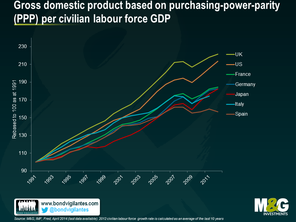
What lessons can we learn from Japan ? Firstly it is not as bad as it looks given the true potential GDP per head of population. In fact monetary and fiscal policy has worked in Japan. Low inflation and the zero bound of monetary policy is something we and policy makers naturally fear. Maybe we fear it too much based on simple analysis of headline numbers.
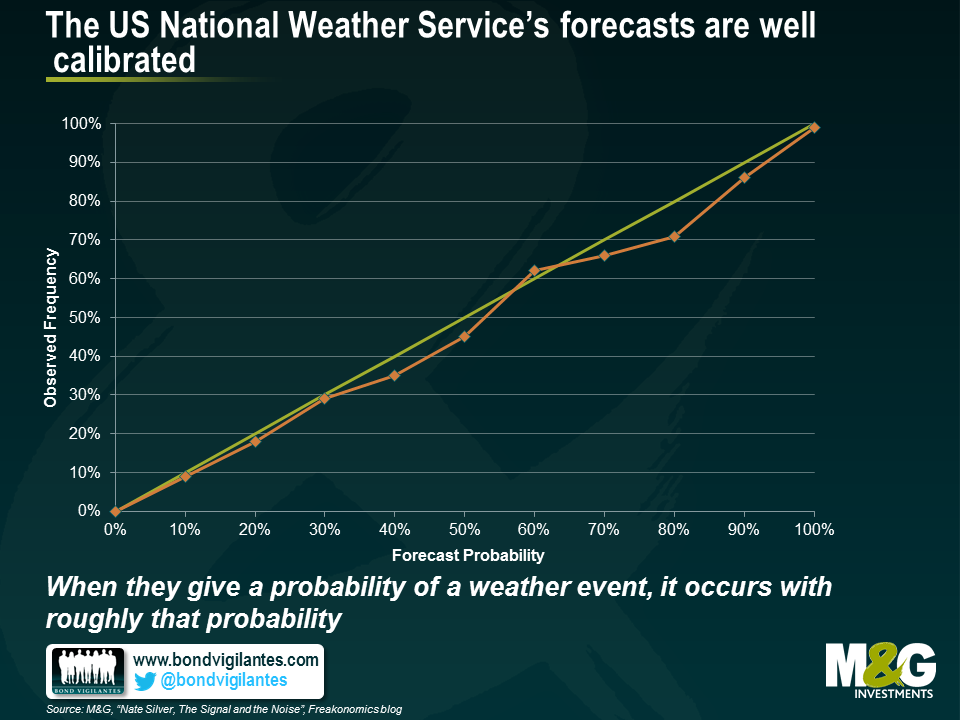
I’ve finally got round to reading Nate Silver’s The Signal and the Noise. It’s a brilliant analysis of why forecasts are often so poor, from the man who called every state correctly in the 2012 US presidential election. In short, predictions are often poor because they are too precise (asserting an absolute outcome rather than assigning probabilities to outcomes); there’s often a bias to overweight qualitative information, gut feel and anecdote over data (these shouldn’t be ignored but must have a high hurdle to overrule the statistics); and there’s also a bias to ignore out of sample data (he suggests that the rating agencies mis-rated CDOs based on MBS because they assumed no correlation between housing defaults, which was indeed the case in the 25 or so years of US data that was used in the models. Japan’s property crisis statistics would have shown that in a downturn the degree of correlation in defaults becomes extremely high). I’d like to propose a deal though – we Brits agree never to use cricket statistics in any academic paper so long as Americans shut up about baseball. What the hell is hitting .300? How many rounders is that?
I liked these charts. The first shows just how good weather forecasting is nowadays. We can’t get the outcome right every time, but we can now call the probability of a weather event occurring right with the same probability of it happening. For example, when the US National Weather Service says that there is a 70% chance of rain, it rains 70% of the time. It snows 20% of the time when they say there is a 20% chance of snow.
But when your local TV weatherman gets hold of this same information, he or she distorted that information such that the outcomes were far worse than those of the National Weather Service’s forecasts. The chart below shows that local TV weatherpeople over-predicted weather events consistently. For example, if they say that there is a 100% chance of rain, it rains just 67% of the time, compared with the National Weather Service which if it says there is 100% chance of rain, it always rains.
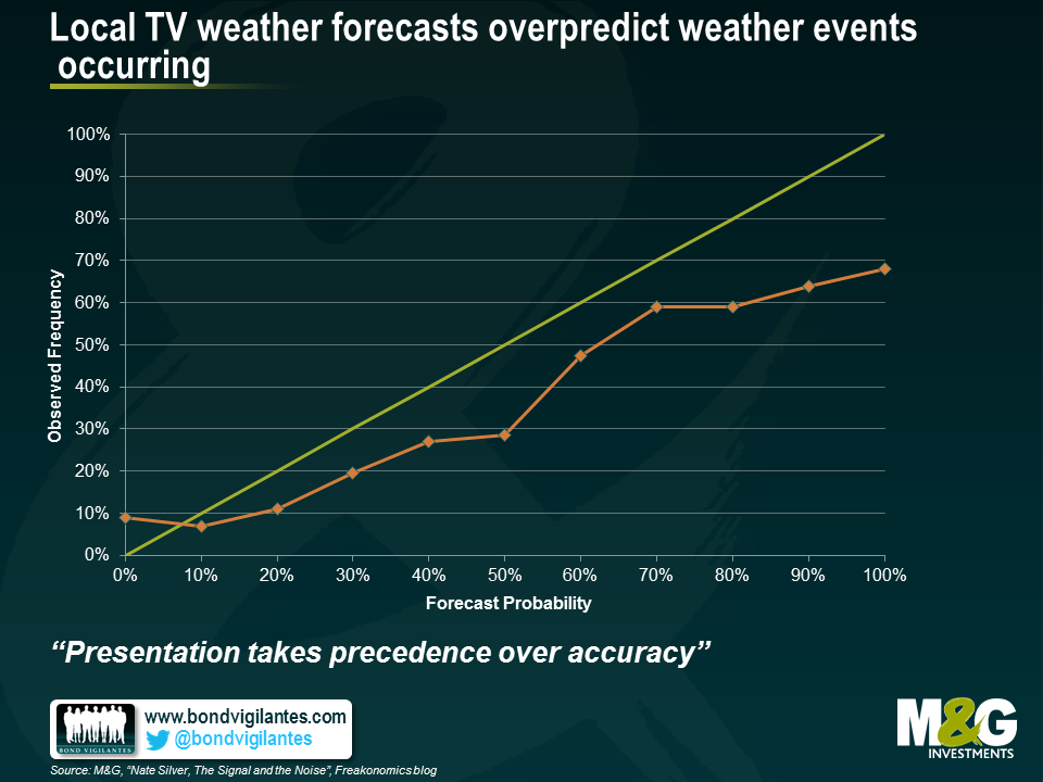
Why? “Presentation takes precedence over accuracy”. In other words local TV news and weather people believe themselves to be entertainers as much as bearers of information. A firm prediction of a biblical rainstorm is more exciting that a range of probable outcomes, and a forecast for a scorching beach day more fun than assigning a 75% chance of sunny intervals. In other studies it was shown that political analysts on panel shows performed extremely badly, systematically predicting outcomes way out of line with statistical polling. The very act of being on TV reduces one’s forecasting ability. I think there is a likelihood that this is also true of economic and market forecasting, which is why market TV channels are full of people either calling for the Dow to soar another 200%, or for the global economy to collapse into a permanent ebola fuelled zombie apocalypse. There’s a danger that when we get phoned by journalists for comment we feel the need to be significantly away from the consensus, on payrolls, on the year end 10 year Treasury yield, on the chances of the Eurozone breaking up – and I’m sure I’ve been guilty of this too in the past. What’s more I’m sure that those who forecast extreme events end up being boxed into a corner where they feel they have to implement those views within portfolios, and end up with portfolios which point only in the direction of tail events and can’t perform in normal economic circumstances. I think this is a must read book for economists and fund managers to help us understand how good forecasts are made, and that the “loudest” forecasts get disproportionate airtime – and are often wrong. Silver has bowled a wicket maiden with this one.


Sign up to the Bond Vigilantes mailing list to ensure you never miss a great article from our expert Bloggers. We will email all new articles to your inbox, meaning you can stay on top of the world of Bonds.
I confirm that I would like to receive information about Bond Vigilantes and products and services from M&G Securities Limited.
We will use the email address and personal data you have shared with us to send you this information. For existing customers, submitting your contact details and requesting to receive this information from us, will replace any earlier choices you have made in respect of marketing information.
You can unsubscribe from marketing at any time, at which point we will not send any further marketing information to you, by selecting the unsubscribe link in all communications.