
It’s the taking part that counts: why Europe’s labour market might be stronger than we’d thought
We saw further evidence of the strengthening US labour market on Friday. In September, 248,000 new jobs were added and the unemployment rate fell below 6% for the first time in six years. Headline unemployment rates in Europe, by contrast, have been more dismal, with the latest numbers coming in at 11.5% across the Eurozone for August.
Less encouraging for the US was the participation rate falling to its lowest level since 1978. The participation rate measures the number of people either employed or actively looking for work as a share of the working-age population. One really has to look at both the unemployment and the participation rates together as they give a fuller feel of what’s going on. Take this, admittedly, extreme example: an economy could look like it has full employment (zero unemployment), but if its participation rate is zero, no one is actually working.
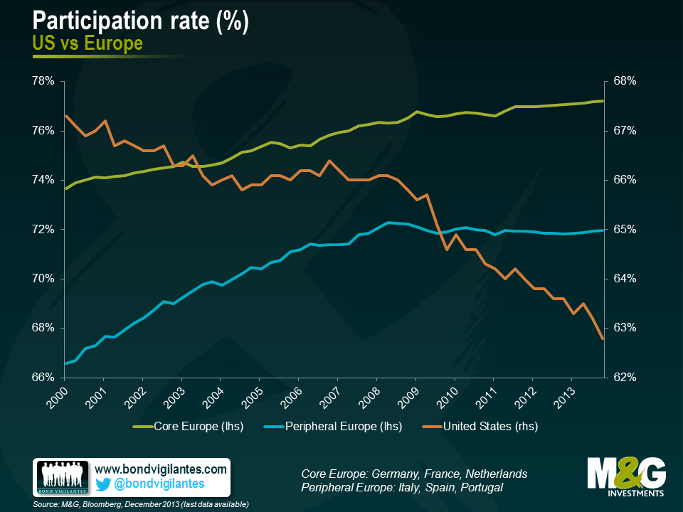
The falling US participation rate has been widely discussed as it is one of the measures that Janet Yellen, the Chair of the Federal Reserve, has consistently pointed to when answering questions on the strength of the US economy. It may be happening for a whole host of reasons, including discouraged workers giving up their job search, some opting for early retirement, or others choosing to stay in – or return to – some form of education. Participation rates in Europe however have had less airtime, so I am grateful to Erik Nielsen of Unicredit for highlighting the situation there.
So, in Europe, while unemployment numbers make for pretty sober reading, the participation rate itself has been on a generally upward trajectory. This is true for both core and peripheral Europe (see chart), so it’s not just a case of German data masking lacklustre numbers elsewhere. Again, the reasons for this are diverse, but may include a greater proportion of women joining the labour force in recent years, and an increase in the pension age in some countries.
To assess the true situation in various countries and the relative progress each has made, we have held their participation rates constant at their 2000 levels and plotted how the subsequent unemployment data would have looked if the number of people in the workforce had remained at the same levels as at the turn of the century.
As the charts below show, the results are illuminating. Headline unemployment in Italy was running at 12.5% at the end of 2013 (the latest reading available), but once the 2000 participation rate is applied this falls to 8.7%, a fall of some 3.8 percentage points. The same is true for Spain, where the difference is a mighty 13.3%. In the US (where we have more recent data) , in sharp contrast, the current headline level of 5.9% unemployment actually rises to 12.5% when the 2000 participation rate is applied.
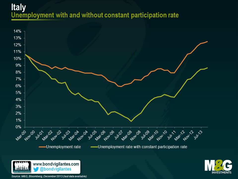
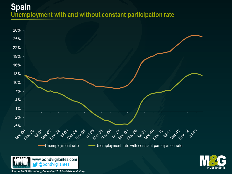
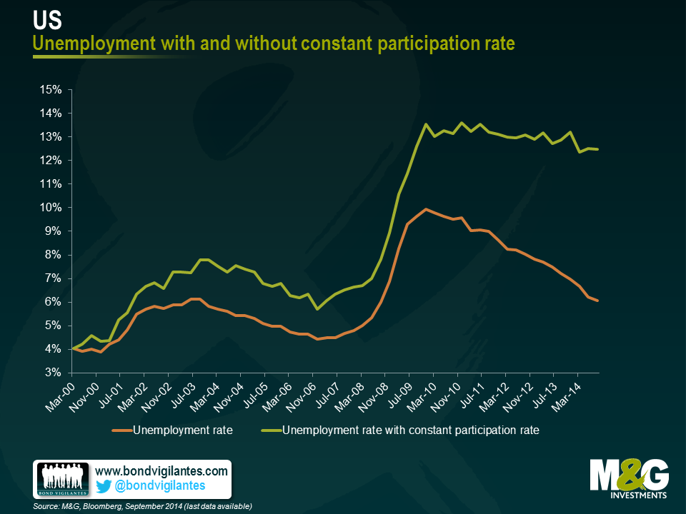
I was rather surprised to see the extent of this divergence and that the US is actually in a worse position relative to where it was in 1999 than peripheral Europe. I remain unconvinced as to whether the Eurozone is entering a period of stronger growth or whether its economy will actually come to resemble that of Japan. But these charts definitely move me closer towards the former.
The value of investments will fluctuate, which will cause prices to fall as well as rise and you may not get back the original amount you invested. Past performance is not a guide to future performance.
17 years of comment
Discover historical blogs from our extensive archive with our Blast from the past feature. View the most popular blogs posted this month - 5, 10 or 15 years ago!


Bond Vigilantes
Get Bond Vigilantes updates straight to your inbox