
Here are some of the scariest charts in finance to celebrate Halloween
Investment markets have been remarkably resilient over the course of 2017. Sure, the geopolitical environment has thrown up a few frightening days which saw markets sell-off but on the whole volatility has been muted and most asset classes have generated solid total returns. That said, any horror movie fan will tell you that the scariest part of a horror film happens when things are relatively calm. With that in mind, here are a few charts that shine a light on a number of threats that are lurking just below the surface of the global economy.
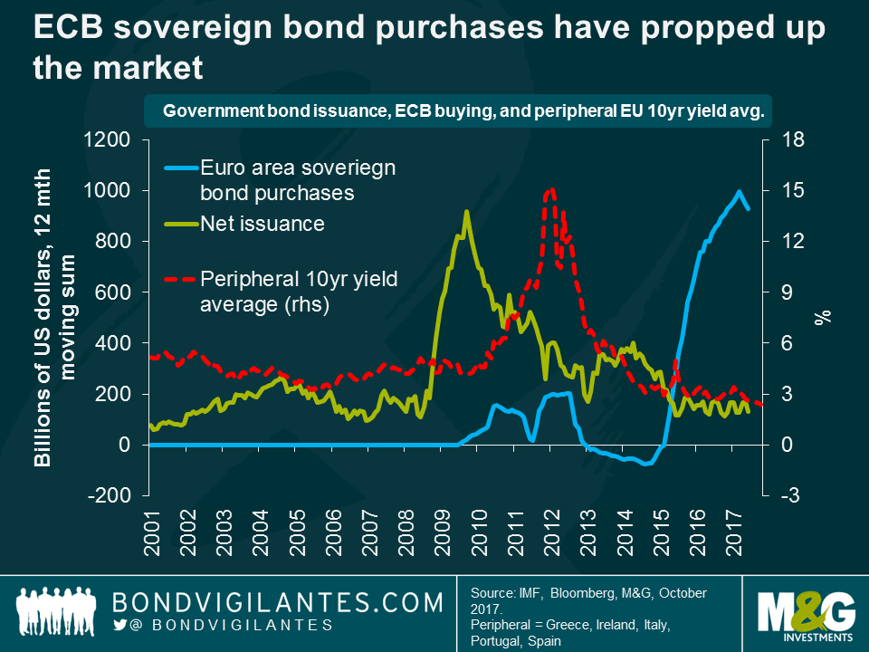
- ECB quantitative easing has propped up government bond markets
The strength of the European economy, and signs of labour market healing across the euro area, has been the surprise story of 2017. It is undeniable that the ECB, and its quantitative easing programme, has played a huge part in the economic success seen to date. Many point to the fall in yields on peripheral area debt as a sign that the euro sovereign debt crisis is well and truly over. The question is, do falling yields signify increasing confidence in the ability of euro area nations to repay their debt, or do they simply reflect the asset purchases that the ECB has conducted since the QE programme started? The above chart, published in the most recent IMF Global Financial Stability Report, shows that official purchases of euro area debt has eclipsed net issuance since May 2015. Indeed, ECB QE is currently 7 times bigger than net issuance. So is it any wonder why yields have fallen, and what happens when the ECB tries to turn off the easy money tap?
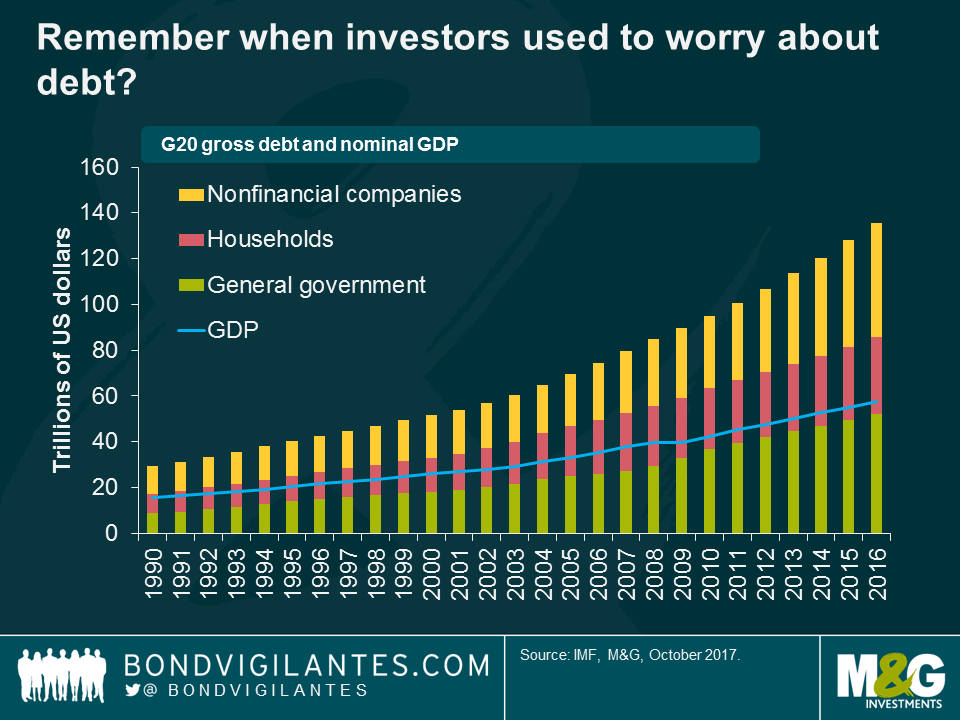
- Debt is a beast that cannot be tamed
In G20 advanced economies, the debt-to-GDP ratio has grown steadily over the past decade and now stands at over 260% of GDP or 135 trillion US dollars. $135,000,000,000,000.00. It’s a big number, and whilst it is true that this debt represents an asset on another balance sheet, it is undeniable that governments, corporates, and households have never lived beyond their means by so much. It is for this reason that advanced economy interest rates are so low, and are unlikely to return back to levels observed before the 2008 financial crisis. For investors, that means you are going to have to take more risk to generate positive real returns.
- Investors have herded into risky assets
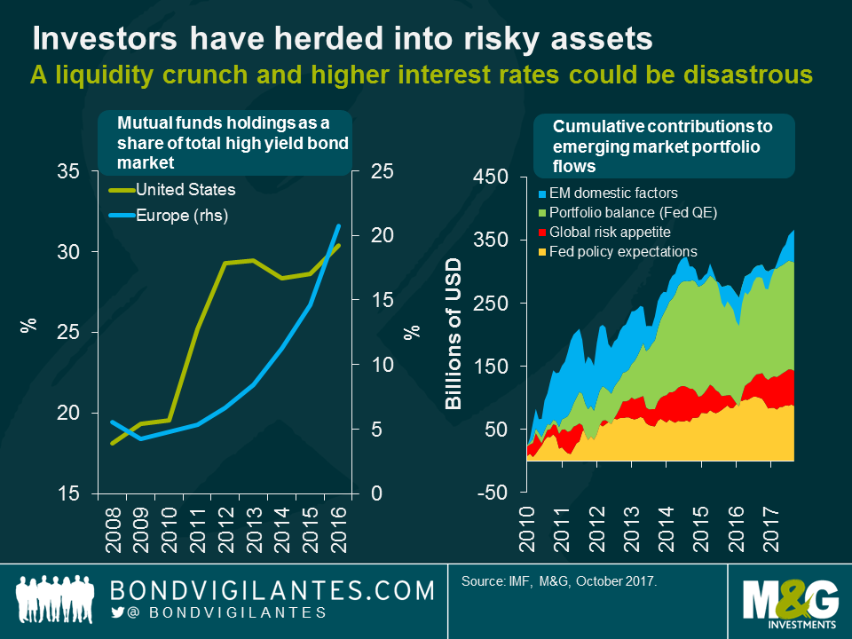
Accommodative central bank policy has encouraged investors to invest in riskier and riskier assets. Whilst this can be described as “portfolio rebalancing” and central banks think that it will help them to generate inflation, it may also pose a significant risk to the global financial system. In the US and Europe, mutual fund holdings of their respective high yield markets have grown considerably. Turning to emerging markets, large-scale monetary accommodation has underpinned a significant portion of portfolio flows to emerging market economies. IMF estimates indicate that around $260bn in portfolio inflows since 2010 can be attributed to the Fed’s QE programme.
A significant issue for the performance of investments in riskier asset classes like high yield and emerging markets would be a spike in investor risk aversion or some form of external shock (like the oil price collapse in 2014). If investors head for the exits, this could trigger sales of riskier and less liquid assets held in open-ended mutual funds, resulting in substantial price declines. The very gradual pace of monetary policy normalisation may be exacerbating these risks, as continued low volatility and low yields encourage investors to further increase credit risk exposure, duration, and financial leverage.
- Despite low unemployment rates, wages aren’t rising materially and productivity is poor
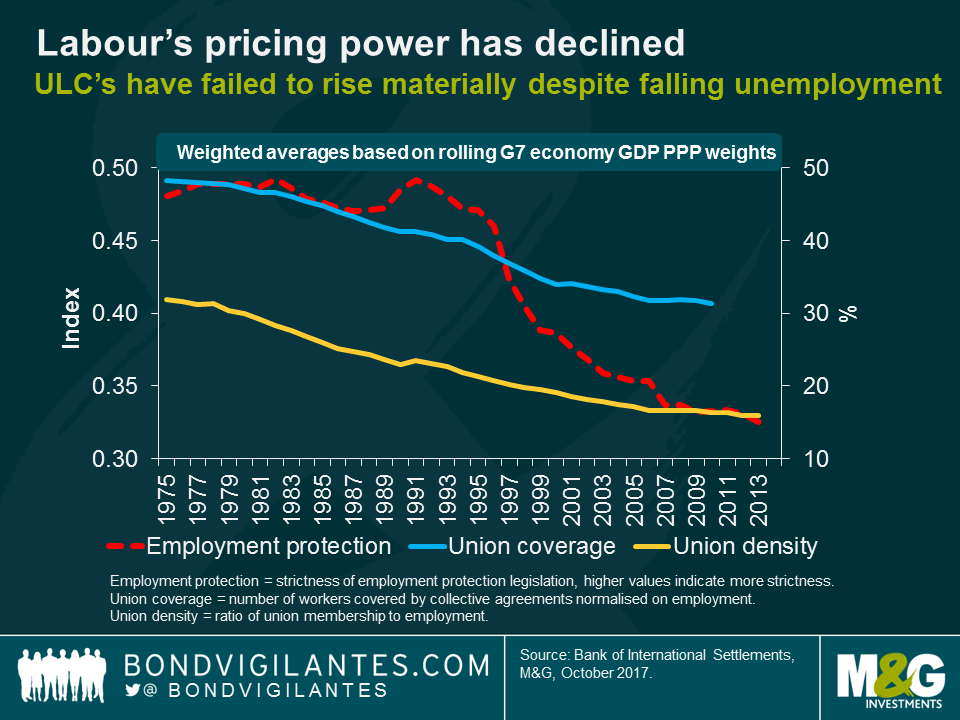
Low wage growth, despite low unemployment rates, is a sign of labour’s declining pricing power as a factor of production. This is a problem, as labour markets have traditionally been regarded as key for inflation as rising wages generally lead to higher production costs, resulting in higher inflation. For the first time, central bankers like Mario Draghi and Haruhiko Kuroda have been calling on unions to increase wage demands, with Draghi stating wages are the “primary driver of inflation”.
The more workers can strengthen their pricing power, the more likely it is that wage demands will be agreed to by businesses. Unfortunately for low and middle-income workers across the G7 economies, pricing power has fallen since the early 1990s. The decline in rates of union density and coverage, combined with a fall in employment protection, has left workers in a weaker position to press for higher wages. Unless workers can start demanding higher rates of pay, it is likely they will continue to suffer real-wage declines. This has been the case in the UK, with unit labour costs and inflation growing by 16% and 25% respectively since 2008.
- Of course there had to be a Brexit chart

From what has been reported in the UK press on a daily basis, it doesn’t look like negotiations between the UK and Europe are going well. To highlight the scale of the challenge that the UK faces, this chart shows the share of total UK trade by trade agreement. According to Bruegel, approximately 51% of UK trade today is conducted with the EU, 4% with nations that are in the EEA or have a customs union agreement, and 9% under existing EU preferential trade agreements (PTA). A further 21% of trade is conducted with nations that have a PTA under negotiation.
In March 2019, unless some form of deal is agreed, the UK will have to negotiate trade deals with the majority of its current trading partners. This would be a major challenge as complex trade agreements are not easy to negotiate and often take years to agree to. If the UK finds itself outside the European Union Single market and the EU Customs Union, tariff and non-tariff trade barriers (like quotas, embargoes, and levies) are likely to be implemented between the UK and its main European trading partners. Some sectors and companies may face much more restricted access to the European market, and that will prove to be a significant headwind to UK economic growth in the short-term.
The value of investments will fluctuate, which will cause prices to fall as well as rise and you may not get back the original amount you invested. Past performance is not a guide to future performance.
17 years of comment
Discover historical blogs from our extensive archive with our Blast from the past feature. View the most popular blogs posted this month - 5, 10 or 15 years ago!


Bond Vigilantes
Get Bond Vigilantes updates straight to your inbox