oil
Not all oil-exporting countries are the cracking winners you think.
By Charles de Quinsonas
4 June 2026


It’s been another massive year for the global economy. Europe saw LTROs, Greece got a haircut, sovereign downgrades and record high unemployment rates. The peripheral European nations attempted to implement austerity measures with limited success. The US re-elected President Obama and the focus quickly shifted to the upcoming fiscal cliff. In the UK, an Olympics induced bounce in growth was the sole bright spark for an economy which appears to be stuck in quick sand and may well lose its prized AAA rating in 2013.
The IMF, being unusually succinct, probably summed up the state of the global economy the best by entitling their latest World Economic Outlook “Coping with High Debt and Sluggish Growth”. The advanced economies account for around two-thirds of global GDP and if they are sluggish then global growth will be sluggish too.
With all this uncertainty and risk in 2012, how have fixed income markets performed? Surely government bonds will be the safe haven of choice?
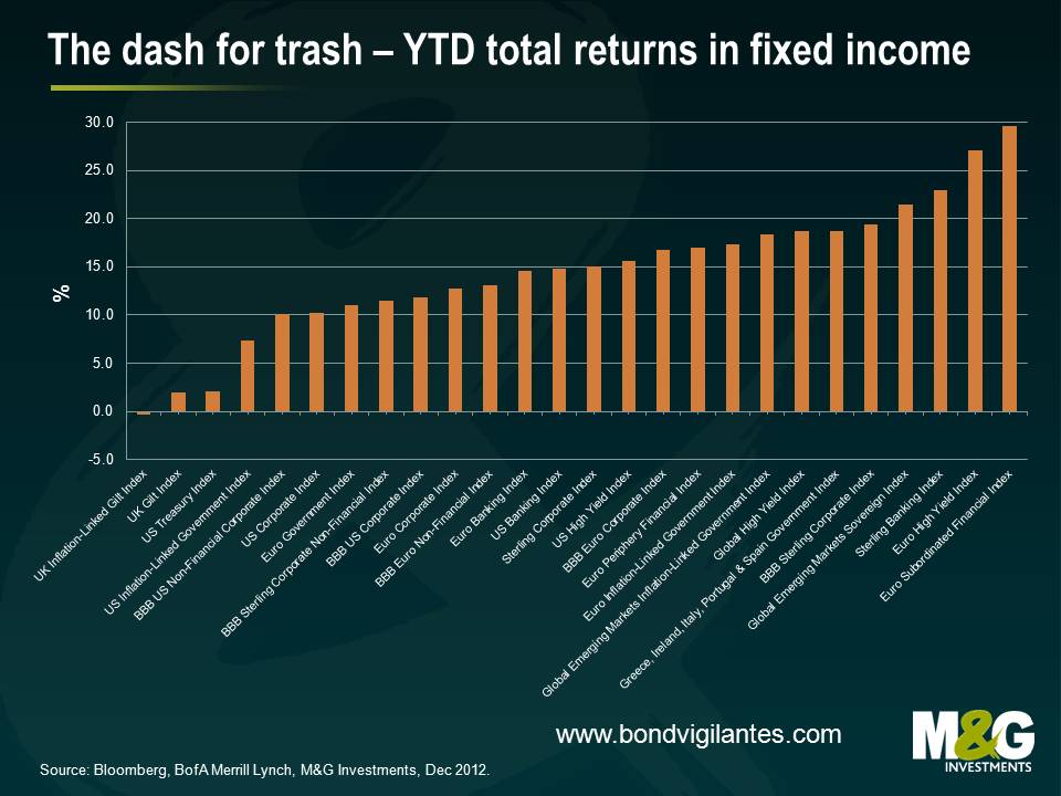
In absolute and local currency terms, it’s been another great year for the markets with everything generating a positive return except UK linkers. It’s been a fall in grace for UK linkers, which were actually one of the best returning asset classes of 2011. The UK linker market was buffeted in 2012 by weak growth expectations and uncertainty surrounding proposed changes to the RPI calculation.
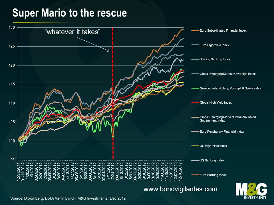
But looking elsewhere, investors had the opportunity to secure some excellent returns in 2012 by taking some risk. The best performing asset class of our sample was European subordinated financial debt which registered a return of 29.5%. European high yield wasn’t far behind with a return of 27.1%, followed by Sterling banks which returned 23.0%.
ECB President Mario Draghi and the ECB’s measures to support the Eurozone also had a positive effect of debt investors in peripheral Eurozone debt, with an index made up of bonds from Greece, Ireland, Italy, Portugal and Spain government bonds up 18.7%. Not a bad return for investors considering the question marks hanging over the ability of these nations to service their respective debt obligations in an environment of political uncertainty and recessionary levels of growth.
Other highlights include global high yield (up 18.7%), European peripheral financials (up 17.0%) and US high yield (up 15.6%). At the less risky end of the spectrum, European investment grade corporates returned 12.8% and US investment grade corporates returned 10.2%. Emerging market debt also did well, with EM sovereigns debt posting a fantastic return of 21.4%.
As outlined earlier, it appears that the global economy faces some substantial fundamental headwinds. So how was it that the riskiest asset classes in fixed income have performed the best? Three little words – “whatever it takes”. Mario Draghi’s speech in late July supercharged returns for the riskiest asset classes and stimulated the “dash for trash”. “Within our mandate, the ECB is ready to do whatever it takes to preserve the euro. And believe me, it will be enough”.
Well Mr Draghi, the markets have certainly believed you. For example, an index of government debt issued by Greece, Ireland, Italy, Spain and Portugal had up until the speech date generated a return of around 5%. The index ended up generating a 17% return, with investors comforted by Mr Draghi’s comments.
It seems to us that the Ostrich effect (the avoidance of apparently risky financial situations by pretending they do not exist) had a significant impact on markets in 2012. And in a world of ultra-low interest rates and negative real returns in cash, investors must take on risk. It is precisely what central banks are encouraging us to do. But uncertainty breeds volatility and in order to generate higher returns investors must face this volatility head on. It will be a feature of the market in 2013.
About the only thing we can say for certain is that it is unlikely that fixed income will continue to generate excellent returns across the spectrum from government bonds to high yield. For example, double-digit returns in European investment grade are not normal and has occurred only three times in the last seventeen years. On the other hand, the asset class has posted a negative return in only two of those seventeen years, with the largest loss being -3.3% in 2008. In US high yield, the consensus amongst analysts is that high yield markets will generate a return of around 4-6%, the result of coupon clipping. Analysing returns for the asset class shows that a coupon-clipping year has occurred only once in the past twenty-five years.
We posted our bond market outlook last week. It looks like the US may experience a housing induced growth spurt, Europe will eventually get round to dealing with its issues and the UK has a long way to go to secure economic growth. We like non-financial corporates, are worried about EM debt valuations and remain confident that there are still attractive investment opportunities in several areas of the fixed income universe. For an expansion of these views and more, please see here.
It was a tough quiz this year – sorry. Here are the answers for you. The winner was Mike Haslam of Barclays Wealth who scored 20 out of 20. Congratulations – please let us know which charity you’d like to nominate for the £200 donation from us. The nine runners up, who like the winner receive a copy of Philip Coogan’s excellent book Paper Promises are:
Sam Morton, Mizuho International
Matthew Riley, Falcon Money Managment
Paul Amery, Index Universe
Mark Dufton, Charles Stanley & Co Ltd
Nick Tudball, BNP Paribas
Will Lewis, Hansa Capital
Adam Grimsley, Blackrock
Johnny Smith, Nomura
Andrew Woolston, Blackrock
 This is Ampelmann, the East German pedestrian traffic light symbol.
 This is iD, the style magazine. All of the front cover stars have an eye closed (usually winking).
 This was Captain Robert Scott’s stationary from the doomed Terra Nova expedition to the South Pole in 1911-12.
 It is Snufkin, from the Moomins.
Congratulations to all the winners. We’ll be in touch shortly. Happy Christmas everyone and thanks for reading the blog in 2012.
It may not have felt like it, but 2012 has actually been a pretty good year for investors. Bond holders in particular have had a decent 12 months: the government bond bull run has continued and investment grade and high yield corporate debt appears on track to deliver some excellent returns. Major equity markets also look likely to end the year in the black.
These broad-based gains on global stock and bond markets have occurred against a still challenging macroeconomic backdrop. In fact, looking back at our last annual outlook, many of the things we were worried about then – “double dips” and rising indebtedness in developed countries and the risk of a significant policy error worldwide – have not only remained unresolved but have become, in some cases, more of a concern. But it’s not all bad news and we’re pleased to note pockets of progress in some parts of the world.
So what does 2013 have in store for financial markets? In our latest Panoramic outlook, Jim outlines his macroeconomic and market forecasts for the year ahead. And remember, there are still a couple of days left to enter the M&G Bond Vigilantes Christmas quiz for 2012.
Enjoy!
Last night’s move by the Federal Reserve to change its approach to US monetary policy to effectively reduce the focus on the inflation target was just the latest step in an accelerating project by the world’s monetary authorities. In a world where unemployment rates are well above pretty much anyone’s estimate of the natural rate, and in many geographies well above 10%, the need for growth is seen as much more pressing that the fear of missing the 2% inflation targets. So at the latest FOMC meeting the Fed decided that inflation would be tolerated if it nudged higher to 2.5% as long as unemployment remained too high (above 6.5%). You can read the text of the Fed’s statement here.
We call this move by the world’s authorities away from the old idea of 2% inflation targets Central Bank Regime Change. We wrote this blog about it in March. The chart is worth showing again.
The chart from the IMF shows us that in the period post Paul Volcker’s appointment to the US Fed in 1979 (the orange line), the monetary authorities kept interest rates higher than the rate of inflation (they were reacting to the damage that inflation caused in the 1970s). As a result inflation steadily fell – and as well as high “real” rates, the rhetoric was all about inflation (inflation targets, the Bank of England’s Inflation Report, independent central banks). It’s been an awesome 30 years (on the whole!) to be a government bond investor, as yields fell in response to inflation fighting credibility. However, I’ve added another line to the IMF chart (blue), showing how central banks have behaved since Lehman went bust, and the credit crisis was followed by the sovereign debt crisis. It’s a very different story, with sharply negative real yields. Nominal interest rates are near zero in much of the developed world, yet inflation has been sticky above 2%. This is deliberate central bank policy – negative real rates are designed to make it attractive to borrow to invest and stimulate growth (and to deliver gains to indebted consumers), and also to encourage risk taking as investors reach for yield (government bond investors buy credit, investment grade investors buy high yield etc.).
Negative real rates also have an impact which we’ll discuss in more detail another time – debt reduction for bust governments. There are a few ways to reduce debt burdens: strong real growth (seems out of reach for the foreseeable future), austerity (unproven and probably counter-productive, although some point to Canada and Sweden as success stories), default (will be necessary for some Eurozone economies without their own currency to depreciate) and inflation. It’s the last that’s likely to be effective – and as the red line on that chart shows, it’s the method by which the western economies reduced the war debts following WWII.
So whilst we don’t believe the world’s central bankers and finance ministers are sitting high in some Swiss cable car complex, stroking white fluffy cats and cackling maniacally, plotting to generate super high levels of inflation, this is becoming the pragmatic (only?) response to a world without other policy responses (no fiscal flexibility left). Now the Fed’s latest move to target both inflation AND unemployment rates is very interesting – when I was a young student of economics, the idea that you could chose BETWEEN inflation and unemployment was discredited. To quote, er, Wikipedia on that idea, known as the Philips Curve “while it has been observed that there is a stable short run trade-off between unemployment and inflation, this has not been observed in the long run”. So the idea that you can choose both is probably even more far fetched.
Anyway, what does the Fed’s action mean? Well watching Bernanke’s press conference last night it struck me that in changing the Fed’s guidance away from the “no hikes until 2015” towards the unemployment and inflation numerical targets should actually be seen as a potential monetary TIGHTENING. After all, we are exceptionally bullish on US housing as a driver for growth in 2013 and 2014, so if things go well we could end up with the Fed raising rates ahead of the old 2015 date.
So I’ve asserted that Central Bank Regime change is taking place, but I thought it would be worthwhile to put together a brief list of the evidence so far. Here it is.
Evidence for Central Bank Regime Change
So with all of this evidence that the authorities are changing how they think, and act, on inflation, you would expect that bond markets would have reacted badly right? If Ben Bernanke thinks 4% is an appropriate level for inflation in the US, you wouldn’t be lending money to the government at 0.65% for the next 5 years would you? And with Mark Carney taking over at the BoE next year, breakeven inflation rates (i.e. market inflation expectations) would be overshooting the 2% inflation target over the next few years too? Well 5 year Treasury yields are still well below 1% (helped by QE buying of that sector, announced last night) and UK breakeven inflation rates on a CPI basis are below the 2% inflation target. In both cases it feels as if state intervention in these markets (financial repression through QE, capital requirements etc.) will keep yields low despite high inflation. And this is entirely necessary – with half the US Treasury market maturing in the next 3 years or so, if yields ever did adjust higher then western governments, with marginal solvency in any case, could go bust quickly.
Anthony recently returned from a research trip to Singapore where he spoke to a number of investors. During his time in the Asian city-state, he took his Bond Vigilantes camera to share with all of us what he’s learnt about Singapore, its economy, and fixed interest markets.
Despite its small geographic size, the Singaporean economy is one of most prosperous in the world, fuelled by a strong international trade link. The Singaporean model advocates for a mixed economic framework where free-market policies coexist with the Monetary Authority of Singapore’s intervention in macroeconomic policy.
With an intact AAA Sovereign credit rating, Singapore finds itself in a fantastic fiscal position which, together with a rapidly developing financial market and robust banking system, has made it one of the most open and competitive markets in the world. And, with the third largest GDP per capita in the world, we wonder if perhaps the Asian city-state could provide some valuable economic lessons for its south-east Asian neighbours.
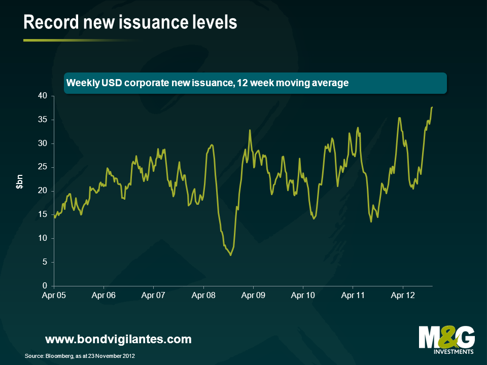
It has been a great few months for corporate bond issuance, as illustrated in the chart below. This huge flush of new transactions where buyer (investor) meets seller (issuer), shows that the primary market is in a historically healthy state, with buckets of liquidity. However, since the credit crunch there has been a great deal of discussion re the corporate bond market becoming less liquid, as dealers’ ability to bid for bonds has gone down the pan. Which is right?
Since the credit crunch began, the financial intermediaries who provide immediate liquidity for bond investors have been under a great deal of capital stress. Losses on securities, more conservative management, and reduced yet more expensive capital, have resulted in a shrinking of their market making balance sheets. This is illustrated in the chart below with data from the Federal Reserve showing primary dealer positions in corporates with maturities of more than a year.
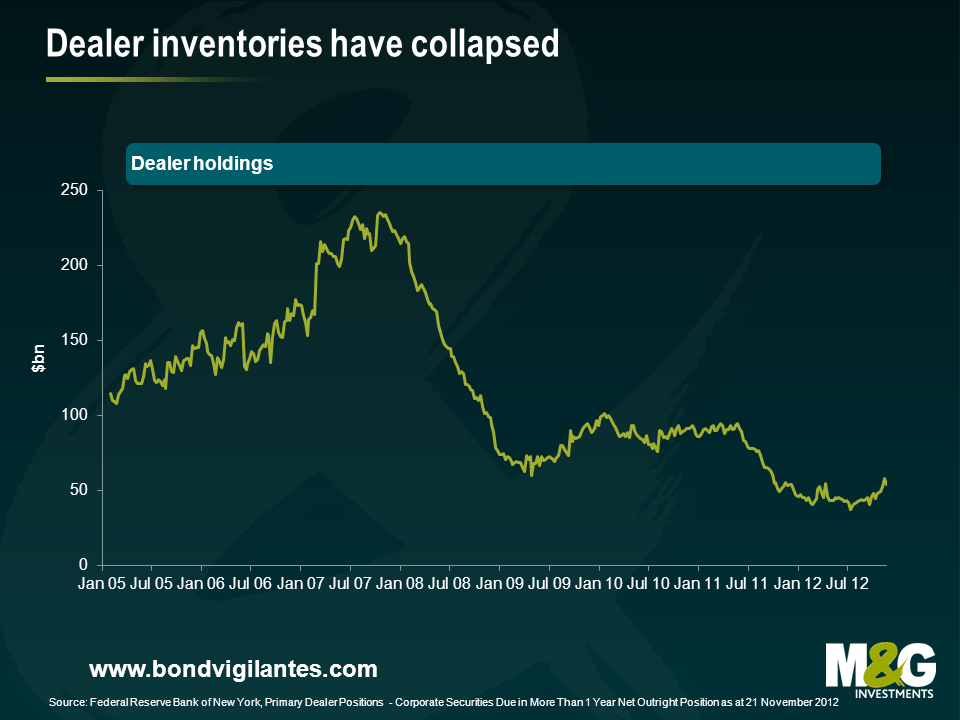
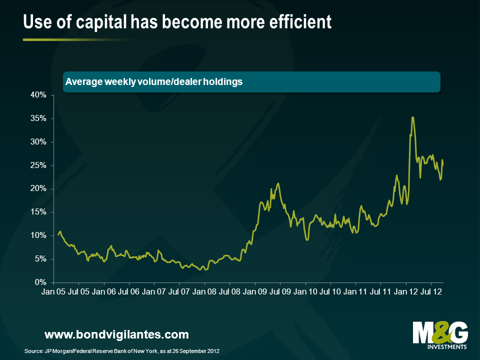
According to some market observers, the above indicates that traders’ ability to take on risk has collapsed by roughly 80 percent, and therefore corporate bond market liquidity must have collapsed significantly in tandem, due to the disappearance of this historic pool of capital to bid for securities. However, we think this is a rather simplistic way for investors to explore what is going on. The chart below shows a far more relevant number than the size of dealers’ books – the actual historic trading volume in secondary corporate bonds, which gives a stronger indication of real, rather than hypothetical liquidity. This shows that turnover has not collapsed 80 percent in the same way as dealer inventory, and in fact daily volumes are on a par with where they were in 2007. It is also worth noting that investment banks’, and their shadow bank counterparts’ percentage of this volume will have fallen, and so it is likely that transactions between genuine end investors have increased substantially in real terms, and as a percentage of this turnover.
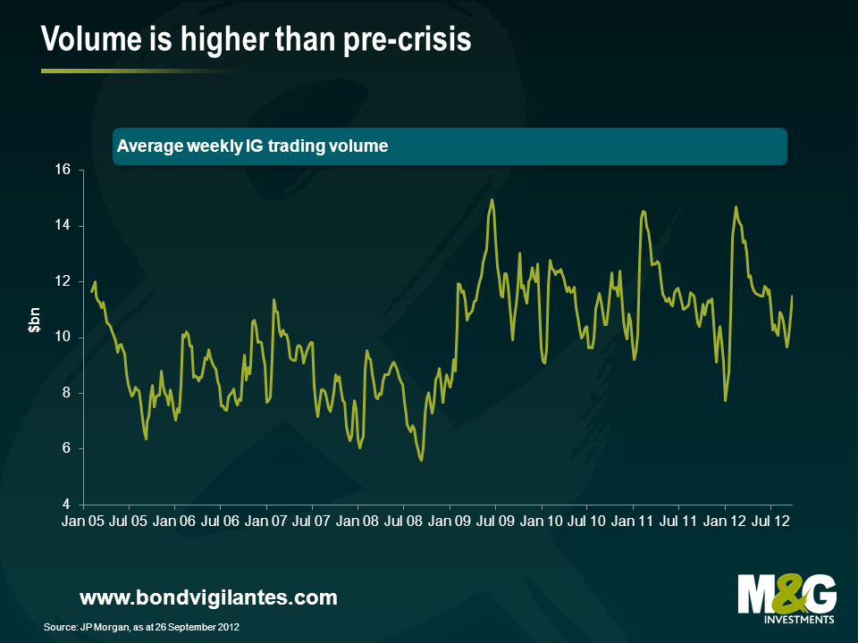
Back in 2007 the markets were exceptionally liquid. They were dominated by short term players using cheap regulatory capital to take on enormous credit risk. This was done directly by investment banks on their own account, or to warehouse positions to be sold on to vehicles such as CDOs and CLOs as they were launched. This activity has collapsed. So, along with the more stringent capital environment, the size of their inventories has understandably shrunk considerably. However, making markets and operating in the corporate bond market remains an important source of revenue for these financial intermediaries. Despite less capital being deployed, total secondary volume has recovered to 2007 levels, which means they have become more efficient and turnover per unit of inventory has gone through the roof, as illustrated below. The financial crisis has changed banks’ and investors’ appetites for and abilities to take risk.
The financial crisis has also driven a significant fundamental shift in how capital markets work. The recycling of capital (through the mismatch of risk taken by banks that was the route of the credit crunch) by using short term deposits to lend long term that dominated the landscape in 2007, is now morphing into a new, hopefully more stable process of borrowers being funded via the corporate bond market. Bank lending has shrunk, and the capital markets, led by the expanding bond market have attempted to fill the gap. As bank lending is replaced by more permanent term bond lending, then term mismatch and credit risk in the banking system is reduced, and that term and credit risk is assumed by the bond investor. The bond investor not only gets paid for assuming this risk but also has to work out what liquidity premium they need to be paid on top of the term and credit risk they have taken on board with their corporate bond position.
This premium will vary over the cycle like the other drivers of returns – credit and interest rates. It will expand when credit markets are weak, and liquidity poor (eg autumn 2009). It will contract when the credit outlook is great and liquidity high (spring 2007), and is something all investors need to be aware of when investing in the asset class. An investor in corporate bonds should examine where we are in the liquidity cycle, and should be aware that the perfect liquidity and huge dealer inventories of 2007 contributed to the ensuing rout in the asset class, while the illiquidity of the winter of 2008 was a great opportunity to buy and take advantage of the expanded liquidity premium. We know from the last 5 years that to an investor in corporate bonds, perfect liquidity can be a precursor to more dangerous times than illiquidity can.
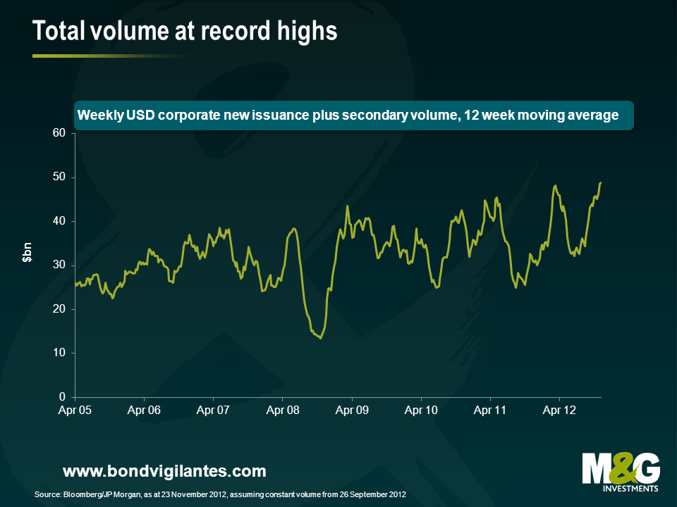
Is corporate bond liquidity brilliant or is it at record lows? Well, it appears that daily volume of primary markets is at record levels, while secondary market liquidity has not grown in line with the size of the market place, but is not as low as a simple analysis of dealer inventory would imply. It is hard to know what average daily liquidity should be, as the market has been evolving in the recent dramatic economic conditions. However, the total liquidity of all transactions, both primary and secondary, indicates a growing, interesting market place as banks are being replaced by the corporate bond market as the funding vehicle of choice.
For the sixth year in a row, we bring you the Bond Vigilantes Christmas Quiz. As always there are 20 questions, and the closing date for entries is midnight on Thursday 20th December 2012. Please email your answers to us at bondvigilantes@mandg.co.uk.
The prize is, once more, glory. But the winner will also get to choose a charity to which we will donate £200. He or she will also win a hardback copy of Philip Coggan’s excellent Paper Promises: Money, Debt and the New World Order. The nine runners up will get a paperback copy of the same. Conditions of entry are shown at the bottom of this post entry. Good luck!
To enter the competition, please click here and to view the T&Cs, please click here.
This competition is now closed.
The information we collect from you is used solely to notify you should you win the competition
In my last blog, about the many positive signals for US housing and the massive potential for that to drive US growth over the next couple of years (see here). I mentioned that I’d met recently with George Trefgarne, the author of a Centre for Policy Studies booklet called Metroboom. In it he pointed out how important housing construction had been in the UK’s recovery from the “slump” of the 1930s – I suggested that house building would be a very powerful way for the UK to get out of our current growth problem. As we’ve pointed out before, the UK’s growth performance from the credit crisis onwards is actually far worse than it had been in the 1930s in terms of lost GDP.
Metroboom is definitely worth a read. It certainly adds to the debate on the austerity vs fiscal stimulus debate, and (perhaps controversially) argues that it was a combination of spending cuts and tax cuts that helped to restore economic growth in the UK in the 1930s. The paper also argues that the view of the 1930s as universally gloomy in the UK is overstated. Areas that relied on shipbuilding and coal mining (the Special Areas) did remain depressed for much of the decade, and only re-armament ahead of the war stimulated growth again, but for much of the nation recovery came much earlier. Trefgarne claims that the UK was well ahead of most of the rest of the world in coming out of depression (only Germany grew faster), and that the period was one of industrial and technical innovation (and an obsession with world speed records!), an infrastructure and housing revolution, and improved leisure time (paid holidays, a cinema boom).
Perhaps one problem that we face today, that makes the UK’s 1930s solution difficult to implement today is that the tighter fiscal stance then could be offset with looser monetary policy – a policy tool that Trefgarne says was necessary to run alongside the austerity. As we approach the zero bound in interest rates around the western economies, and when the Bank of England hints that it finds diminishing returns from more and more Quantitative Easing, those monetary tools are unavailable. Olivier Blanchard, chief economist of the IMF, suggests that the reason for the negative fiscal multipliers being perhaps 3 times higher in this current downturn than they had expected them to be (1.5x versus 0.5x) is exactly this effect – monetary policy can no longer offset fiscal policy tightening. Additionally, when the UK came off the Gold Standard in 1931, the depreciation of sterling was very beneficial to UK exporters – I think that this currency depreciation was the most important factor in the UK’s eventually recovery. It’s also interesting to note that at the recent IMF/World Bank meetings in Tokyo (see my video here), Blanchard used the UK in the 1930s as an example of exactly why austerity failed, so the data from that period can be interpreted in very different ways!
I highly recommend you read Metroboom – it’s a short and concise economic history of the UK in that period with some great colour too (Neville Chamberlain at the time was regarded as a dynamic, media savvy “Man of the Year”, the Navy came close to mutiny following wage cuts, and 180 lidos were built in the decade). It’s interesting to have a different view to the commonly held one that the UK’s policies were disastrous whilst the New Deal Keynesian policies of the US proved to be the way to get out of Depression.
We have 20 copies of the Metroboom booklet to give away to the first names out of the hat with the correct answer to this question:
Which famous train broke the speed record between London and Edinburgh in 1938?
Terms and conditions here. Enter here or email us at bondvigilantes@mandg.co.uk
Congratulations to the 20 winners named below – we will be in touch to get your copy of Metroboom to you. My question turned out to be a little ambiguous. I was looking for The Mallard as the answer to the question, as it hit a record speed of 126 mph at one point between London and Edinburgh in 1938. However, the Flying Scotsman set the record time for the entire journey between London and Edinburgh. In light of the confusion I generated, both answers were accepted. Thanks to everybody who entered, and good luck if you are attempting the annual Bond Vigilantes Christmas Quiz!
William Blake, Quilter
Chris Summers, FAMC Ltd
John McLaughlin, Brewin Dolphin
Nigel Farmer, Charles Stanley
Rachel Revesz, Citywire
Harry Rogers, Bentley Reid & Co
Joanna McIntyre, Standard Life Investments
John Slater, Medicas
Chris Spink, Thomson Reuters
Chris Rule, Kingfisher Financial
Herman Bakker, VSB
Jacob Nelson, BIS
John Topalian, Topalian Associates
Neil McHaffie, KM Financial
Mateusz Malek, Killick & Co
Mark Jones, Brewin Dolphin
Debbie Behrens, Charles Stanley
Richard List, J O Hambro Investment Management
Ian King, The Times
Bill Crowley, Independent IFA
There are some big risks to the US economy, but the potential for the US housing market to surprise on the upside, and deliver massive gains to US employment might well be the bigger story for 2013.
The real damage that the fiscal cliff is causing is mainly psychological at the moment, discouraging both capital investment and hiring. I’m not allowed to use the phrase that involves metal food containers being moved further along transport routes by means of the foot, as we have a “cliché box” at work, and saying it would cost me dearly – but that is both the obvious solution to the problem, and indeed the only solution. The size of the US debt is now too big for any politician to deal with decisively, and some sort of default (against bond holders if a default against the population’s pension or healthcare expectations isn’t possible) or devaluation (currency or inflation) sometime in the future will be likely.
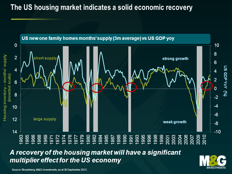
The focus on the fiscal cliff has taken attention away from what we think are extremely positive developments elsewhere in the US economy – and particularly in the housing market, as alluded to in September. US housing became the centre of the global financial crisis from 2007 onwards, when the credit bubble burst as sub-prime mortgage loans started to go bad. Too many houses had been built, and the overhang of unsold inventory together with foreclosures and falling real incomes and unemployment led to a sharp fall in house prices. The banking system went bust, and a huge number of construction jobs were lost in the economy. From a peak of 7.7 million Americans employed in construction in 2006, by the start of 2010 the sector had lost 2.2 million jobs. But we’re now seeing a large number of positive signs in the US housing market, and just as the negative multiplier effects spread through the economy when the sector tanked, the reverse might be true next year.
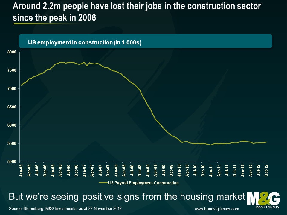
The chart below was very important to us in 2007, when it led us to expect not just weak growth in the US, but an outright recession with huge damage to the banking sector. It showed that there had been so much overbuilding in US residential property that the supply of inventory had moved from about 4 months to over 7 months. This had historically been a leading indicator of recession. In fact unsold inventory moved much further than 7 months, hitting 1 year in 2008, presaging US GDP falling by 4% year on year. You can see that the available inventory of housing is now contracting sharply, to the extent that US growth should continue positive. It’s also at a level where house-building should resume – and the multiplier effect from that will be extremely powerful.
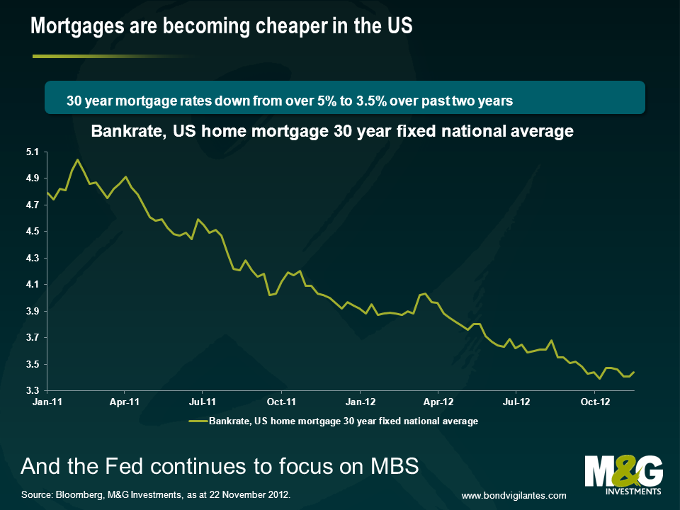
Other reasons to be cheerful about US housing? Well house prices have been rising, according to the S&P/Case-Shiller index, since March this year (but remain “cheap”, 30% below the peak in nominal terms, even weaker in real terms). So the negative sentiment around the sector will be fading somewhat – nobody wants to buy into a falling market. And the Federal Reserve has almost entirely moved its Quantitative Easing programme away from purchases of US Treasuries and towards the purchase of Mortgage Backed bonds. This should eventually help get the transmission mechanism working again. In theory American mortgage investors should be able to refinance existing mortgages at high rates into new lower rate loans. This hasn’t been happening – banks have dragged their heels on paperwork (the time from agreeing a loan to it closing has anecdotally risen from a month to three months for example), and lending standards for the new mortgages are often higher than they were for the outstanding stock of mortgages. So new 30 year mortgage rates are around 3.31%, (a record low). But as at 2011 (it’s probably lower now) 28 million Americans had outstanding mortgages with rates over 1% higher than the rate for new mortgages – in theory these are all refinanceable at lower levels. You could read this as bad news – but it represents a possible windfall gain for consumers if the transmission mechanism does start working again (lower interest payments equals more spending power). And the Fed is now focused on making the transmission mechanism work – it will get better.
So if the price of US housing is attractive, and mortgage rates have fallen, and there’s an increasing level of demand relative to low supply, how powerful can this be? Well we saw how powerful the negative impact was post 2007 – the multipliers involved with housing construction and household formation (people starting households for the first time, as a result of population growth and immigration, or moving out of a parental home) are very strong. A new housing construction project might result in a contractor hiring more workers, who buy pick-up trucks and power drills, and have wages to spend in their neighbourhoods. They buy cement (from Cemex hopefully, a high yield company we like!) and wood. And the people who move in buy carpets, chairs and flat screen TVs (is it time to stop saying flat screen when it comes to TVs? Probably). The Australian Bureau of Statistics calculated construction multipliers back in 2002 (the link is here). They found that there was an initial effect (the employment of construction workers and what they produce), a first round effect (the output and employment of those that produce the goods and services to the construction industry needs), an industrial support effect (the extra output impact on the suppliers to that first round effect), and a consumption induced effect (increased spending resulting from the wages resulting from all of those efforts). The ABS calculated that every US$1 million spent on construction output results in US$2.9 million of output in the economy as a whole. And, better still, gives rise to 13.5 jobs in construction and 55.5 jobs in the economy as a whole (I’ve pro-rated the jobs upwards from the Australian example, as their original calculations were using the Aussie $). The ABS did warn about the multiplier being overstated from the theory to the actuality, and Australia is obviously not America – but the numbers show the power of housing and construction, and could make you very bullish on the US economy over the next couple of years.
Which brings me on to my final, and tenuously related point – I had a coffee with George Trefgarne last week, the former economics editor of the Daily Telegraph, and the author of Metroboom, a paper about Britain’s recovery from the 1930s slump. We can debate about whether it was austerity or currency devaluation that got the UK out of depression – but house building was certainly part of the solution. Between 1931 and 1939 we were building from 200,000 to (in 1936) over 350,000 new houses per year. Compare that to the UK today, where despite the much bigger population, we’re building under 150,000 houses per year, whilst rents rise and affordability remains very poor for most. In some ways we are lucky – we have a potential solution to the UK’s weak growth – allow house building to take off (by loosening planning restrictions, incentivising house builders to release land banks). If you are Spain, and you have a huge glut of housing, this is not a way out of the ongoing crisis – but for the UK, or the US, building homes could be the answer.
Today in Europe we have a day of action. The day of action means in reality a day of inaction, as the active protesting on the streets is outweighed by the inactive sectors such as transportation hit by the strike. Why are workers and, increasingly importantly, non workers undertaking such protests?
Firstly let’s look at the evidence. Below is a chart of unemployment in the Eurozone split by country. The chart shows who is protesting and why. The higher the unemployment the more concern there is in that nation’s population over the current economic situation. Germany is not protesting; southern Europe is.
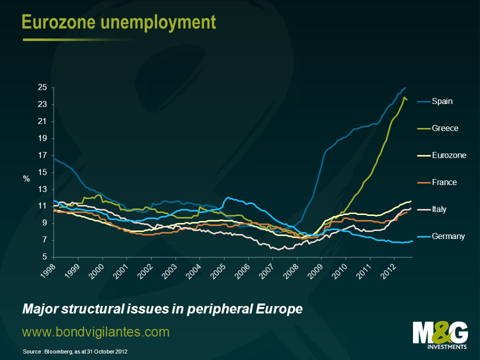
It can be seen from the chart that at various times over the last 10 years the sick and healthy economies of Europe have alternated, the strong core and the weak periphery were the weak core and the booming periphery in the middle of the last decade. Industry, labour skills, and structural shifts do not occur that quickly so what is causing this volatility in national economic outcomes?
We have commented before on the travails of the single currency concept. This is an economic construct, which has been constructed for the good of Europe. Let’s look at how this current economic policy affects the Eurozone, and how the divergence in economic outcomes can be solved using economic theory.
The first economic lesson I learned from my excellent economics teacher, was the concept of the invisible hand (quite ironic as he had the biggest hands I’ve ever seen!). The introduction of a single currency causes the invisible hand as expressed via exchange rates to be metaphorically tied behind your back. Given the single currency is the root of the dislocation, disbanding it is an obvious solution. However the other ramifications of doing this are potentially large, and it is not an option European leaders are prepared to take. This is not because it is an ineffective policy option, but they are wedded to the political concept as well as the economic concept that comes with a single currency. The weak economies are therefore stuck with too high an exchange rate and the strong economies are left with too low an exchange rate. The economics of the invisible hand in foreign exchange markets is not allowed to work and therefore economic divergence not convergence becomes a more likely event.
Being educated in Britain, the next main economic lessons we learned were around the work of John Maynard Keynes. The principle point drummed into us being that governments should run counter cyclical budget deficits. Unfortunately in Europe the response that the weaker economies are being forced to take is more fiscal discipline through budget deficit reductions. The strong have room to undertake fiscal stimulus, the weak are being told to run pro cyclical fiscal policy. So from this economic perspective the weak will get weaker and the strong stronger…..
The third basic lesson of economics was monetary policy. Lower interest rates stimulate consumption and growth. If you’re the German state, a German company, or a German individual the transmission mechanism of borrowing substantial amounts of money at low rates is available and is working. Sadly if you’re the state, a company, or an individual in the weaker economies the cost of borrowing is high and the physical quantity you can borrow is limited. The transmission mechanism is not working equally across Europe. The strong will get stronger the weak will get weaker.
The single currency is an economic construct that has come about through a political process. If that economic construct does not cause many economic ripples then politically it is relatively easy to take the political decisions to make the concept work. However if the economic construct becomes very destabilising as it appears to be doing then the political skills and policy options have to increase in size to offset its destabilising effects. The political day of action of launching a single currency was simple, the actions required to make it work long term are not.


Sign up to the Bond Vigilantes mailing list to ensure you never miss a great article from our expert Bloggers. We will email all new articles to your inbox, meaning you can stay on top of the world of Bonds.
I confirm that I would like to receive information about Bond Vigilantes and products and services from M&G Securities Limited.
We will use the email address and personal data you have shared with us to send you this information. For existing customers, submitting your contact details and requesting to receive this information from us, will replace any earlier choices you have made in respect of marketing information.
You can unsubscribe from marketing at any time, at which point we will not send any further marketing information to you, by selecting the unsubscribe link in all communications.