Fixed income
We need to talk about the 61s
By Robert Burrows
30 April 2024

Some people will watch a scary movie on October 31st. Others like to go to costume parties and dress up. For us, there is no better way to scare ourselves silly than by reading a few IMF reports. So in the spirit of the holiday, here are five scary charts. Boo!
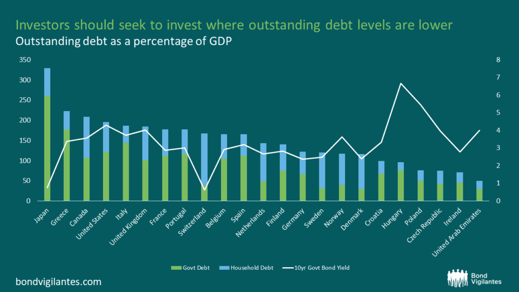
1. An oldie but a goodie – high public debt-to-GDP ratios
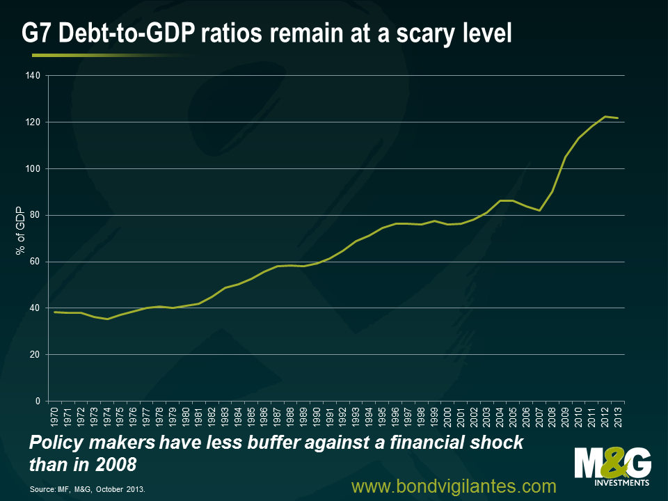
Economic theory has told us for a long time that debt held by the public is what we should be looking at when trying to work out the potential impacts that high debt levels could have on an economy. This is because the borrowing associated with government debt competes for capital with investment needs in the private sector (for factories, equipment, housing, etc) and can affect interest rates. A good ol’ classic case of “crowding out” in the IS-LM model.
More recently, the market has taken its focus off looking at debt-to-GDP ratios. A 2010 research paper by Carmen Reinhart and Kenneth Rogoff was found to have computational errors, resulting in some serious question marks being raised about their finding that a debt-to-GDP ratio of 90 per cent or more is associated with significantly lower growth rates. Following this debacle, we now know that there is probably no magic threshold for the debt ratio above which countries pay a marked penalty in terms of slower economic growth. For all it’s importance, the 60% debt-to-GDP ratio target written into the Maastricht Treaty adopted by the European Union was pretty much based on zero economic evidence.
This doesn’t mean we shouldn’t keep an eye on the measure though. High government debt means a high debt servicing cost. In general, a lower debt-to-GDP ratio is preferred because of the additional flexibility it provides policymakers facing economic or financial crises. What has now changed is that it has been acknowledged by policy makers that lowering the debt ratio comes at a cost to economic growth, requiring larger spending cuts, higher revenues, or both. Should the financial system face another wobble, for whatever reason, we would have to question the capacity of governments to step in and support their banks like they did back in 2008.
2. Deteriorating health and ageing in the developed economies
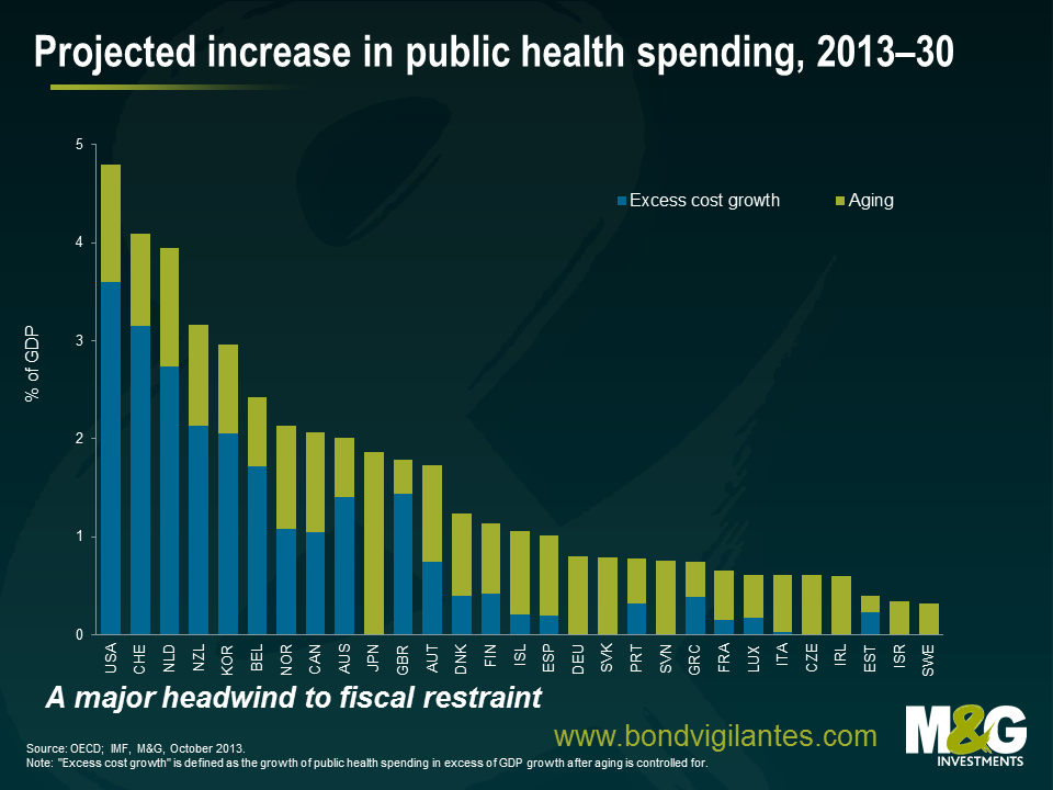
The world’s population is growing older, leading us into uncharted demographic waters. There will be higher absolute numbers of elderly people, a larger share of the elderly, longer healthy life expectancies, and relatively fewer numbers of working-age people. We are aging due to three underlying factors: increased longevity, declining fertility and the baby boomers getting older.
This signals a profound economic and social change, with big implications for businesses and investors. Will we see an asset meltdown as the elderly sell off their assets? How will publicly funded pension systems deal with rising beneficiaries and falling contributors? How will policy makers react to a chart like the one above, which shows ever-increasing expenditure on public health as a percentage of GDP? The need for policy adaptations to an aging population will become more important in the face of retirement of the baby boomers, slowing labour force growth, and the rising costs of pension and health care systems, especially in Europe, North America, and Japan.
As a result of this key demographic change we can now reasonably expect to retire later in life, work harder as the size and quality of the workforce deteriorates, and pay higher taxes to fund those expensive medical technologies. Scary, huh?
3. Economic inequality and its impact on society
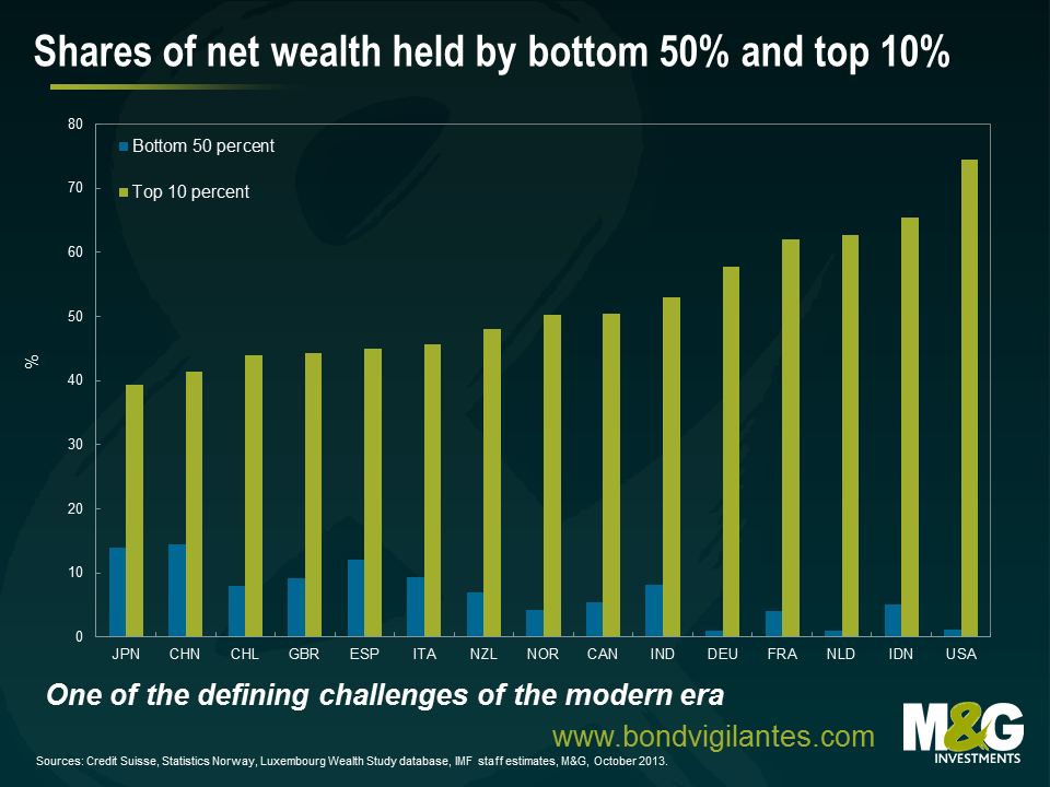
Income inequality is of great interest to economists due to the impact that it could potentially have on economic growth. Robert Shiller, who recently won the Nobel Prize in Economic Science, said that income inequality is the most important problem that we are facing now. Billionaire investor Warren Buffett thinks that rising income inequality is a drag on US economic growth. He said in an interview with CNN Money that “the rich have come back strong from the 2008 panic, and the middle class hasn’t. That affects demand, that affects the economy. The people at the bottom end should be doing better.” Stan Druckenmiller, who spent more than a decade as chief strategist for George Soros, has described QE as causing “the biggest redistribution of wealth from the middle class and the poor to the rich ever. Who owns assets? The rich.”
What is really scary about this chart is the social and political ramifications that some economists have hypothesised. One theory suggests that high inequality could lead to a lower level of democracy, high rent-seeking policies, and a higher probability of revolution. An economy could fall into a vicious cycle because the breakdown of social cohesion brought about by income inequality could threaten democratic institutions.
4. A new economic world order
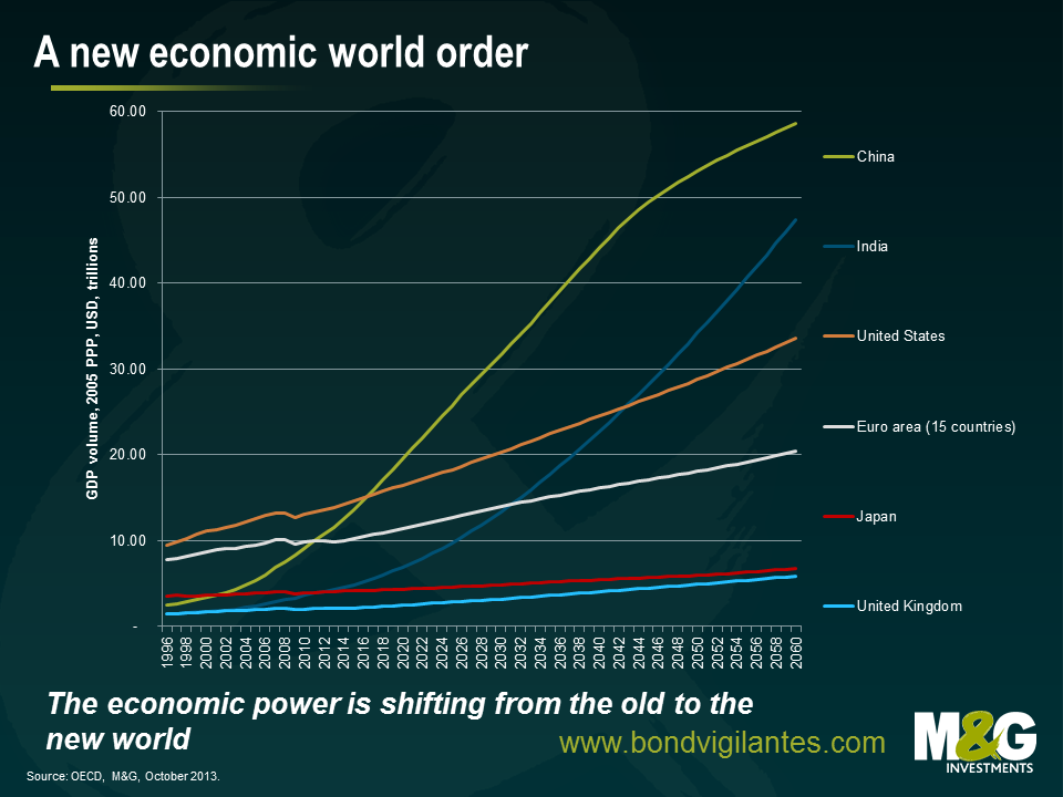
The last decade has witnessed the emergence of China as an economic superpower, the next decade may well be characterised by the emergence of India. China and India will both expect their global influence to expand in the coming years and decades, but strong growth will not be without some headaches. Political leaders must deal with the environmental consequences, an aspirational middle class and rising social inequality. We have all felt the impact of the ascension of the developing economies through their thirst for commodities; the next phase may well see these two nations become the most influential in the world.
Markets don’t particularly like uncertainty. How they react to this new world order is anyone’s guess. This chart isn’t particularly frightening. What it does is challenge the economic status quo that many of us have become accustomed to.
5. Feeding the world
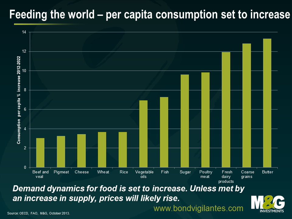
The global population is set to grow considerably in coming years, though there will likely be considerable differences across countries. It has been estimated that the world’s population could increase by 2 billion people to exceed 9 billion people by 2050. Of course, global agricultural production will have to increase in order to meet this demand. If our farmers don’t manage to produce more, then we could easily find ourselves in an inflationary environment as our grocery shopping bills increase. Not only that, we have to become much smarter about using the planet’s limited resources.
Increasing farmers output won’t be easy, or without cost. Recent experience suggests that an increase in production efforts can lead to significant negative environmental effects, like pollution and soil erosion.
Increased productivity and innovation alone will not tackle the demand that will come from our growing, global population. Investment and infrastructure is vital. Farmers are likely to adopt technologies only if there are sound incentives to do so. This calls for well-functioning and efficient capital markets, a stable financial environment and sound risk management tools.
We’ve been very worried about emerging markets for a couple of years, initially because of surging portfolio flows, better prospects for the US dollar and historically tight valuations (see The new Big Short – EM debt, not so safe, Sep 2011). But increasingly recently our concern has been driven by deteriorating EM fundamentals (see Why we love the US dollar, and worry about EM currencies, Jan 2013). A combination of miscommunicated and misconstrued Fed speak in May brought things to a head, and EM debt crashed in May to July (see EM debt funds hit by record daily outflow – is this a tremor, or is this ‘The Big One’? Jun 2013), although the asset class has since recovered roughly half of the losses. So where are we at now?
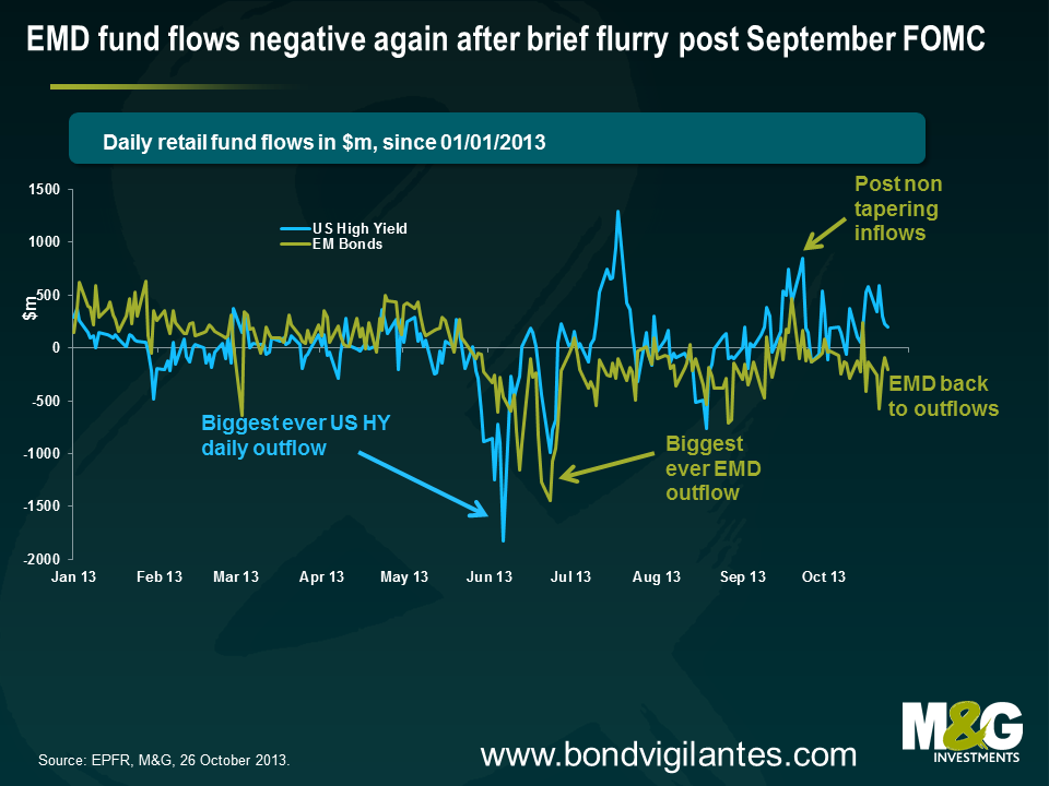
First up, fund flow data. Outflows from EM debt funds abated in July and August, briefly turned into inflows in mid September immediately following the non-tapering decision, but have since broadly returned to outflows (see chart below). Outflows from EM debt funds since May 23rd have been a very chunky $28bn, over $3bn of which have come since September 23rd.
However, as explained in the blog comment from June, EPFR’s now much-quoted fund flow data only apply to mutual funds, and while you get an idea of what the picture looks like, it’s only a small part of the picture. Just to emphasise this point, it has now become apparent that a significant part of the EMFX sell was probably due to central banks. The IMF’s quarterly Cofer database, which provides (limited) data on reserves’ currency composition, stated that advanced economy central banks’ holdings of “other currencies” fell by a whopping $27bn in Q2, where much of this ‘other’ bucket is likely to have been liquid EM currencies. Maybe half of this fall was driven by valuation effects, but half was probably dumping of EM FX reserves. Limitations of the EPFR data are also apparent given that there has been a slow bleed from EMD mutual funds this month, but that doesn’t really tally with market pricing given that EM debt and EM FX have been edging higher in October. An increase in risk appetite among EMD fund managers could account for this differential, although it’s more likely that institutional investors and other investors have been net buyers.
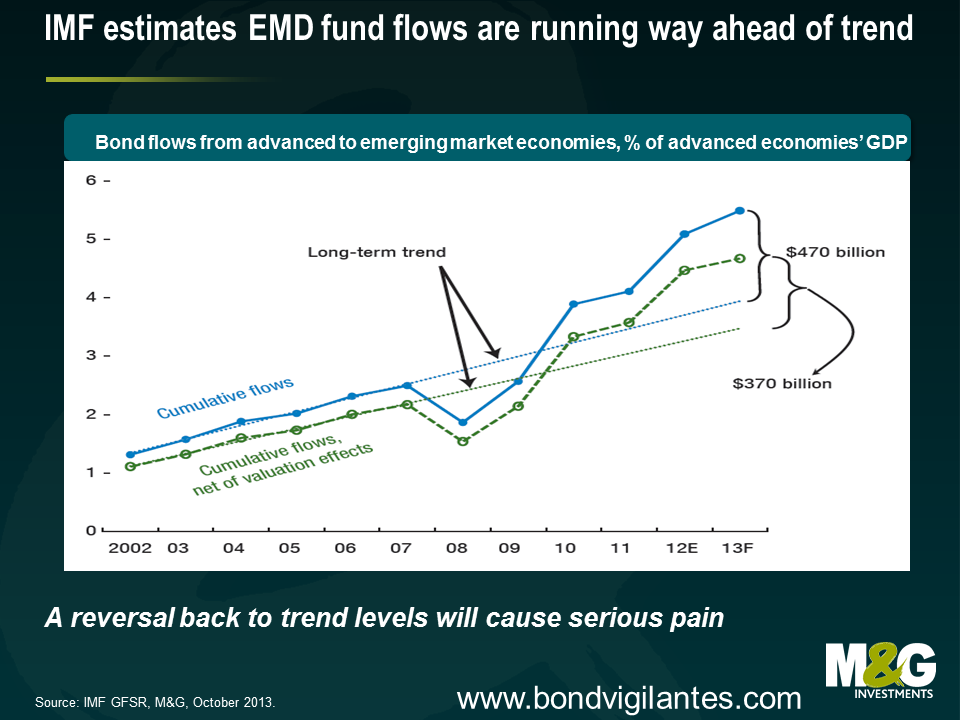
A relative stabilisation in fund flows doesn’t mean that planet EM is fine again. The recent IMF/World Bank meetings had a heavy EM focus, which followed on from the negative tone towards EM in the latest editions of the IMF’s flagship World Economic Outlook and Global Financial Stability Report (GFSR). The IMF again voiced concerns about the magnitude of the EM portfolio flows, and the chart below suggests that flows have deviated substantially from what the IMF believes is a gentle trend upwards in investors’ allocation to EM. A reversal of recent years’ inflows back towards the long term trend level would cause considerable pain, and while $28bn of outflows since May 23rd may sound like a lot, this is only equivalent to the inflows in the year up to May 23rd, let alone the inflows from the preceding years. As explained in Chapter 1 of the GFSR, which is highly recommended reading, foreign investors have crowded into local emerging markets but market liquidity has deteriorated, making an exit more difficult.
What now for EM debt? Your outlook will likely depend on how you weight and assess the different performance drivers for the asset class. There has been a heated debate in recent years on whether emerging market portfolio flows are driven primarily by so called ‘push factors’ (eg QE and associated negative developed country real interest rates pushing capital into countries where rates are higher), or whether flows are driven by ‘pull factors’ (eg domestic factors such as reforms or financial liberalisation). EM countries have tended to argue that push factors dominate, with Brazilian Finance Minister Mantega going as far as to accuse G3 policymakers of currency manipulation, while Fed Chairman Bernanke and future Chairman (Chairperson?) Yellen have argued that EM countries should let their currencies appreciate, although a recent Federal Reserve paper highlights both push and pull factors.
Number crunching from the IMF suggests that it is the EM policy makers who have the stronger arguments. In April’s GFSR, the IMF’s bond pricing model indicated that stimulative US monetary policy and lower global risk (itself partly attributable to the actions of advanced economy central banks) together accounted for virtually all of the 400 basis point reduction in hard currency sovereign debt from Dec 2008-Dec 2012, as measured by JP Morgan EMBI Global Index. Meanwhile, external factors were found to have accounted for about two thirds of the EM local currency yield tightening over this period. ‘Push factors’ therefore appear to dominate ‘pull factors’, something I agree with and have previously alluded to.
The relevance of external factors shouldn’t be a major surprise for EM investors given that the arguments are not remotely new. Roubini and Frankel have previously argued that macroeconomic policies in industrialised countries have always had an enormous effect on emerging markets. Easy monetary policy and a low global cost of capital in developed countries (as measured by low real interest rates) in the 1970s meant that developing countries found it easy to finance their large current account deficits, but the US monetary contraction of 1980-2 pushed up nominal and real interest rates, helping to precipitate the international debt crisis of the 1980s. In the early 1990s, interest rates in the US and other industrialised countries were once again low; investors looked around for places to earn higher returns, and rediscovered emerging markets. Mexico received large portfolio inflows, enabling it to finance its large current account deficit, but the Fed’s 1994 rate hikes and subsequent higher real interest rates caused a reversal of the flows and gave rise to the Tequila Crisis.
High real interest rates were maintained through the mid 1990s, the US dollar strengthened. Countries pegged to the US dollar lost competitiveness, saw external vulnerabilities grow and in 1997 we had the Asian financial crisis. In 1998, Russia succumbed to an artificially high fixed exchange rate, chronic fiscal deficits and low commodity prices (which were perhaps due in part to the high developed country real interest rates). A loosening of US monetary policy in the second half of 1998 alleviated the pressure on EM countries, but a sharp tightening in US monetary policy in 1999-2000 was arguably the final nail in the coffin for Argentina, and only IMF intervention prevented the burial of the rest of Latin America. The low US real interest rates/yields that have been in place ever since 2001-02 and particularly since 2009, together with the weak US dollar, have sparked not only large, but also uniquely sustained, portfolio flows into EM. [This is of course a gross simplification of the crises of the last 30 years, and there were also numerous domestic factors that explained why some countries were hit much harder than others, but it’s difficult to dispute that US monetary policy has played a major role in the direction of capital flows on aggregate].
It’s starting to feel like Groundhog Day. Soaring US real and nominal yields from May through to August were accompanied by an EM rout. The tentative rally in EM over the last month has been accompanied by lower US real and nominal yields. Correlation does not imply causation, but investors should probably be concerned by the potential for US nominal and real yields to move higher as easy monetary policy is unwound. The date for the great monetary policy unwind is being pushed back, with consensus now for US QE tapering in March 2014, and if anything I’d expect it to be pushed back further given that it is hard to see how we’re going to avoid a rerun of the recent US political farce early next year. But this should only be a postponement of US monetary tightening, not a cancellation.
This year has been painful for EM, but it has been more a ‘spasmodic stall’ in capital flows rather than a fully fledged ‘sudden stop’. If, or perhaps when, the day of reckoning finally comes and US monetary policy is tightened, EM investors should be very concerned with EM countries’ growing vulnerability to portfolio outflows and ‘sudden stops’. [Guillermo Calvo coined the phrase ‘sudden stop’, and he and Carmen Reinhart have written extensively on the phenomenon, eg see ‘When Capital Inflows Come to a Sudden Stop: Consequences and Policy Options (2000)’]
History suggests that a good old fashioned ‘sudden stop’ would be accompanied by banking and particularly currency crises in a number of countries. There are numerous variables you can use to assess external vulnerabilities, and many people have been busy doing precisely that since May (eg see a write-up on a piece from Nomura). In January I highlighted some of the lead indicators of EM crises regularly cited in the academic literature, namely measures of FX reserves, real effective exchange rates, credit growth, GDP and current account balances.
To be fair, a few of these crisis indicators are pointing to a slight improvement. Most notably, FX reserves are on the rise again – JP Morgan has highlighted that FX reserves of a basket of EM countries excluding China fell by $40bn between April and July, but that decline was fully reversed through August and September, even accounting for the fall in the US dollar (which pushes up the USD value of non-USD holdings).
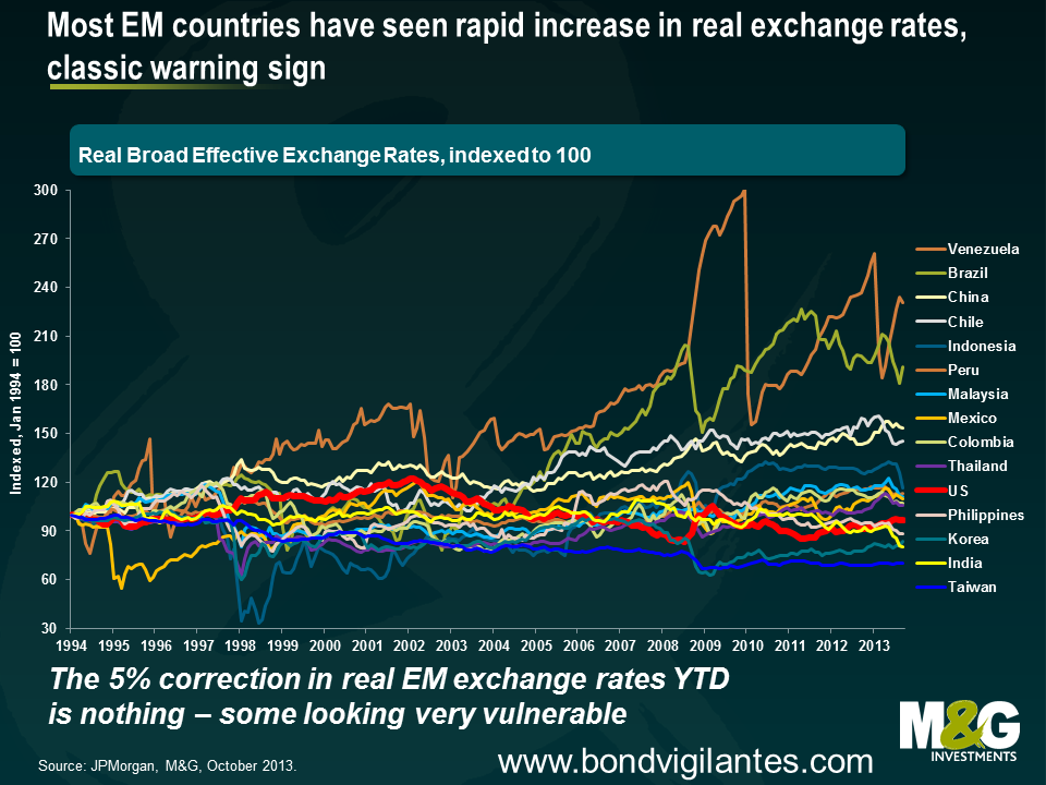
Currencies of a number of EM countries have seen a sizeable and much needed nominal adjustment, although it’s important to highlight that while nominal exchange rates have fallen, the fact that inflation rates tend to be a lot higher in EM than in DM means that real exchange rates have dropped only perhaps 5% on average, which still leaves the majority of EM currencies looking overvalued and in need of significant further adjustment. In particular, Brazil has much further to go to unwind some of the huge appreciation of 2003-2011. Venezuela looks in serious trouble, which is what you expect given it is trying to maintain a peg to the US dollar at the same time as its official inflation rate has soared to 49.4% (Venezuela’s FX reserves have halved in five years, and are at the lowest levels since 2004).
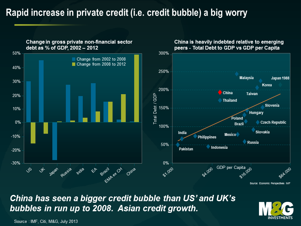
However some of these lead indicators are just as worrying as they were in January. While the rapid credit growth rates of 2009-2012 have eased a little in most countries, perhaps partly on the back of weaker portfolio flows, there’s no evidence of deleveraging. Indeed, China is as addicted to its credit bubble as ever, while Turkish credit growth is inexplicably re-accelerating. The charts below put China’s credit bubble into perspective, where the increase in China’s private debt/GDP ratio since 2008 is bigger than the US’ and the UK’s credit bubbles in the years running up to 2008, and China’s total debt/GDP ratio is approaching Japan’s ratio in 1988. A banking crisis in China at some point looks inevitable. Although a banking crisis will put a dent in China’s GDP growth, it shouldn’t be catastrophic for the economy in light of existing capital controls and high domestic savings (these savings will just be used to plug the holes in banks’ balance sheets). The pain will likely be felt more in China’s key trade partners, particularly in those most reliant on China’s surging and unsustainable investment levels, and of those, particularly the countries with growing external vulnerabilities (see If China’s economy rebalances and growth slows, as it surely must, then who’s screwed? Mar 2013).
And probably the biggest concern is the rapidly deteriorating current account balances for almost all EM countries, where a country’s current account is essentially a broad measure of its trade balance. If you look through historical financial crises, large and/or sustained current account deficits are a feature that appears time and time again. Current account deficits were a feature of the LatAm debt crisis of the early 1980s, the Exchange Rate Mechanism (ERM) crisis in 1992-3, Mexico in 1994, Asia in 1997, (arguably) Russia in 1998, Argentina and LatAm generally in 1999-02, Eastern Europe and many developed countries in the run up to 2008, and the Eurozone periphery (2010-?). Current account deficits are not by themselves necessarily ‘bad’ since by definition a current account deficit in one country must be balanced by a current account surplus elsewhere, and a country ought to be running a current account deficit and therefore attracting foreign capital if it has a young population and superior investment prospects. Foreign investors will willingly fund a current account deficit if they expect their investment will result in future surpluses, but no country is able to run a current account deficit (which is the same as accumulating foreign debt) indefinitely – if foreigners see a deficit as unsustainable then a currency crisis is likely. Maybe Mongolia’s or Mozambique’s current account deficits of almost 40% last year can be justified by the high expected returns from the huge mining/energy investment in the countries. Or maybe not.
But consistently large deficits, or rapidly deteriorating current account balances, can be indicative that things aren’t quite right, and that’s how many EM countries look to me today. Morgan Stanley coined the catchy term the ‘fragile five‘ to describe the large EM countries with the most obvious external imbalances (Indonesia, South Africa, Brazil, Turkey and India), and this is a term I gather those countries understandably aren’t overly impressed with (BRICS sounded so much nicer…). Unfortunately the list of fragile EM countries runs considerably longer than just these five countries.
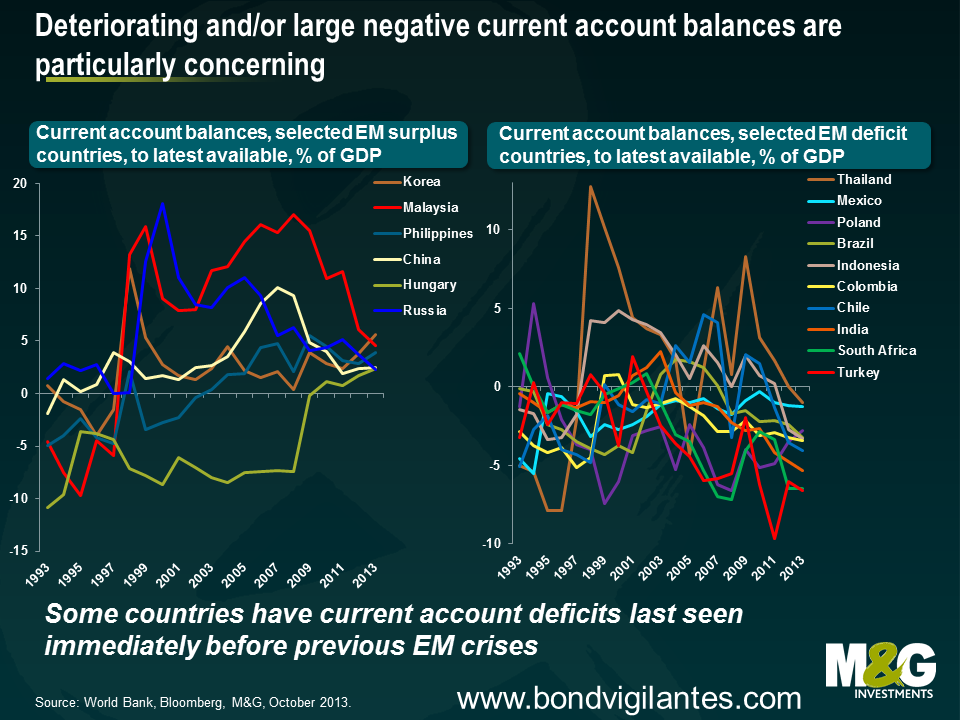
The chart below highlights a select bunch of EM countries that are running current account surpluses and deficits. Some countries look OK – the Philippines and Korea appear to be in healthy positions on this measure with stable surpluses. Hungary has moved from running a large deficit to a small surplus, although Hungary needs to run sustained surpluses to make up for the period of very large deficits pre 2009*.
Almost all the other surplus countries have seen fairly spectacular declines in their current account surpluses. Malaysia’s surplus has plummeted from 18% of GDP in Q1 2009 to 4.6% in Q2 2013, while Russia, which is regularly cited as being among the least externally vulnerable EM countries, has seen its current account surplus steadily decline from over 10% in 2006 down to 2.3% in Q2 this year, a number last seen in Q2 1997, a year before it defaulted. Russia’s deteriorating current account is all the more alarming given that the historically high oil price should be resulting in large surpluses. Financing even a small current account deficit (which by definition would need financing from abroad) could cause Russia serious problems, and a lower oil price could also result in grave fiscal stresses given that the breakeven oil price needed to balance Russia’s budget has soared from $50-55/ barrel to about $118/ barrel in the last five years.
Many (but not all) current account deficit countries are looking grimmer still. A number of countries are seeing current account deficits as large or larger than they have historically experienced immediately preceding their previous financial crises. Turkey has long had a very large current account deficit, and while it has improved from almost 10% of GDP in 2011 to 6.6% in Q2 this year, the central bank’s reluctance to hike rates in response to a renewed credit bubble suggests this will again deteriorate. Despite the sharp drop in the rand, South Africa’s economic data has not improved – its current account deficit was 6.5% of GDP, and Q3 is likely to be very weak given the awful trade data in July and August. I continue to think South Africa should be rated junk, as argued in a blog from last year (the modelled 10% drop in the rand actually turned out to be overly optimistic!). India’s chronic twin deficits have been well documented – its current account deteriorated sharply in recent years, hitting a record 5.4% in Q4 2012 and with only a marginal improvement seen since then. As previously highlighted, Indonesia’s current account is now back to where it was in Q2 1997, immediately before the outbreak of the Asian financial crisis. Thailand’s previously large current account surplus has moved into deficit. Latin American countries tend to run reasonable sized deficits (as they generally should, given their stage of development), although Brazil and Chile have moved right into the danger zone.**
Another concern is contagion risk. If the Fed does tighten monetary policy next year, investors withdraw from EM en masse and capital flows back to the US, and/or China blows up and takes EM down with it, then an EM crisis this time around could look very different to previous ones. EM crises have historically been regional in nature – the international debt crisis of the early 1980s is a possible exception, but even then it was Latin America that bore the brunt. The big difference this time around is that a material portion of the portfolio flows are from dedicated global EM funds and large ‘Total Return’ style global bond strategies, as opposed to flows from banks. If these funds withdraw from EM countries, or to be more precise, if the end investors in these funds liquidate their holdings in the funds, then the funds will be forced sellers of not only the countries that may be in trouble at that point in time, but will also be forced sellers of those countries that aren’t necessarily in trouble. In fact, in a time of crisis, they may only be able to sell down the better quality more liquid positions such as Mexico in order to meet redemptions. So if a crisis does develop then you’ll probably see a correlation of close to one across EM countries. And not just between EM countries – the fate of, say, Ireland, may now be tied to that of Ukraine, Ghana, Mexico, and Malaysia.
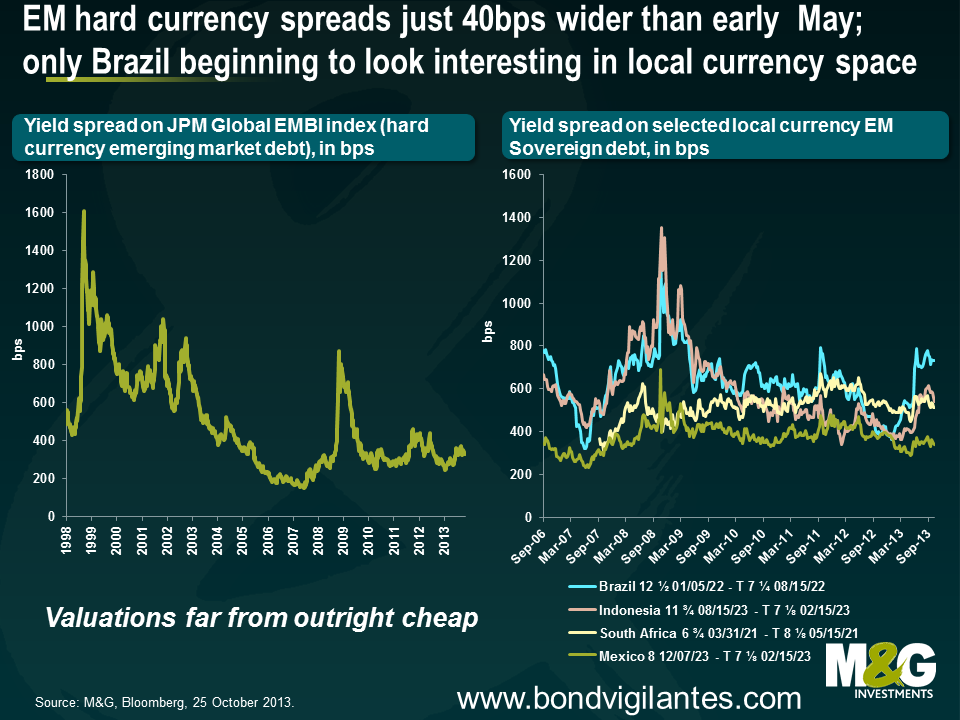
That’s the rather lengthy ‘story’ for emerging markets, but what about the most important thing – valuations? In June I concluded that following the sharp sell-off, EM debt offered better value than a few months before, and it therefore made sense to be less bearish on an asset class that we have long argued has been in a bubble (but that didn’t mean I was bullish). As mentioned above, EMD has now recovered roughly half the sharp losses of May and June, but given very little has fundamentally changed over the period, it makes sense to be more concerned about valuations again.
The charts below illustrate the yield spread pick up over US Treasuries on hard currency (as shown by the JPM EMBI Global spread) and EM local currency (as shown by 10 year yields on Brazil, Indonesia and Mexico). Even though a number of EM macroeconomic indicators are at or approaching historical crisis levels, spreads on hard currency EM debt are not far off the tights (although at least you are exposed to the US dollar, whose valuation I like). EM local currency yields are also offering an unspectacular yield pick up over US treasuries, but here you have to contend with a lot of EM currencies with arguably shaky valuations, and you additionally face the risk of some countries being forced to run pro-cyclical monetary policy (i.e. EM central banks hiking rates in the face of weakening domestic demand in order to prevent a disorderly FX sell-off , the result of which sees local currency bond yields rising, as seen recently in Brazil, India, Indonesia).
So rising EM external vulnerabilities, combined with what are now fairly unattractive valuations, means that EM debt could potentially be teetering over the edge. Would the Fed give EM the final shove though?
On the one hand, while US domestic demand was considerably stronger in the 1990s than today, it’s interesting that during the really bad EM crises in 1997 & 1998, US GDP didn’t wobble at all, not remotely. US GDP was 5% in 1998, the strongest year since 1984, and 1997 saw the US economy grow at a not too shabby 4.4%. The Fed Funds rate didn’t budge at all in 1997 through the Asian crisis, and it wasn’t until after the Russian crisis in September 1998 that the Fed cut interest rates from 5.5% to 5.25% (and then again in October and November down to 4.75%), although this was a combination of domestic and foreign factors. Rates were actually back at 5.5% by November 1999 and continued higher to 6.5% by May 2000.
On the other hand, EM countries now account for about half of global GDP, so a direct hit to EM could loop quickly back to the US. This is something that the Federal Reserve has become acutely aware of in recent months (in case they weren’t already) given the extreme moves in EM asset prices. And in both the June and September press conferences, Bernanke was keen to stress that the Fed has lots of economists whose sole job is to assess the global impact of US monetary policy, and what’s good for the US economy is good for EM. That said, if US growth hits 3% next year, which is possible, it’s tricky to see how the Fed won’t start tightening monetary policy regardless of what EM is up to.
But the deteriorating EM current accounts may mean that at least a few EM countries won’t have to wait for a push from the Fed; they may topple over by themselves. A deteriorating current account deficit means that a country needs to attract ever increasing capital from abroad to fund this deficit. If developed countries’ appeal as investment destinations improves at the same time that a country such as South Africa’s appeal is deteriorating due to deteriorating economic fundamentals or other domestic factors, then investors will begin to question the sustainability of the deficits, resulting in a balance of payments crisis. EM investors need to be compensated for these risks in the form of higher yields, but in the majority of cases, yields do not appear sufficiently high, which therefore makes me more bearish on EM debt valuations.
*A current account deficit is an annual ‘flow’ number; Hungary’s ‘stock’ still looks ugly thanks to years of deficits, as shown by its Net International Investment Position. Hungary’s current account surplus is one of the few things Hungary has going for it. For more see previous blog.
** I’m still slightly baffled as to why Mexico HASN’T had a credit bubble given the huge portfolio inflows, the relative strength of its banking sector and a very steep yield curve, and it remains a favoured EM play (see Mexico – a rare EM country that we love from Feb 2012, although I’d downgrade ‘love’ to ‘like’ now given the massive inflows of the last 18 months and less attractive valuations versus its EM peers).
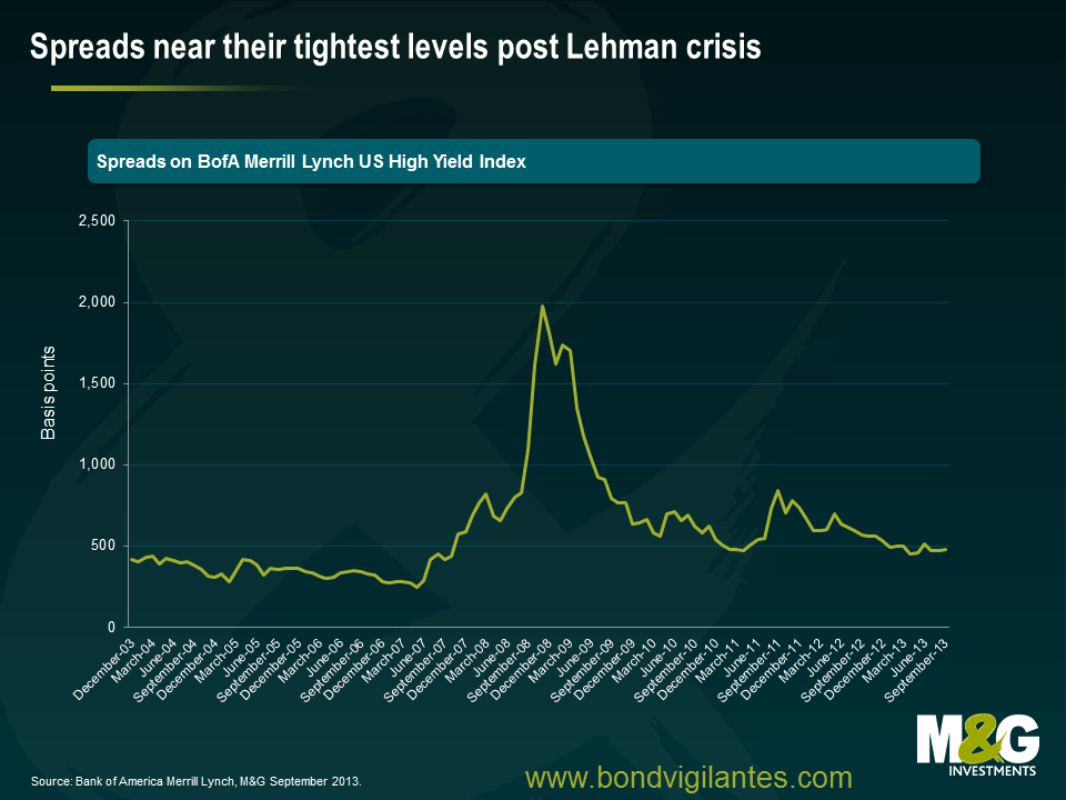
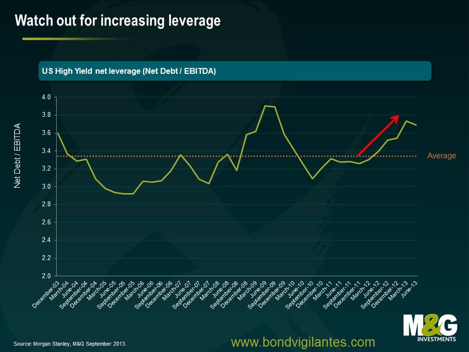
The high yield market rightly pays a good deal of attention to leverage trends (the relationship between debt and earnings). The larger the quantum of debt a business carries relative to its earnings, the greater the risk. Other metrics are arguably as important, though it is the leverage metric that consistently garners the lion’s share of attention. With spreads near the post Lehman tights, it is unquestionably concerning to see a trend of rising leverage as earnings plateau and companies generally take on more debt.
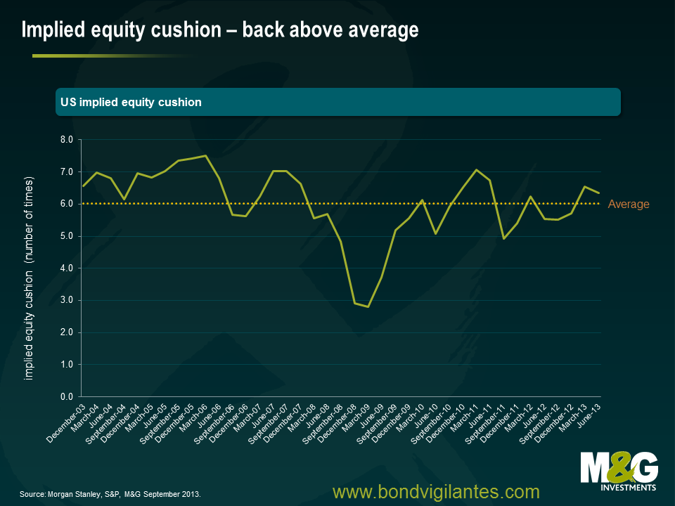
The very same central bank policies that have kept bond yields low and encouraged high yield companies to take on more debt have also helped to support higher equity prices. As money has flooded into the asset class, the market has not surprisingly re-rated upwards. What this has meant for high yield investors is that one measure of the ‘margin of safety’, or an equity cushion has, at least temporarily, been increased. The chart below shows the implied equity cushion by subtracting the average level of US high yield leverage from the S&P Mid Cap trailing 12 month enterprise multiple. The higher the implied cushion the better. So for example with stock markets at the lows in early 2009, the implied equity cushion fell to a mere two turns, but has since recovered to a far more healthy and above average six.
Many will no doubt point out that an implied cushion is exactly that- implied. And the argument is clearly a pro- cyclical one that relies on an imperfect comparison. We’d concur with that and emphasise the fact that there can be no substitute for thorough credit analysis. We will always prefer to invest in appropriate financial leverage, strong interest coverage and free cash flow generation over equity implied multiples. The former gives a business flexibility and exposes it less to market vagaries.
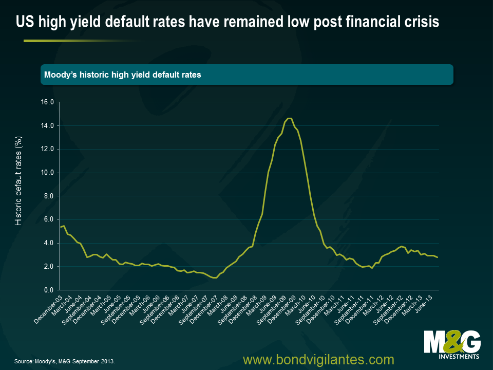
Yet there is no getting away from the fact that central bank policy has, and can still yet, come to the rescue of even some of most levered high yield companies. In hindsight, few of us would have predicted the surprisingly low level of defaults we’ve witnessed through this cycle. And whilst IPOs of high yield companies has been a fairly rare thing over the last few years, higher equity multiples, an on-going return of animal spirits and a desire/need to put money to work may yet alter that trend.
In my last blog I focused on the transition mechanism of financial policy in the UK, with government actions targeting the housing market, thus having the effect of loosening monetary policy. This encouraged us to look once again at the situation in Europe. Is the ECB any nearer making the monetary transmission system actually work?
Back in May 2011 we wrote about how the monetary system in the eurozone was not working effectively because different nations faced different interest rates in the private and public sector. One central bank rate was not being transmitted across the whole eurozone.
By using official money market rates as depicted by Euribor and adding bank CDS spreads as a proxy for the real cost of borrowing, we illustrated the difficulty the ECB was having in transmitting a single policy through a fractured financial system. We have brought the chart up to date below, and as you can see, the situation is no longer as extreme.
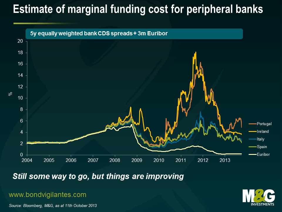
Thankfully, some semblance of order is being returned. The drag on growth from the massive fiscal adjustment that most of Europe has been through over the past few years could be petering out. Hopefully, less restrictive policy will point to future economic growth across the region. Although some progress has been made and funding costs have come down, access to credit remains restricted for many in the real world (see for example Ana’s blog from August). But if the ECB and the authorities can continue to heal the banking system then a virtuous circle of confidence could return to the eurozone, once again making loose monetary policy set by the ECB flow into the real world in the periphery.
I was recently fortunate enough to see a presentation by Phillip Turner from the Bank for International Settlements (BIS) on a paper he published earlier this year. ‘Benign neglect of the long term interest rate’ is a highly informative and interesting piece. In it he argues that after decades of the market determining long term interest rates the “large scale purchases of government bonds have made the long term interest rate key in the monetary policy debate”, and that a policy framework should be implemented around long term rates.
The use of central bank balance sheets isn’t as novel a concept as one might think when they hear (as I did repeatedly over 4 days of conferences and seminars in conjunction with the IMF/world bank annual meetings) QE described as unconventional monetary policy. In fact Keynes argued that central banks should stand ready to buy and sell government bonds as a means of affecting the price of money (the interest rate) from as early as the 1930s. Furthermore, the Thatcher government engaged in “quantitative tightening” as recently as the early 1980s by issuing more long dated gilts than were required to finance government spending. The rationale was that issuing more gilts would drain liquidity, curtail broad money growth and slow inflation more effectively than just increasing the Bank Rate.
Setting policy for longer term interest rates may be new territory for today’s generation of policy makers however it shouldn’t be for some. It’s often forgotten that the Fed actually has a triple, not dual mandate. Along with maximising employment and promoting stable prices they are also charged with providing moderate long term interest rates.
What constitutes a moderate long term interest rate is a matter for debate but the paper makes clear that adjusting the short term rate is not necessarily an effective measure in influencing the 10yr yield.
Turner argues that it may be more efficient to alter the average maturity of the outstanding government bonds – those not held by the central bank – through open market operations. The BIS has calculated that shortening the average maturity by one year will lead to a 1% reduction in the yield on a 10 year note. Essentially the message is that the longer the average maturity of the outstanding debt the tighter the policy.
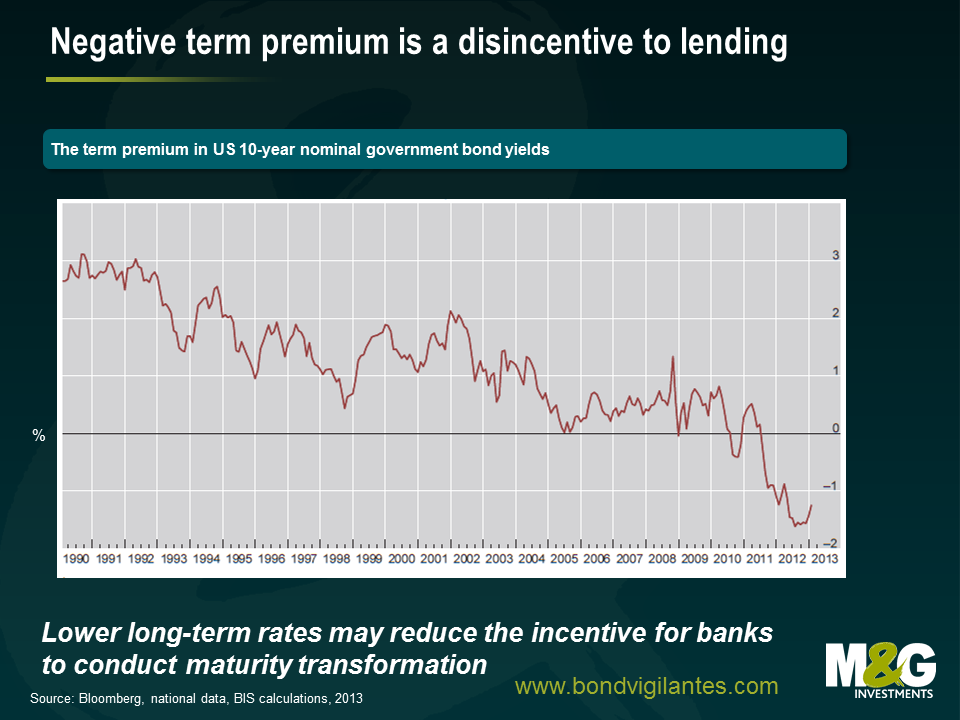
The inherent irony of lowering long term rates to stimulate the economy is that it reduces the incentives for banks to perform their socially useful function of maturity transformation – borrowing short and lending long. The lower long term interest rates the less of an incentive banks have to lend further out along the yield curve. The graph below shows that the term premium in the US 10yr has been negative for a large part of this decade.
However I believe that tougher regulation (larger capital buffers), increased litigation costs and a general de-levering of the economy will restrict the level of bank lending regardless of how steep the yield curve is.
This chart shows the maturity distribution of bonds held by the Fed.
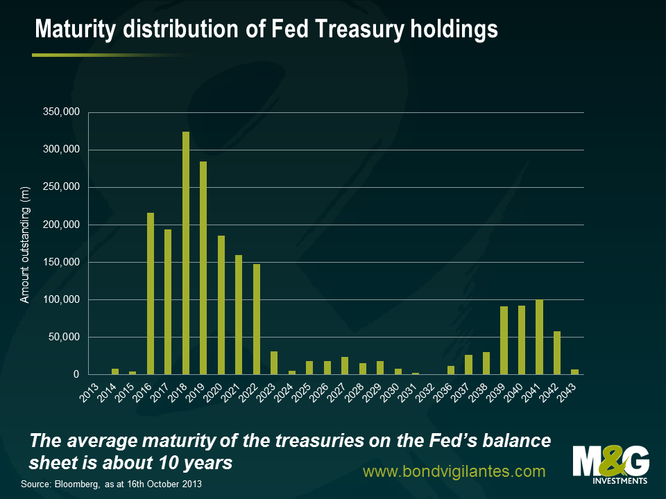
I’ve calculated that the average maturity of all Treasuries in issue is roughly 6 years, whilst the average of those on the Fed’s balance sheet is about 10 years. Operation Twist was a conscious effort by the fed to lower long run yields and they are still buying bonds at the long end. Given that factors other than the steepness of the yield curve are driving bank lending perhaps the Fed should be buying fewer Treasuries with 7-10 years to maturity in favour of even more longer dated ones. Also if and when they decide to sell their holdings they should consider this (and the on-going) analysis on the wider implications of altering the average maturity of the Treasury free float.
There are plenty of other interesting observations and questions raised in the paper so I recommend reading the whole thing…..especially if your job involves managing a central bank balance sheet.
Back in January I wrote about why we loved the US dollar and worry about EM currencies, and did an update on EM in June (see EM debt funds hit by record daily outflow – is this a tremor, or is this ‘The Big One’?). Another EM piece will follow soon (the short version is that while it was ‘just’ a tremor, I’m increasingly worried that ‘The Big One’ is coming).
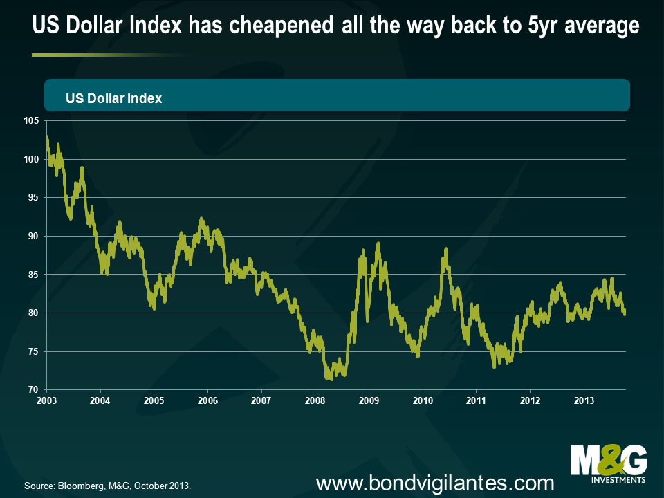
The US Dollar was strong through Q1 and Q2, but an interesting development in Q3 was that while the US Dollar held up OK against most EM currencies, it performed abysmally against other developed currencies. Below is a chart of the US Dollar Index, a gauge of US Dollar performance against a basket of major world currencies, where the basket contains EUR (57.6%) JPY( 13.6%) GBP (11.9%) CAD (9.1%) SEK (4.2%) CHF (3.6%). The Dollar Index is back to where it was at the beginning of the year, and despite the relative strength of the US economy versus other developed countries, the Dollar Index has now returned to the average level of the last five years.
The reasons that led us (and an increasing number of others) to be so excited about the US dollar over the past 18 months were namely compelling USD valuations following a decade long slump, an improving current account balance, the rapid move towards energy independence, and a strengthening US economic recovery where a surging housing market and a steadily falling unemployment rate made it likely that the US would lead most of the world in the monetary policy tightening cycle.
The long term positives for the US dollar are still there, but have recently been overshadowed by negative ones. So what has changed? Recent US Dollar weakness is probably to do with the Fed’s non-tapering in September, the ongoing budget nonsense, and a very big unwind in a whole heap of long USD positions.
It makes sense to be more bullish on the US dollar because these negative forces appear to be dissipating.
Firstly the non-tapering event. Treasury yields and the US dollar had already started to drop ahead of the non-tapering decision thanks to a slight weakening in US data, with US 10 year yields dropping from 3% on September 5th to 2.9% on September 18th and the Dollar Index falling 2%. Nevertheless markets were still taken by surprise, and Treasury yields and the US Dollar had another leg lower with US 10 year yields briefly dropping below 2.6% at the end of September, and the Dollar Index falling almost another 2%.
But then on Wednesday we had September’s FOMC minutes, which were surprisingly hawkish. The decision not to taper was a close call, where most members still viewed it as appropriate for tapering to start this year and for asset purchases to be finished by the middle of next year. Yes, the US government shutdown that has occurred since the meeting took place appears to be already starting to hit US economic data (estimates vary enormously for the total hit to Q4 US GDP), and the weaker data is therefore likely to push the start date for tapering back a little. But if you assume that the US government shutdown is a one off event (admittedly not a particularly safe assumption), then the shutdown should merely slightly delay the tapering decision and the normalisation of US monetary policy, it should not result in a permanent postponement.
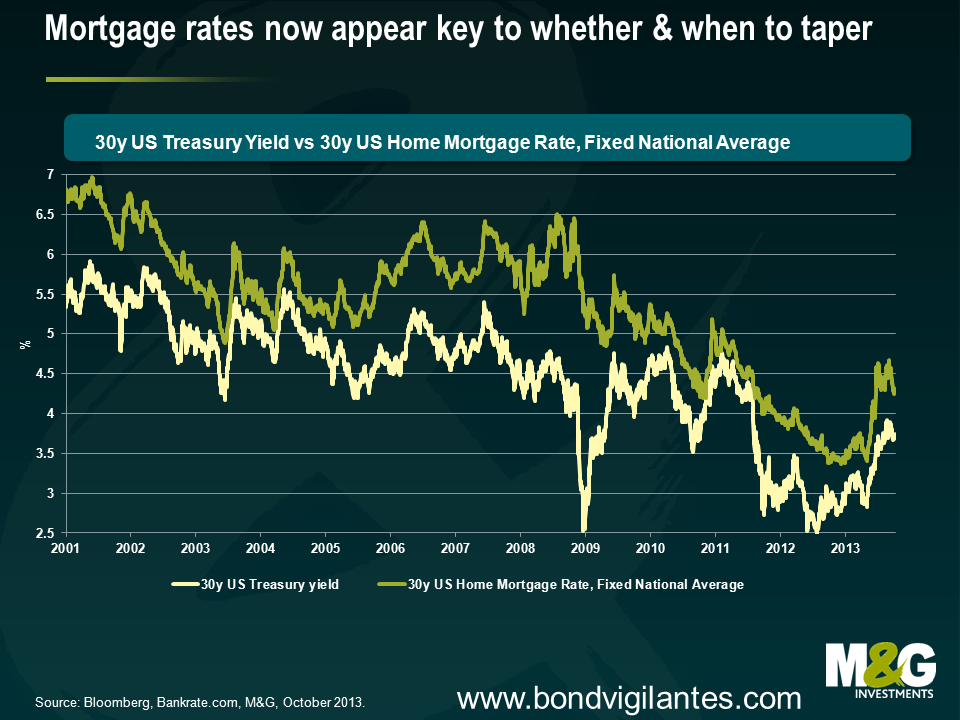
That said, something that was a little disconcerting from the minutes of the September FOMC meeting was that the jump in mortgage rates played a key role in the decision not to start tapering, with some members worrying that a reduction in asset purchases “might trigger an additional unwarranted tightening of financial conditions”. HSBC’s Kevin Logan makes the good point that higher mortgage rates present Fed policy makers with a dilemma; if rates rise because the markets expect a tapering of QE, and that in turn stops the Fed from tapering, then it makes any QE exit pretty tricky and it appears that the Fed now has an additional criterion for reducing QE – not only must the economy and labour market be doing better, but long-term interest rates cannot rise too much in advance, or even during, the tapering process. If the Fed’s decision not to taper was heavily influenced by higher mortgage rates, though, then their fears should now be allayed given the chart below. This chart, together with the effect that mortgage rates have on the US housing market, has clearly taken on added importance.
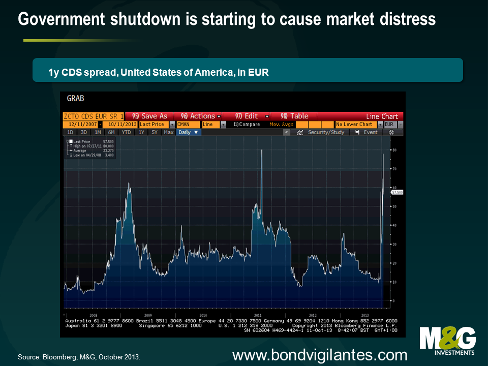
What about the ongoing budget nonsense? This one takes a bit of a leap of faith, but markets are clearly starting to price in the risk of something going very badly wrong as demonstrated by the jump in T-bill yields and the surge in 1yr US CDS (i.e. the cost of insuring against a US default, see chart below). But market stresses should make the prospect of a deal more likely, and this appears to be starting to happen. It’s dangerous reading too much into the headline tennis, but the latest news is that Republican and Democratic leaders are open to a short term increase in the debt limit. And don’t forget, the debt ceiling has been raised 74 times since March 1962 – past performance is no guide to the future as everyone knows, but while this episode is particularly chaotic, is this time really different?
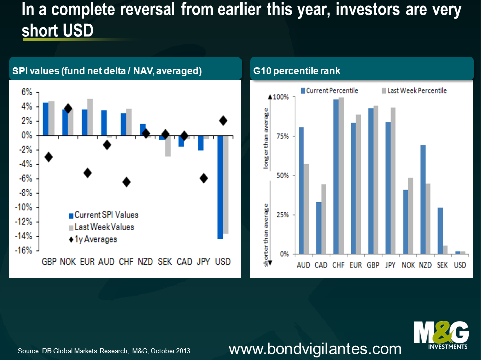
Finally, the technicals for the US Dollar are now much more appealing. US Dollar positioning has seen a sharp reversal from earlier this year, and Deutsche Bank estimates the US dollar is the only substantial short in the market (see charts below). Does this matter? To finish with a quote from John Maynard Keynes* regarding investing, “It is the one sphere of life and activity where victory, security and success is always to the minority and never to the majority. When you find any one agreeing with you, change your mind. When I can persuade the Board of my Insurance Company to buy a share, that, I am learning from experience, is the right moment for selling it”‘.
*Keynes is famous for amassing a fortune through investing, but in 1920 he had to be bailed out by his father together with an emergency loan from Sir Ernest Cassel, and he came very close to being wiped out in the 1929 and 1937 stock market crashes. So clearly the consensus can occasionally be right.
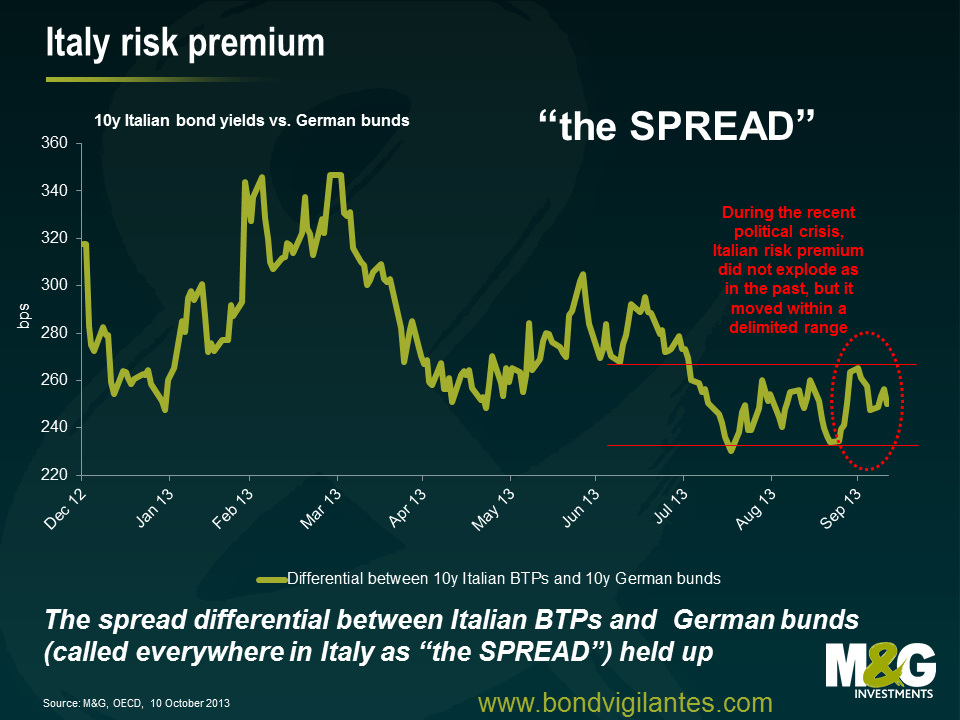
Italian politics has been in the international news, again. Markets tend to fear instability and Italy is always a creative and boundless source of uncertainty. We Italians have a wonderful ability to put ourselves into trouble. The good news is that markets in recent weeks have held up more than in the past.
1 – Political life in the peninsula
In the last few weeks, research from many well-known investment banks has identified Italy as one of the two major global sources of near-term risk for capital markets (the other being the US shutdown). The crisis started when Mr. Berlusconi asked his ministers to resign from the government in order to push for new elections. However, against expectations, the risk dissolved almost as quickly as it appeared when Mr. Letta won the ensuing confidence vote with large support. While this was good news, what is next in store for Italian politics? While I can’t forecast the future, I can say that Italy will never change in this sense. Uncertainties around party and electoral laws, social policies, public debt, tax evasion, structural reforms, trade interests and inefficient regulations (to name just a few) will be around for a long time in a nation that is incapable of moving quickly. While political risk will remain a source of noise, investors excessively focused on it may miss the bigger picture, both on the downside and on the upside.
2 – Bad news first: above and beyond the “Res Publica”
In the land where the ancient Roman Empire began, several economic problems have lingered for decades. Public debt at EUR 2 trillion (of which around 30% is non-resident holdings, according to IMF Dec 2012 numbers) is enormous with a debt/GDP number worryingly on the rise. The key concern for investors should be the implication of carrying such a high interest expense, together with the overall amount of public spending. The Italian system – including salaries for public sector employees, general benefits, ongoing expenses to run the state and transfers to local administrations – costs over EUR 790 billion (or 51% of GDP) to taxpayers each year. Interest expenses alone cost EUR 85 billion. As an anecdote, did you know that the Italian Parliament cost taxpayers about EUR 1.65 bln in 2011, as much as the English, French and German ones together? Once accounting for sub-optimal GDP growth, the necessary resources to invest in productivity, social measures and new business initiatives remain scarce. At the same time, there is limited scope to reduce the high tax burden which affects families and impacts the ability of companies to become more competitive on international markets. In the World’s Economic Forum latest Global Competitiveness Report, Italy, the world’s 9th biggest economy, was moved down from number 42 to 49.
In parallel, doing business within the country remains problematic for companies and entrepreneurs:
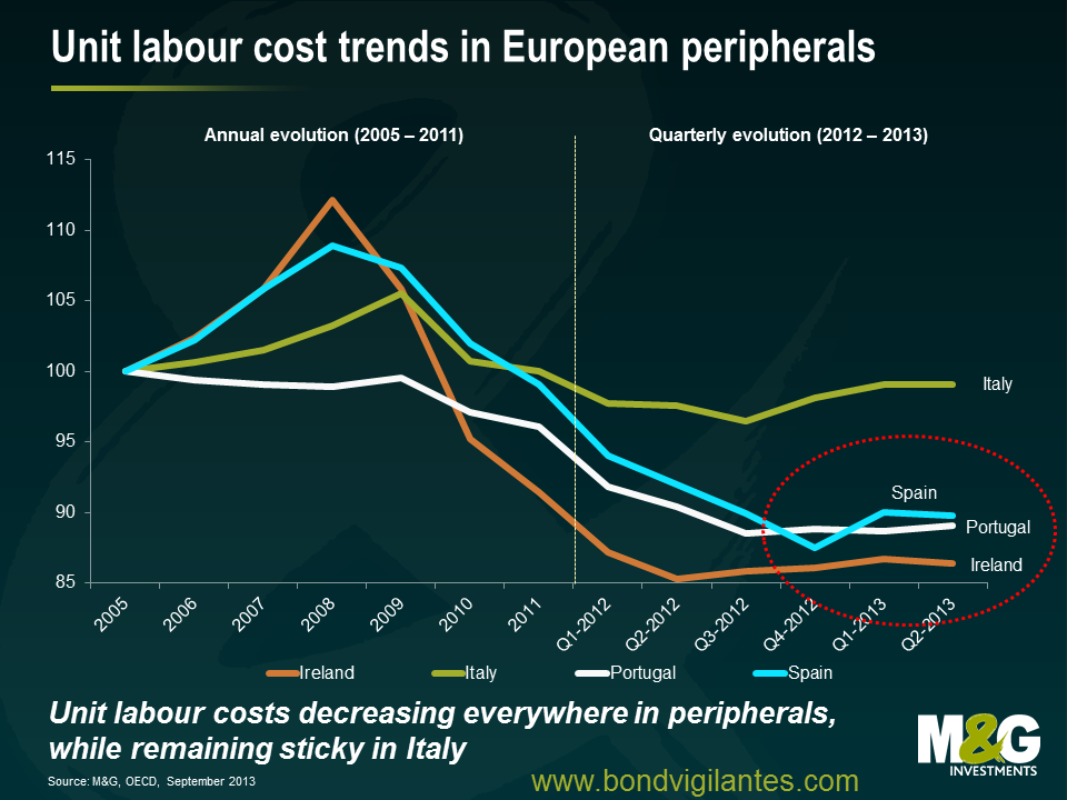
Additional ongoing economic issues in Italy are well known, from rising unemployment (latest reading in August reports a rate of 12.2%, with youth unemployment at 40.1%) to the excessive power of trade unions. Moreover, while labour costs have decreased in other European peripheral countries helping to make them more competitive, they have not done so in the “Bel Paese”.
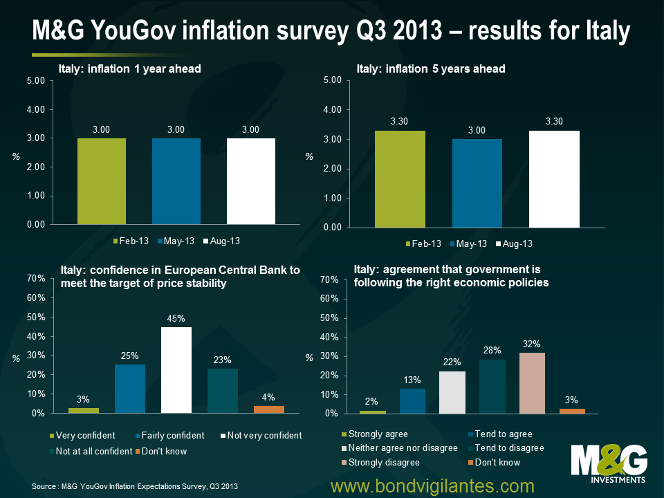
As a result of all of the above, Italian citizens – not surprisingly – have limited trust in institutions. The latest M&G YouGov Q3 2013 inflation report showed that the majority of respondents have little confidence in the government’s ability to follow the right economic policies. Results show a lack of trust in the government’s actions, but also a decreasing confidence in the central bank’s ability to maintain price stability over the medium term (ie inflation around 2%). For Italians, the European Central Bank is not doing much, suggesting that forward guidance measures may have been poorly received. Italians are also expecting a shift in inflation dynamics in the future, forecasting inflation up to 3% over 1 year and up to 3.3% over 5 years. This compares with the current inflation figure of 0.9% as of August 2013, reflecting the recession and a weak labour market.
3 – Now the good news: improving economic trends, size of private wealth and resiliency of Italian companies doing business abroad provide a different picture worth considering.
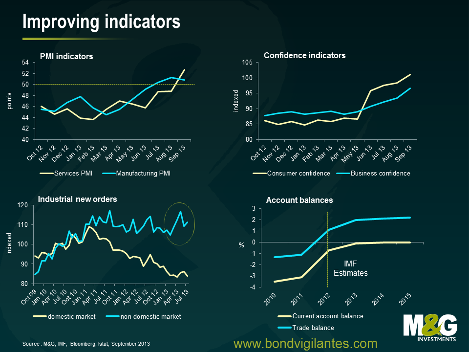
While the IMF expects Italy to come back to modest growth by 2014 with a GDP of only 0.7%, better news is that after nearly two years of recession Italy’s economy is showing signs of stabilising. Some indicators are finally improving, from PMI indices to confidence indicators and industrial new orders for the non-domestic market. The banking sector is progressing, even if we continue to be concerned. Let’s review some key developments.
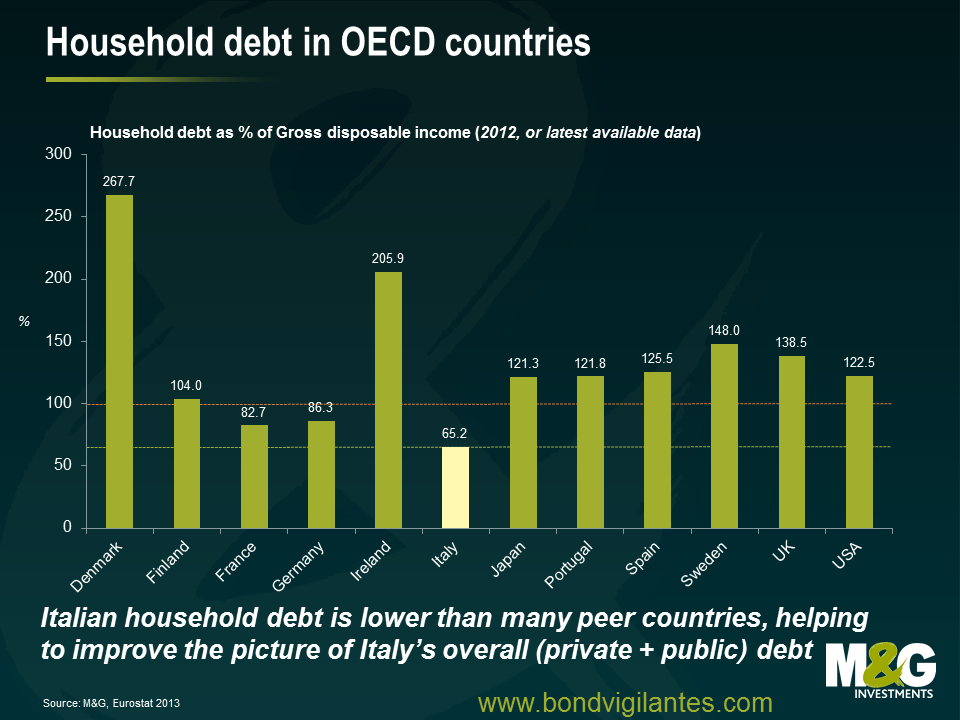
While unemployment, weak growth and other factors have eroded household income in the last few years – impacting both domestic demand (consumption) and savings rate – the existing stock of private wealth in the Italian peninsula (the sum of financial and non-financial assets minus liabilities) may offer a surprise. Wealth is one of the key components of the economic system, a source of finance for future consumption, for reducing vulnerability to shocks and to other unexpected developments, and for undertaking business and other economic activities. Italy is characterised by still having one of the highest levels of private wealth (gross household wealth) in Europe with a total of EUR 9 trillion assets, or 8.5 times the nominal disposable income (OECD 2013, based on 2011 figures). In the UK and France this figure is around 8 times, and only 7.6 times in Japan, 6.3 times in Germany and 5.2 times in the US. Such a high stock of savings is not a bad resource in times of economic downturn. These accumulated savings allow families to keep consuming (even if less than before) and, in many cases, prevent the long-term unemployed from a dramatic fall into poverty, thereby preventing social unrest and disorder. Moreover, given a low household indebtedness in the nation (even if on an increasing trend), the overall gross debt mix (public and private) provides a better picture than public debt on a stand-alone basis and looks broadly in line with the Euro area average around 300% of GDP.
On a different perspective, doing business outside Italy can be great for Italian companies. An IMF report issued last Friday highlights the strength of Italian exports in the face of a depressed global demand. Findings show that Italian trading firms continue to be solid, adaptable and resilient. At a macro level, with exports revamping and a depressed domestic economy keeping imports weak, the current account balance is improving. At micro-level, unlike many other European countries, Italy‘s tradeable sector continues to perform in a context of an established competition from low cost emerging markets. Agility, capacity for incremental innovation and a diversified range of high-quality, high-margin products have been highlighted as central factors allowing Italy to maintain its relative world position. The country remains the world‘s top ranked exporter in textiles, clothing and leather goods; it is ranked second in the world (behind Germany) for non-electronic machinery and manufacturing.
A number of Italian, non financial companies have very valuable brands recognised at a global level. Many are well managed businesses which continue to generate value, provide a source of talent and will continue to compete in international markets in the future. On the banking side, Italian banks on average have so far managed to overcome the shocks coming from a severe and prolonged recession at home and the crisis in Europe. Quoting a recent IMF report on Italian banks, the system has stabilised. Banks expanded domestic deposits and built additional capital buffers without significant state support. In addition, the impact of the sovereign debt crisis has been softened by the ECB intervention via LTRO and OMT announcement, shielding Italian banks from wholesale funding volatility. Capital buffers have strengthened in recent years and seem sufficient to absorb most of the losses in case of an adverse shock. In the team, we continue to believe that the system is not out of danger, though. Continuing weakness in the real economy and the link between the financial sector and the sovereign remain key risks. Weak profitability and deteriorating loan quality (the average non-performing loan ratio has nearly tripled to 14 per cent since 2007) are the most pressing vulnerabilities affecting Italian banks, while the coverage of non-performing loans by provisions and collateral remains lower than most other EU countries, a concern as the ECB is set to review banks’ asset quality in the first half of 2014. Moreover, while the decline of Italian sovereign yields from their peaks has eased these pressures, the crisis in Europe has not ended. Banks with large holdings of Italian government securities continue to be exposed to direct mark-to-market losses and higher funding costs should sovereign yields surge again.
We cannot ignore the ongoing concerns that the Italian economy and domestic companies continue to face. That said, it is important to continue to monitor progress towards a stronger and more competitive Italian growth model. Italian assets have rebounded strongly in 2013 (despite the recent political-induced wobble) and there are some good examples in credit markets of well diversified companies that are trading cheap, not because of fundamental problems, but reflecting the stress that Italian government bonds have come under in recent years. Valuation remains key for credit investors, and fundamental analysis will be crucial to picking winners in the peripheral markets.
Since we started writing these blogs almost 7 years ago we have spent an understandably great deal of time discussing Bank of England monetary policy in the UK, initially with regard to conventional interest rate policy and now in the context of the unconventional policies we see today.
The most recent unconventional twist for monetary policy is not emanating from the Bank of England itself, but is effectively coming directly from the government. The Help to Buy home ownership scheme is a direct attempt to make the monetary transmission system more effective, with its supporters claiming it is a way to get free markets working so that good borrowers can access appropriate funding, while its detractors claim it’s stoking a housing boom and fuelling the next crisis.
One of the ways that monetary policy in the UK works is through the housing market. Interest rate changes reduce the cost of financing, which increases disposable income, or allows an individual to own a larger house for the same mortgage payments. This creates immediate wealth via higher disposable income, economic activity via the associated services and goods consumption that occurs with house moves, and a wealth effect as house prices rise.
It has been pretty plain that the connection between official interest rates and rates available in the real world has broken down during the financial crisis, as the banking system has been repressed from a capital, confidence, and regulatory point of view. The authorities have tried to counteract this by providing capital, encouraging the raising of capital, and providing huge amounts of liquidity. However, the traditional mechanism of rates feeding into the real economy in the UK via the housing channel was limited.
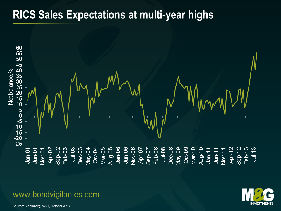
The Help to Buy and other schemes such as Funding for Lending are attempts to mend the disconnect between official rates, the banking system, and the real economy. Therefore they should be welcomed as an attempt to make monetary policy work again. This unconventional policy appears to be working. The UK housing market is strong. This week’s RICS survey showed that home sales in September reached a near four year high and the market is improving across the country, not just in London. As the chart below shows, there is potential for further strength in the future too, with sales expectations for the next three months reaching new highs.
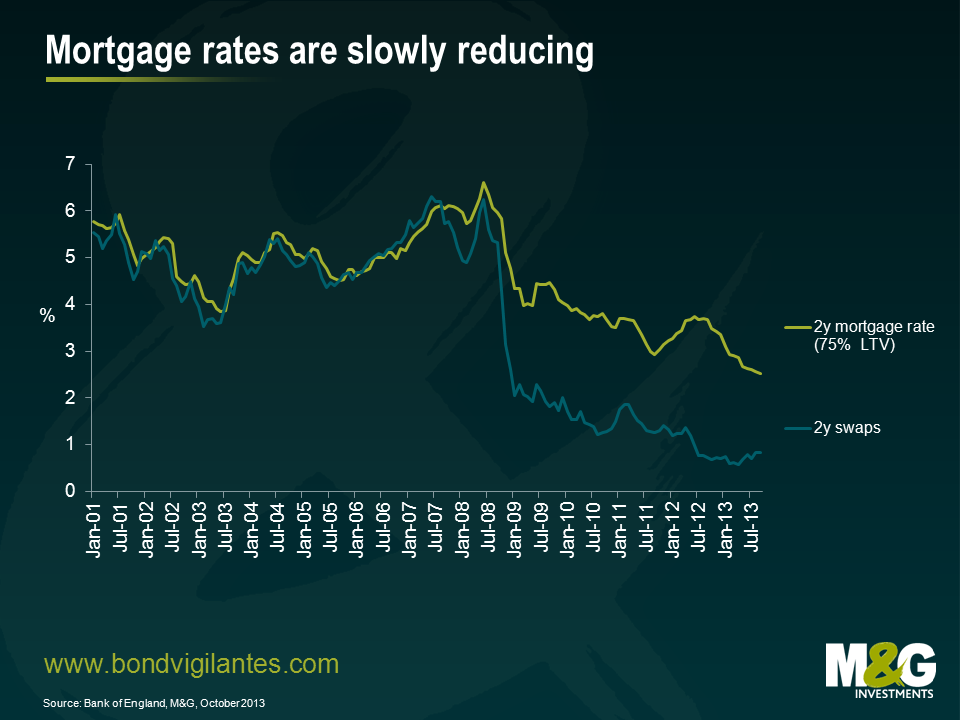
My next chart shows 2 year fixed mortgage rates plotted against 2 year swap rates. As you can see, although swap rates plummeted from late 2008, when official interest rates were slashed in the height of the credit crisis, these falls were not passed on to the same degree in the real world through mortgage rates. But they are now becoming slowly more aligned, as swap rates have been gradually rising recently and mortgage rates continue to fall. This is obviously good for the housing market and the economy. This effect is about to get bigger as the availability of low deposit mortgages should provide a strong boost to all the activity associated with housing.
Why has it taken so long to introduce this unconventional measure? It could have been a reluctance to stoke the housing market following the last crash, a belief that these kind of non-standard measures would not be needed, or it could be that it has been timed now in an attempt to push the economic cycle in line with the UK political cycle. The latter seems to be a consequence of the measures. They have been introduced in time to boost the housing market and the economy, and are set to expire before the election to encourage a rush of buying, as occurred with the removal of mortgage interest tax relief in the 1980s.
The UK economy looks set to be strong in the run up to the election as the disconnect between official rates and real activity gets resolved. The liquidity trap is being solved by government action. For better or worse, the UK housing market is going to be at the centre of UK economic activity once again.
Times are changing in Spain, or at least they might – and I am not alluding to tentative signs of economic recovery, such as the recent upgrade of Spain’s 2014 growth forecast from 0.5% to 0.7%. I am, quite literally, referring to a possible change of time in Spain. In late September, a Spanish parliamentary commission issued a report in favour of turning clocks back one hour in Spain. Being located in the wrong time zone, so the argument goes, had negative implications on eating, sleeping and working habits, and hence, a corrective time shift might improve public health as well as economic productivity. Interestingly, Spain had not always been in its current time zone but was moved one hour ahead in 1940 at General Franco’s command to be in line with then fascist allies Germany and Italy. But does the commission have a point; should Spain return to its pre-war time zone?
Let’s have a look at time zones in the European Union. Ignoring overseas territories, EU member countries use three time zones – Western European Time (WET, UTC+00:00), Central European Time (CET, UTC+01:00) and Eastern European Time (EET, UTC+02:00) – as well as the respective daylight saving time derivatives. In the following, only relative time differences between countries will be relevant. Therefore, to simplify matters, we can disregard daylight saving time since all EU member countries move clocks back and forth in sync anyway. Only three EU countries use WET: Portugal, Ireland and the UK. EET is used in the Baltics as well as in Finland, Romania, Bulgaria, Greece and Cyprus. Spain, except for the Canary Islands, is located in the CET zone together with the remaining EU countries.
In order to assess on a geographical basis whether Spain is placed in the wrong time zone or not, I took a look at the location of some of the largest Spanish and other major European cities using WET or CET. For each city I then calculated in degrees of longitude the difference between its actual location and the central axis of its time zone, i.e. the prime meridian for WET and the 15th meridian east for CET.
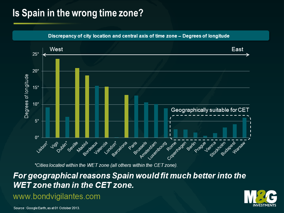
Amongst these European cities, sorted from west to east, Spanish towns (light green colour) exhibit the highest levels of misplacement. In particular Vigo, located in the north-west autonomous community of Galicia, features an impressive discrepancy of nearly 24°. Apart from Spain, cities in western France, such as Bordeaux, show very high displacement values. Western European cities using WET (marked with an asterisk), e.g. Lisbon, Dublin and London, have distinctly lower discrepancies, though, as their reference axis is the prime meridian rather than the 15th meridian east. Strictly speaking, only cities east of the Benelux countries, i.e. Rome onwards in the chart, are fitting geographically into the CET zone. Spain, in contrast, is clearly much more suitable for the WET zone. Sticking with CET causes a permanent mismatch between official time and actually perceived solar time. But why has Spain not switched to WET long time ago?
One reason is that some of the effects of the time mismatch are actually considered desirable. For instance, an extra hour of sunshine in the evening might be beneficial for tourism in Spain. Another consideration to be taken into account is the effect a change from CET to WET would have on Spain’s cross-border business. It is likely that in case of a switch to WET, business with CET countries would become more difficult. Due to a misalignment of daily schedules, business and trading hours, transaction costs could rise. Similarly business with EET countries might suffer as an additional hour of time difference would be added. In contrast, business with WET countries would most likely be facilitated. In order to evaluate these contrary effects, I grouped Spain’s intra-EU exports and imports over the past five years into time zones. For the sake of simplicity, I did not include Spain’s foreign trade outside of the EU. Major trading partners, such as China and the US, are separated from Spain by several time zones, and hence a shift of one hour would most likely have only negligible consequences.

Over the past five years the composition of Spain’s EU exports and imports by time zone has remained remarkably stable. EET countries are only niche markets for Spain’s exports and imports. Both sides of the balance of trade are clearly dominated by business with CET countries (72-74% of exports and 80-81% of imports). Exports to and imports from WET countries account for only 22-24% and 16-18%, respectively. This suggests that moving from CET to WET bears the risk of making the vast majority of Spain’s EU trade more difficult.
But is there a way to reduce this risk and still enable Spain to switch to WET? Well, here is a thought: Spain could launch a lobbying campaign and convince France as well as the Benelux countries to switch together from CET to WET. As shown in Chart 1, cities in these countries, particularly in western France, would geographically fit much better into the WET zone. In addition, there is also a political argument to be put forward as CET was introduced at gunpoint in these countries during the German occupation in the Second World War. Therefore, a move to WET could be presented to the affected electorate as a long overdue measure to remove the legacy of fascist aggression in western Europe – and who could seriously question such an honourable pursuit? A large-scale move of several major EU countries from CET to WET would have significant implications for the composition of Spain’s EU exports and imports as well as for the economic power balance of the EU in general. The below chart compares the actual 2012 percentage division of Spain’s EU exports and imports as well as the EU’s GDP into time zones with a hypothetical 2012 scenario in which Spain, France and the Benelux countries are located within the WET zone.
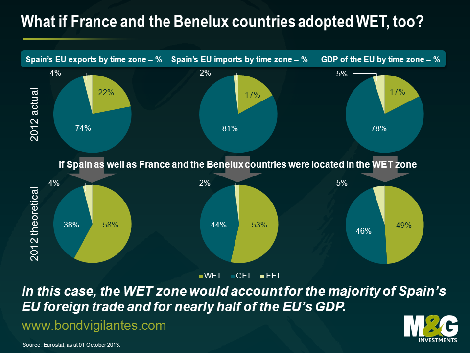
As pointed out above, in terms of Spain’s EU exports and imports CET countries currently dominate over WET countries. However, if other major western European countries moved together with Spain to WET this relationship would reverse, as indicated in the theoretical scenario. In this case, WET countries would account for 58% of Spain’s EU exports and 53% of its EU imports. Furthermore, the economic weights of CET and WET within the EU would change drastically. The WET’s share of the total EU GDP would rise from 17% to 49%, whereas the CET’s share would drop accordingly from 78% to 46%.
In conclusion, it would make perfect sense for Spain to switch from CET to WET for geographical reasons. However, in order to guard against potential negative side effects on its cross-border business, Spain should lobby hard to convince France and the Benelux countries to copy its move. If this move is successful, then Portugal, Ireland and the UK will likely benefit as well.
Finally, if you think Spain has time-keeping issues, spare a thought for India and China. Indian Standard Time applies throughout India and Sri Lanka, and is confusingly GMT+ 5 hours 30 minutes. The time zone covers over 28 degrees of longitude, meaning the sun rises two hours earlier in the east of India than the west. Meanwhile, China has one official time zone spanning more than 60 degrees of longitude (the 48 contiguous US states cover 25 degrees of longitude), and while this problem is tempered by most of the Chinese population living on the east coast, sunrise in the western city of Kashgar can be as late as 10.17am!
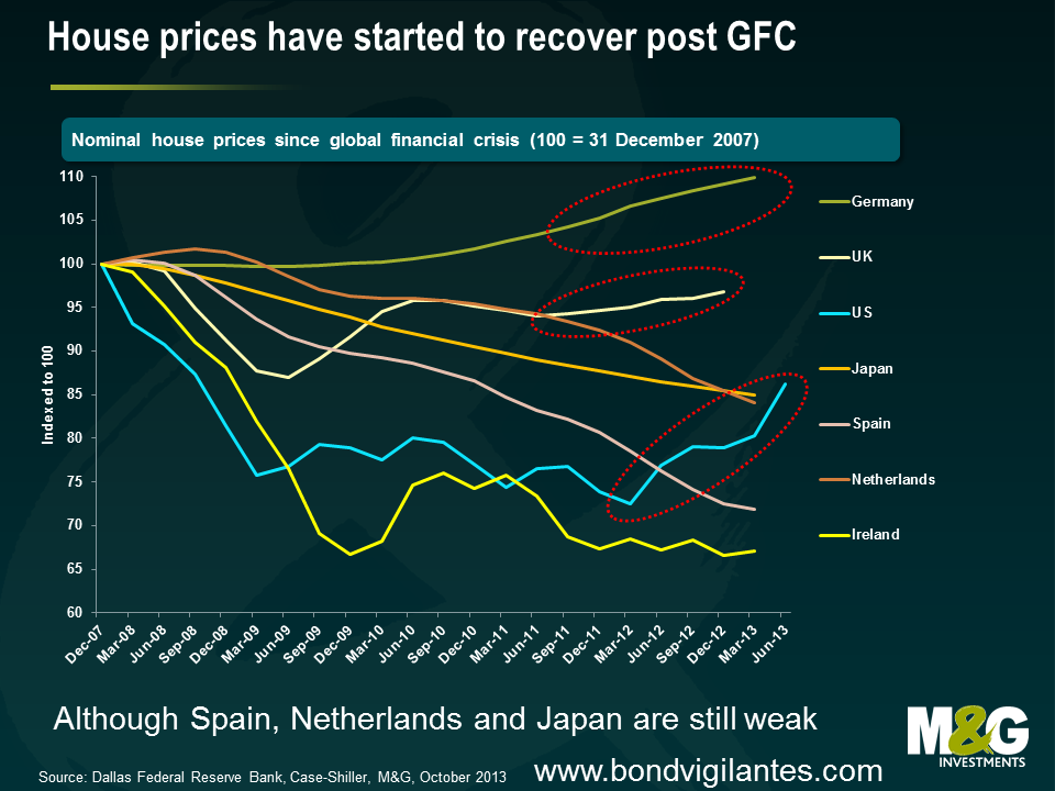
After the collapse in real estate prices in many of the major developed nations during and after the Great Financial Crisis, housing is back in demand again. Strong house price appreciation is being seen in most areas of the US, in the UK (especially in London), and German property prices have started to move up. We’re even seeing prices rise in parts of Ireland, the poster child for the property boom and bust cycle. I wanted to take a quick look at what rising house prices do for inflation rates. Not the second round effects of higher house prices feeding into wage demands, or the increased cost of plumbers and carpets, but the direct way that either house prices, mortgage costs and rents end up in our published inflation stats. Also, the question about whether central banks should target asset prices is another debate too (there’s some good discussion on that here).
There is no simple answer to the question “how do house prices feed into the inflation statistics”. It varies not just from country to country, but also within the different measures of inflation within one geographical area. But given central banks’ rate setting/QE behaviour is determined by the published inflation measures it’s important to understand how house prices might, or might not, drive changes in those measures.
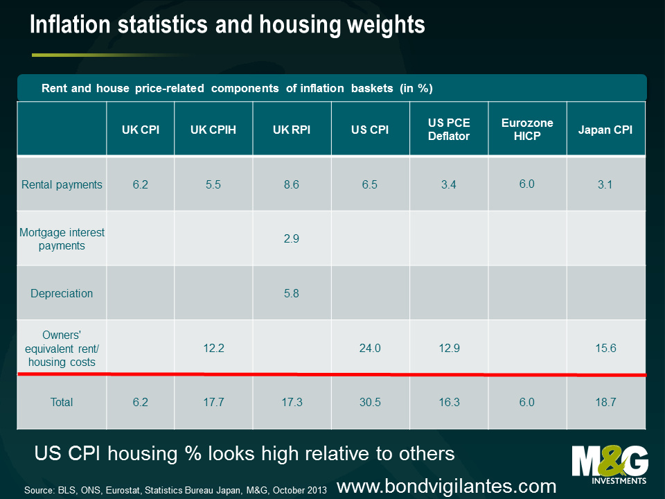
“Shelter” is around 31% of the CPI which is used to determine the pricing of US inflation linked bonds (TIPS), but just 16% of the Core PCE Deflator, the measure that the Federal Reserve targets. The PCE is a broader measure, with much bigger weights to financial services and healthcare, so shelter measures therefore have to have a smaller weight in that measure. The CPI shelter weight looks high by international standards. For the Bureau of Labor Statistics, the purchase price of a house is not important except in how it influences the ongoing cost of providing shelter to its inhabitants. The method that the BLS uses to determine what those costs might be is “rental equivalence”. It surveys actual market rents, and augments this data by asking a sample of homeowners to estimate what it would cost them to rent the property that they live in (excluding utility bills and furniture). You can read a detailed explanation of this process here. In both the CPI and PCE, pure market rents are given around a quarter of the weight given to OER, Owners’ Equivalent Rent. There are problems with this – and not just with the accuracy of the homeowners’ rental guesses. Having rents and rental equivalence in the inflation data rather than a house price measure means that you can have – simultaneously – a house price bubble, and a falling impact from house prices in the inflation data. We’ve seen times when a speculative frenzy means house prices rise, but the impact of that speculation is overbuilding of property (just before the 2008 crash there was 12 months of excess inventory of houses in the US compared to a pre-bubble level of around 5 months) leading to falling rents. The reverse happened as the US recovered. House prices continued to tank, but because of a lack of mortgage finance more people were forced to rent, pushing up rents within the inflation data.
How house prices feed into the UK inflation data depends on whether you care about CPI inflation (which the Bank of England targets) or RPI inflation (which we bond investors care about as it’s the statistic referenced by the UK index linked bond markets). House prices directly feed into the RPI, but because house prices have little direct input into the CPI, the recent trend higher in UK property will lead to a growing wedge between the two measures – good news for index linked bond investors! The RPI captures house price rises in two ways – through Mortgage Interest Payments (MIPs) and House Depreciation. Mortgage payments will increase as the price of property rises, but they will most quickly reflect changes in interest rates. For example Alan Clarke of Scotia estimates that a hike in Bank Rate of 150 bps would feed almost immediately into the RPI, adding 1% to the annual rate. This is despite the trend in the UK for people to fix their mortgage payments. Housing Depreciation linked to UK house prices with a lag, and is an attempt to measure the cost of ownership (a bit like the BLS’s aim with rental equivalence) but has been criticized as overstating the cost of ownership in rising markets as house price inflation is almost always about land values accelerating rather than the bricks and mortar themselves. Land does not depreciate like other fixed assets (no wear and tear). Housing is very significant in the UK RPI, making up 17.3% of the basket (8.6% actual rents, 2.9% MIPs, 5.8% depreciation).
The UK’s CPI is a European harmonised measure of inflation. It only takes account of housing costs through a 6% weight on actual rents. There has never been agreement within the EU about how wider housing costs should be measured! Countries with high levels of home ownership have different views from countries with a high proportion of renters. Housing is around 18% of the expenditure of a typical person in the UK, so the Office of National Statistics regards the current CPI weight as a “weakness”. They therefore are now publishing CPIH, which includes housing on a rental equivalence basis (the same idea that the ONS measures “the price owner occupiers would need to rent their own home” as a dwelling is a “capital good, and therefore not consumed, but instead provides a flow of services that are consumed each period”). CPIH has a 17.7% weight to housing, but remains an experimental series, and plays no part in the official monetary targets.
The European Central Bank targets CPI inflation, at or a little below 2%. As mentioned above the harmonised measure that Eurostat produces does not include any measure of housing other than actual rents, with a weight of 6%. If you think house price inflation (or deflation) is important for policymakers this low weighting has probably never mattered since the Eurozone came into existence. Although there have been pockets of very high house price inflation (Spain, Ireland, Netherlands) because the Big 3, Germany, France and Italy have had very little house price movement I doubt that a CPIH measure would be terribly different. We are, however, now seeing some upwards movements in the German residential property market in “prime” regions – albeit it as Spanish and Dutch house prices continue to freefall. It’s also important to note the range of importance of rents within the individual countries’ CPI numbers. For Slovenians it makes up 0.7% of their inflation basket, but for the Germans it is 10.2%.
Housing makes up 21% of the headline CPI. Like the US CPI the Japanese statistical authorities use a measure of an “imputed rent of an owner-occupied house” as well as actual rental costs. Again the imputed rents from owner occupiers (15.6%) dwarf the actual numbers from renters (5.4%) – aren’t these large weightings to imputed rents here and elsewhere a bit worrying? How would you homeowners reading this go about guessing a rent for your property? I’d only get close by looking at websites for similar places to mine up for rent nearby. Is that cheating?
So why does this matter? Well if there is no correlation between house price inflation and consumer price inflation then it probably doesn’t. But intuitively both the direct impact on wage demands of workers who see house prices going up, and the wealth effect on the consumption of those who see their biggest asset surging in value should be significant. Therefore central banks will be missing this if they use statistics where the relationship between house prices and their impact in those statistics is weak.


Sign up to the Bond Vigilantes mailing list to ensure you never miss a great article from our expert Bloggers. We will email all new articles to your inbox, meaning you can stay on top of the world of Bonds.
I confirm that I would like to receive information about Bond Vigilantes and products and services from M&G Securities Limited.
We will use the email address and personal data you have shared with us to send you this information. For existing customers, submitting your contact details and requesting to receive this information from us, will replace any earlier choices you have made in respect of marketing information.
You can unsubscribe from marketing at any time, at which point we will not send any further marketing information to you, by selecting the unsubscribe link in all communications.