World Cup
The Bond Vigilantes World Cup Model
By Joe Sullivan-Bissett
11 June 2026


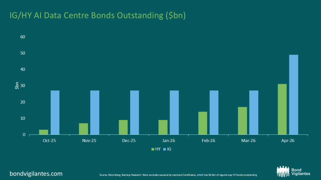
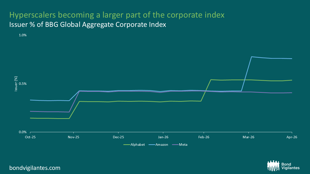
The biggest shift in credit markets over the past six months hasn’t come from banks or industrials, but from Big Tech.
Alphabet, Amazon and Meta have been issuing debt on a scale rarely seen in the sector. Combined, these companies are now among the most significant contributors to global corporate bond supply – a development that is beginning to reshape investment grade credit markets.
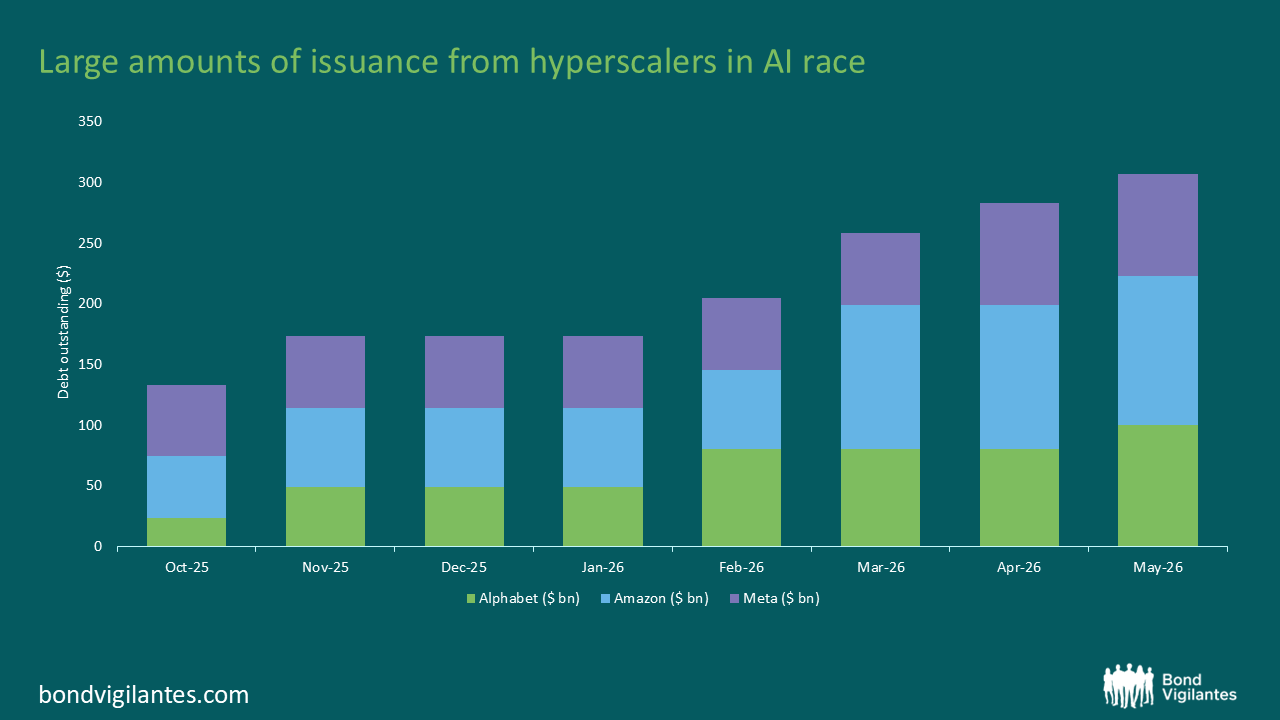
Source: Bloomberg, May 2026
This wave of issuance reflects a simple reality: the largest technology companies are entering a capital expenditure cycle that can’t be funded through cash flow alone.
Two forces sit behind this shift.
First, artificial intelligence. The build-out of data centres, semiconductors, networks and supporting infrastructure is extraordinarily capital intensive, even by the standards of the technology sector. As in previous investment cycles in telecoms and media, balance sheets are expanding to fund what is seen as the next phase of structural growth.
Second, US policy. Incentives embedded in the current fiscal framework have materially improved the economics of domestic capital expenditure, effectively accelerating investment. In practice, this acts as a subsidy and corporates are responding accordingly.
Normally, a sharp increase in borrowing would place pressure on credit quality. But in this case, the scale of earnings matters more than the scale of issuance.
With EBITDA across Alphabet, Amazon and Meta running at roughly $150bn to $200bn, even large increases in debt translate into only modest changes in leverage. The impact on debt-to-EBITDA is limited, and these issuers remain well within high investment grade rating thresholds.
The more immediate effect is on market pricing.
Bond markets tend to react to large increases in supply by demanding a higher spread. This dynamic is well established, particularly in sectors experiencing capex-driven issuance cycles. What makes the current episode notable is that it is occurring in some of the highest-quality names in the market.
These companies are becoming a larger part of major bond indices. Their growing weight in benchmarks such as the Bloomberg Global Aggregate Corporate Index reflects both the scale and persistence of issuance.
Source: Bloomberg, May 2026
Yet there are structural constraints on the demand side.
Unlike equity investors, bond portfolios are typically subject to strict diversification limits. Exposure to any single issuer is capped well below levels commonly seen in equities. This means that even highly rated issuers can struggle to find incremental buyers when supply increases sharply.
In the short term, the bond market simply finds it difficult to absorb issuance at this scale.
The result is a notable dislocation. Some of the largest, most profitable companies in the world are issuing debt at spreads that appear attractive relative to the broader investment grade market.
For investors, that creates a clear opportunity.
The combination of strong fundamentals, policy-driven investment and temporary supply pressure is opening a window into high-quality credit at more favourable valuations than might otherwise be expected.
In other words, today’s surge in Big Tech borrowing is not just a story about funding growth – it is also creating a rare entry point for bond investors and an opportunity to invest in Big Beautiful Bonds.
In writing these blogs one hopes to be insightful, consistent, and timely, ie to try to emulate the output of Howard Marks at Oaktree.
His memo of January this year on equities inspired us to look further into the relative attractiveness of bonds vs equities (here).
Howard has updated his thoughts in August (link) – this looks like something that is seriously on his mind. It is on ours as well, so we thought we would update our thinking on our Weighted Outlook On Long-term Yields.
The principle of investing is a function of choosing a good investment at the right price. When looking at the S&P 500, there are many great companies, but is the price cheap, fair, or expensive?
When we look at prospective returns based on current price to earnings (PE) ratios, we get a gauge of that price. In Oaktree’s January blog, the salient point was that purchasing this index at historically high PE levels generated unexceptional returns in the subsequent 10 years.
Where we added to this thinking was to simply compare these prospective returns with the yield if one simply bought and held a 10 year treasury. The risk free alternate.
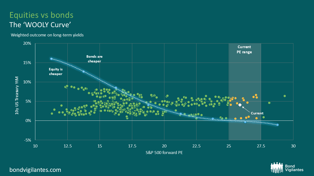
When the 10-year bond yield is higher than a modelled prospective 10-year historical equity return, per annum, then in this simple model bonds are cheap versus equities. We are essentially comparing the Weighted Outlook Of Long-term Yields on the graph. Or, the ‘WOOLY’ curve.
In the update below we add some simple granular data so one can see the different regimes we have been in, and plot where we potentially are now.

On a relative long term earnings yield vs bond yield it is clear which regimes mark an attractive starting point of equities versus bonds, the Global Financial Crisis, and the Eurozone crisis. It can also be seen that the tech bubble was a time to prefer bonds to equities.
The white markers for 2025 echo that the starting point for US bond yields is attractive versus the S&P 500 index. Things are always different, but the fundamental analytical starting point remains the same.
As Howard Marks regularly says: “Investment success doesn’t come from ‘buying good things’, but rather from ‘buying things well’.”
The standing economic orthodoxy is that Independent central bankers are adamant in their belief that their remit is purely monetary and that governments are in charge of fiscal policy.
Though at times of stress, it is well recognised that central banks should act in a coordinated fashion with national governments. This has rightly occurred across many jurisdictions since independent central banks became the common framework in developed economies towards the end of the last century. We are now not in an emergency, so central banks are once again allowed to operate their monetary levers independently of national governments. The legacy of quantitative easing (QE) has, however, left an interesting legacy for central banks in this relationship. This is best typified by the Bank of England and this is the topic we will focus on below.
The spillover effects of QE under different interest rate regimes
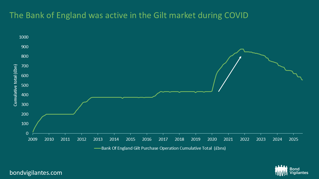
The UK was amongst the most active in altering its day-to-day economic life during COVID. The UK’s central bank, the Bank of England (BoE), also pursued an index approach of printing money via purchasing fixed interest securities across the length of the yield curve, in broadly equal buckets. The BoE was therefore the most heavily involved in buying long-dated debt to facilitate the creation of money.
During the low-interest rate phase of QE this resulted in excess income for the BoE, which was essentially borrowing at short-term interest rates by printing money, and lending at long-term interest-rates by buying gilts. In this scenario there was a benefit from the yield advantage generated by buying bonds at higher yields than the short-term financing rate. This excess income, and the occasional capital gain when a gilt redeemed, was repatriated to the government’s finances. Hence, QE not only reduced interest rates but also helped government finances. The independent central bank was stimulating the private sector directly through monetary policy, and indirectly by creating fiscal headroom by reducing the budget deficit, thereby creating fiscal headroom for tax cuts or higher spending for the government.
Given the increase in both short- and long-term interest rates post COVID, this carry trade has turned negative. Gilts that were bought with low yields are now being financed by borrowing at a much higher cash rate. This results in an income loss that means the government ultimately has less fiscal room, as they need to refill the BoE’s coffers.
Quantitative tightening (QT) brings this negative carry loss into the present day.
The impact of monetary policy on budget deficit
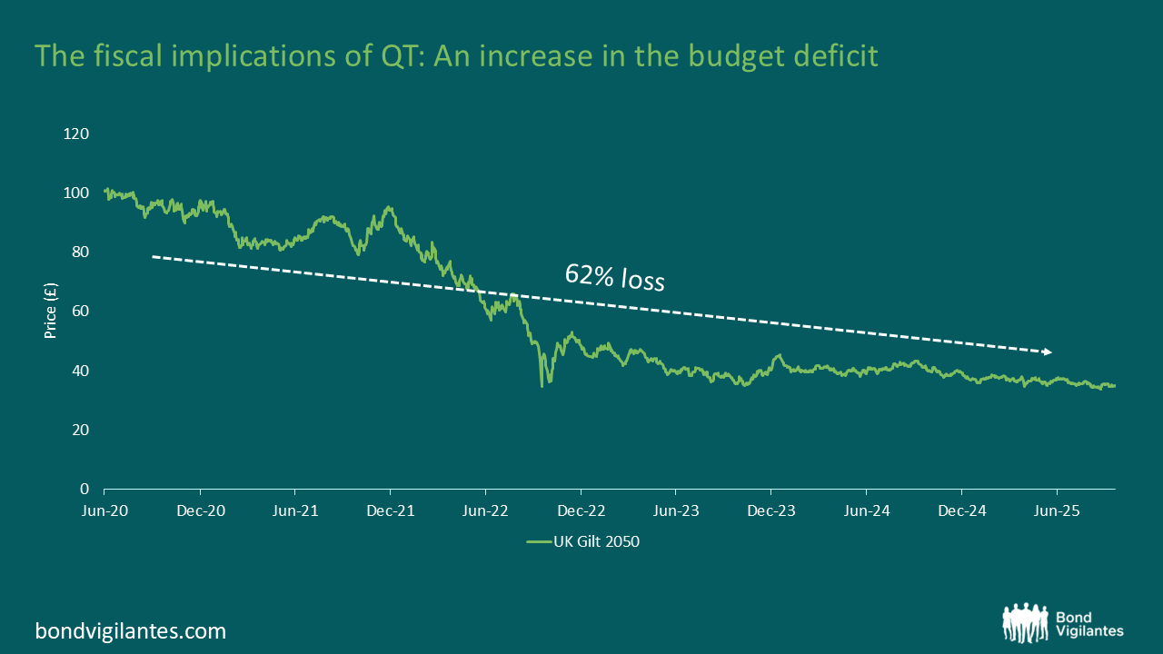
When the Bank of England sells a Gilt, it will make a profit or a loss. The chart below shows the price of a 30-year gilt from 2020 to the end of September 2025. A purchase during QE in 2020 at an average price of £96.2 ,combined with a sale now at a 2025 average price of £36.6, results in an overall loss of 62%. The Bank of England has this loss covered by the guarantee given by the UK government. Hence there is a transfer from the government to the Bank, resulting in the government deficit increasing. This transfer must be funded by, all else equal, tax rises or cuts in public spending. Therefore, the legacy of QT has fiscal implications.
We can quantity the size of the fiscal boost and fiscal headwind in the chart below.
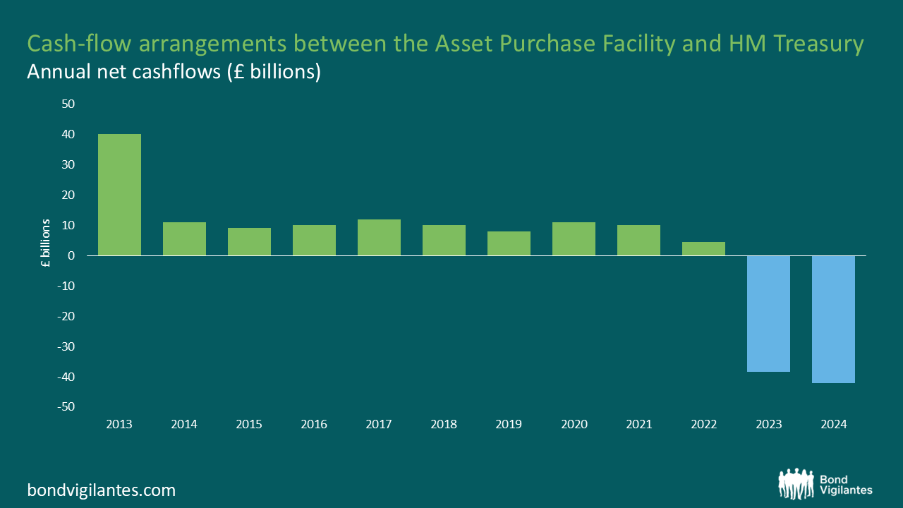
To put these recent negative annual cashflows into perspective, in the 2024/25 financial year, the UK government raised around £840bn billion in tax receipts.
There is a lot of discussion about the fiscal position of the UK, with various factors coming to the fore: Brexit, COVID, election giveaways, and productivity growth. One that gets rarely mentioned is the fiscal pain of QT.
QE in the first phase made the government’s fiscal manoeuvrability… Quite Exceptional
While QT makes it… Quite Tough
We’ve spent nearly two decades on this blog exploring the economic outlook, and history shows that this is especially relevant for active bond managers.
Currently, risk markets are priced for a benign economic scenario. Credit spreads are historically tight, equity valuations are elevated, and interest rates are on a downward path as central banks unwind tight monetary policies to keep growth on track.
The global economy appears healthy, and markets seem to have rediscovered their appetite for risk.
But as always, we believe it’s worthwhile to explore alternative diagnoses.
Just as one might consult a doctor for a second opinion in life, we can do the same in economics: by turning to Doctor Copper.
Doctor Copper is simply the ratio of the price of copper divided by the price of gold. Copper, an industrial metal, reflects economic activity, while gold is traditionally viewed as a store of wealth. The theory goes: when the economy is strong, the ratio is high; when it’s weak, the ratio is low.
When we chart the effectiveness of this diagnostic tool over time, we find that it has merit.
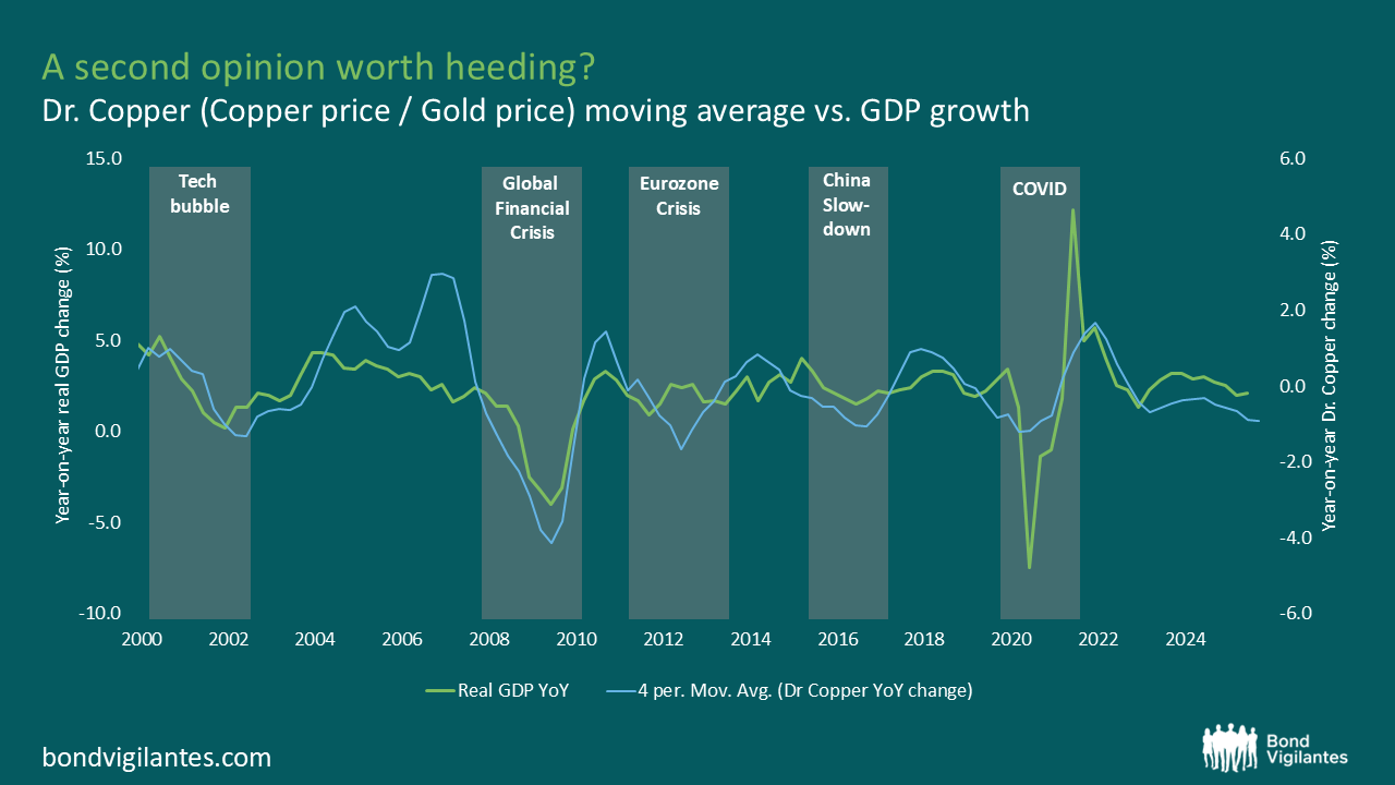
The chart suggests that previous declines in the Doctor Copper ratio have often aligned with periods of economic slowdown or recession. While investors remain optimistic, the copper-to-gold ratio is signalling a more cautious view. Whenever the ratio has reached levels this low, it was consistent with a slowdown or even a recession. With the ratio trending lower again, it’s worth considering whether this indicator is once more highlighting risks that broader markets may be overlooking.
Could this decline be a sign of the Markets’ Risky New Appetite (MRNA)? Or is it a reminder to trust the traditional economic wisdom of Doctor Copper? Either way, something is different this time, and it might be worth paying attention.
When analysing long-term investments, the primary focus is naturally on the potential total returns. Your final profit is simply a function of the future actual returns of the investment, less the original cost.
In the realm of fixed interest bonds, this calculation is relatively straightforward. For instance, you can estimate the likely return using the redemption yield, as the coupon is set, and the redemption date and value are known. This predictability allows for a clear definition and a strong approximation of future profits.
However, in equities, this predictability is not attainable. Returns are a function of the dividend payments made by the company and the future performance of the business, both of which are uncertain. At the end of the period, there is no set redemption value; you remain invested, and to convert your investment back into actual cash, a sale has to be made. The final value remains at the vagaries of future market valuations.
So, what should you buy on any given day, bonds or equities? What should your weighting be? There is no definitive answer, particularly if focused on short-term investment horizons; however, some guidelines can help predict likely long-term outcomes. Equity returns, in particular, appear to become more predictable over extended periods, though this appears to be a function of the starting price paid.
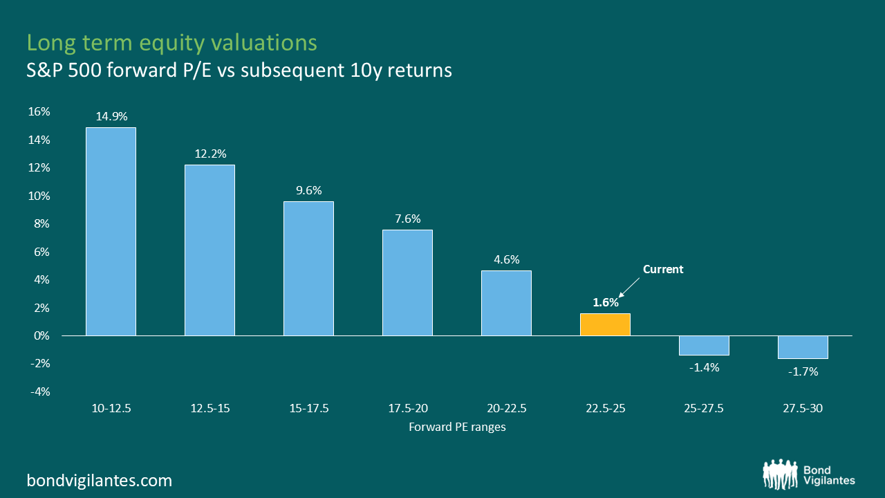
The chart above shows the subsequent 10-year annualised returns on the S&P 500 based on the starting valuation, as measured using the forward P/E ratio. Unsurprisingly, given the total return is a combination of the starting price and investment outcome, we find that the initial valuation is a significant driver of the eventual outcome, similar to the total return aspect of bond yields. As the above chart depicts, historically, higher valuations have been associated with lower subsequent 10-year returns, and at current levels, forward returns have averaged just 1.6%.
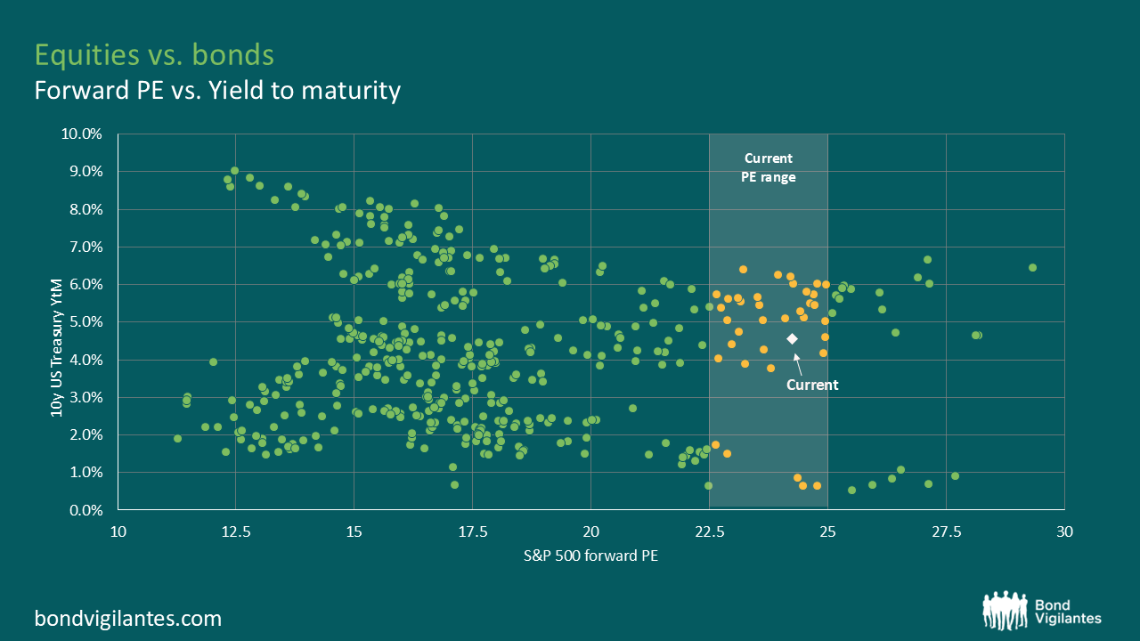
Given the question we are trying to answer is whether investors should prefer equities over bonds, it is essential to consider equity valuations in the context of bond valuations. The chart below depicts the relationship between the S&P 500’s forward P/E ratio and 10-year US Treasury yields. Each dot represents a historical data point, showing the historic level of Treasury yields at different historical equity valuation levels, with the current P/E range shaded in white.
The final step in our analysis is to combine the first two charts seen thus far, overlaying the treasury yields with historical equity returns. This helps define a break-even curve, a threshold where investors would have been indifferent between investing in equities or bonds based on historical returns.
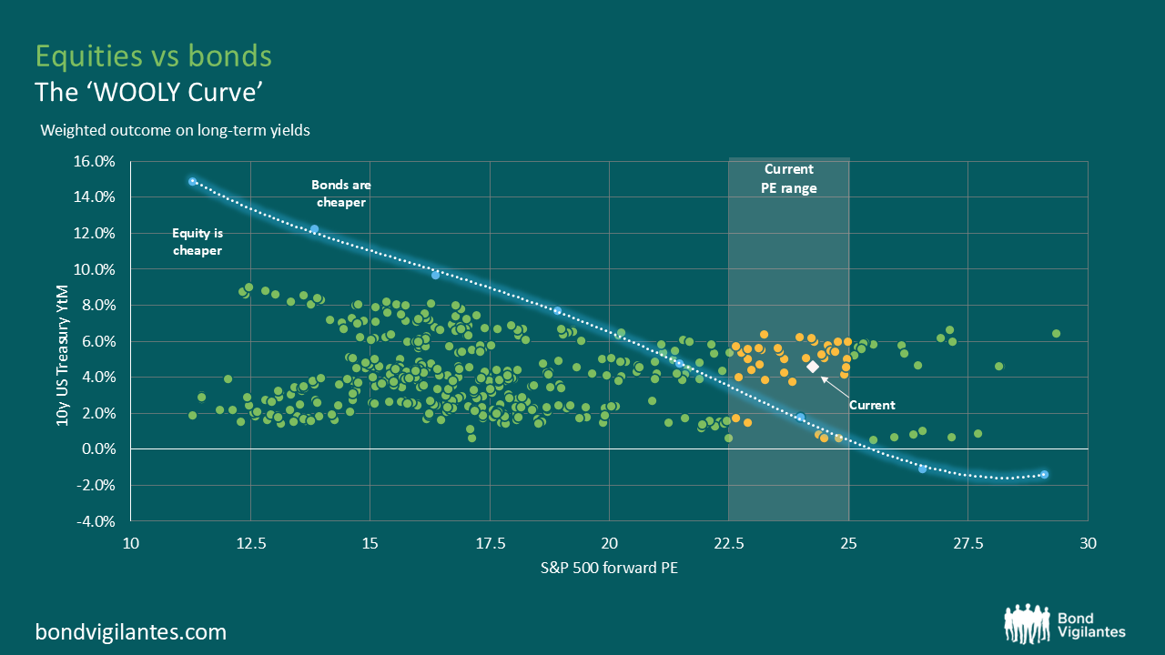
This provides us with a historical plot indicating where equities were likely to provide a superior return to bonds and should have therefore been overweighted, and vice versa. Points to the left of the curve indicate periods when equities were cheaper, as their forward “expected” returns exceeded Treasury yields, and points to the right of the curve represent points where bonds were cheaper, delivering “expected” higher returns than equities. We could name this curve the ‘WOOLY curve’, based on the Weighted Outlook of Long-term Yields. This line indicates where, based on historic norms, one may be indifferent between equities and bonds.
This exercise explores historical starting points to determine potential asset allocation. As of the 1st of January 2025, it would depict that if we invested $10,000 in a bond on the 31st of December 2024 and held it for ten years, assuming it compounds at the redemption yield of 4.6%, the investment would grow to approximately $15,700. In contrast, using the historical data from the first chart, a $10,000 investment in the S&P 500 at year end valuations would have an “expected” return of 1.6% per annum, resulting in a final value of $11,700 over the same 10-year period. Essentially, based on this analysis, bonds are expected to outperform equities by approximately 40% over the next 10 years.
This is investing 101 as outlined by Benjamin Graham in the Intelligent Investor. Bond yields and equity yields are both income streams that are then discounted to create a present value, which gives us the equity risk premium. The two should be compared, and asset allocation decisions should be analysed accordingly. Warren Buffett has constantly noted, future returns are not random, but depend on your starting point.
The above charts do not suggest that 10-year US treasuries are cheap or that the S&P 500 is expensive. However, they do indicate a strong possibility that, from an investor’s perspective at current valuations, one is historically a better bet than the other. Starting yields have historically provided a potential guide to future investment returns and portfolio weightings.
I hope you agree that this is more than just Wooly thinking!
In order to take a dispassionate look at this important discussion, we will focus solely on current long-term market-implied forecasts and work from there. The best way to explore this is to plot the 30-year interest rate swap. This represents the market’s pricing of average short-term interest rates over the next 30 years.
This is the average cash rate. At times, the short-term rate will be above the long-term rate when central banks are running a more restrictive monetary policy, and at others, it will be below the long-term rate when policy needs to be eased.
The charts below illustrate the traditional three main currency blocks over this century: the euro, sterling, and the US dollar. Superimposed on each chart is a yellow line representing actual short-term rates. The charts also depict a range indicating a proxy for maximum easing and tightening, 200bps below and above the average, respectfully, which, for the purpose of this analysis, is considered an appropriate range based on our historic market observations.
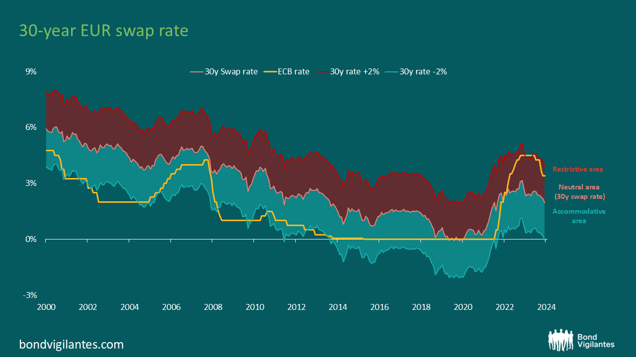
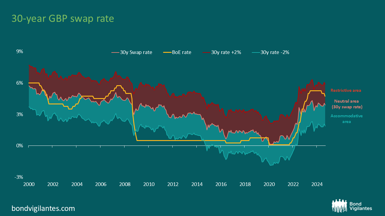
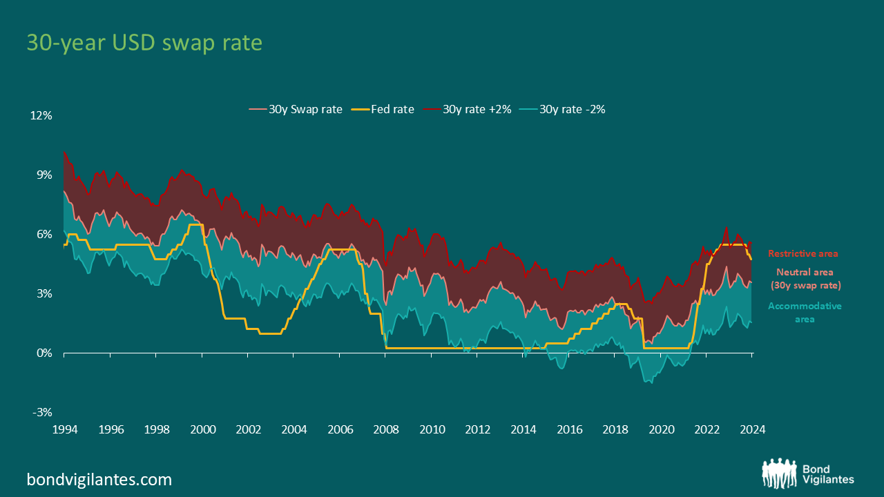
As policy has moved from tight to easy historically, short-term rates have reduced by 4% in these developed markets. There were times when this amount was lower, although this was due to the zero bound issue we discussed before. The new monetary policy easing tool of quantitative easing (QE) has had to be used in this century.
The market-implied analysis above demonstrates that yes, euro cash rates could well return to zero during the course of a normal economic cycle. However in the US and the UK, the lower band bottoms out at around 2%.
As an aside, the above charts also illustrate the extent of tightening the economy has faced over the last few years, with the yellow short-term rate lines all within ‘restrictive’ territory. As we have commented on before, and as economic textbooks have stated, monetary policy works with a lag, so it would be very unusual if 2025 is one of strong growth or inflation given the restrictive monetary policies pursued over the last 2 years.
The US, and consequently the global bond markets, were rightly focused on the November US election. With the election concluded, it is time to shift our attention from the 50 states to the state of the US economy, particularly the labour market, which is a key economic indicator for policy decisions.
Unlike in the past, not all jobs statistics are moving in the same direction and as a result, we are receiving mixed signal from the labour market. Take for example the JOLTS (Job Openings and Labour Turnover Survey) report, which is a monthly publication by the US Bureau of Labor Statistics that provides detailed insights into the US labour market. Depending on which indicators you decide to focus on, you can create a bull case or a bear case for the current state of the labour market.
Below is a slide representing the key indicators published in the JOLTS report. The charts on the left support the bull case for a robust economy. Job offers remain historically high, and layoffs are low, indicating a strong labour market. Conversely, the charts on the right illustrate the bear case. Both the quits rate and the hirings rate are low and at levels consistent with a recession.
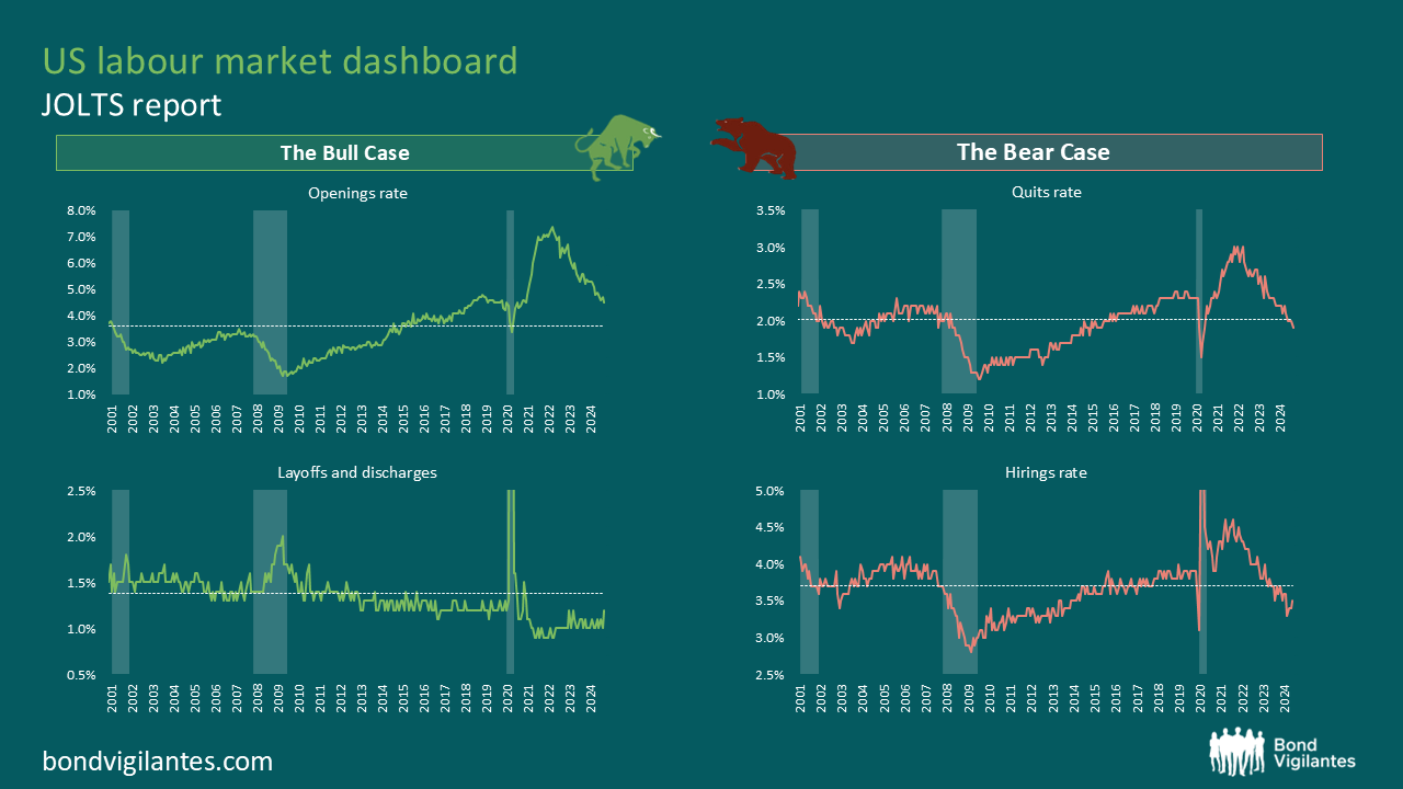
The market’s interpretation of economic data swings between these two perspectives. Strong economic data supports the bullish view, while weak data supports the bearish view. This dichotomy contributes to the volatility in interest rates as the economic outlook remains uncertain. The key question is whether the labour market is strong, weak, or perfectly balanced.
When considering all four charts together, one could argue that we have a neutral outlook for the labour market and, by extension, the overall economy. However, the divergence between the bullish and bearish indicators warrants further examination.
The chart below plots the quits rate against layoffs and discharges. The quits rate is driven by workers and reflects their confidence in the job market. When more employees voluntarily leave their jobs, it indicates that they are confident in their ability to find new, likely better, employment opportunities. This confidence usually stems from a robust job market with ample opportunities. Conversely, layoffs and discharges are decisions made by companies and generally reflect the underlying health of a company. The chart below shows an unusual divergence between these two lines. Workers seem hesitant to leave their jobs, suggesting weak labour market dynamics, while companies are behaving differently.
This relationship has significantly changed since the beginning of this decade, likely due to the unprecedented economic impact of the COVID-19 lockdowns. The T shaped recession has understandably affected how management approaches hiring and firing. Companies laid off employees quickly in 2020 and then struggled to rehire. This experience has changed their behaviour, leading to a tendency to hoard labour. This behavioural shift likely explains the current labour market puzzle: companies are not firing employees and are continuously looking for new hires. Consequently, redundancies are low, and theoretical job offers are plentiful. This labour hoarding behaviour could account for the divergence between corporate and worker behaviour.
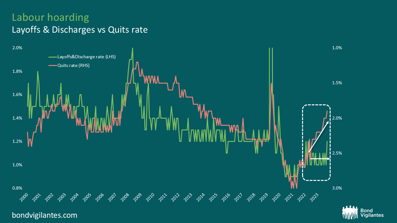
The logical conclusion from the above chart is that while companies’ behaviour has changed, workers’ behaviour remains unaltered. The critical question is: how long companies will continue to hoard labour? The longer this behaviour persists, the stronger the economy will be.
If companies revert to a more traditional approach, moving away from labour hoarding, we would see a convergence in the data. Firings would increase, and job offers would decline. However, if companies decide to maintain their current approach, the economic outlook would involve less risk.
President-elect Trump is well known for his “You’re Fired” catchphrase. His appointments in his new administration suggest a downsizing of employment in the public sector. If this drive for efficiency is mirrored in the private sector, labour hoarding is likely to decrease rather than increase.
In conclusion, the US labour market presents a complex puzzle with indicators pointing in different directions. Understanding the underlying behavioural changes in corporate hiring and firing practices is crucial to interpreting these mixed signals and predicting future economic trends. If the corporate mood mimics the recent change in political culture then “You’re Fired” becomes a more likely corporate mantra.
Central banks have traditionally relied on interest rates as a primary tool to influence economic activity, raising rates to cool down an overheating economy, and cutting rates to stimulate growth. Historically, these mechanisms have worked fairly well; however, the recent cycle has proven to be different. Despite a series of aggressive rate hikes, the expected economic slowdown has been surprisingly muted, suggesting that economies are now less sensitive to interest rates. This raises a crucial question: if recent rate hikes haven’t significantly slowed the economy, how can we assume that traditional rate cuts will effectively stimulate it? And just how low must rates go to have an impact?
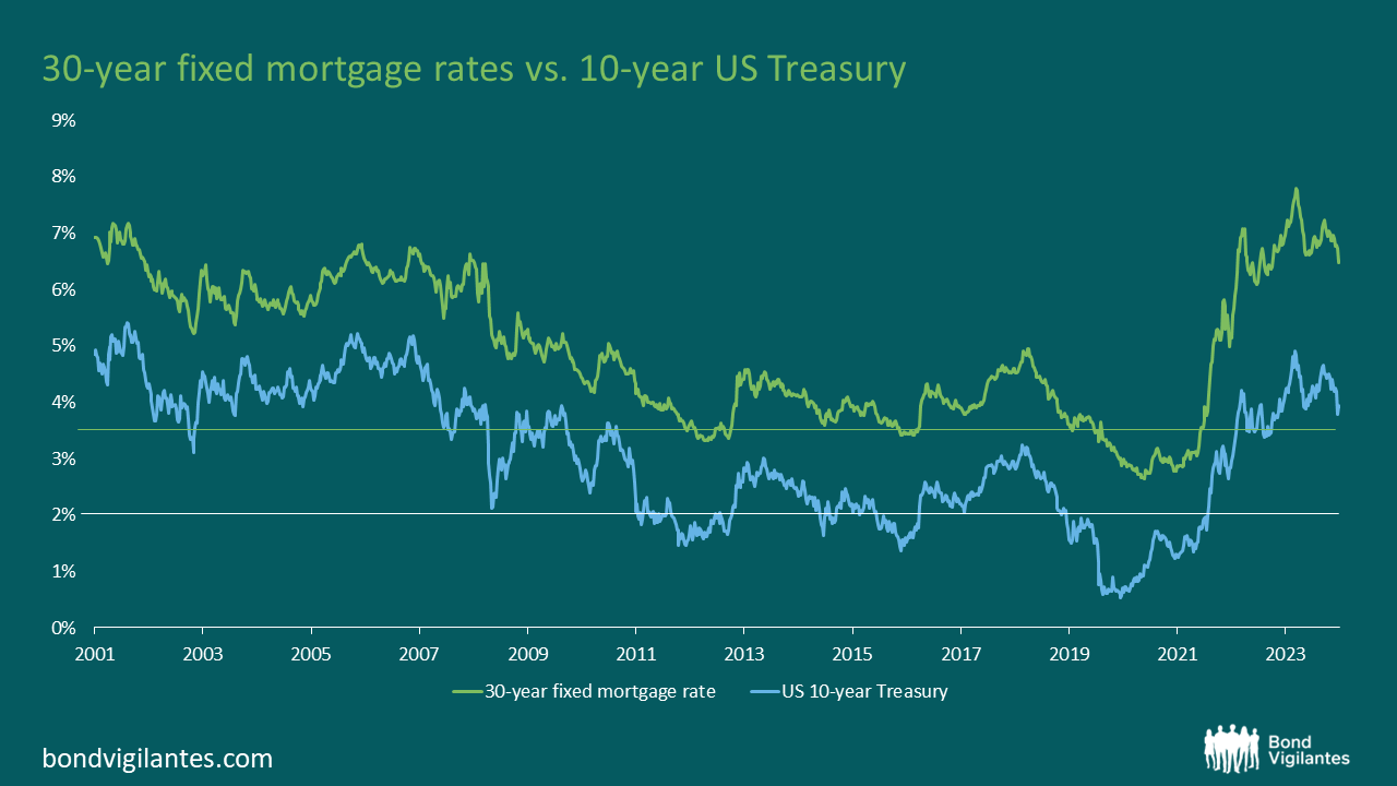
The housing market serves as a key channel for monetary policy transmission, making it essential to examine how it has responded to recent rate changes. Historically, the transmission mechanism from monetary policy to the housing market, and subsequently to the broader economy, was straightforward (as discussed here). However, this mechanism has become less predictable, especially post-financial crisis (discussed here). This monetary mechanism is not working as normal due to the unique nature of the current housing market.
The strength of the housing market depends on the balance between supply and demand. The housing inventory chart below illustrates the current bifurcation in this market, showing a sharp divergence between the average time new and existing homes stay on the market, with the availability of existing home inventories remaining low due to homeowners’ reluctance to sell, while new home inventories have risen as affordability challenges deter potential buyers:
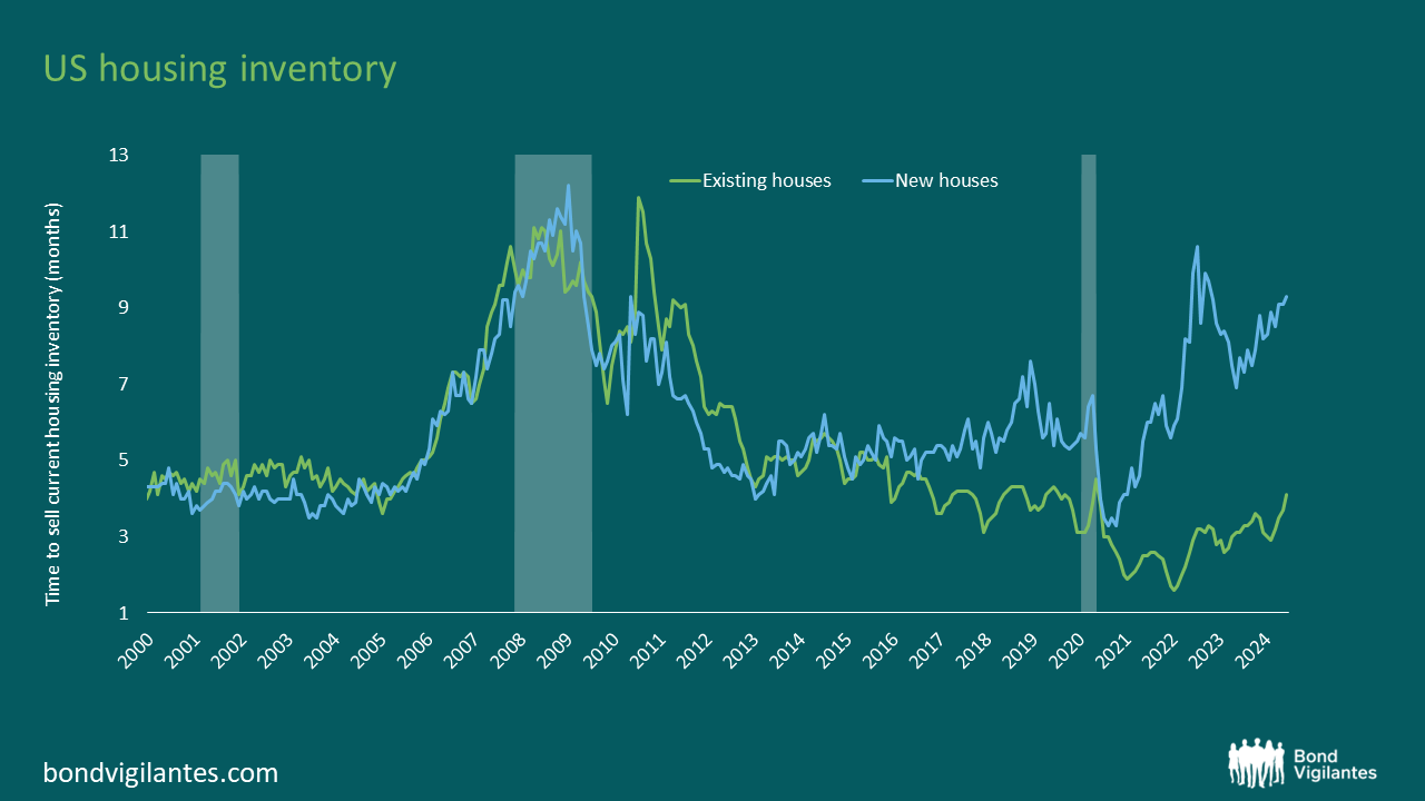
On one side, existing homeowners, who have locked in historically low mortgage rates, have little incentive to move, since doing so would mean giving up those competitive rates. On the other side, new homebuyers are willing to buy but cannot afford to, as elevated mortgage rates have made housing largely unaffordable for them.
We therefore need to understand what level of rates is required to restore balance in the housing market and stimulate activity again. Starting with first-time buyers, the chart below shows their level of affordability, which, not surprisingly, is historically low. In order to restore affordability in this market, the line would have to return to 100, meaning that a median family would have just enough income to qualify for a mortgage loan on a median-priced home. To achieve this, we calculate that mortgage rates would need to drop to 3.4% (assuming all other factors remain constant).
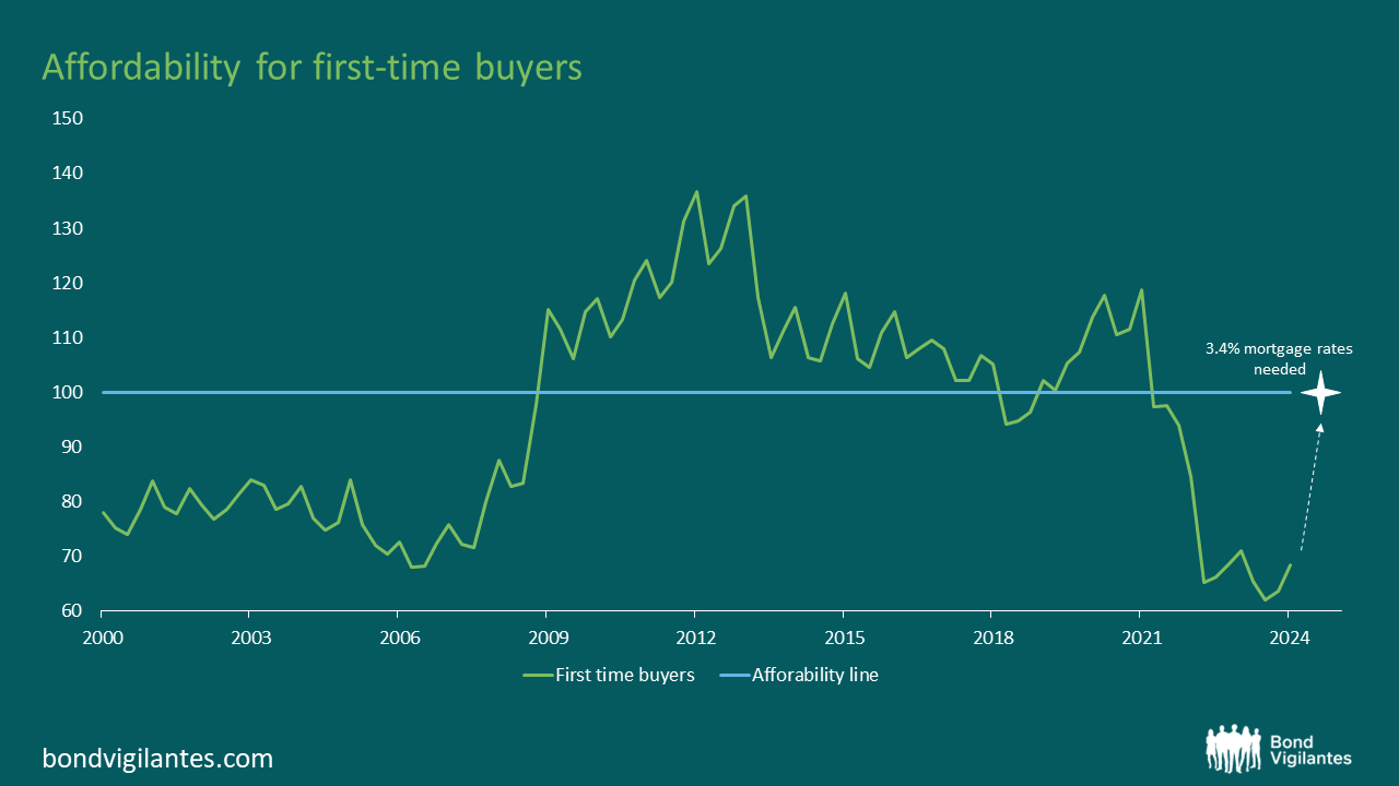
The situation with existing homeowners is different. For them, affordability is generally not an issue, given their lower loan-to-value ratios (LTVs). Instead, it is a matter of incentive. Aside from some exceptions, most people are not willing to move and thereby give up their extremely competitive mortgage rates. To incentivise most existing homeowners to move, rates would need to fall to levels similar to those they originally locked in. This would be around 3.5%, which is the average mortgage rate available during the period around COVID-19, when many either bought a house or refinanced their existing debt.
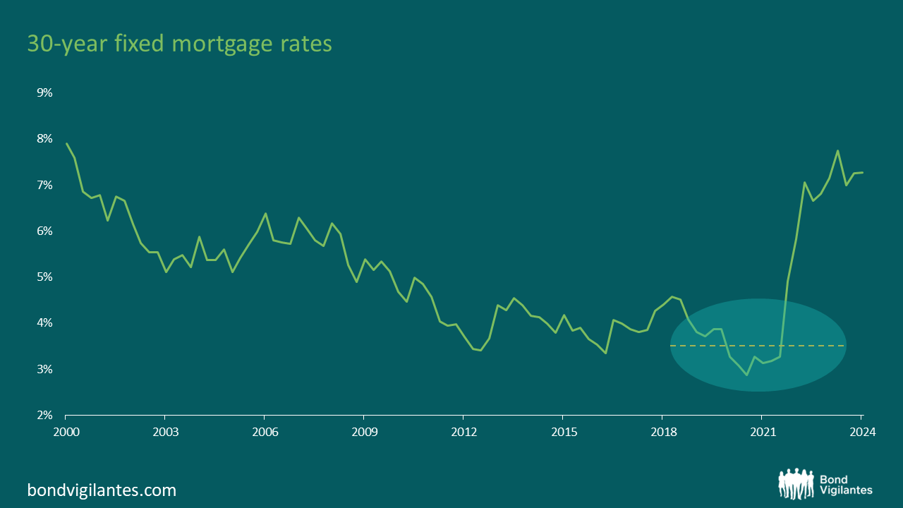
In conclusion, the transmission mechanism of interest rates has been dampened in the restrictive phase and will likely remain less effective in an easing phase. To effectively stimulate the U.S. economy through its housing channel, mortgage rates might need to fall significantly. Our analysis indicates that to restore activity in the housing market, mortgage rates might need to drop to around 3.5%. Historically, this would correspond to a reduction in the 10-year U.S. Treasury yield, potentially towards 2%, depending on broader economic conditions and Federal Reserve policy.
We have written many times on QE (Quantitative Easing) and QT (Quantitative Tightening); however, we have never talked about QN. QN is the ultimate goal for central banks – but what exactly is it?
The ‘N’ in QN stands for Neutral. In a steady state of economic growth, money must be printed to facilitate inflation in the economy. In this steady state, there is a simple requirement to have enough money tokens in the system to achieve the desired growth in the nominal GDP of the country, which is defined as the combination of real growth and inflation.
We can plot this monetary policy stance over time by showing money supply growth vs nominal GDP. In the chart below we can see that the US Central Bank normally pursues a 6 percent annual growth in money supply to achieve 4 percent growth in nominal GDP, composed on average of 2 percent of real growth and 2 percent of inflation.
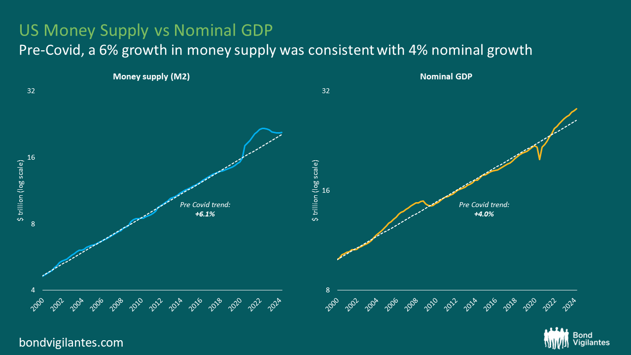
Given the series of economic events over the course of the first quarter of this century, unconventional monetary policy has been regularly occurring. QE has been in operation on and off over much of the period, in order to facilitate stable growth in the money supply. As mentioned earlier, in the 20 years prior to Covid, the Fed generally succeeded in maintaining a stable level of money supply growth. However, the aggressive QE measures implemented since Covid have led to a significant increase in the money supply, contributing to the subsequent inflationary pressures.
Since June 2022, the Fed has reversed its course and initiated a round of QT to gradually reduce the amount of money in circulation.
The question now is, how much more do they need to do? If we assume the amount of money in the system should approximate to the size of the economy, we need to plot the size of the economy versus the size of money supply to attempt to solve the balance sheet conundrum, which we have done.
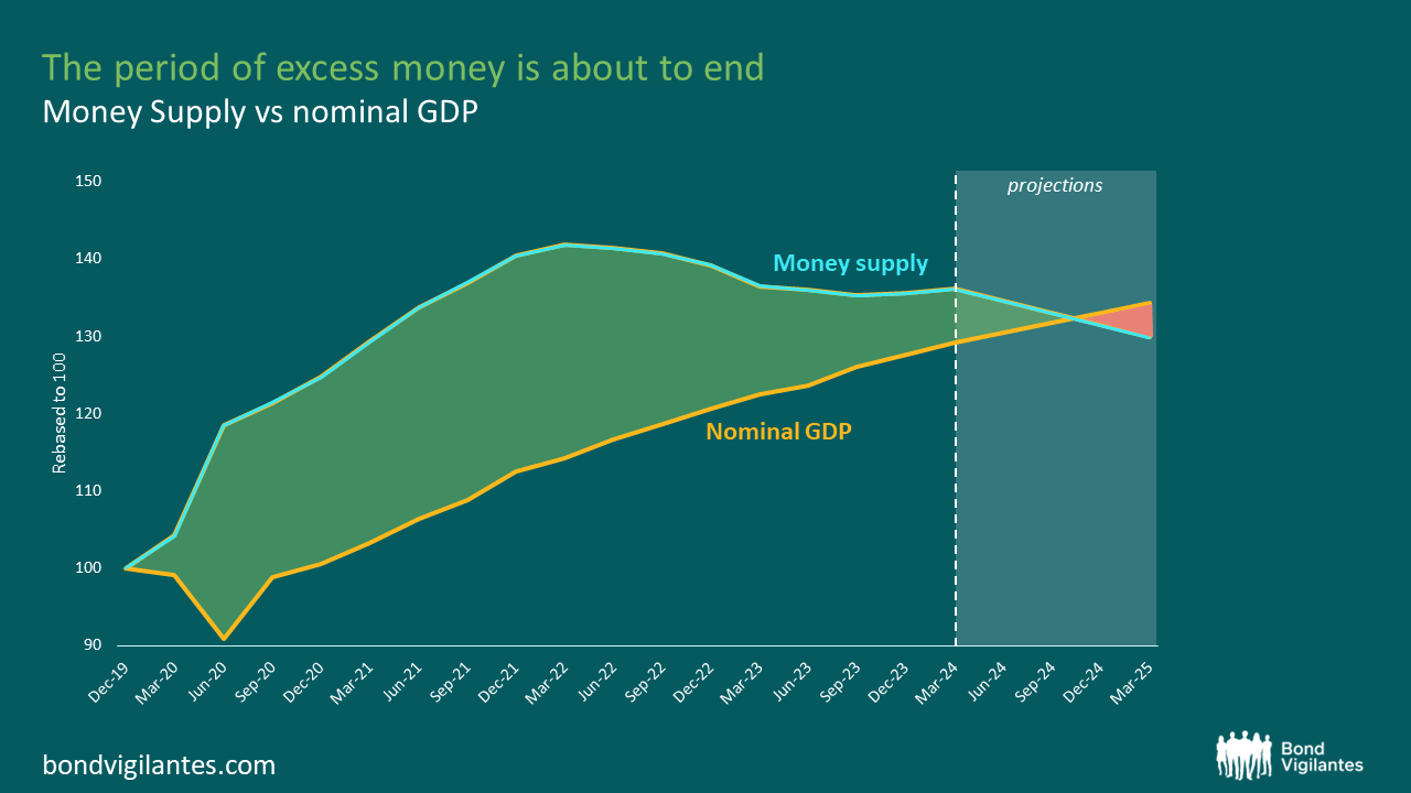
In the chart above, we shade the area representing excess money. This excess money will be inflationary in nature, as discussed before here. We can see that QT is getting very close to the point where this excess inflationary money stock is going to disappear. Theoretically, this looks like December of this year. At this point in the stylised picture we provide, monetary policy should be run in a QN framework to allow natural economic growth and inflation of around 2 percent to be facilitated[1].
This move to a more normal monetary approach is something that central banks need to approach over the near term as they transition from a ‘cancel culture’ to ‘business as usual’.
Monetary policy is acknowledged to work with long and variable lags. If we get to December and real QT persists, or the central banks are not expanding the cash in the system at the QN rate, then there would, by definition, be a monetarist argument for inflation to be below their target. If this were to transpire, then inflation would potentially be low enough to encourage significant interest rate cuts.
NET monetary policy matters. Going forward, it will be crucial to understand what central banks will decide to do: will they move to a more Neutral stance? Will they change course completely and adopt a policy of Easing? Or will they opt for continuous Tightening?
[1] To note, the above assumptions are based on the current pace of QT. Whilst the Federal Reserve plans to taper its Quantitative Tightening program, should the pace of QT be reduced, it is likely that the point where the two lines cross could be pushed further back. Further, M2 is influenced by both the Fed and commercial banks through their lending activities; however, for simplicity, the above assumptions are solely dictated by the Fed’s QT, so could be impacted by other factors. Despite this, given high interest rates and lower lending activity, it is likely that the Fed’s QT will be the dominant factor impacting M2 levels in the short term.
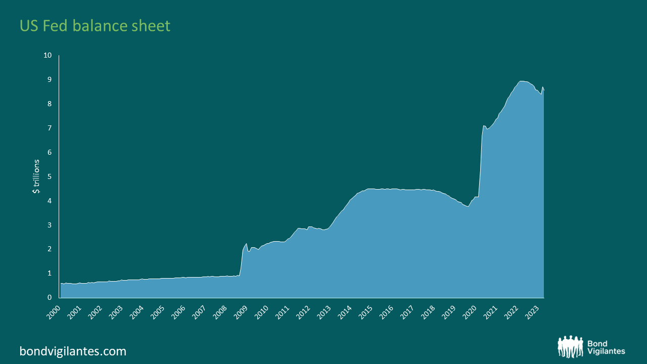
We have spent over 15 years talking about quantitative easing (QE) and quantitative tightening (QT). Each phase of QE has become increasingly more significant, resulting in a huge final dose of monetary creation in response to the COVID crisis. This money is now being cancelled.
To recap QE is the printing of money. Theoretically, this is expected to be inflationary. Increasing the supply of something will reduce its value, all else being equal. Traditionally this was implemented with old world technology: the printing press and then reversed in the furnace. It is now achieved electronically: money created from thin air at the magic press of a computer button, and cancelled in the same manner.
The original fears when this innovative measure was introduced were that the increase in the supply of money would have the understandable side effect of increasing inflation. This did not occur in the first phases of QE. Therefore, the policy became more acceptable. The link between the money supply and inflation appeared to be theoretical only, given the real world results. However, the empirical evidence of late would point to the opposite conclusion. Too much QE does result in inflation. I discussed this further in my previous September 2022 blog. The central banks are now tackling this inflation and they have been taking aggressive action to solve the problem. They have two prongs of attack: conventional rate hikes – which have been historically strong over the last year – and QT.
The charts below show the broad relationship between money supply growth and inflation. There is a historical observable link between the creation of money and inflation. This monetary lag of around 18 months is a constant feature of the economy and markets.
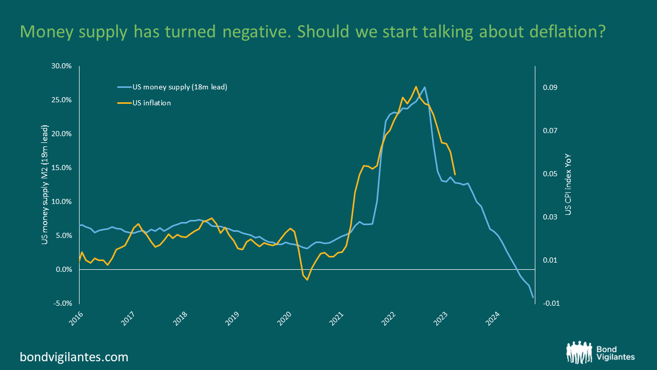
From the charts it is pretty clear that the recent inflationary surge is potentially a function of money supply growth. Strangely, this is something central bankers do not focus on. Maybe because of the data set they have from early QE? From a monetarist point of view this is a mistake, as espoused elegantly by Tim Congdon. I have a great deal of sympathy for his views. It seems strange that Central Bankers recognise that supply demand dynamics are important: a shortage of energy, labour and microchips are all inflationary, but they don’t seem to recognise that an abundance of printed money reduces its price – A.K.A. inflation!
The most interesting point on this chart is the degree of monetary cancellation: it is historically unprecedented. On a simple reading, this is hugely deflationary and suggests that inflation will reach new lows. The culture of cancelling money has not yet reached its zenith. We know that central banks are signalling that this process will continue and we can assume that money supply growth is likely to remain negative for some time. This is a new grand experiment.
Which is correct? Is money supply growth inflationary or not? One way of squaring the circle of early vs late QE would be to analyse where the printed money went. During early QE, it simply filled the bank vaults to make banks solvent against depositor runs, and paid for previous lending mistakes, refilling the reservoir due to the drying up of financial markets. The later stages of QE resulted in cash overflowing from banks into the real economy, and therefore brought about inflationary consequences. Is it the environment that QE is undertaken in that determines the inflationary outcome?
One way to maybe perceive this is to analyse the recent woes in regional US banks. Cancelling money through QT results in less money in the economy. Therefore, banks will have less deposits on aggregate. If this deposit drain is focused evenly across the system then the effects on each institution are minimal, but if that drain of potential reserves all comes out of one institution, then that bank will face problems. Printing money to provide liquidity and reserves to support the weak banks in the first stage of QE has been replaced with cancelling reserves via QT, challenging the weaker banks.
Most investors didn’t seem to be too worried about inflation 18 months ago when money supply reached a historical high. Now inflation is at the forefront of our minds, but money supply is negative. This cancel culture of quantitative tightening is a new monetary phenomenon. Should we be starting to think more about deflation than inflation next year?
‘inflation is always and everywhere a monetary phenomenon, in the sense that it is and can be produced only by a more rapid increase in the quantity of money than the output’ – Milton Friedman


Sign up to the Bond Vigilantes mailing list to ensure you never miss a great article from our expert Bloggers. We will email all new articles to your inbox, meaning you can stay on top of the world of Bonds.
I confirm that I would like to receive information about Bond Vigilantes and products and services from M&G Securities Limited.
We will use the email address and personal data you have shared with us to send you this information. For existing customers, submitting your contact details and requesting to receive this information from us, will replace any earlier choices you have made in respect of marketing information.
You can unsubscribe from marketing at any time, at which point we will not send any further marketing information to you, by selecting the unsubscribe link in all communications.