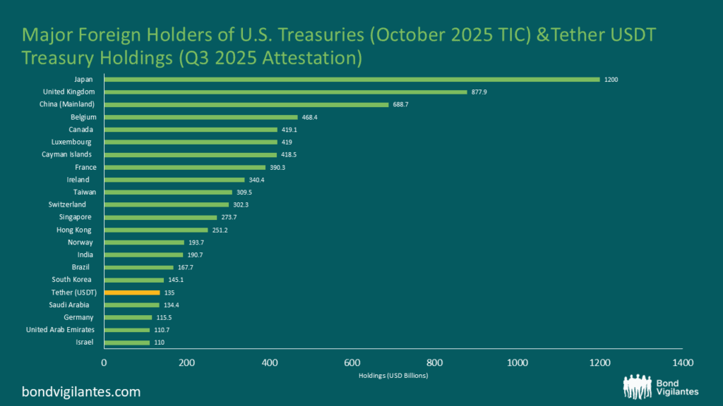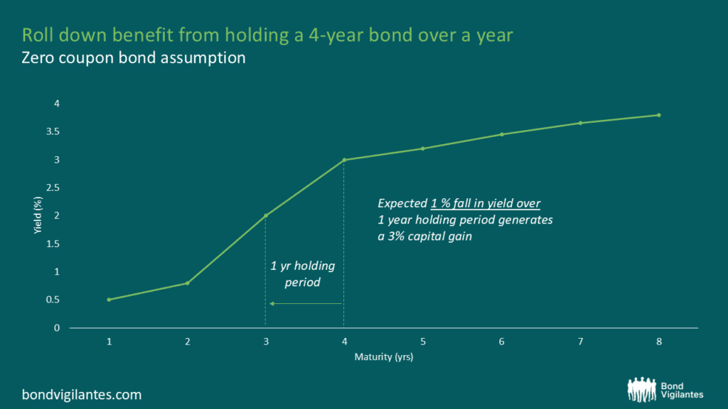
Rolldown
A dispatch from the number crunchers – Yield curve rolldown
By Matthew Russell
15 April 2026

The US housing market is getting worse and worse, and the UK looks set to follow it
Yesterday saw the monthly update on the disaster that is the US housing market. Figures showed that the downturn is accelerating – the S&P/Case-Shiller Composite-20 Index showed that the US house prices fell 7.7% in the year to the end of last November. The S&P/Case-Shiller Composite-10 Index (which covers the 10 main US metropolitan markets and has a longer history – see graph) showed that house prices fell 8.4% in the year to the end of last November, the steepest fall since the index began in 1987. This is bad enough, but digging below the headline year-on-year numbers reveal a startling trend in the house prices. Taking the quarterly house price change, and annualising it, shows that the Composite-20 index fell 16.2%, while the composite-10 index fell 16.6%, which shows that the downward trend is quickly accelerating.

Then today we had the UK release of what I believe is perhaps the most important UK economic indicator, the number of mortgage approvals. We have discussed mortgage approvals numerous times on this blog (see here for our last comment), but it’s worth a brief recap. The housing market is the transmission mechanism for monetary policy – when the housing market is strong, the Bank of England increases interest rates to stop the economy from overheating. Higher interest rates slow the housing market, then consumer spending and economic growth both slow (both with a lag), then inflation falls (with a further lag), and finally unemployment starts rising as companies react to weaker growth by cutting costs. Any predictor of what’s happening to the housing market is therefore worth its weight in gold to figuring out what’s going to happen to the broader economy.
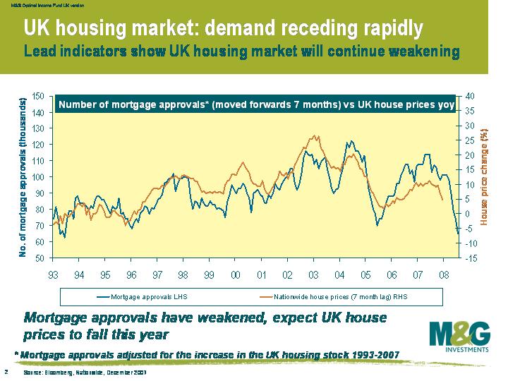
As you can see from this chart, today’s mortgage approvals number was shockingly bad. Since we last wrote about mortgage approvals we’ve made a slight adjustment to mortgage approvals, where we now adjust for the fact that the total UK housing stock has gradually increased over time. This makes recent mortgage approval data much more comparable to historical data, and improves the predictive powers of the mortgage approvals on the housing market. As you can see from the chart, the dramatic slump in mortgage approvals spells woe for UK home owners, and UK house prices look set to fall further over the next six months. The graph suggests that by the summer we’ll be seeing a year-on-year decline of around 5%.
What does a collapsing housing market mean for the central banks? It means that economic growth is set to fall very sharply. The US Federal Reserve is acutely aware of the risks, as a falling US housing market has always historically resulted in or coincided with recession. The Federal Reserve is being very active in slashing interest rates but the Bank of England has been slower to react, having cut rates only once so far. With UK rates at 5.5%, many rate cuts will surely follow. The Bank of England will not be maintaining the status quo.
A stream of poor economic data and some horrendous writedowns from the big banks have meant that risky assets have been walloped. The iTraxx crossover has shot out from 340 to 470 since the start of the year, and most of the world’s equity markets are down between 10 and 15%.
The recent release that I’d like to focus on is last week’s Philly Fed number (or the Federal Reserve Bank of Philadelphia’s Business Outlook Survey, to give it its full name), which has been an excellent leading indicator of US growth going back 40 years. Prior to the announcement, market consensus had been for a reading of -1.0, a slight improvement on November’s -5.7. The market consensus got it very badly wrong though, and the Philly Fed number was actually -20.9, the weakest reading for six years. According to my chart (click to enlarge), a reading of -20.9 means a US growth rate of zero should follow.
Looking back over the 40 year history, the Philly Fed survey has only gone slightly wrong as a predictor on two occasions. The first was in Q2 1995, when confidence was dented by Mexico’s financial crisis, which coincided with the Federal Reserve hiking rates very aggressively (the Fed took rates from 3% to 6% from February 1994 to February 1995). The Federal Reserve averted a serious slowdown by cutting rates over the second half of 1995, and the US economy experienced a soft landing rather than a hard landing.
The only other wonky reading was in September 1998, which followed Russia’s default and the LTCM crisis. Although emerging market economies were in turmoil, the US economy was relatively unscathed, helped by the Fed cutting rates very rapidly from 5.5% in September 1998 to 4.75% in November 1998. Despite the financial mess at the time, though, the Philly Fed survey still only fell to -14.1, which is still quite a bit better than last week’s number.
The Fed has applied the usual dose of medicine to this crisis by cutting interest rates rapidly, but will it be enough to prevent a hard landing? I don’t think so. The financial crises of 1994-5 and 1998 came at a time when the US economy was already fairly strong, and it was able to withstand the shock. This financial crisis, however, has come at a time when growth was already weak, and the housing market was already falling. I think the Fed will continue cutting rates to avert recession, but I don’t think it will be enough.
In August I posted a comment explaining why the US unemployment rate was to climb sharply (see here) and this is now happening. On Friday it was announced that the US unemployment rate jumped to 5.0% in December, up from 4.7% in November and ahead of expectations of 4.8%. Non-farm payrolls only rose by 18 thousand, the weakest figure since August 2003. Equity markets have slumped 2% on the news and the high yield market has also sold off.
The fact that the US unemployment rate is now at a two year high has inevitably grabbed the headlines, but it’s not actually the level of unemployment that matters, it’s the change in the unemployment rate.
This chart shows that there is a very close correlation between the change in the unemployment rate (measured as the change in unemployment over a rolling six months, right hand axis) and US economic growth (left hand axis). The unemployment rate is now up 0.4% since June 2007, and 0.6% higher than in March last year. Looking back over almost 50 years, a jump in unemployment of half a percent over a six month period has always resulted in or coincided with recession. Watch this space


Sign up to the Bond Vigilantes mailing list to ensure you never miss a great article from our expert Bloggers. We will email all new articles to your inbox, meaning you can stay on top of the world of Bonds.
I confirm that I would like to receive information about Bond Vigilantes and products and services from M&G Securities Limited.
We will use the email address and personal data you have shared with us to send you this information. For existing customers, submitting your contact details and requesting to receive this information from us, will replace any earlier choices you have made in respect of marketing information.
You can unsubscribe from marketing at any time, at which point we will not send any further marketing information to you, by selecting the unsubscribe link in all communications.