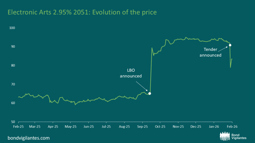
Rolldown
A dispatch from the number crunchers – Yield curve rolldown
By Matthew Russell
15 April 2026

Jim and Richard recently gave a teleconference on fixed interest markets to our clients. In it they address a number of key questions including the outlook for inflation, interest rates and bond markets generally. They also touch on how a number of our funds are positioned at this current point in time. The final half an hour of the call features Jim and Richard answering a number of topical and probing questions, featuring Jim’s feral kids and beachball-eating snakes.
As ever, if you do have any comments or feedback, feel free to leave a comment below.
This week saw the 15th anniversary of the first ever web banner ad. HotWired (now defunct) was the first web site to sell banner ads in large quantities to a wide range of major corporate advertisers. HotWired coined the term “banner ad” and was the first company to provide click through rate reports to its customers. It was paid for by American telecommunications company AT&T. And here it is:

Undoubtedly, the world of web advertising has changed a lot over the past 15 years and will continue to evolve going forward. In 1994, Larry Page and Sergey Brin (the founders of Google) had yet to meet at Stanford and Google was spelt “googol”. Mark Zuckerberg (co-founder of Facebook) was 10 years old.
For us bond investors, technological advances have been very important in driving down inflation via productivity gains – output per hour has increased markedly, resulting in lower costs and lower prices for producers and consumers. Technological advances have also accelerated globalisation, another main driver of productivity gains over the last three decades. Alan Greenspan put a lot of faith in gains in productivity from technological advances, and noted in 2002 that “arguably, the pickup in productivity growth largely reflects the ongoing incorporation of innovations in computing and communications technologies into the capital stock and business practices. Indeed, the transition to the higher permanent level of productivity associated with these innovations is likely not yet completed”.
The productive power of the internet still has much further to go, and will be good for both inflation outcomes and good for growth.
Preliminary UK Q3 GDP numbers were pretty shocking. Headline writers will have a field day, and UK chancellor Alistair Darling has already released a statement defending his projections put forward in his budget earlier this year, saying that he’s "always been clear that growth will return at the end of the year".
Prior to the economic data release, the forecast range of economists surveyed was for UK Q3 GDP to come in between 0.0% and +0.7%. Nobody expected a negative number, so there was quite a surprise when it was announced that Q3 GDP was actually -0.4%. That’s now six quarters of negative growth, the longest run of negative numbers since records began in 1955, and in terms of the absolute decline in economic activity from peak to trough, this recession is now as bad as the early 1980s with a 6% fall. Bond and currency markets have reacted pretty aggressively – at the time of writing, gilts have reversed what was initially another hefty sell off to now be in positive territory on the day, since the market has concluded that it’s now more likely that the Bank of England will expand quantitative easing to £200bn in November. Sterling is down more than 1% against the US dollar, the euro and the yen versus where it was just before the data release.
Equity markets have shrugged the news off, though, and to me the reaction makes more sense. That’s because, as Goldman Sachs have pointed out, preliminary UK GDP numbers are fairly useless. Goldman Sachs economists have found that due to subsequent revisions, there is almost a zero correlation between preliminary UK GDP and the final UK GDP number (a +0.15 correlation). In fact, the first estimate of Eurozone GDP is a better estimate of the final UK GDP number with a +0.34 correlation! The survey data is a far better indicator of economic activity than preliminary GDP numbers in the UK, and I’d assume that the Bank of England is aware of this.
As many of you are aware, we have been following the developments in housing markets quite closely, particularly in the UK. The housing markets were both a signpost and then a symptom that helped to drive inflation lower and brought the banking system close to collapse. For the UK, the chart we have focused on the most is the use of mortgage approvals as a lead indicator for the strength of the housing market, and therefore the economy (see here). This relationship appears to have broken down, and it is important to explore why.
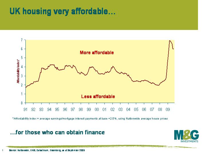 We are debt investors, so we are used to analysing whether companies’ earnings are sufficient to service their debt. With regard to housing, similar methodologies can be employed to determine the health of the housing market and the consumer. The simplest method is to plot the average house price versus average interest rate charged so that we can derive the cost of servicing a mortgage. We can then use average income to derive a guide to how cheap housing is. This chart shows how affordable housing is on a debt servicing basis.
While this is a good guide, the banks’ ability and willingness to lend has been greatly diminished, and availability of financing for new purchases is restricted. Mortgage approvals for new purchases therefore remain moribund. This new reality is not great news for house prices, housing activity, and the economy.
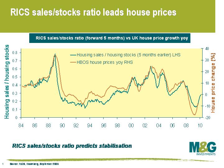 However, if an asset price is cheap versus the cost of financing, then the market can still stabilise in the absence of the leveraged buyer. Firstly, cash buyers or the less stretched borrowers will enter the market. Secondly, individuals who own a property will logically decide not to sell as their housing is historically cheap to finance. Data on the first is hard to source and is mainly anecdotal (eg euro based individuals buying cheap sterling property). The second is easier to follow – the RICS sales to stock ratio is a measure of demand versus supply, and suggests a more bullish outcome for the housing market than the mortgage approvals numbers.
The consensus view seems to be that demand/supply ratios have lost their relevance because the volume of transactions is low. We differ – to make a market you have to focus on supply and demand, and this lack of supply is fundamental and reflects the cheapness of housing on a serviceability basis. The UK housing market has traditionally been driven by first time buyers, as reflected by the historically close correlation between mortgage approvals and house prices. This buying power is now limited, but supply is equally limited. New less levered buyers will step into the breach, and existing owners of property will hold on and attempt to service their historically cheap debt. Of course, higher interest rates could rapidly change the supply dynamic, but the authorities are acutely aware of this, and with inflation subdued, rate hikes still look a long way off.
Monetary policy is thankfully working in the UK. Low rates are directly supporting the housing market, and in turn supporting the economy. Now that the housing market is showing strong signs of bottoming, one can become more relaxed that the economy can recover. Deflation is not as likely as earlier this year, and financials look healthier.
At a time when the gilt market is desperately interested in the future of Quantitative Easing, the Prime Minister yesterday sent a shot across the bows of the Bank of England’s MPC by saying that ending QE would put the UK into a “very deep recession”. Whilst his words were, on the face of it, aimed at the Conservative Party’s perceived reputation as Great Depression puritans who would remove all forms of stimulus as quickly as possible (see here for David Blanchflower’s view that the Cameron/Osborne plans would push us into a “death spiral of decline”), the remarks are unhelpful for the Bank of England. “If we removed stimulus now, stopped the quantitative easing we would be back to where we were”, he said. The Bank will decide on an extension, or end, to QE at the 5th November MPC meeting, and it must be remembered that this is a form of monetary policy delegated to the Bank in the same way as interest rate policy is. Given some stabilisation in the UK’s economic indicators over the past couple of months (house prices, retail sales, business survey data) this decision is going to be a very tough call, and we still walk the tightrope between inflation and deflation. Today’s CPI data came in at 1.1% year-on-year, just above the level where the Bank has to write to the Chancellor explaining itself – although this should edge up later this year as the base effects from lower energy prices fall out. I can’t imagine that the Bank was pleased with this pressure, although Mr Brown did state in an interview on Bloomberg TV that QE is a Bank of England decision (shortly after saying that “the right time to do this is when we are absolutely sure of a recovery”, so no pressure there then).
Goldman Sachs surveyed its clients yesterday afternoon on the outlook for QE. Only 21% thought that November would see the end of the programme, with the vast majority seeing a further extension (nearly 30% thought that the total would rise to above £250 billion, comfortably mopping up the entire predicted gilt issuance for this financial year, and more!). No wonder gilts have been rallying over the past few days, and no wonder sterling is falling.
Elsewhere, we had a team outing to see the new David Hare play, The Power of Yes, at the National Theatre. The Bond Vigilantes were “clocked” as evil City workers within seconds of sitting down, but made it out alive after some robust discussions with our fellow audience members. The play itself gets a modest 6/10 – the first half is dull for anybody who’s read a paper over the last two years, but it does improve, and there are some interesting interviews with people close to the action (we learn that Mervyn King panics if there are transport problems when he’s travelling on business, and that Fred Goodwin had to be shocked into agreeing to apologise at his Select Committee hearing – the exact wording is not appropriate for a family bond market blog). But bankers get the entire blame for the crisis, without any thought for the demand side of the credit expansion (i.e. our lust for flat screen TVs and buy-to-let mortgages). The dealers are evil, and the addicts blameless. The only time the role of the wider public is examined is when Hare examines the demutualisation of building societies into banks, which led to a change of role from piggy banks that lent to solid homebuyers into quasi-investment banks driven by growth. This demutualisation wave was driven by a greedy public – a couple of thousand pounds of shares here and there (worthless now in some cases), and we lost our local, conservative lending institutions. Mind you, the remaining building societies didn’t escape the rush into toxic assets (the Dunfermline BS had its assets split up by the authorities in March this year). You can read real reviews here (The Telegraph and the Guardian). If anybody else has seen the play, feel free to leave your comments below.
The Baltic Dry Index is a measure of the price of shipping dry goods such as coal, iron ore or grain, and is commonly used as an indicator of global demand. The beauty of this index is that unlike financial markets, it’s not subject to speculation. We’ve mentioned the Baltic Dry Index once before on this blog, when Jim highlighted at the beginning of September 2008 that continued new lows in the index were good news for government bonds.
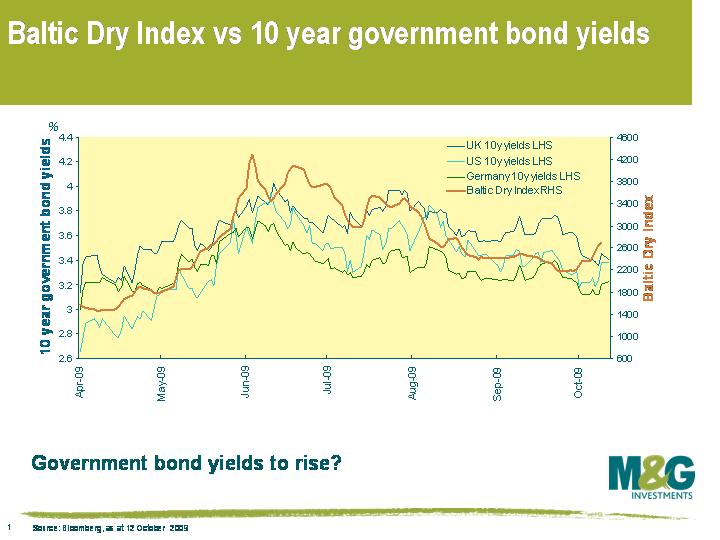 Now, the index is beginning to suggest the opposite. This chart (data as at today) illustrates the index level versus 10 year government bond yields in the US, Germany and the UK since the beginning of April 2009, and government bond yields haven’t followed the Baltic Dry Index higher in the past couple of weeks (at least they hadn’t when I started messing around with the chart on Thursday, although unfortunately for the purpose of this blog comment there was a pretty hefty sell off on Friday).
A rise in the Baltic Dry Index is all the more important because it tends to exhibit strong momentum. For example, since the beginning of April, a daily increase has been followed by another daily increase (or a daily decrease followed by another decrease) more than 80% of the time.
Before people get too excited though, it’s worth remembering that shipping rates are influenced by their own set of demand and supply factors (eg the supply of ships) so the correlation can and does change over time. But given the Baltic Dry Index’s strong track record, it’s definitely something worth keeping a close eye on.
Richard Woolnough and I were in Asia last week to try to get a view on a couple of the big macro questions of the day – firstly, is China still an exporter of deflation to the global economy, and secondly, will the region continue to finance the West’s exploding budget deficits? We also wanted to get a feel for Asian credit opportunities, and to understand how the region’s banks managed to get through the credit crisis relatively unscathed. If you watch the video via the link below, you can also learn exclusively where the best Chinese restaurant in the world is (clue – according to Richard it’s somewhere in Surrey), and find out which of our top banking counterparties imposed a fine of HK$800 on Richard, and why.
The new issue of an inflation-linked gilt maturing in 2050 a couple of weeks ago reminded me of an excellent three page paper that Larry Summers wrote in the mid 1980s (see here). In short, Summers invented what he called ‘ketchup economics’ and had a bit of a dig at economists working in the world of finance. Financial economists ‘work only using hard data and are concerned with the interrelationships between the prices of different financial assets. They ignore what seems to many to be the more important question of what determines the overall level of asset prices’. The so-called ketchup economists are much more concerned about ensuring that ‘two quart bottles of ketchup invariably sell for twice as much as one quart bottles of ketchup’ rather than asking themselves what the value of ketchup should fundamentally be.
This inflation-linked gilt maturing in 2050 was issued with a coupon of just 0.5%. It was expected to be an issue of £3-4bn, and seemingly appeared tasty to a number of investors since it was supposed to yield 1 or 2 basis points more than the 2055 IL gilt issue. However demand was large, and the book was £9bn. Ultimately £5bn of the bond was issued, with the bond actually yielding the same as the 2055 IL gilt (and 4bps less than the 2047 IL gilt). We didn’t buy any of it – we thought that the prospect of a total return (if held to maturity!) of 0.5% plus the inflation rate wasn’t particularly good value. In fact, considering that the cost of insuring against the risk of the UK government defaulting over only the next ten years was 50bps (as implied by 10 year UK CDS), the real yield on the bond wasn’t even compensating you for credit risk.
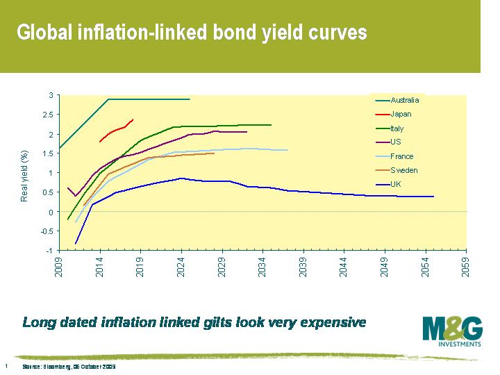
It’s not that all inflation linked bonds are unattractive. This chart shows how UK inflation linked gilt real yields compare to the other major linker markets around the world. So, for example, we thought that last week’s new issue of Australian inflation-linked government bonds maturing in 2025 with a real yield of almost 3% was much more attractive.
So why is the long end of the UK linker market so expensive? It’s basically to do with investors who have been forced to match assets with their liabilities (eg pension funds, insurance companies), and one of the best ways of matching assets with liabilities is with inflation linked bonds. As evidenced by spectacularly low yields on UK linkers, demand is clearly outstripping supply – in fact the yield on the 2050 UK linker finished yesterday at just 0.39%, a record end of day low. A pretty obvious fix to this distortion is for the authorities to issue more long dated linkers, and this does indeed seem to be gradually happening (£750m of the 2042 IL gilt is to be auctioned today, the first tap of this index-linked issue)
There’s another problem with long dated inflation-linked bonds that you’ve got to consider, and that’s the extremely long duration of these bonds. Duration is a measure of the sensitivity of a bond’s price to a change in its yield, or in the case of inflation-linked bonds, a change in the real yield. As can be seen from the chart above, the UK linker market has far more longer dated issues than other linker markets. The UK market in particular is getting longer and longer duration as a result of more and more long dated linkers being issued – the duration on the generic UK inflation linked index has extended out to 14.6 years.
Returning to the 2050 UK linker, the duration of the bond is almost 40 years. What that means is that its performance is going to be influenced much more by changes in the real yield rather than changes in the inflation rate. Real yields would rise if there was a detrimental change in the demand/supply dynamic, perhaps due to much more supply, change in regulations, better funded pension funds, or maybe just a rise in conventional gilt yields due to the unwind of Quantitative Easing (you may be surprised to know that linker yields are actually strongly positively correlated to conventional government bond yields).
The extremely long duration of some of these bonds means that investors could face huge capital losses. If the real yield on the 2050 linker (instantaneously) increases from 0.4% to 1.4%, bond maths says that its price falls from 104 to 72.6. If its yield rises by 200 basis points to 2.4%, its price falls to 51.2. This is certainly possible. Long dated UK real yields were above 2% as recently as 2003, and exceeded 4% in the mid 1990s. Long dated inflation-linked bonds could continue their meteoric rise if demand continues unabated, as seems likely over at least the short term. But for the reasons mentioned above, our UK inflation-linked bond fund has a large underweight to the long end of the UK linker market, and we also have a preference for inflation-linked corporate bonds. If you’re buying UK inflation linked bonds because you’re worried about changes in the inflation rate over the next couple of years, be aware that you may not be as well protected in longer dated linkers as you may have previously thought.
 Practically every newspaper article or research note I have read on the global economy over the past couple of years hasn’t failed to mention the huge pool of potential demand for goods and services that lies in the emerging middle classes of China and India. I think this map gives us some sense of perspective when reading the huge numbers the journalists and analysts have been talking about. The map re-sizes a country by population rather than by area. It also leaves me with a sense of how insignificant we in the West could become if these trends continue.
I got this from www.worldmapper.org. There are loads of other maps on there if, like me you find this sort of thing interesting.
Jim and Richard are in China this week so no doubt we will be hearing their thoughts on it in due course.


Sign up to the Bond Vigilantes mailing list to ensure you never miss a great article from our expert Bloggers. We will email all new articles to your inbox, meaning you can stay on top of the world of Bonds.
I confirm that I would like to receive information about Bond Vigilantes and products and services from M&G Securities Limited.
We will use the email address and personal data you have shared with us to send you this information. For existing customers, submitting your contact details and requesting to receive this information from us, will replace any earlier choices you have made in respect of marketing information.
You can unsubscribe from marketing at any time, at which point we will not send any further marketing information to you, by selecting the unsubscribe link in all communications.