Rolldown
A dispatch from the number crunchers – Yield curve rolldown
By Matthew Russell
15 April 2026

A few months ago, Anthony wrote about inflation hedging (see here) and referred to an IMF paper which suggested that ‘traditional asset classes’, most notably equities, don’t fare well if inflation increases, which is something to bear in mind when trying to protect a portfolio against increases in the level of prices.
Francesco Curto at Deutsche Bank recently released a research piece that comes to similar conclusions. The article states that investors regularly use equities as an inflation hedge because of the view that nominal earnings and dividends rise faster when inflation is high, but this was not the case in the US during the 1970’s. Deutsche Bank show that over the last 50 years, while nominal returns on equity rose, real returns on equity actually fell.

Deutsche’s research also shows that a fall in the PE ratio should be expected as inflation rises. For investors to be protected against inflation free cash flow would need to grow in line with inflation. If equities were a perfect inflation hedge, ceteris paribus, then the PE ratio should remain unchanged as the share price and corporate earnings increase in line with inflation. The article does suggest that inflation hedging with equities may be possible, but due to the depressed levels of PE it could prove to be more costly than expected.

Looks like bond investors and central banks aren’t the only ones that need to keep a close eye on inflation.
It has been almost three years since the collapse of Lehman Brothers back in September 2008. The High Yield market has staged the sort of recovery few imagined possible, with each recent month bearing further witness to increased risk taking, evidenced by falling risk premia, record issuance and ever looser lending standards. With dividend transactions (Ardagh Glass), portable cap structures (House of Fraser/Odeon) & CCC issuance (Gala) all in evidence of late, is complacency setting in amongst investors? Is the HY market repeating the mistakes of 06/07 ?
In two words; not yet. Comparisons will understandably be made between the lending practices of 2006/7 & 2011 but they currently remain fundamentally different. Consider first the use of proceeds of debt raisings. Unlike 2006-2008 the vast majority of new issuance has been to refinance existing bonds or loans rather than to finance new LBO’s. The more aggressive activity of 2005-7 – dividends, share repurchases and LBO issuance, remain at early cycle type levels (see chart 1). New issuance in EHY has been predominantly focussed on refinancing leverage loan debt rather than underwriting the sort of mega LBOs witnessed pre Lehman.
")
Credit ratings and leverage are other ways of comparing the two time periods. Whilst the market has indeed been willing to countenance lower ratings of late, CCC rated paper accounts for approximately 10% of issuance by volume against 16% in 2006. Despite the credit quality of new issues trending lower of late, it is still some way off of the quality seen in 2005-2007. (see chart 2) Leverage, or the amount of debt relative to earnings (net debt/ebitda), also suggests that current lending standards remain early/mid cycle like. According to Morgan Stanley, 1Q11 new issues saw leverage of around 4.6x, considerably lower than the 6x multiples of 2007. And finally, perhaps the biggest difference worth noting is the amount of senior secured paper being issued. Whilst 2006 saw €2.5bn of secured issuance, some 12% of the year’s total, Euro high yield has already surpassed €12bn so far this year, which is almost 38% of total issuance.

Talk of bubbles in high yield appears premature and the market is still some way off the heady pre Lehman days. That said, the on-going demand for yield may continue to pressure investors to take ever more risk, with issuers and sponsors looking on keenly. A pull back in risk appetite may yet prove healthy. Vigilance remains as relevant as it ever has.
Pyrrhic victory is a term that is used when you win the battle but lose the war. In this case, the battle as defined by the ECB is maintaining price stability at or just below 2 percent. This battle – as happily stated by the President of the ECB, Jean-Claude Trichet in a recent press conference – has been won in exemplary fashion with average yearly inflation in the EMU being 1.97 percent over the first 12 years of the euro. However, what is the cost of achieving this target?
The cost in the EMU is divergent economies. Diverging short term interest rates (as noted here in my last blog) are contributing to a further divergence of economies, with some national banking systems already on life support.
It is becoming increasingly likely that economies within the EMU will continue at least in the short term to diverge and not converge as predicted by the proponents of monetary union. Consequently, we expect this divergence will drive the national politics of the member countries in opposite directions. The wealthier presumably shifting to the right politically, and the poorer to the left. One could also reasonably expect that in this environment, nationalistic sentiment will rapidly grow. This is likely to bring the euro experiment into extreme focus, and economically divergent economic and political member states would threaten its survival.
The ECB has won the battle but is it in danger of losing the war?
UK CPI inflation jumped from 4.0% to 4.5%, versus expectations of only a slight increase to 4.1%. Core CPI, which strips out food and energy prices, soared from 3.2% to 3.7% and is now at easily a record high (data goes back to 1997). One bank called the inflation numbers shocking, arguing other economies aren’t seeing anything like this surge in core inflation, UK monetary policy is too loose and the MPC should hike rates in August.
The first thing to point out, as previously discussed on this blog (see here), is that the CPI figures include the VAT increase to 20% in January. The VAT increase is presumably temporary unless there’s another hike next year, and will therefore fall out of the inflation numbers early next year (it’s difficult to say exactly when as it depends on the timing and extent of the VAT passthrough from retailers to consumers). This chart gives a truer ‘long term’ picture of UK inflation by stripping out this tax effect, and as you can see, 2.8% is still within the Bank of England’s target (albeit energy and food price increases over the past year have pulled it uncomfortably close to 3%). Note that the headline CPI number came in temporarily lower than the constant tax measure through 2009 following the VAT cut in January of that year, but the last two years have seen the headline CPI inflation number look temporarily high.

The second thing to point out is that even if inflation does continue rising through this year (and maybe unexpectedly fails to fall next year), will the Bank of England really hike rates? Well the market seems to think so, as it’s still pricing in two 0.25% rate hikes in the UK by this time next year, with the first hike coming in November.
However this chart shows just how badly wrong the market has got its UK interest rate forecasts. Each dotted line shows the market’s expectations of the future course of the Bank of England base rate at the time of each quarterly inflation report going back to August 2009. In August 2009, the market was pricing in a Bank of England Bank Rate for May 2011 of 3.25%. Instead, the Bank Rate has remained firmly stuck at 0.5%. It’s all the more surprising if you consider that UK inflation has consistently exceeded market expectations at the time of release, so if inflation is the primary driver of the Bank Rate, you’d have expected to see the market underestimate the Bank Rate over this period.

Why has the market been so wrong? The answer is all about growth – investors have placed too much emphasis on inflation in their Bank Rate forecasts. The UK economy is no bigger than it was six months ago. UK consumption has flatlined. With such a vulnerable consumer, housing market, and banking sector, we can’t risk higher rates. With that in mind, it’s not a bad idea to have a fresh look at the second part of the opening paragraph in the Bank of England’s quarterly Inflation Report;
‘In order to maintain price stability, the Government has set the Bank’s Monetary Policy Committee (MPC) a target for the annual inflation rate of the Consumer Prices Index of 2%.Subject to that, the MPC is also required to support the Government’s objective of maintaining high and stable growth and employment.’
Get `em while they’re hot. The new National Savings inflation linked certificates were launched on Thursday last week, to great rejoicing on the money pages of the newspapers. And rightly so – these are a gimme. Although the rate of interest (RPI + 0.5%) is lower than on the similar certificates withdrawn 10 months ago (RPI +1%), this is still attractive compared to the market rate for 5 year real yields. With the same government credit risk, the 2016 index-linked gilt yields RPI minus 0.5%, i.e. a 1% lower yield than these retail only certificates. AND the NS&I product is tax free! So for taxpayers the yields are outstanding. With the breakeven inflation rate on the 2016 linker at just 2.9% on an RPI basis, so maybe at 1.9% on a CPI basis, this implies inflation below the Bank of England target level on average over the next 5 years, the absolute level looks good too.
Why is the government offering such an attractive product? It’s giving 50% taxpayers a AAA rated, riskless investment equivalent to nearly 10% at current levels of RPI and about 7% if inflation averages 3% over the period. I can’t even find many junk bonds that pay 10% nowadays. And this is happening whilst the banks and building societies are desperate for retail funding – this is “£2 billion that the private sector won’t be able to raise and lend to first time buyers and homeowners” (says the Building Societies Association).
Well I guess the first reason is that it needs the money. The NS&I has to contribute £14 bn towards funding the deficit this financial year, and this will certainly help. But did the rate need to be so generous, and so far from the market rate? The government has talked about these certificates in terms of helping the poor savers stuck in low yielding bank accounts. But those with savings to benefit from this deal are largely the richest portion of society – many of those will be higher rate taxpayers who have been given a windfall gain. Is this a deliberate subsidy for the rich?
I’d also have thought that the government might have taken the opportunity to move to a CPI+ basis rather than continuing to use RPI. After all, that’s the BoE’s target, and pension funds are being encouraged to move to using CPI for their liabilities too. With the “wedge” between RPI and CPI high, and likely to be about 1% going forward that might have been a smart thing to have done – although there would have been some negative press headline risk in doing so.
I talked to Richard Woolnough about this being a windfall giveaway for the rich – a kind of subsidy from the government. He pointed out that these certificates have been available under the last Labour government too, and we doubted that a subsidy for the rich was their explicit policy. But he also made a good point that there is another government subsidy for rich savers – the deposit protection scheme that allows a huge amount of savings to be guaranteed by HMG if you spread it around the market below the £85,000 ceiling for individual banks. This, like the huge interest on the latest inflation certificates, is a real cost to the taxpayer – as the bailout of Northern Rock showed. Another example of the baby boom generation writing itself generous promises for which the poor youth of today will end up funding?
“Wham, bam – I am, a man
Job or no job, you can’t tell me that I’m not.
Hey everybody take a look at me
I’ve got street credibility
I may not have a job but I have a good time
With the boys that I meet down on the line.”
“Wham Rap” by Wham!, 1982
My mate told me recently that the first Wham! album was surprisingly good, so I bought it. It is good, and I am surprised. I was also surprised to find how political songs like Wham Rap were, and it got me thinking about writing a blog about the political songs that made the charts in the 1980s in response to the recession, and wondering why today’s youth haven’t written any. After all, youth unemployment is famously high isn’t it?

The data only go back to 1983 for youth unemployment – but you can see that the early 80s were a time of youth unemployment rates of nearly 20%. In 1981 we had songs like Ghost Town by the Specials, 1 in 10 by UB40 (the band itself named after the dole claim form), Shipbuilding by Elvis Costello in 1982, and by 1985 Frankie Goes to Hollywood were selling T-Shirts saying “Frankie Say Arm the Unemployed” and leading a delegation to Downing Street to deliver a petition against the axeing of benefits for school leavers if they didn’t go onto a Youth Training Scheme (YTS). It was signed by Paul Weller, Madness, Smiley Culture, the Flying Pickets (another politically relevant name inspired by the miners’ strike) and Alison Moyet.

Some argue that the youth unemployment numbers are distorted (this post on the website Straight Statistics says that the treatment of youths in education is a distorting factor, and that the outright number of young people claiming unemployment benefits is little different than it was in the early 1990s, although it was high then too). Nevertheless there are 1.7 million people between the ages of 18 and 24 who are economically inactive (of which 0.7 million are officially unemployed, the remainder are largely in education). If anything, with free tertiary education a thing of the past (although with access to that education easier) the kids of today have even more to be aggrieved about – those going to university are being saddled with debts of tens of thousands of pounds. And never before has the technology to make music (or indeed film) been so cheap and available. I’ve a grand piano, a drum machine, and an 8 track recording studio on my mobile phone. Maybe you can only be a protest singer if you have an acoustic guitar. Incidentally whilst thinking about this issue I stumbled across an article on the BBC website, by an American writer wondering where the great US cultural response to the Great Financial Crisis is. Perhaps, he speculates, the safety net is greater than it once was, and the starting point for living standards higher thanks to multi-income families?
Perhaps though there are protest songs out there but I’m missing them? Let me know.
On an unrelated note, I was in Ireland seeing clients earlier this week – one recommended I read an article by Morgan Kelly, a notorious economics professor at University College Dublin, from Saturday’s Irish Times. In it he claims that the Central Bank governor Patrick Hononhan’s decision to keep a government guarantee on Irish bank bonds was “the costliest mistake ever made by an Irish person”. He says that the only way to avoid an Irish sovereign bond default is to effectively default on the ECB loans made to the Irish banking sector, halving Ireland’s debt to Euro 110 billion. He also thinks government borrowing needs to fall to zero. Neither of these outcomes looks likely – Irish CDS currently trades at 640 bps and there is open talk about default being both acceptable and even desirable. The mood is relentlessly gloomy in Dublin – our taxi driver told us that his firm now hires him out at a daily rate of Euro 200 compared with Euro 440 a couple of years ago. There’s no shortage of taxis – it’s a service where demand collapses simultaneously with a dramatic increase in supply as people try to earn an extra income.
Finally, and totally unrelated to bond markets or economics, the film How to Lose Friends and Alienate People was on TV earlier this week. This is the story of Toby Young (who is trying to set up a Free School near where I live in Hammersmith – don’t get me started…) and his disastrous time on the staff of Vanity Fair in New York working for the famous editor Graydon Carter. It reminded me that I read the book when it first came out, and finished it on a plane. I’d never heard of Graydon Carter before, but as I disembarked the man in front of me’s tennis racket case dangled in my face revealing a business card tag stating “Graydon Carter, Vanity Fair”. What are the chances of that? Then I realised that whilst for me, the chances of being on a flight with him were minutely small, the chance of Graydon Carter being on the same flight as somebody reading that newly published book were probably evens or better.
Following on from last week’s ECB press conference, on Wednesday this week we had the quarterly Bank of England Inflation Report. Amongst the questions asked at the press conference were a couple on the serious issue of the stability and future of the Eurozone. Mervyn King refused to be drawn into commenting though, saying that “the problems are very difficult, they are very challenging, and I don’t want to make life more difficult by making any public comment that could conceivably make it more difficult for those charged to deal with it”. In one extreme he may have feared his words would be twisted to weaken the Eurozone financial system, or at the other extreme, if he were to speak the plain truth he would undermine the system.
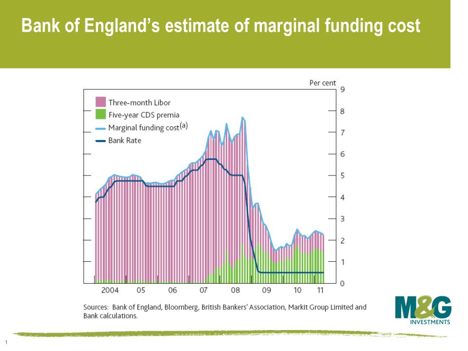
In its report, the Bank of England focused on the attached chart as one of the reasons why they had maintained the bank rate at such a low rate of 0.5%. The chart tries to create a proxy for the real cost of borrowing for the wider economy by taking 3-month libor and adding on a proxy for bank cost of bank funding (CDS). It illustrates that the official bank rate of 0.5% is equivalent to an official rate of 2% in the pre credit crunch world. The transmission mechanism between the official Bank of England ‘Bank Rate’ and the real price and availability of credit to the wider economy has dramatically altered. We are still in a credit crunch.
Let’s use this analysis and apply it to the Eurozone economy that Mervyn King refused to discuss. We’ve taken the biggest banks in each of Ireland, Greece and Portugal and added CDS to 3-month Euribor, where each bank is weighted equally within each country. The financial crash and the Eurozone sovereign debt crisis has meant that the cost of money has changed dramatically for these countries. There is not a single market interest rate in the single market. The true interest rate for peripheral Europe is very high, and is not exactly encouraging for growth in these countries. The Eurozone has a single official cost of financing set by the European Central Bank, but the cost of money varies dramatically between nation states and their banks.
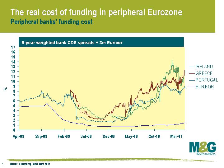
In order to attempt to offset this effect, the ECB has been forced to intervene by funding the peripheral banks itself in return for collateral. This helps mitigate the problem but exposes the ECB to risk. The chart shows the problems these peripheral economies face in terms of a functioning financial system, and the huge task the ECB faces in implementing appropriate monetary policy for the Eurozone. No wonder the Bank of England does not want to comment directly on the problems the Eurozone faces.
I attended an interesting lecture last year by Carmen Reinhart (hosted by RBC) where she predicted an era of negative real returns for investors in developed market sovereign bonds. This was due to what she termed ‘financial repression’, as the authorities in richer countries struggle with the huge debt burden. Financial repression is loosely taken to be things such as greater financial regulation, capital controls designed to limit capital flows, restrictions on competition in the financial sector, credit restrictions, higher bank reserve requirements, enforced liquidity ratios (so banks must hold a minimum of their reserves in government bonds), pension fund legislation forcing pensions to own more domestic sovereign debt, or caps on deposit rates. The consequence of financial repression is that nominal sovereign bond yields are artificially depressed for a prolonged period of time, and domestic investors therefore experience low or negative real returns.
Reinhart and Sbrancia have since elaborated on these thoughts (see here), where they argue that financial repression is a subtle form of debt restructuring and is a policy that had significant success in reducing government debt burdens post the Second World War. Far from being a modern phenomenon or one confined solely to emerging markets, they find that real interest rates in advanced economies were negative about half the time between 1945 and 1980, and ‘for the United States and the United Kingdom, the annual liquidation of debt via negative real interest rates amounted to 3 to 4 percent of GDP on average per year. Such annual deficit reduction quickly accumulates (even without any compounding) to a 30-40 percent of GDP debt reduction in the course of a decade.’
Many investors and commentators point to negative real yields today as a reason why government bonds are unattractive (see here for a sensationalist write-up on negative real yields in the US for example). Real yields are indeed exceptionally low right now. Take index-linked gilts for example – real yields on the 2.5% 2013s are -2.1%, which means that if you purchase this security and hold to maturity then you are guaranteed to underperform UK RPI inflation by an annualised 2.1%. In the UK, you have to go down the yield curve to 2020 before you have a positive real yield. The same can be seen in US TIPS, where the 0.625% 2013 has a real yield of -1.8%, although European real yields are a bit higher (the German 2013 inflation linked government bond has a real yield of -0.2%, a reflection of lower anticipated inflation rates and a reflection of the ECB’s decision to hike nominal interest rates in the face of a perceived inflation shock).
PIMCO’s Bill Gross also highlighted Reinhart and Sbrancia’s paper in his recent investment outlook, and used this argument to explain why investors in developed market government bonds are being short changed. But I think he misses out on a very important point*, which is all to do with the shape of the yield curve. Let me explain.
Yield curves in the UK and the US in particular are exceptionally steep. Looking at the UK, the MPC’s decision to keep the bank rate at 0.5% is keeping the front end of the gilt market very well anchored. Short dated gilts are also being supported by heavy buying from relatively price insensitive central banks (all these FX reserves from around the world have to go somewhere – the Economist had an interesting take on this topic recently). The yield on the UKT 4.5% Mar 2013 is just 1.0%, which isn’t particularly enticing.
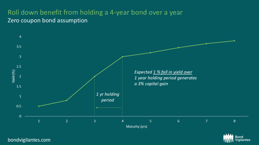
However, once you go out a few years, the gilt yield curve starts steepening sharply and gilts look more interesting. The UKT 2% 2016 has a yield of 2.2%, while the UKT 3.75% 2021 has a yield of 3.5%. Many argue that an average annualised 2.2% total return for a five year gilt held to maturity is hardly a screaming buy, and nor is a 3.5% annual return from a 10 year gilt. But you also need to consider the effect of what’s called the ‘roll down’. This means that what is currently a five year gilt yielding 2.2% will ‘roll down’ the yield curve and will become a three year gilt yielding just over 1% in a couple of years, if you make the assumption that the yield curve remains exactly the same shape. And as we all know, when bond yields fall, prices rise.
So if the yield curve stays the same shape, then the drop in the gilt’s yield as it rolls down the curve will result in a capital gain on top of the income received from the gilt. To demonstrate this, firstly consider the UKT 4.5% 2013, which matures in March 2013. The yield on this gilt is currently 1.0%, so an investor buying this today will have had a total return of 1.0%pa at maturity. Not great. But assuming the yield curve doesn’t change shape between now and March 2013, the UKT 2% 2016 will have a yield of 1.4% in a bit under two years, so as well as clipping the 2% coupon each year, you’d also get a capital gain of 1.3%pa, providing a total return of 3.3%pa. This is a very important difference as a 3.3% annual return (coupon plus capital gain) is considerably more attractive than 2.2% (the bond’s current yield). In fact, the UK bond market’s five year inflation expectations for the RPI measure is 2.8%pa, which equates to inflation expectations of roughly 2%pa for CPI. If the UK yield curve remains the same shape, then the UKT 2% 2016 would give a return 1.3% in excess of current inflation expectations.
Using the same yield curve assumption, by March 2013 the UKT 3.75% 2021 will have shortened from being a ten year gilt to an eight year gilt, and its yield will have fallen from 3.5% to just above 3.2%. The income from the gilt plus the capital gain as the yield falls would give you a total return of about 4.7%pa over the next couple of years, which is again significantly above the headline yield of 3.5%, providing a decent positive real return.
Therefore, if you believe that the yield curve will remain steep and short rates will remain anchored (perhaps due to the massive public and private sector debt burdens, the vulnerable housing market and UK banking system, the likelihood of lower inflation next year, and the fact the UK economy is no bigger than it was six months ago), then you’d likely see government bond returns in excess of inflation, at least in the 5-10 year maturities where the yield curve’s still steep. Of course, if your view is that the Bank of England or Federal Reserve will start hiking rates then you’ll have a different view about the future shape of the yield curve and therefore the attractiveness of government bonds. Indeed, the market is pricing in a normalising of interest rates (there are two 0.25% rate hikes priced into the UK bond market by this time next year) and the ‘no arbitrage’ rule dictates that the yield curve is expected to steadily flatten over the next few years. But we disagree with what the market’s pricing in – we think rates will stay lower for longer, and the yield curve will remain steep. Given this view, the roll down effect illustrates why we’re uncomfortable getting too short duration, and most of the funds we manage are either marginally short duration or neutral. It’s expensive to be very short duration right now.
Congratulations if you’re still with me; here is your reward. Carmen Reinhart signed a copy of This Time is Different for me when I met her last year, and it’s such a good book that we’ve previously offered it to readers on this blog. The person who is closest to guessing where Spain 5y CDS is at the close of Tuesday 31st May wins (we’re taking the GCDS page on Bloomberg). To give you a guide, it briefly exceeded 350bps at the beginning of this year before rallying to below 200bps at the beginning of April, but continuing Eurozone sovereign debt fears have meant it’s since widened to back above 250bps.
All entries to be received by midnight Friday 13th May. The information we collect from you is used solely to contact you in the event that you have won and the winners name may be publicised.
This competition is now closed.
* Note that it’s not the first time that we’ve disagreed with Bill Gross – see Richard’s response to PIMCO’s ‘bed of nitroglycerine’ comments here
As fund managers we sift through a huge amount of information, in the desire for finding good and avoiding bad investments. Writing these blogs entails a further distilling of these ideas into a single point.
One of the things we do regularly is to listen to the ECB press conference, held following their rate decision. Most of this is the usual mix of diplomatic, repetitive, and instructive dialogue you would expect to hear.
What we look for beyond this is the subtext, the trend, or the offguard comment. Occasionally we get something different. This is when a question penetrates the cool facade and the answer given reveals the real issues.
Such an event occurred this week. One journalist asked if the ECB was concerned about having a balance sheet containing Greek and other sovereign debt that might not be money good. A good question. The answer came back short and sweet from Trichet, “No problem”.
No problem
Usually an economist would happily expound on this and explain why it was no problem. Instead he moved swiftly on.
Now either it is simply at one extreme no problem and so obvious the question was plainly beyond contempt, or at the other extreme something that needs to be swept under the carpet.
No problem
Don’t think so.


Sign up to the Bond Vigilantes mailing list to ensure you never miss a great article from our expert Bloggers. We will email all new articles to your inbox, meaning you can stay on top of the world of Bonds.
I confirm that I would like to receive information about Bond Vigilantes and products and services from M&G Securities Limited.
We will use the email address and personal data you have shared with us to send you this information. For existing customers, submitting your contact details and requesting to receive this information from us, will replace any earlier choices you have made in respect of marketing information.
You can unsubscribe from marketing at any time, at which point we will not send any further marketing information to you, by selecting the unsubscribe link in all communications.

