Rolldown
A dispatch from the number crunchers – Yield curve rolldown
By Matthew Russell
15 April 2026

Yesterday’s Philly Fed number was an absolute shocker. The Philadelphia Fed’s general economic index is something we watch closely because it is a good indicator of the Institute for Supply Management indices, and the ISM surveys are arguably the most important monthly US economic data releases.
We wrote a comment back in January 2008 about the importance of the Philly Fed data release, which back in 2008 was already flashing red. Yesterday’s release was a staggering minus 30.7 (versus expectations of +2, nice work economists), and as the chart below demonstrates, these kind of levels give a strong indication that a negative US GDP print is coming.
 Meanwhile, Eurozone economic data has followed the US in falling off a cliff. It was announced on Tuesday that the Euro area economy grew at just 0.2% quarter on quarter in Q2, with the big worry being that the preliminary growth estimate for the German economic powerhouse was a puny +0.1% versus expectations of +0.5%. More worrying still is that economic conditions appear to have deteriorated significantly since the end of Q2, raising the very real chance that the data for Q3 will be negative.
We’ve written a lot about the ECB recently, and have been utterly flummoxed by the quite outrageous decision to hike rates twice this year (eg see here). In July 2008, when the ECB had its last major policy disaster, it took three months for the ECB to reverse the decision to hike and start cutting rates. It’s starting to feel like Groundhog Day.
On Monday Warren Buffett stated “our leaders have asked for ‘shared sacrifice'”. But when they did the asking, they spared me….whilst most Americans struggle to make ends meet, we mega-rich continue to get our extraordinary tax breaks.” (click here for the NY Times op-ed).
We’d just been looking at the chart below, so the timing of his commentary was good. Whilst mean US male weekly earnings are up 13% in inflation adjusted terms since 1969, this is highly skewed by high earners getting a disproportionate share of the economic gains of capitalism (and government intervention in capitalism!). The median, which measures the middle person in the distribution, has actually fallen by 28% over the same period. At the same time full time employment has fallen by 16.5% for men.

This lack of burden share is also well illustrated by Stephen von Worley’s breakdown of the relative U.S. income tax burden over time. Three observations are striking in this context. First, the tax burden was comparatively high in the 1950s and 1960s when the U.S. public debt stayed flat at relatively low levels. Secondly, the Bush administration lowered the tax burden across income levels at a time when the federal debt level had already been at historically high levels. We know how the story has continued. Finally, Buffett and his peers benefitted disproportionately from the Bush administration’s fiscal policy.
Interestingly, Jim tore out this newspaper article from the New York Post last time he was in the States. The commentator, Bill O’Reilly is famously right wing, and tries to avoid the real, and obvious conclusions of the survey – whilst it’s true that 49% said “no” to the question “do you think our government should redistribute wealth by heavy taxes on the rich?” (a fairly biased question to start with), 47% said “yes, heavy taxes please”. It makes the Republican’s refusal to even consider tax rises as part of the disastrous debt ceiling negotiations look not just suicidal from a credit rating standpoint, but even undemocratic.

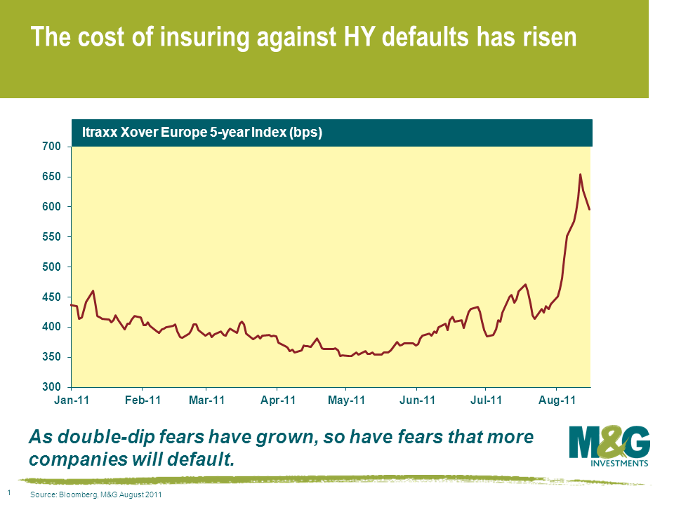
The price action in the high yield market has been brutal over the last few weeks. A very respectable year-to-date return of 3.8% as at end of June currently stands at -1.3% (according to the Merrill Lynch European Currency HY Index as at 15/08/11). That’s a significant re-pricing of risk. To put it in context, look at the iTraxx Europe Xover Index (for an explanation, see here). The most liquid vehicle in European high yield has seen spreads almost double from 350 in May to 595 today, and around 650 late last week. In other words, investors now require almost double the compensation for investing in the same 40 high yield names from three months ago.
Concerns around a stalling economic recovery & sovereign fears have seen investors redeem money in record amounts, forcing unprepared investors to sell indiscriminately into a very nervous buyer base. We’ve seen this sort of price action before – back in 2009, and it created some superb buying opportunities. Around $3bn of outflows were recorded in the US during the week to Aug 10th 2011, with the figure estimated to be around €600m in Europe. These are near record outflows respectively. Again taking the Xover Index as a proxy, the market is pricing in a default probability of some 42% (assuming a 40% recovery). Whilst this is some way shy of what the same index was pricing in at the nadir of the crisis, excluding CCC grade bonds, it is still pricing in a higher default rate than anything experienced in any five year period since 1970s.
Now I’d be a fool to call the bottom of the market here. If the global economy double dips, spreads will undoubtedly go wider again. Yet I am convinced that there are some bargains on offer. As James talked about in his recent blog, good old fashioned credit analysis is key. Where I can lend to sensibly capitalised businesses – with decent earnings prospects, strong liquidity, limited re-financing risk and good investor protection in the form of comprehensive covenants – I remain inclined to continue to do so. In a world where we expect interest rates to remain lower for longer, the 8-12% yields on offer from investing in senior secured paper issued by certain packaging and cable companies looks particularly attractive.
With a significant fall in the oil price (-28% since the end of April), inflation linked bonds are underperforming their nominal counterparts. The biggest impact though is in the US market, where TIPS yields have risen, especially at the shorter maturities. This chart shows that whilst short dated index linked gilt yields have edged up in the last couple of weeks, the yield on the 2012 maturity TIPS has risen aggressively.

Why are oil prices (both rising and falling) much more important for US inflation linked bonds than they are for those in the UK and Europe? It’s all about tax. In the UK, the duty rate for road fuel is the equivalent of £2.20 per US gallon, and VAT at 20% is charged on top of both the fuel and the duty. European taxes are similarly high (the Netherlands is especially high). In the US, federal tax is just 18.4 cents per gallon – adding in other state taxes, the average is 48.1 cents per gallon. So UK fuel taxes including VAT are about 10 times higher than those in the US. As a result, a rise or fall in the crude oil price impacts a much, much bigger part of the cost of a gallon of gasoline in the US than elsewhere, and therefore there is a more significant impact on the CPI as a result (both directly in the fuel element, and then subsequently through pass through costs to delivery drivers etc.).
This chart shows the impact of oil prices rising up to $180 per barrel and shows the impact on UK, EU and US inflation rates. All other things being equal, a rise to $180 would add 1.43% to the UK RPI, 1.54% to EU CPI and a massive 4.88% to US CPI. So higher tax rates protect UK and EU consumers against inflation and inflation volatility – not sure they’d see it like that though…

Anyway, elsewhere, I read a review of a BBC2 Horizon programme called Do You See What I See? It looked at sporting results for teams that play in red and blue – there’s always been an argument that teams in red do disproportionately well – this looked at a study from the 2004 Olympics, where taekwondo results were analysed. In that sport, red and blue combat gear is assigned at random – yet the results showed that red won 2/3rds of the results. Better still, when the fights were filmed, and the colours reversed digitally, judges watching the recordings still awarded of the “red” fighters the bouts. Fascinating stuff – and congratulations Nottingham Forest (in red) on a stunning cup come back last night versus Notts County!
Yesterday Jim did a conference call covering both the S&P downgrade of the US sovereign credit rating and the ECB’s massive buying of Spanish and Italian government bonds.
Recent selling of risk assets into traditional haven government bonds has taken their yields back near their all time lows. Will people continue to buy them in a risk off trade? We are almost certainly nearer the beginning than the end of a western world sovereign debt crisis. That means quite clearly that Gilts, Bunds and Treasuries are not the ‘risk free’ investments they once were. In relative terms, their risks are low and perhaps falling. But in absolute terms, their risks are high and rising. The US was just downgraded from AAA by S&P, and yet their yields are still rallying, contrary to the expectations of many and contrary to traditional theory. If greater fiscal union is the final solution to the peripheral European sovereign debt crisis, then the transfer of wealth from Germany and other strong EU states to the weaker ones will see Bunds, amongst others, sell off dramatically. Yet if fiscal union is unacceptable to some EU states and it fails to get parliamentary approval, then surely Bunds will remain firmly within the very top echelon of government bonds in the world, with yields potentially less than 1%? Perhaps the austerity plan which has been so important in supporting Gilt yields and the AAA rating in recent times sees UK borrowings become the last true safe haven in the Western world? Yet the low economic growth consequences of this approach could also scupper the plans and have just the opposite effect. As you can see, in each case traditional economic views and expectations about these ‘risk free’ safe havens could prevail, or could be utterly wrong. That doesn’t sound to me to be very risk free at all!
So, to where do we retreat in a new paradigm in which traditional safe havens are no longer such? Given the recent widening in credit spreads, I believe that some of the high quality investment grade credit now looks good value again. Maybe, just maybe, the new safe haven could become the high quality, low beta, internationally exposed, lowly geared, corporate bond universe?
Two months ago I questioned whether the decoupling between credit spreads and economic fundamentals could continue for much longer. I felt at the time that at some stage the weakening economic data would start to drag credit spreads wider, at least relative to government bonds. I also asked whether we might enter an environment in which high quality investment grade credit could see a flight to quality rally, whilst some of the lower quality, higher beta credit could sell off. Let’s see how government bonds and credit have fared since this blog was posted.
Bunds, Gilts and Treasuries have had a fantastic couple of months as shown in the chart below, with 10 year benchmark returns of 7%, 5.25% and 5%, respectively. However, this did not happen solely because economic data turned so horribly south, although it clearly did. These government bonds were boosted because of the peripheral sovereign debt concerns in Europe, and debt ceiling negotiations almost bringing about a technical default in the US. The markets panicked and sold risk and bought traditional, relative safe havens.

How has credit performed over the same period? The broad European, Sterling and US investment grade indices’ spreads have widened over the last two months. European spreads have risen from an average of +143 basis points to +172 (20% spread widening), Sterling spreads have risen from +193 to +218 basis points (13% spread widening), and US spreads have risen from +162 to +173 basis points (7% spread widening). Credit default swap spreads paint a similar picture of rising credit premia and rising risk aversion in the last two months, although the extent of the credit spread sell off has been greater in this market than in cash, largely due to far superior liquidity and therefore activity. The index of the 125 investment grade names in Europe has risen from a weighted average spread of 104 to 134.5, or a 29% spread widening, and the equivalent US index has risen from 96 basis points to 105 basis points, a widening in spreads of 9%.
Market participants in all risk assets have reacted typically: selling higher risk assets for perceived lower risk ones. In fixed income, we have observed this both in the cash market and in the CDS market.


However, in June I expected to see this as a result of a fundamental worsening in the economic data and environment, rather than as a result of a global panic in risk that has actually transpired. But the panic sell off in all types of risk has seen all sorts of participants sell whatever they can and buy anything traditionally perceived as risk free. Assets of all classes have been sold into higher quality government bonds.
Think the US is out of the woods now that congress has come to an agreement on the debt ceiling? Not according to this chart from Rich Yamarone, an economist at Bloomberg. It’s called the “2 percent rule”. When US GDP falls below 2%, it usually means the world’s largest economy is headed for a recession.

Last week, we received confirmation that US GDP was just 1.6% in Q2 2011. Combined with yesterday’s much weaker than expected ISM report and an unemployment rate at 9.2% , it suggests that the US Federal Reserve won’t be in any rush to hike interest rates this year. Fed Governor Ben Bernanke may even be warming up the printing press (as Mike alluded to here) if US employment and growth outcomes don’t start to improve – and quickly.
We’ve finally activated our long dormant Twitter account, and you can now follow us.
Click here to follow @bondvigilantes.
To start with we’ll simply be tweeting links to new articles on this blog, but once we’ve got the hang of it we will use Twitter to link to articles we think are interesting, retweet stuff by people we follow ourselves, and, on exciting days (budgets, elections, economic meltdowns) maybe give our blow-by-blow thoughts on the world. In common with the blog itself, tweets about our funds, performance etc. will be off limits. We’ll keep it entirely focused on bond markets and economics.
All of this will be subject to getting the day job done of course, so forgive us if it takes us a while to match Stephen Fry’s 9,145 tweets. In the meantime I am trying to work out the difference between an @ and a #.
Please also let us know if there’s anybody that we should be following. My favourites so far? @zerohedge, @lcdnews, @boe_news and @ftfmforum.


Sign up to the Bond Vigilantes mailing list to ensure you never miss a great article from our expert Bloggers. We will email all new articles to your inbox, meaning you can stay on top of the world of Bonds.
I confirm that I would like to receive information about Bond Vigilantes and products and services from M&G Securities Limited.
We will use the email address and personal data you have shared with us to send you this information. For existing customers, submitting your contact details and requesting to receive this information from us, will replace any earlier choices you have made in respect of marketing information.
You can unsubscribe from marketing at any time, at which point we will not send any further marketing information to you, by selecting the unsubscribe link in all communications.