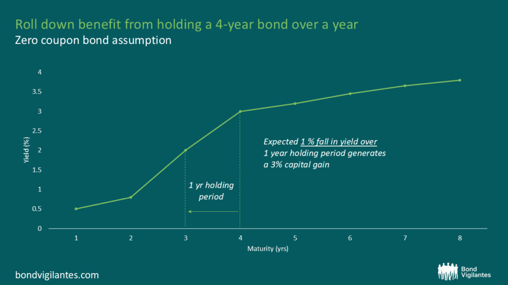
Rolldown
A dispatch from the number crunchers – Yield curve rolldown
By Matthew Russell
15 April 2026

The financial sector has understandably been a hot topic over the past few years and is a subject we’ve blogged about at great length. Given the constant newsflow around the sector, and of course due to popular demand, Ben Lord and Stefan Isaacs recently joined forces with Jeffrey Spencer, a senior member of our financial institutions credit research team, to share our current views.
We thought these two teleconferences would be of interest for our readers as Jeffrey uncovers the truth behind some common misconceptions about the state of the banking system.
From a fundamental research perspective, Jeffrey analyses a range of issues, including the extent to which banks have de-levered, their reliance on wholesale funding as well as the challenges they are facing in raising capital.
Our fund managers took this opportunity to restate their views about financials from a more macroeconomic and sector allocation perspective.
There are two versions, similar to each other, but one is aimed at a more European audience, whilst the other is slightly more UK focused.
Enjoy!
Financial Teleconference: UK Call: http://mediazone.brighttalk.com/comm/mandg/be63cbb3aa-28085-2783-30958
Financial Teleconference: Euro Call: http://mediazone.brighttalk.com/comm/mandg/80430385fb-27989-2783-30927
I saw a very interesting article in this weekend’s Financial Times discussing the London property market. Ed Hammond cited data showing that Greek and Italian citizens have accounted for more than 10% of London property purchases so far in 2011. In fact, Greeks and Italians have so far this year spent more than £400m on prime London property, up from £245m in 2010. Much of this has been into the most exclusive parts of London such as Mayfair and Knightsbridge. It looks like there is a real urgency amongst rich southern European citizens to protect their wealth in this environment of soaring government bond yields.
It struck me that it was, though, a strange situation. Two countries that are on their knees, unable to finance at sustainable rates, that at the same time find themselves very high up the global wealth league tables. Italy, for instance, in 2010, sat in the top 10 of countries with the highest average wealth per adult (according to Credit Suisse). In another study, the Human Development Report 2011, Italy comes out as the 24th wealthiest country in the world while Greece sits at 29th. The UK came just above Greece, at 28th, for purposes of context. Norway and Australia come first and second, respectively.
In these markets that are being totally dominated by what we call the sovereign debt crisis, the market has become fixated on debt to GDP ratios, as corporate bond investors have always paid close attention to companies’ net debt to EBITDA ratios (an income statement approximation to cash earnings). Both ratios very simply look at the level of debt relative to earnings, and thus give some indication of how easily a country or company can service their debts.
Going into this crisis, countries (not companies) were paying out more in spending than they were taking in tax revenues. And as the bond markets have become not just concerned, but obsessed with starting to reduce debt levels relative to GDP, we have seen austerity budgets passed all over Europe (not the US, but that is something we will all worry about at a-not-that-much later date). These are a direct attempt to bring primary budgets back into balance, where spending is financed through tax revenues rather than increased borrowings. A secondary aim of this is to start to bring down the all-important debt to GDP ratio.
But governments are finding it very difficult to bring in the necessary budgetary reforms due to political unrest. And now, the few reforms that have been brought in to cut spending have met with what looks like being a global slowdown. Perhaps even a global recession. So governments are not only struggling to bring the primary budget back into balance, but are now seeing GDP growth fall, whether by coincidence, or by actually contributing to the decline in growth (more likely). And if GDP starts to fall, then debt to GDP ratios deteriorate unless total debt levels are being reduced by a faster amount. You won’t find many, if any, examples of states that are actually cutting their total debt levels in Europe yet.
It is worth observing, in passing, that there are several countries that have pretty terrible debt to GDP ratios that also have historically low interest rates (witness the US, the UK and Germany, amongst others). The implicit message here is that debt to GDP is not the be-all and end-all in terms of the cost of that debt.
So what is needed, if growth continues to slow and the threat of renewed recession spreads across these over-indebted nations?
The evidence of the Greeks and the Italians coming and spending such large sums of money on prime London property suggests that these people fear a new wave of fiscal approach to this crisis. As growth in both these states continues to plummet, thereby worsening traditional debt to GDP ratios (bar a haircut or default, both synonymous as far as we’re concerned) a new approach by policymakers may start to take hold. Austerity isn’t going to help in this environment. Perhaps even the opposite. What is needed is an ability to stimulate the economy, so as to generate jobs and growth. And what is all too clear from the last couple of years is that the bond markets will no longer lend to finance these budgets aimed at growth. So the resource needs to come from somewhere else. Is it time for Robin Hood to come to the rescue in the form of a wealth tax? It appears that many citizens of peripheral Europe are starting to fear exactly that.
In this heightened atmosphere of risk aversion, the high yield market as a whole has been far more discriminating when it comes to any poor fundamental performance from individual issuers or sectors. This has led to some large relative moves between certain bonds and sectors within the market. To put it another way, 2011 is turning out to have been a vintage year for stock picking. Those high yield fund managers who have managed to correctly back the “winners” and avoid the “losers” will have significantly outperformed.
This has been particularly true of one major trend that happens to affect a lot of high yield issuers, namely the shift away from traditional physical and analogue media toward online and digital media.
This shift has been occurring for years, but the pace of the change in how people consume content has suddenly accelerated in the last 18 months, with profound consequences for many companies within the high yield market.
One group of “winners” in this case has been the broadband and cable operators in Europe. As people start to watch more digital TV, use more bandwidth intensive services and consume content online, the demand for faster and more reliable broadband and digital TV has increased rapidly. With well invested fibre optic networks and with consumers willing to pay premium prices for premium services, a lot of European cable companies have been enjoying a miniature boom despite the broader travails of the European economy. The latest round of third quarter results from companies such as Virgin Media in the UK, Kabel Baden Wurttemberg in Germany and Ziggo in the Netherlands, have merely affirmed the trend. (Full disclosure: M&G funds own bonds issued by the companies mentioned).
The “losers” in all this have been companies who have been involved in the traditional provision of physical media.
For instance, let me ask you a question: when was the last time you picked up a physical telephone directory?
Directories businesses (traditionally large issuers in the high yield markets) have been having to cope with gradual structural decline for years. This in itself is not a large negative for creditors. A company that is in decline can still generate a lot of cash and repay its debts. The pertinent issue for bondholders is the pace of decline and whether those debts are manageable.
What the directory companies have found is that in the age of Google and Facebook, fewer consumers are reaching for the Yellow Pages to find a plumber and are instead reaching for their laptop or smart-phone to type in a search or ask their social circle for a recommendation. As a result small businesses are reallocating their advertising budgets online at an ever-accelerating rate. Directories companies have tried to mitigate the shift by entering the online space but with mixed results. Consequently, as earnings and cash flow have been falling ever faster in 2011, debt loads are starting to look increasingly unsustainable. Debt restructurings and bankruptcies are becoming a recurring feature of this sector. (Seat Pagine in Italy, for instance, is currently in talks with its bond holders to exchange almost € 1.3bn of high yield bonds into equity)
The crucial thing for us as high yield investors is that this fundamental trend has been starkly reflected in the performance of the bonds over the course of this year. As we can see in the chart below, backing the “winners” (in this case senior secured bonds issues by Virgin Media, Kabel Baden Wurttemburg and Ziggo) in green and avoiding the “losers” (senior secured bonds issued by Seat Pagine and Pages Jaune) would have meant a relative outperformance of almost 30% this year.

As the Eurozone melodrama continues to dominate the headlines, it’s easy to forget that for the millions of European consumers and thousands of companies, life (for now at least) carries on. As it does so, there are many profound shifts within the economy that should not be ignored by investors.
Inflation remains a hot topic here in the UK. The latest numbers out last week showed CPI had risen by 5% over the year. This is only 3% above the Bank of England’s target rate. If inflation remains at this rate for the next 5 years, the buying power of £100 today will fall to £78.35. Ouch! The words of John Maynard Keynes immediately spring to mind: “The best way to destroy the capitalist system is to debauch the currency. By a continuing process of inflation, governments can confiscate, secretly and unobserved, an important part of the wealth of their citizens.”
I thought it might be interesting to see what the actual experience of inflation was for UK citizens. Obviously, the basket of goods will differ between a student or a pensioner and hence their respective experience of inflation can be very different. Warning – I had to make a few assumptions/guesses along the way (as any good economic analysis inevitably does).
I have split up the population into four highly simplistic categories; student, parent of a young family, baby boomer, and a pensioner. To assist my guess work, I had a few people in mind. These being: my brother’s girlfriend (uni student), my uncle (parent of a young family), my old man (baby boomer b. 1956), and my granny (age 78). From this highly scientific reasoning I came up with the following inflation basket weights.
| Category | UK CPI | Student | Parent of a young family | Baby boomer | Pensioner | Average of sample |
| Food | 12% | 15% | 15% | 10% | 20% | 15% |
| Alcohol & Tobacco | 4% | 10% | 2% | 5% | 0% | 4% |
| Clothing | 6% | 3% | 5% | 5% | 5% | 5% |
| Housing | 13% | 7% | 20% | 15% | 20% | 16% |
| Furniture | 6% | 0% | 5% | 10% | 5% | 5% |
| Health | 2% | 1% | 3% | 3% | 15% | 6% |
| Transport | 16% | 18% | 15% | 20% | 5% | 15% |
| Communication | 3% | 5% | 2% | 3% | 4% | 4% |
| Recreation | 15% | 10% | 15% | 10% | 10% | 11% |
| Education | 2% | 10% | 10% | 0% | 0% | 5% |
| Restaurants | 12% | 15% | 5% | 13% | 5% | 10% |
| Miscellaneous | 9% | 6% | 3% | 6% | 11% | 7% |
Interestingly, even though it is a very small sample, the average weights of the four people comes very close of the official UK CPI weights. The biggest difference is recreation (the sample proportionately spends less than the official basket) and health (where granny’s basket of goods is weighted 15% towards health).
Let’s have a look at what the inflation rate was over the past year for the categories that make up the UK’s basket of goods.
| Food | 5.00% |
| Alcohol & Tobacco | 9.10% |
| Clothing | 3.60% |
| Housing | 9.10% |
| Furniture | 5.70% |
| Health | 3.00% |
| Transport | 7.70% |
| Communication | 4.80% |
| Recreation | -0.50% |
| Education | 5.10% |
| Restaurants | 4.50% |
| Miscellaneous | 2.80% |
It is now possible to calculate inflation across the categories. UK inflation is 5.0%. Inflation for a student came out at 5.4%. Inflation for a parent of a young family is 5.3%. The baby boomer category came out at 5.5%. Pensioner inflation was calculated to be 4.8%. From this analysis it appears baby boomers are being hit the hardest by inflation. If inflation stays at its current rate for my old man, in 2024 he will find £100 will lose half its value and will only purchase £49.86 worth of goods and services.
What is particularly interesting is that UK pensioners currently make up 16% of the population. This is forecast to grow to 23% by 2035. This demographic trend may have a substantial impact on inflation going forward. As the UK population ages, a greater proportion of the population will be minimising their consumption to save for retirement. This is a deflationary force. Categories like recreation, restaurants, and alcohol & tobacco will likely fall as a proportion of the consumer basket.
On the other hand, the workforce will become less efficient as workers retire. Highly skilled workers will become more scarce, suggesting employment costs will rise. Production of goods and services and productivity will fall. This is an inflationary force. Categories like health and housing (which incorporates utility bills) will likely grow as a proportion of the average UK consumer’s basket.
Sir Mervyn King blames the VAT increase and higher import and energy prices for high UK inflation readings. It is nice to be able to look through these effects if you are setting monetary policy, less nice if the rising costs of these items are eating into your retirement nest egg. With the BoE bank rate at 0.5% and unlikely to rise anytime soon, it is hard to find a secure investment which will compensate for the current elevated level of inflation.
It is rumoured that if you place a frog into a pot of water and slowly increase the heat to boiling, it will not feel it. With the BoE embarking on another round of QE, the water could reach boiling point very soon for UK savers.
Ben and Mike attended a very informative recent lunch featuring two of the top bods at the UK’s Office for National Statistics and hosted by the excellent Alan Clarke (ex BNP Paribas UK economist, now at Scotia Bank). They thought that there could be a great opportunity to share Joe and Pam’s expertise on UK GDP and UK inflation with our blog readers so they phoned ahead and managed to locate both a small camera and a vacant meeting room. Joe and Pam were extremely kind to agree to jump in a taxi and head over to M&G’s office, where they recorded an impromptu 15 minute video discussing a range of topics from why you shouldn’t read so much into the strong UK Q3 GDP data to why the Retail Price index (RPI) is getting outdated and what the Office for National Statistics (ONS) is planning to do about it.
People are still wondering what caused the big surge in Italian and Spanish government bond yields back in July that lurched the Eurozone debt crisis into the current very serious phase (eg see here). I suspect that, if anything, the most likely trigger was Moody’s decision to cut Portugal’s rating from Baa1 all the way down to Ba2, a four notch downgrade, on July 5th this year. The junking of Portugal, while surely not that unexpected, managed to spark a wave of forced selling by investors who presumably were only permitted to own investment grade sovereigns. Portugal 10 year bonds collapsed immediately after the downgrade, with 10 year yields soaring from 10.75% to 12.7% in a day. The effect was rapidly felt in other peripheral Eurozone sovereigns, and in just one week, Spanish 10 year yields leapt 60bps to 6%, a level at which market participants began to question debt sustainability.
The lesson is that whatever you may think of the credit rating agencies, they really matter. They also tend to follow what the market does. As I mentioned in a blog comment on July 7th here, the tail tends to wag the dog when it comes to the rating agencies. A sovereign bond sell-off = domestic bank sell off = higher borrowing costs all round = higher interest costs = creditworthiness deteriorates = ratings downgrade = sovereign bond sell-off. But now that the market has figured out this reaction function, it just results in Eurozone sovereigns and banks getting dragged into the vortex.
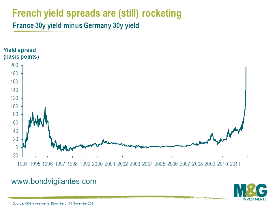
Today we’ve seen probably the most worrying day of this crisis so far. It’s a ‘risk off’ day, yet even the Netherlands, which the market perceives to be the second strongest Eurozone sovereign, is coming under a bit of pressure with Netherlands 5 year bond prices down 1% on a day when Germany has rallied. France is seeing a full blown run on its debt, with France 30 year bond yields soaring to 4.43%, the highest since June 2009 (German 30 year bond yields are at record lows of 2.45%). In price terms, 30 year French bonds have underperformed 30 year German bonds by 14% since the beginning of November and by 20% since the beginning of October. See below for a chart on French spreads over Germany, updated from a blog comment on the developing situation in France last month here.
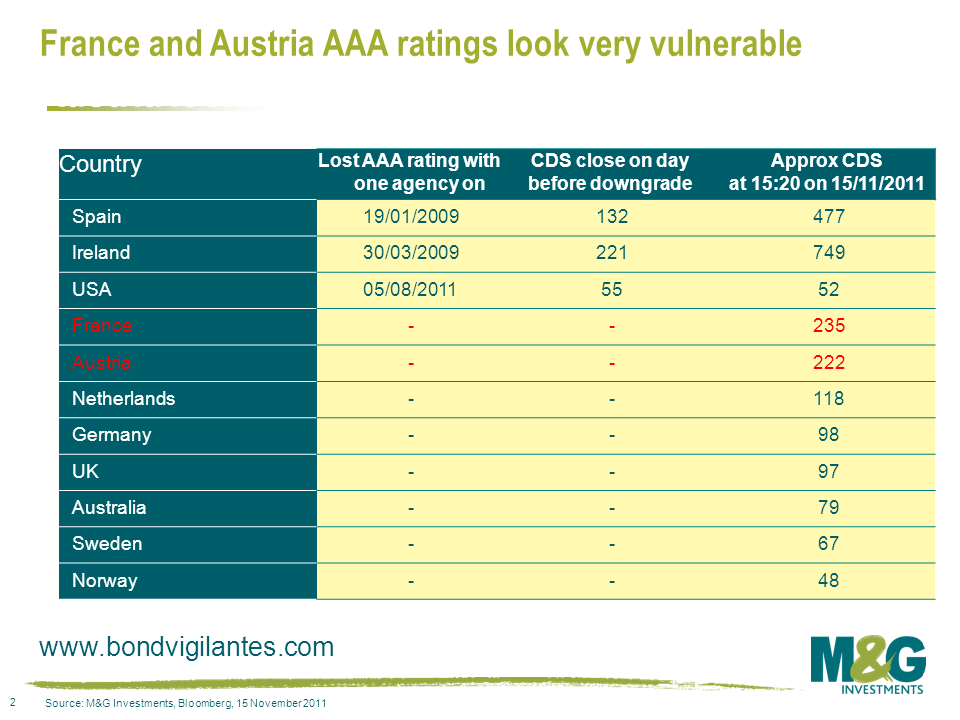
What does the CDS market, which has arguably slightly led the sovereign cash bond market in the past few years, say about the risk of France or Austria losing their AAA ratings? Pretty much nailed on, as the table below shows. The pesky bond vigilantes have found a whole heap of bones, their tails are wagging furiously, and surely the rating agencies’ threatening barks are about to turn into bites. Get prepared for a dog’s dinner.
Today’s FT launches on the significant headline of record low gilt yields (see here). Within the article it discusses a number of issues from quantitative easing to Bill Gross’ famous quote regarding the UK “resting on a bed of nitroglycerine” (which was something we took issue with at the time as commented here).
However the new revelation for me today was the opinion that “low gilt yields are bad news for savers and pensioners that rely on interest for income”. At face value true, but what about reality?
If you are a current saver or pensioner and own gilts, or indeed any other good quality bonds, then you have had a cracking year, and a cracking decade. The asset class has been in a huge bull market. Surely that is a position in which a saver wants to be?
 If you are about to start seeking an income from government bonds by saving in the asset class then yes, income returns are at historic lows. However for existing investors, record high prices and low yields are presumably good news. If investors think the asset class is now unattractive, at least they have the capital gains and option to buy into an asset class whose performance has lagged and where yields have not fallen to new lows.
The concept that a bull market is bad news for investors is indeed true if you own none of the asset class, but similarly a bear market in equities is great news for pensioners and savers if they have yet to allocate to the asset class.
So regarding record low government bond yields being good or bad news, as always with investments, it depends on your position.
There’s a very interesting article in the British Airways in-flight magazine this month by Tim Harford, also known as the Undercover Economist in his FT column. In it, he points out that Benford’s Law showed that Greece’s reported macroeconomic statistics could have been dodgy well before we knew that for a fact. Benford’s Law shows that in real-life data, numbers are distributed in a non-random way. If you look at any collection of numbers – and Harford gives examples of populations of cities, lengths of rivers, or the numbers mentioned in The Economist magazine – the first digit will be 1 in 30% of occasions, with 9 as the first digit only appearing less than 5% of the time.

Benford’s Law is useful because “real” data exhibits such characteristics, but manipulated data doesn’t. Therefore it can be used to analyse data which might be suspected to be fraudulent. And according to the German Economic Review (Fact and Fiction in EU Governmental Economic Data), the Greek economic data was the furthest away from the expected Benford distribution of any EU member state. In particular Greece’s data was especially unusual in the year 2000, the year before its entry into the euro…
At the beginning of this year our team sat down and had a collective brain dump about long term big picture themes. To be honest we do this on an intra day basis anyway, but for some reason at the beginning of a calendar year everyone feels the need to have a fresh look at things.
It seems a long time ago now, but in January 2011 the global economy was looking fairly robust. In terms of the Eurozone debt crisis, the financial markets weren’t looking beyond Greece, Portugal and Ireland, and the strong consensus view at the time was that Spanish and particularly Italian sovereign bonds were money good.
As we’ve exhaustively documented on this blog and elsewhere, we’ve been very negative on Eurozone banks and the weaker Eurozone governments for a long while, and our big concern when we sat down back then was that yes, Spain and Italy may be perceived to be fine now, but what happens to the creditworthiness of these countries if the Eurozone falls back into another recession?
Well we’re about to find out. As we tweeted this morning, the final release of the Purchasing Managers Index (PMI) data for the Eurozone provided a clear indication that the Eurozone is entering recession (see chart). A PMI composite reading of 46.5 equates roughly to a quarterly GDP reading of -0.7%, or an annualised GDP rate of -2.5 to -3%. Looking at the country breakdown, the weakest PMI numbers by far were seen in the large highly systemic economies of Spain, Italy and France.
 I attended a highly informative roundtable discussion with Moody’s this morning where we spent a number of hours talking about the Eurozone, and my interpretation was that they have concerns about France’s track record in sticking to its deficit targets. Surely any further downgrade to France’s growth forecast would increase these concerns further. Moody’s stressed that they are keen not to surprise markets, and indeed in October they publicly gave a warning of a warning of a French downgrade.
Given today’s data release, I believe it’s now inevitable that France has its AAA rating put on negative outlook in the coming months. If French yield spread widening continues and the ‘unthinkable’ happens whereby France follows Spain and Italy and begins to lose access to the bond market, then this would trigger a multiple notch rating downgrade.
If the rationale behind Moody’s French warning in October was to give markets a ‘heads up’ about the risk of a downgrade then it clearly worked. Markets have moved to start pricing in the risk of a downgrade, and at one point yesterday the yield spread on French 10 year government bonds hit a record 140bps over German 10 year government bonds. As mentioned on this blog here, this really matters because if France (a ‘core’ Eurozone country) loses its AAA status then the EFSF bailout fund just doesn’t work (it didn’t work anyway – see previous comments here and here – but a French downgrade would mean it definitely definitely wouldn’t work). And French yield spreads have rightly exhibited a close correlation to EFSF yield spreads.
So now what? Fiscal union? Very unlikely any time remotely soon, as exemplified by Berlusconi being quoted just now saying that Italy will not give up any sovereignty to the IMF. How about the ECB buys half the eurozone bond market? More likely as a short/medium term solution, but evidence suggests this is still highly unlikely in light of the Securities Market Programme’s (SMP) lack of action and lack of success this week in stabilising Italian government bonds. In fact 5 year Italian government bond yields, having been 4.2% at the end of August, just hit a euro era high of 6.2%. Not pretty given that the Italian government, the third most indebted in the world after Japan and the US, has over €300bn of maturing debt it has to somehow refinance next year (and even less pretty is the enormous amount of bank debt that needs refinancing at a time when European banks are struggling to get any unsecured funding at all).
That doesn’t leave many other options, just more confusion, more inaction, more social unrest, more toppled governments, more money printing and more panic.
Have a good weekend!
Everyone is familiar with the deterioration in US labour market. Figures out today show that the unemployment rate has more than doubled to 9.1% from its pre-crisis low of 4.4% in 2007. The question is how accurately does the unemployment number reflect the true state of the US labour market? To understand this, we need to grasp how the unemployment numbers are compiled.
The Bureau of Labor Statistics (BLS) is responsible for conducting the surveys that inform economists, press, politicians and citizens as to the strength or weakness of the labour market. To do this, the BLS conducts the Current Population Survey (CPS), known as the Household Survey. The CPS has been conducted in the United States every month since 1940.
The BLS calls up around 60,000 households – covering around 110,000 people – every month to find out who is and who isn’t working. To get an even spread of responses, the US is split into 2,025 geographic areas. From the 2,025 areas, 824 are selected every month to take part in the survey. The sample is designed to reflect urban and rural areas and different types of employment. Persons are classified as unemployed if they do not have a job, have actively looked for work in the prior four weeks, and are currently available for work.
There are around 115,000,000 households in America, meaning that there is a 0.05% chance that the BLS will call any individual household. Obviously, the majority of households will never be called. If you are lucky enough to be called up, the BLS will ask you a number of questions including:
If there is no reason, except temporary illness, that the person could not take a job, he or she is considered to be not only looking but also available for work and is counted as unemployed.
The labour force is made up of the employed and the unemployed. Excluded are persons under 16 years of age, all persons confined to institutions such as nursing homes and prisons, and persons on active duty in the Armed Forces. Everyone else is defined as “not in the labour force”. If you are not in the labour force, the BLS will ask you:
From responses to these questions, the BLS will determine whether or not a person is “marginally attached to the labour force”. To be counted as marginally attached to the labour force, individuals must show some degree of labour force attachment by looking and being available for work. “Discouraged workers” are those who are not looking for work because they don’t believe there are any jobs, were previously unable to find work, lack the necessary skills or experience to do a job, or face some form of discrimination from employers such as being too young or too old.
If you are “marginally attached to the labour force” or a “discouraged worker”, you’re out. You are not included in the labour force. When it comes to calculating the unemployment rate, you’ve disappeared. You are not counted in the official unemployment rate, the rate that everyone uses to understand how well the Fed is doing at achieving its dual mandate of stable prices and full employment. This official unemployment rate, which equals the total number of unemployed as a percent of the labour force, is known to economists as U-3. On this measure, it appears the unemployment rate is now trending lower.

For those who think the U-3 calculation is too stringent (like us) to get the full picture of what is going on in the labour market, the BLS produces a broader measure of unemployment known as “U-6”. It basically includes marginally attached and discouraged workers in the unemployment calculation. It also includes those people that are working part-time but would rather be full-time. On this measure, the US labour market appears to be deteriorating once more, and the unemployment rate as calculated by this measure is 16.5%. This suggests around 11.4 million Americans are marginally attached or discouraged workers (from 2001-2008, the number of marginally attached or discouraged workers was on average 5.8m people). According to the BLS, 11.4m Americans do not have an income, do not pay income tax, and do not contribute producing goods and services. Indeed, almost 15% of Americans (45.8m) are now on food stamps. This is a substantial drag on economic growth. In writing this blog, we’ve had an eyebrow-raising moment. According to the BLS, the American workforce (employed plus unemployed people) has actually shrunk since October 2008. It doesn’t seem to make sense, given most estimates tend to suggest the US population is growing at 1.0% per year, in part due to immigration. We would expect labour force growth to slow due to the retiring cohort of baby boomers and peak in the participation of women in the labour force. But it shouldn’t be negative.

The reason it is negative is because the BLS doesn’t count those who are marginally attached or discouraged from entering the labour force (as shown above, around 11.4m people). This has the result of reducing the size of the labour force, resulting in a lower unemployment rate percentage. This is why the official unemployment rate is much lower than the broader U-6 measure and has actually been falling. More and more people are becoming so disenchanted with their job prospects that they have simply stopped looking for a job.
Despite the idiosyncrasies in calculating the unemployment numbers, they are the best we’ve got. If the Fed is really serious about targeting the unemployment rate – as Chicago Fed President Charles Evans has suggested – then it should have a good hard look at including those people who are underemployed, discouraged or marginally attached to the labour force. The official headline rate – which gets the most coverage amongst the financial community – overstates the current health of the US labour market.


Sign up to the Bond Vigilantes mailing list to ensure you never miss a great article from our expert Bloggers. We will email all new articles to your inbox, meaning you can stay on top of the world of Bonds.
I confirm that I would like to receive information about Bond Vigilantes and products and services from M&G Securities Limited.
We will use the email address and personal data you have shared with us to send you this information. For existing customers, submitting your contact details and requesting to receive this information from us, will replace any earlier choices you have made in respect of marketing information.
You can unsubscribe from marketing at any time, at which point we will not send any further marketing information to you, by selecting the unsubscribe link in all communications.