Rolldown
A dispatch from the number crunchers – Yield curve rolldown
By Matthew Russell
15 April 2026

In my last blog, about the many positive signals for US housing and the massive potential for that to drive US growth over the next couple of years (see here). I mentioned that I’d met recently with George Trefgarne, the author of a Centre for Policy Studies booklet called Metroboom. In it he pointed out how important housing construction had been in the UK’s recovery from the “slump” of the 1930s – I suggested that house building would be a very powerful way for the UK to get out of our current growth problem. As we’ve pointed out before, the UK’s growth performance from the credit crisis onwards is actually far worse than it had been in the 1930s in terms of lost GDP.
Metroboom is definitely worth a read. It certainly adds to the debate on the austerity vs fiscal stimulus debate, and (perhaps controversially) argues that it was a combination of spending cuts and tax cuts that helped to restore economic growth in the UK in the 1930s. The paper also argues that the view of the 1930s as universally gloomy in the UK is overstated. Areas that relied on shipbuilding and coal mining (the Special Areas) did remain depressed for much of the decade, and only re-armament ahead of the war stimulated growth again, but for much of the nation recovery came much earlier. Trefgarne claims that the UK was well ahead of most of the rest of the world in coming out of depression (only Germany grew faster), and that the period was one of industrial and technical innovation (and an obsession with world speed records!), an infrastructure and housing revolution, and improved leisure time (paid holidays, a cinema boom).
Perhaps one problem that we face today, that makes the UK’s 1930s solution difficult to implement today is that the tighter fiscal stance then could be offset with looser monetary policy – a policy tool that Trefgarne says was necessary to run alongside the austerity. As we approach the zero bound in interest rates around the western economies, and when the Bank of England hints that it finds diminishing returns from more and more Quantitative Easing, those monetary tools are unavailable. Olivier Blanchard, chief economist of the IMF, suggests that the reason for the negative fiscal multipliers being perhaps 3 times higher in this current downturn than they had expected them to be (1.5x versus 0.5x) is exactly this effect – monetary policy can no longer offset fiscal policy tightening. Additionally, when the UK came off the Gold Standard in 1931, the depreciation of sterling was very beneficial to UK exporters – I think that this currency depreciation was the most important factor in the UK’s eventually recovery. It’s also interesting to note that at the recent IMF/World Bank meetings in Tokyo (see my video here), Blanchard used the UK in the 1930s as an example of exactly why austerity failed, so the data from that period can be interpreted in very different ways!
I highly recommend you read Metroboom – it’s a short and concise economic history of the UK in that period with some great colour too (Neville Chamberlain at the time was regarded as a dynamic, media savvy “Man of the Year”, the Navy came close to mutiny following wage cuts, and 180 lidos were built in the decade). It’s interesting to have a different view to the commonly held one that the UK’s policies were disastrous whilst the New Deal Keynesian policies of the US proved to be the way to get out of Depression.
We have 20 copies of the Metroboom booklet to give away to the first names out of the hat with the correct answer to this question:
Which famous train broke the speed record between London and Edinburgh in 1938?
Terms and conditions here. Enter here or email us at bondvigilantes@mandg.co.uk
Congratulations to the 20 winners named below – we will be in touch to get your copy of Metroboom to you. My question turned out to be a little ambiguous. I was looking for The Mallard as the answer to the question, as it hit a record speed of 126 mph at one point between London and Edinburgh in 1938. However, the Flying Scotsman set the record time for the entire journey between London and Edinburgh. In light of the confusion I generated, both answers were accepted. Thanks to everybody who entered, and good luck if you are attempting the annual Bond Vigilantes Christmas Quiz!
William Blake, Quilter
Chris Summers, FAMC Ltd
John McLaughlin, Brewin Dolphin
Nigel Farmer, Charles Stanley
Rachel Revesz, Citywire
Harry Rogers, Bentley Reid & Co
Joanna McIntyre, Standard Life Investments
John Slater, Medicas
Chris Spink, Thomson Reuters
Chris Rule, Kingfisher Financial
Herman Bakker, VSB
Jacob Nelson, BIS
John Topalian, Topalian Associates
Neil McHaffie, KM Financial
Mateusz Malek, Killick & Co
Mark Jones, Brewin Dolphin
Debbie Behrens, Charles Stanley
Richard List, J O Hambro Investment Management
Ian King, The Times
Bill Crowley, Independent IFA
There are some big risks to the US economy, but the potential for the US housing market to surprise on the upside, and deliver massive gains to US employment might well be the bigger story for 2013.
The real damage that the fiscal cliff is causing is mainly psychological at the moment, discouraging both capital investment and hiring. I’m not allowed to use the phrase that involves metal food containers being moved further along transport routes by means of the foot, as we have a “cliché box” at work, and saying it would cost me dearly – but that is both the obvious solution to the problem, and indeed the only solution. The size of the US debt is now too big for any politician to deal with decisively, and some sort of default (against bond holders if a default against the population’s pension or healthcare expectations isn’t possible) or devaluation (currency or inflation) sometime in the future will be likely.
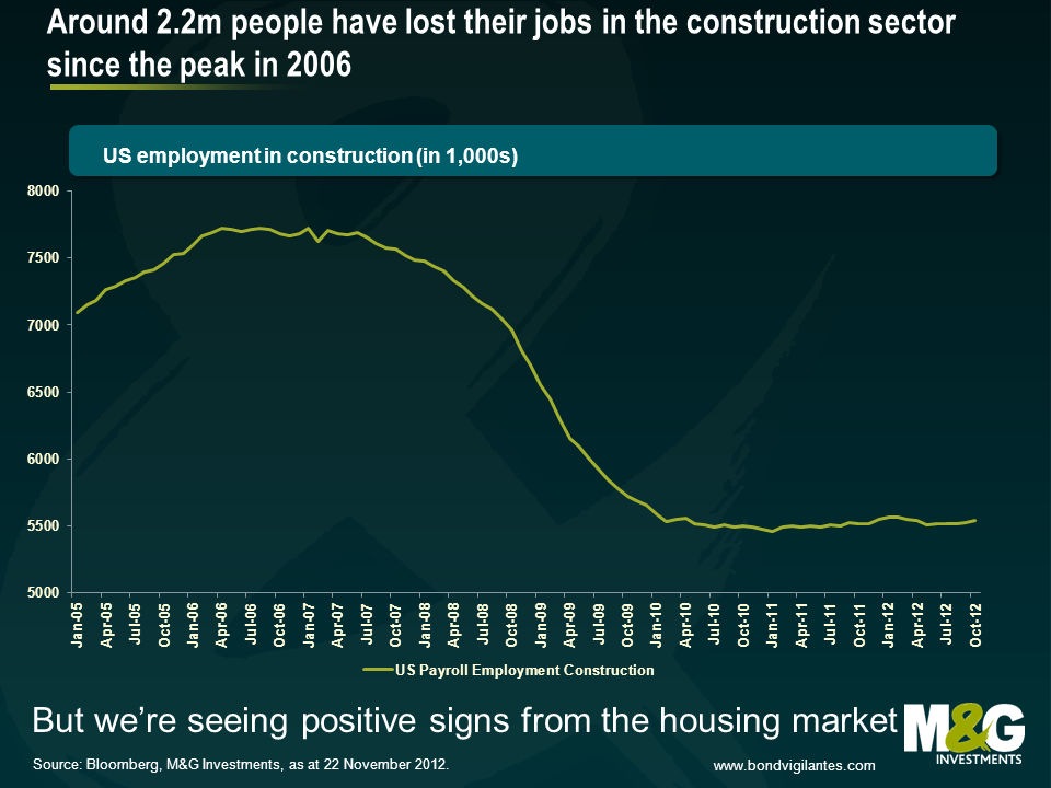
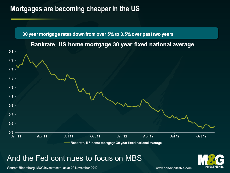
The focus on the fiscal cliff has taken attention away from what we think are extremely positive developments elsewhere in the US economy – and particularly in the housing market, as alluded to in September. US housing became the centre of the global financial crisis from 2007 onwards, when the credit bubble burst as sub-prime mortgage loans started to go bad. Too many houses had been built, and the overhang of unsold inventory together with foreclosures and falling real incomes and unemployment led to a sharp fall in house prices. The banking system went bust, and a huge number of construction jobs were lost in the economy. From a peak of 7.7 million Americans employed in construction in 2006, by the start of 2010 the sector had lost 2.2 million jobs. But we’re now seeing a large number of positive signs in the US housing market, and just as the negative multiplier effects spread through the economy when the sector tanked, the reverse might be true next year.
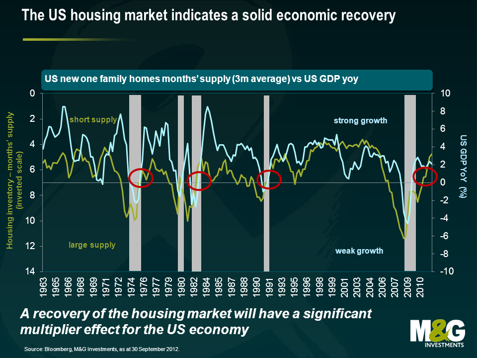
The chart below was very important to us in 2007, when it led us to expect not just weak growth in the US, but an outright recession with huge damage to the banking sector. It showed that there had been so much overbuilding in US residential property that the supply of inventory had moved from about 4 months to over 7 months. This had historically been a leading indicator of recession. In fact unsold inventory moved much further than 7 months, hitting 1 year in 2008, presaging US GDP falling by 4% year on year. You can see that the available inventory of housing is now contracting sharply, to the extent that US growth should continue positive. It’s also at a level where house-building should resume – and the multiplier effect from that will be extremely powerful.
Other reasons to be cheerful about US housing? Well house prices have been rising, according to the S&P/Case-Shiller index, since March this year (but remain “cheap”, 30% below the peak in nominal terms, even weaker in real terms). So the negative sentiment around the sector will be fading somewhat – nobody wants to buy into a falling market. And the Federal Reserve has almost entirely moved its Quantitative Easing programme away from purchases of US Treasuries and towards the purchase of Mortgage Backed bonds. This should eventually help get the transmission mechanism working again. In theory American mortgage investors should be able to refinance existing mortgages at high rates into new lower rate loans. This hasn’t been happening – banks have dragged their heels on paperwork (the time from agreeing a loan to it closing has anecdotally risen from a month to three months for example), and lending standards for the new mortgages are often higher than they were for the outstanding stock of mortgages. So new 30 year mortgage rates are around 3.31%, (a record low). But as at 2011 (it’s probably lower now) 28 million Americans had outstanding mortgages with rates over 1% higher than the rate for new mortgages – in theory these are all refinanceable at lower levels. You could read this as bad news – but it represents a possible windfall gain for consumers if the transmission mechanism does start working again (lower interest payments equals more spending power). And the Fed is now focused on making the transmission mechanism work – it will get better.
So if the price of US housing is attractive, and mortgage rates have fallen, and there’s an increasing level of demand relative to low supply, how powerful can this be? Well we saw how powerful the negative impact was post 2007 – the multipliers involved with housing construction and household formation (people starting households for the first time, as a result of population growth and immigration, or moving out of a parental home) are very strong. A new housing construction project might result in a contractor hiring more workers, who buy pick-up trucks and power drills, and have wages to spend in their neighbourhoods. They buy cement (from Cemex hopefully, a high yield company we like!) and wood. And the people who move in buy carpets, chairs and flat screen TVs (is it time to stop saying flat screen when it comes to TVs? Probably). The Australian Bureau of Statistics calculated construction multipliers back in 2002 (the link is here). They found that there was an initial effect (the employment of construction workers and what they produce), a first round effect (the output and employment of those that produce the goods and services to the construction industry needs), an industrial support effect (the extra output impact on the suppliers to that first round effect), and a consumption induced effect (increased spending resulting from the wages resulting from all of those efforts). The ABS calculated that every US$1 million spent on construction output results in US$2.9 million of output in the economy as a whole. And, better still, gives rise to 13.5 jobs in construction and 55.5 jobs in the economy as a whole (I’ve pro-rated the jobs upwards from the Australian example, as their original calculations were using the Aussie $). The ABS did warn about the multiplier being overstated from the theory to the actuality, and Australia is obviously not America – but the numbers show the power of housing and construction, and could make you very bullish on the US economy over the next couple of years.
Which brings me on to my final, and tenuously related point – I had a coffee with George Trefgarne last week, the former economics editor of the Daily Telegraph, and the author of Metroboom, a paper about Britain’s recovery from the 1930s slump. We can debate about whether it was austerity or currency devaluation that got the UK out of depression – but house building was certainly part of the solution. Between 1931 and 1939 we were building from 200,000 to (in 1936) over 350,000 new houses per year. Compare that to the UK today, where despite the much bigger population, we’re building under 150,000 houses per year, whilst rents rise and affordability remains very poor for most. In some ways we are lucky – we have a potential solution to the UK’s weak growth – allow house building to take off (by loosening planning restrictions, incentivising house builders to release land banks). If you are Spain, and you have a huge glut of housing, this is not a way out of the ongoing crisis – but for the UK, or the US, building homes could be the answer.
Today in Europe we have a day of action. The day of action means in reality a day of inaction, as the active protesting on the streets is outweighed by the inactive sectors such as transportation hit by the strike. Why are workers and, increasingly importantly, non workers undertaking such protests?
Firstly let’s look at the evidence. Below is a chart of unemployment in the Eurozone split by country. The chart shows who is protesting and why. The higher the unemployment the more concern there is in that nation’s population over the current economic situation. Germany is not protesting; southern Europe is.
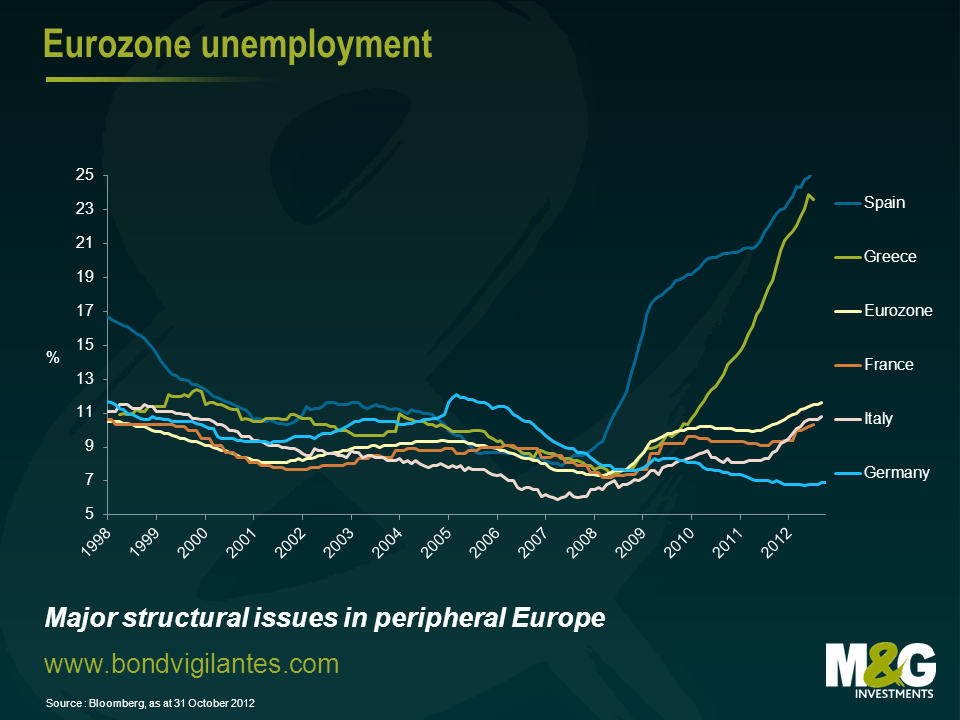
It can be seen from the chart that at various times over the last 10 years the sick and healthy economies of Europe have alternated, the strong core and the weak periphery were the weak core and the booming periphery in the middle of the last decade. Industry, labour skills, and structural shifts do not occur that quickly so what is causing this volatility in national economic outcomes?
We have commented before on the travails of the single currency concept. This is an economic construct, which has been constructed for the good of Europe. Let’s look at how this current economic policy affects the Eurozone, and how the divergence in economic outcomes can be solved using economic theory.
The first economic lesson I learned from my excellent economics teacher, was the concept of the invisible hand (quite ironic as he had the biggest hands I’ve ever seen!). The introduction of a single currency causes the invisible hand as expressed via exchange rates to be metaphorically tied behind your back. Given the single currency is the root of the dislocation, disbanding it is an obvious solution. However the other ramifications of doing this are potentially large, and it is not an option European leaders are prepared to take. This is not because it is an ineffective policy option, but they are wedded to the political concept as well as the economic concept that comes with a single currency. The weak economies are therefore stuck with too high an exchange rate and the strong economies are left with too low an exchange rate. The economics of the invisible hand in foreign exchange markets is not allowed to work and therefore economic divergence not convergence becomes a more likely event.
Being educated in Britain, the next main economic lessons we learned were around the work of John Maynard Keynes. The principle point drummed into us being that governments should run counter cyclical budget deficits. Unfortunately in Europe the response that the weaker economies are being forced to take is more fiscal discipline through budget deficit reductions. The strong have room to undertake fiscal stimulus, the weak are being told to run pro cyclical fiscal policy. So from this economic perspective the weak will get weaker and the strong stronger…..
The third basic lesson of economics was monetary policy. Lower interest rates stimulate consumption and growth. If you’re the German state, a German company, or a German individual the transmission mechanism of borrowing substantial amounts of money at low rates is available and is working. Sadly if you’re the state, a company, or an individual in the weaker economies the cost of borrowing is high and the physical quantity you can borrow is limited. The transmission mechanism is not working equally across Europe. The strong will get stronger the weak will get weaker.
The single currency is an economic construct that has come about through a political process. If that economic construct does not cause many economic ripples then politically it is relatively easy to take the political decisions to make the concept work. However if the economic construct becomes very destabilising as it appears to be doing then the political skills and policy options have to increase in size to offset its destabilising effects. The political day of action of launching a single currency was simple, the actions required to make it work long term are not.
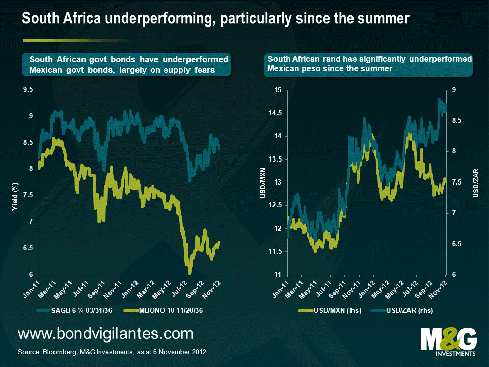
The worrying developments in South Africa in the past few months have caught the attention of the ratings agencies and the markets (see first chart). South Africa is one of very few emerging market countries whose credit rating is deteriorating; it’s still officially rated investment grade, but we think it should already carry a junk credit rating and the market is not pricing this in. And considering that the country has a 10% weighting in a commonly used EM local currency benchmark, this really matters for EM debt.
South Africa faces a number of financial, political and economic issues, none of which appear likely to be resolved quickly or easily. Some of the problems, and especially those that the rating agencies reacted upon, are well known and widely discussed (namely gold and commodity export dependence, crime and social unrest, stubbornly high unemployment and income inequality, corruption and poor governance, unionisation and labour market rigidities, and a poor climate for investment culminating in renewed threats to nationalise mining companies). The Economist has done some good pieces covering many of these topics, eg see here.
We think the market and rating agencies continue to underestimate the following issues regarding South Africa;
1. Debt sustainability
Although the central government debt/GDP ratio appears manageable at around 43%, or 60% of GDP including guarantees provided to state owned companies, this does not reflect the increasing debt burdens of local governments and municipalities. Getting accurate figures for local government borrowing is difficult, but the finances of several municipalities appear unsustainable, compounded by massive IT failures which have left thousands of bills unaccounted for. In addition, state owned utilities have also struggled to manage billing and revenue collection, reporting large uncollected debt balances owed by citizens. There are also cases of large arrears being run by local governments themselves, failing to pay for goods and services provided by, for instance, water boards as well as other state and private companies. As in Greece and Italy, payment arrears can comprise a significant portion of government ‘borrowing’ which is typically under-reported in official statistics.
2. Limited fiscal headroom
According to an analysis by Fitch, 90% of South African government spending is on current items such as wages, subsidies and interest, leaving very little available for longer term investment to fuel sustainable growth. At the same time, this also implies limited ability to absorb any significant rise in interest finance costs or any other external shock. In this context, the fact that around 90% of government debt issued is denominated in domestic currency suggests lesser vulnerability to a significant exchange rate shock. However, a large proportion of debt is now held by foreigners which means that exchange rate volatility could have a considerable impact on South Africa’s ability to refinance.
[More generally, a spike in foreign ownership in most EM local currency markets remains an acute concern to us, which is something we’ve repeatedly highlighted on this blog over the last year or so such as here. Investors and EM policy makers I’ve spoken to remain far too complacent about flows into local bond markets (historically, EM debt crises have tended to follow big jumps in external debt levels and everyone is very sensitive to this, but foreign buying of local EM markets is a relatively recent phenomenon). Interestingly, however, the IMF are starting to focus on foreign ownership of local currency bond markets as a key risk, eg see page 67 onwards in the IMF’s recent GFSR. Note that foreign ownership of domestic bond markets isn’t solely an EM country problem – Australia stands out on this measure too as previously discussed here]
3. Implicit support of the banking sector increases sovereign liabilities
Another critical issue is the separation of the South African banking sector from government implicit support. To date, the population (and most investors) have taken it for granted that the government would stand behind the five largest banks, which account for 90% of deposits. As a result, there has been a lack of progress on implementing deposit insurance, let alone on implementing global banking reforms such as resolution regimes. The banking sector, therefore, remains essentially a contingent liability of the sovereign. The local banks, in turn, have leveraged this assumption by raising significant amounts of wholesale debt. They also remain very short term funded, with heavy reliance on local money market deposits from local insurers and pension funds. Consequently, these have built up massive exposures to the banking sector – again in the expectation of government support for the banks if needed.
Let’s think this through. Adding further government liabilities of about.90-100% of GDP to the existing ones in order to support the banks (and even more, if the insurers and pension funds themselves also have to be supported because of their investment concentrations in the banks) clearly creates an unsustainable burden on the sovereign. South Africa is gradually waking up to the fact that it cannot maintain an implicit bank support policy while also retaining strong investment grade sovereign ratings – these two are incompatible, as much of Europe has discovered. However, introducing some sort of resolution planning that avoids taxpayer support for banks will require major structural reform, including deposit insurance, bail-in of wholesale liabilities and balance sheet shrinkage, none of which will be popular in the short term.
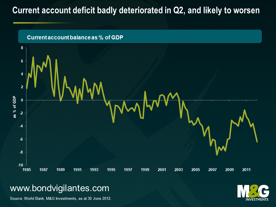
4. Current account deficit
Despite the commodity boom of the last decade, and despite the fact that 42% of exports are currently in the form of commodities, South Africa has had a current account deficit since 2003. More strikingly, the lack of investment in critical sectors such as mining have not only led recently to labour unrest, but have also contributed to a declining productivity and competitiveness in those sectors which South Africa is highly reliant upon (a member of the South African Treasury I met at the beginning of this year cited a lack of investment as one of the country’s most critical problems, and recent unrest will hardly accelerate much needed FDI). Meanwhile, consumption of imported finished goods has continued to rise as domestic productivity has deteriorated in these sectors. The country’s increasing dependence on gold exports, which account for 25% of all exports, as well as on China, where around 15% of the exports go to, makes it increasingly vulnerable to external shocks. The high dependency on China worries us in particular, as we believe that China is in a structural slowdown rather than a cyclical slowdown as we’ve previously explained. If our China thesis is correct, it would have major implications for global demand for hard commodities and raw materials and would put pressure on countries reliant on exporting these commodities. Again, many of these issues are things that South Africa has in common with Australia.
While it’s true that the four points above apply to varying degrees to a number of developed and developing countries, South Africa doesn’t look like an investment grade country to us when taken together with the issues previously highlighted. If the rating agencies follow this assessment – and their latest actions show a clear tendency – then this could have major implications for South African debt and currency markets. South Africa has only just entered the widely used Citi World Government Bond Index (and enjoyed large inflows from foreign investors on the back of this) but would rather embarrassingly drop out again if it were to be junked. Interest rate costs for not just the sovereign but banks and corporates would rise, potentially sharply, and the South African rand could slump (South Africa has few reserves with which it can intervene in FX markets).
If South Africa were to be junked, what would the impact be on EM debt more generally? In terms of direct effects, given a 10% index weighting in EM local currency debt, a drop of, say, 10% in the rand and 5% in the bonds’ prices would detract 1.5%. South Africa has a smaller weighting in external sovereign and corporate debt indices (typically 2-4% depending on the index) so the impact would be less. Indirect effects are impossible to quantify; at the very least other African countries would likely be hit (many of whom run even larger current account deficits) although these countries form only a small part of the EM debt indices. It’s possible that investors will reawaken to idiosyncratic EM risks and contagion could spread to other regions.
It’s important not to over-blow the systemic risks, and bear in mind that events in the Eurozone, the US and China will obviously be far bigger drivers of returns for the wider EM debt market than events in South Africa. Nevertheless the message remains -EM debt, not so safe.
James recently returned from a research trip to the US. He attended the Deutsche Bank Leveraged Finance Conference in Arizona, gaining insights into US market sentiment ahead of the presidential elections and the arising fiscal cliff. Following his latest research trip to Chicago, James had further meetings with a considerable number of US high yield issuers and discussed their outlook for 2013. The conference also created an excellent framework to share market views amongst fellow investors. Most of the talks with both issuers and investors were centred on the fiscal cliff. Therefore, the speeches of George W. Bush and Bill Clinton, guest speakers at the conference, proved to be quite valuable. Have a look at this short video from his trip in which James summarises his main observations and conclusions just before the Election Day for you.
In August last year, I picked up on Warren Buffett’s call for a higher burden share for America’s rich in a New York Times Op-Ed and alluded to the heated debate around income taxation and wealth distribution. Since then the US Senate has seen the Democrats proposing and the Republicans opposing the ‘Fair Share tax’, also called ‘Buffett rule’, which would require those with incomes over $1m to pay an income tax rate of at least 30 per cent. Alongside the political debate, academic research has informed and polarised the public debate before and after. For instance, Nobel laureate Peter Diamond and Emmanuel Saez have estimated that the income tax rates for the wealthy should be between 45 and 70 per cent.
Being misguided by today’s environment, the intuitive reflex is to say that a country like the US could never have – or accept – such high income tax rates. High income tax rates are rather perceived to be a European predicament, associated with these countries’ welfare state systems. A look at the historical US income tax bands reveals though that this is actually a clear misperception – and the elder amongst us will even remember these days. US top income tax rates have historically been significantly higher than the last 25 years suggest, although it’s fair to say that they peaked at war-related time periods. The top tax rate didn’t concern a large share of the tax payers back then, but it wouldn’t do so today either.
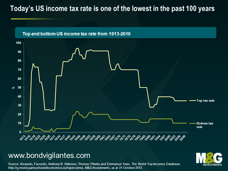
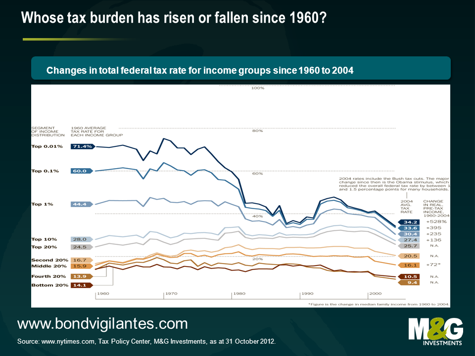
Admittedly, purely looking at these top and bottom income tax rate bands doesn’t tell you enough about the tax burden that the poor, the rich and the middle class had to bear in the US over this period. So let’s have a look at the chart below. This tells us that over the 44 years from 1960 to 2004, so after the implementation of the Bush era taxes, the average tax rate has actually modestly fallen for the 40% with the lowest income. The lower middle income class has seen a slight increase in their tax burden over the same period. Those who can be described as upper middle income class had seen a rise in their income tax levels throughout the 1990s which were reverted in the Bush era. Most strikingly though, the top 1% income group has seen a sharp decline of its tax burden since the 1960s, initially peaking in the early 1970s and falling subsequently to its lowest historical level in the Bush era.
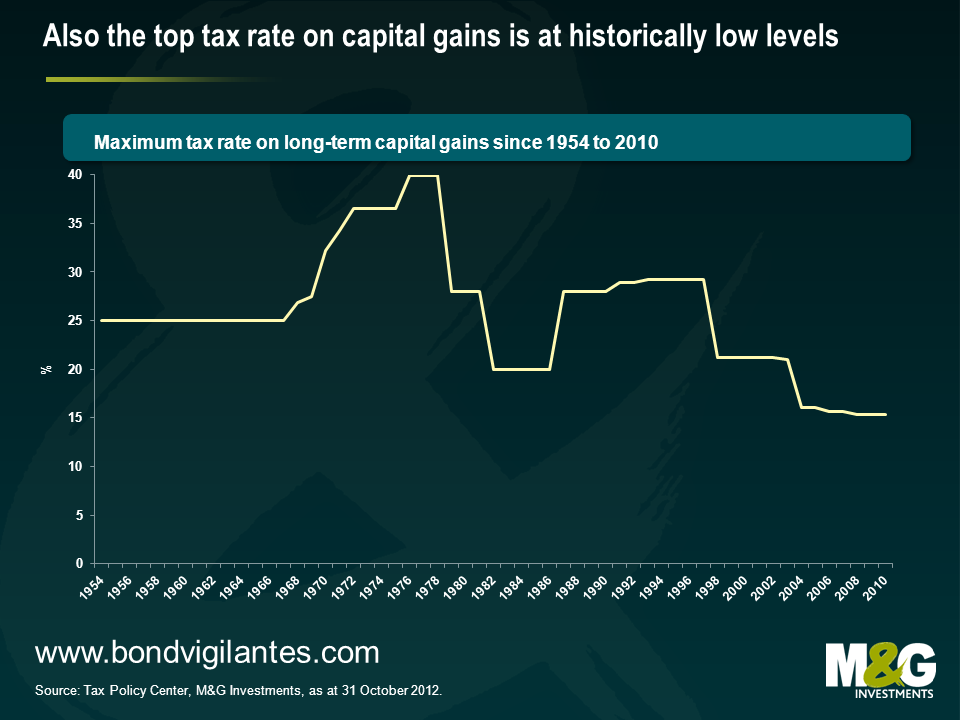
Now with a look at Buffett’s opinion piece, you could point out that he’s not only been referring to the low income tax burden, but that he and many of his peers make a lot of their money – different to those belonging to the lower and middle income class – from capital investments. Therefore, it’s important to have a look at the historical development of the maximum tax rate on capital gains as well. Supporting Buffett’s assessment, the chart below demonstrates that the current tax rate level for capital gains is the lowest in the past 50 years.
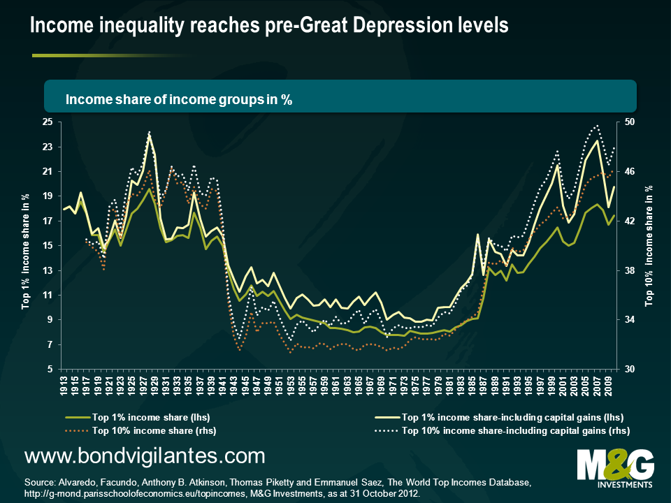
So let’s put all this into perspective. The previous charts suggest that the “mega-rich”, as Buffett has previously described himself and his peers, as well as the ordinary wealthy currently face one of the lowest income and capital gain tax burden since these figures have been reliably recorded. At the same time, their share of the total income has doubled since the 1980s. While income inequality fell after World War II until the 1970s, the so-called ‘Great Compression’, this trend took a u-turn in the following decades. Today Warren Buffett and his peers, represented by the top 1% income category, earn around 20% of total income.
But is this exclusively an American phenomenon? It is not, but the magnitude of this development seems to be particularly high in the United States. I’ve picked three more countries to demonstrate this. One of these, the UK, follows a similar economic and social model as the US, whereas Sweden and France represent the European welfare state model. While the UK has seen a comparable increase in the income share of the top 1%, this development in France and Sweden has been rather modest, and is only at around the long-run average. It’s particularly interesting to think about the below chart in the socio-economic context. Instantly, the recent talks about the feasibility of tax hikes for higher incomes in the UK come back to mind. At the same time, Hollande’s unpopular demand for higher income taxes for the rich, and their potential effect on government revenue, might have been put into a less favourable perspective by this chart.
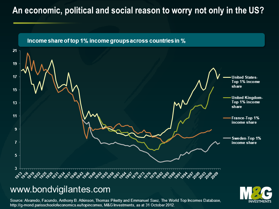
What do I make of all of this? First of all, it doesn’t look like a healthy development for a society when the gap between poor and rich widens disproportionately. In the US, the income share of the wealthiest part of the society has reached close to all-time record levels. The financial crisis didn’t revert the trend seen since the 1980s, it was only briefly interrupted. Inequality is currently at the highest level since the Great Depression. It might be even more reasonable to be worried about such a development since there isn’t a proportionate burden share, as the evolution of the tax burden across income classes in the US suggests. Ultimately, this might have contributed to what appears to be a much divided society these days. That’s a development that doesn’t sound too unfamiliar to me in the UK. It might also partly explain today’s toxic political climate in the US where parties and individuals have become strong lobbyists for rather limited parts of the society. It seems to be clear that a situation in which tax burden and income distribution are historically rather exceptional, but have been taken as the new norm by one side at the negotiation table is difficult to resolve. The argument that it might only be a correction of a previous exaggeration is then easily overheard. And there’s an economic side to it. The IMF actually concludes in a paper that fighting income inequality and fuelling growth might be two sides of the same coin in the long run. Therefore, Warren Buffett rules. He’s given this debate visibility. And I believe that he’s got a fair point. Surely, the higher taxation of the highest incomes will not make a fundamental difference to the US government revenues in the short term. But it certainly helps to create the feeling of a shared burden across society and to revive the inspirational thought of unity. Apart from this rather philosophical note, it might also have implications for the bipartisan negotiations around the fiscal cliff. When I look at the expiring Bush era taxes that will be brought to the negotiation table, then I may conclude that all this public debate – and the factual evidence presented – make it more likely that both sides can ultimately agree on the expiry of the Bush era tax cuts for the wealthy rather than those for the middle incomes. That would be a sensible thing to do
We have opined on many occasions about the call features on bank debt and have long argued that investors and issuers should price these securities on economic rather than emotional grounds (for more detail, see Jim’s blog on Deutsche Bank being the first not to call a Lower Tier 2 bond in 2008).
However, even we were surprised late last week when Intesa SanPaolo decided to amend the terms of some of its callable subordinated debt by removing the call option for each of the bonds.
The terms of a security are sacrosanct to bond investors. We obviously fear the terms of a contract being amended as this reduces our legal rights and the value of our securities. Therefore bond documents are carefully written, and a trustee generally acts as an arbiter to protect both the issuer and the investors’ interests. How can Intesa be allowed by the trustee to unilaterally change the terms of the bond?
The simple removing of the call option from the bond terms and conditions is not detrimental to bond holders. If someone has an option against you and cancels that option the text books and simple logic states that you can be no worse off, and the only party whose position is weakened is the one who has cancelled the option they had against the other party. So in theory as a bond investor you’re better off, so why complain?
The reason investors in these types of securities are concerned is that they were hoping that for reputational reasons the bonds would be called to keep them happy. In many cases that long term care of reputation with regard to funding has been deemed an appropriate call (excuse the pun) for the bank issuer of these callable securities to make.
The companies that have generally not called securities in the past have been led by the likes of JP Morgan, Deutsche Bank, and US Bancorp. But none of them decided to remove the call option as that would be potentially detrimental to them. Indeed this week US Bancorp’s subordinated bonds matured due to them exercising an economically efficient call. These non-callers continue to be able to fund and interact with the investors whose expectations were not met regarding their bond holdings.
In these difficult times it appears that banks are now more willing to act on a purely economic basis, which takes some of the hope out of the valuation of callable securities. The investor relations department of banks used to have a mantra of ‘don’t call us we’ll call you’. That is looking increasingly out of fashion.


Sign up to the Bond Vigilantes mailing list to ensure you never miss a great article from our expert Bloggers. We will email all new articles to your inbox, meaning you can stay on top of the world of Bonds.
I confirm that I would like to receive information about Bond Vigilantes and products and services from M&G Securities Limited.
We will use the email address and personal data you have shared with us to send you this information. For existing customers, submitting your contact details and requesting to receive this information from us, will replace any earlier choices you have made in respect of marketing information.
You can unsubscribe from marketing at any time, at which point we will not send any further marketing information to you, by selecting the unsubscribe link in all communications.