Rolldown
A dispatch from the number crunchers – Yield curve rolldown
By Matthew Russell
15 April 2026

It’s fair to say that we have been toning down our view on the high yield market of late. We could well see returns in the high single digits for 2013, but the potential for more substantial capital gains is less apparent in today’s context.
This does, however, ignore quite a powerful feature of the current high yield environment – the scope for exploiting opportunities and pricing dislocations within the market itself. To use a more technical term, spread dispersion within the market is very elevated. What do we mean by this?
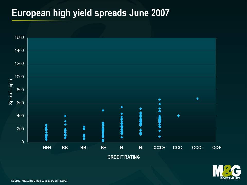
Here is a snapshot of the European high yield market back in 2007 with credit rating plotted against credit spread. As credit risk increased, you got paid incrementally more credit risk premium. This produced a gentle upward sloping curve. The market was fairly efficient and the level of spread dispersion within a credit rating category was fairly limited.
Compare this to a snapshot of today’s market below: not only is the average risk premium significantly higher than in 2007, but more importantly, there is a much higher range of spreads within each rating category.
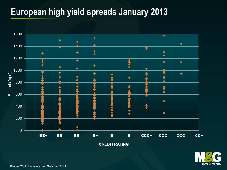
How can this obvious dislocation be exploited? If you can correctly assess credit risk independent of the ratings agencies, then you can start to pick and chose the bonds that are mispriced. Furthermore the reward for getting this “stock selection” correct can be meaningful. If for example you purchase Bond X at a credit spread of 750bps and sell Bond Y at 250bps, this is a 500bps difference. Let’s say that this difference moves to zero over time with both Bond X and Bond Y converging to a credit spread of 500bps, with a duration of 5 years. This is a relative price performance of 25% (a capital gain of 12.5% for Bond X, and avoiding a 12.5% capital loss for Bond Y).
If an active manager can realise even a small element of these sorts of opportunities across a portfolio, then the additional returns can be meaningful. It’s (stock) pickin’ time.

This speech by Mark Carney, incoming Bank of England Governor, to the CFA Institute in Toronto, is potentially very important for UK monetary policy. He appears to suggest that targeting a level of Nominal GDP (NGDP) can be more powerful than an inflation target. Importantly he also emphasises the “history dependence” of such a policy regime, and that “bygones are not bygones”. Central bankers would be compelled to make up for past misses. Holes in growth, caused by recessions and slowdowns, need to be filled in.
George Osborne, UK Chancellor, has appeared to be warm to a discussion about a change in the UK’s monetary policy regime (and he appointed Carney to the Bank). But what would it mean in practice? Nominal GDP targeting means that monetary policy would aim to hit a combination of growth and inflation over time consistent with its trend. In the case of the UK this might be 2.5% real growth and 2% inflation, so 4.5%. But the wonderful thing about nominal GDP targets is that you don’t really care about the mix, so 4.5% inflation and 0% real growth is as good as 4.5% real growth and 0% inflation. Or at an extreme, a fall in real GDP of 10%, and inflation at 14.5%. I think that many of us would regard this indifference between growth (“good”) and inflation (“bad”) as strange. Is this an example of a policy that turns failure (having persistently higher than target inflation rates) into a triumph? Not even, I’m afraid as we haven’t achieved a 4.5% nominal GDP rate in the UK in recent times as real growth has hovered around zero.
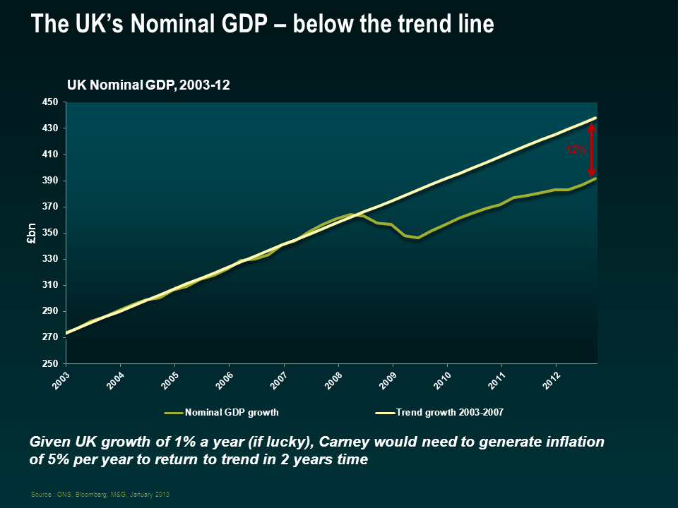
I have some other issues about the proposed policy too. The estimation of the trend itself becomes very important. On this chart I show, in green, the level of UK nominal GDP. If we draw a trend line, using the period from 2003 to 2007 and project it forward, it appears that the level of UK growth is still significantly below trend. On my calculations it’s around 12%, but I’ve heard estimates (including from within the Bank) of 15-16% below trend too. You can see that given how weak real growth is in the UK (we may have gone back into recession), we would need to generate a significant amount of inflation to return to the trend level within the next couple of years. After all, the Bank would be “compelled to make up for past misses”.
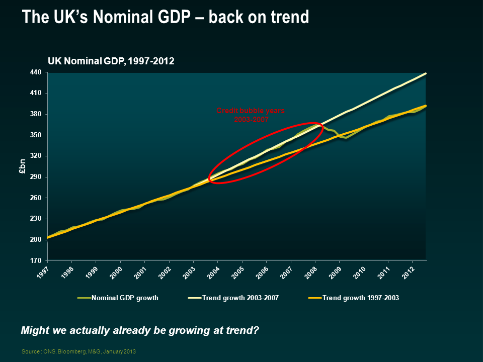
But what if that trend rate of growth was too high? 2003 to 2007 was in the white heat of the credit bubble, and growth came from all directions, consumer spending and government spending. It seems very plausible that we were growing above our potential at the time, thanks to cheap money and leverage. If we show the same chart with a trend line from the period before credit exploded, say 1997 to 2003, we get a very different gap. In fact the yellow line here shows that the current level of Nominal GDP is bang on where we might expect it be. Perhaps this explains why the UK’s employment situation has been relatively strong in the period since the credit crisis, and perhaps it explains why inflation has been so sticky to the upside – maybe we are operating around full capacity already?
There are other objections of course – inflation data are never revised, whereas GDP numbers are, sometimes drastically. So central bankers could be aiming at a historical number that might change significantly (most economists expect UK GDP to be revised higher for the period since the credit crisis). But perhaps the greatest criticisms are reserved for the damage this might do to monetary policy credibility – does not caring about the mix of inflation and growth increase the risks of inflation drifting further away from 2%? And some have suggested that countries that have followed a NGDP regime have experienced higher volatility of both output and inflation compared to those that target inflation alone.
So on the face of it, I’m not a fan. But I am a pragmatist, and the debt to GDP ratios that we have now (or are baked in the cake for the future thanks to demographic trends) can only be dealt with by either above trend growth (are we going to see 4% real growth in the UK for any sustained period?), or higher inflation. No central banker will ever tell you that this type of regime change is taking place to erode the national debt. But if growth continues to stagnate, and politicians remain reluctant to take difficult decisions on pensions, tax rates and benefits, inflating the debt away looks to be the only option. Outright government bond defaults are unnecessary in countries with their own currencies – but subtler defaults will happen – against populations as we find that the promises made to us about our old age or child benefit no longer apply, and with inflation reducing the real liabilities of the government. This is Central Bank Regime Change, and you won’t like it.
In 2012, the Reserve Bank of Australia cut its cash rate five times and by a total of 1.25%. That is a big move in interest rates for an economy growing at 3.1%, an unemployment rate of 5.4% and inflation sitting bang-on target at 2.0%. The RBA cash rate is now equal to the 50-year low seen during the 2009 recession. So what has got the RBA so nervous?
One word: consumption. Around 54% of Australian GDP is household consumption. But the household saving rate, at 10.6%, is more than double the average of the past decade. Aussies are deleveraging. Consumption, for so long the driver of growth in the boom years, has stumbled.
And unfortunately for the RBA, the latest GDP statistics showed limited sign of investment outside the mining sector. Certainly the appreciation of the Australian Dollar – once known as the “Aussie Battler” or “Pacific Peso” – has not helped things. On a trade-weighted basis, the Australian Dollar has risen by 45% since January 2009, leading to calls from industry for the RBA to intervene in currency markets. The strong dollar is a huge headwind for the Australian manufacturing sector in an increasingly globalised world. The RBA is hoping that a reduction in interest rates will a) spur household consumption and b) have some impact on the strength of the currency.
On the currency front, the RBA rate cuts have had minimal impact. The trade weighted index rose over the course of 2012 by 1.7%. Ouch. On the consumption front, unfortunately for the RBA and the heavily indebted Aussie consumer, the banks haven’t been playing ball. The chart below highlights the spread differential between variable mortgages, variable term loans, and the standard credit card rate over the RBA’s cash rate.
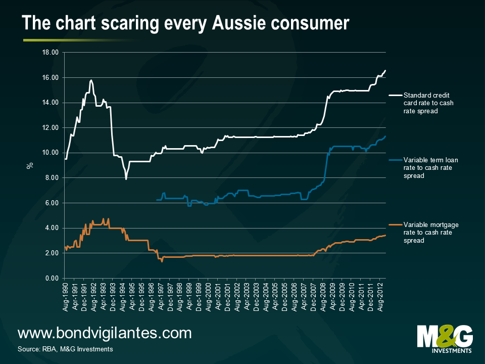
Despite a record low cash rate of only 3.0%, the spread between the rate charged on personal loans and credit cards is at a record highs. Banks aren’t passing on the full cuts in the official rate. In the variable home loan space, the spread has been steadily rising since October 2007. It is particularly important to have a look at the variable mortgage rate as around 80% of home loans in Australia are variable rate mortgages. Overall, the chart shows that the transmission mechanism of monetary policy in Australia is becoming increasingly muted, presenting greater challenges for the RBA.
Central banking isn’t the easiest job in the world at the best of times. Due to high rates of indebtedness and home ownership, the RBA has previously found that moving interest rates could quickly stimulate the economy if needed. The last thing that central bankers need is a further handicap on their ability to deliver their inflation targets. But that is exactly what is going on in Australia right now and the RBA should be concerned.
‘The ruin of a nation begins in the homes of its people.” – Ashanti proverb
In the last ten years, around the world, we’ve seen a series of housing led credit booms inflict heavy recessions on economies. We seem to be seeing the same thing happening today in parts of China.
Deutsche Bank’s excellent economist Torsten Slok has produced the following graph; which clearly shows how unaffordable house prices are becoming, relative to incomes, in some major Chinese cities.
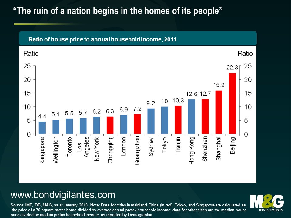
While property prices in the rest of the world continue to adjust towards more fundamental valuations, China’s credit boom is allowing the opposite to happen.
Current property prices in major Chinese cities are unsustainable. Either they adjust (a bursting of the bubble) or real wages have to catch up (massive inflationary pressure).
The currently inflated dragon is unlikely to survive in its current form.
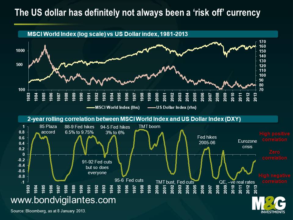
The US dollar has been one of the worst performing currencies in the world in the last decade, but we think it is ripe for a rally. We expect the US dollar’s correlation with risky assets to steadily change (in fact this is already happening). We believe that the US monetary policy transmission mechanism is actually working fine. We are bullish on US growth, particularly in relation to other regions. The Federal Reserve appears behind the curve, but a number of policy makers are increasingly realising this. And following a prolonged period of big underperformance, the US dollar is looking fundamentally cheap, especially in relation to some emerging market currencies.
The main push back we hear regarding our bullish US dollar view is that by being long US dollar you’re basically being short of risky assets. Lately this has been true; the US dollar has tended to rally sharply when large banks are blowing up or the Eurozone is threatening to fall apart, and has tended to perform poorly when everything looks alright again.
However the US dollar has not always had this risk on/risk off (“RoRo”) characteristic. The first chart below plots the US Dollar Index (a general international value of the US Dollar) against the MSCI World equity index, and the chart immediately following shows the rolling two year correlation of the two indices with some rough annotations (usual causation/correlation disclaimer applies).
It’s noticeable that the RoRo qualities of the US Dollar have weakened in the last two years, presumably on the back of a broader risk rally at a time when investors and central banks have been dumping/diversifying away from euro denominated assets. Going further back, it’s also apparent that the US dollar has not always been a ‘risk off currency’, where a major factor appears to be Fed Funds rate cycles.
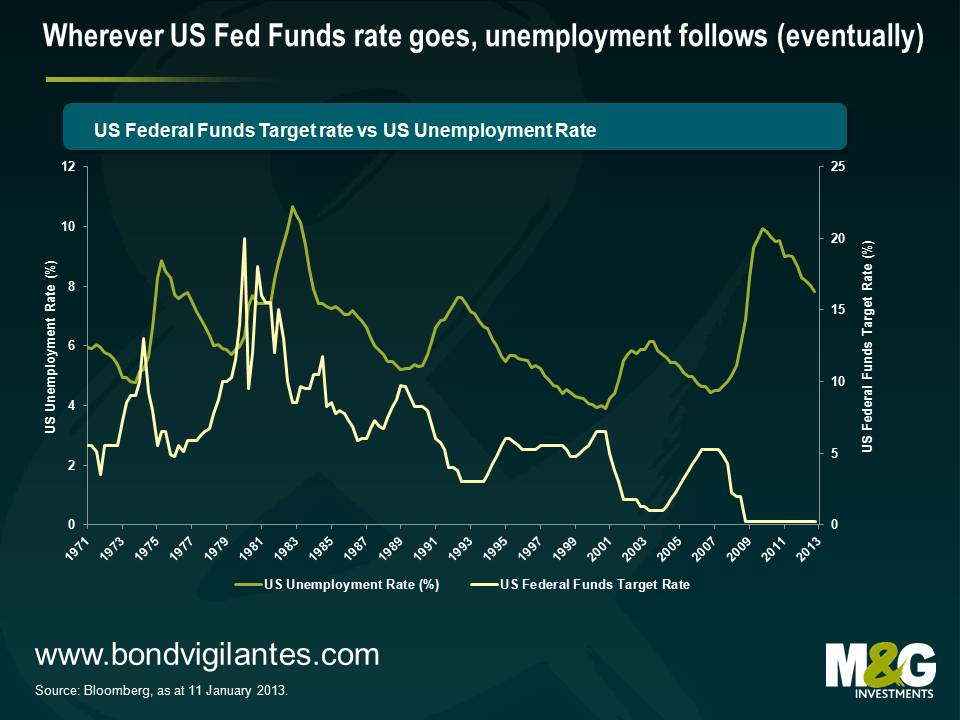
On the point of Fed Funds rate cycles, we think that the Federal Reserve continues to be behind the curve, or following the Federal Reserve’s change in communication, it’s perhaps more accurate to say that the market is behind the curve. We spent much of last year discussing how the US housing market was starting to take off (eg see here), which is evidence that the monetary policy transmission mechanism is no longer broken. But it’s interesting to consider the chart below – wherever the Fed Funds rate has gone in the last four decades, unemployment eventually follows. The shock to the US economy in 2008 was obviously huge, but this cycle doesn’t actually look that different to previous ones.
The current trajectory suggests that the US unemployment rate could hit 6.5% sometime in the middle of next year, an eventuality that would surely see US Treasuries sell off violently. There are eerie echoes of 1994, when the Fed hiked rates from 3% in January 1994 to 6% in February 1995 with very little prior warning; investors were caught with their pants down and markets were given a jolly good spanking (the 10 year US Treasury yield had fallen to 5.2% in late 1993 but a year later peaked at 8%).
It’s likely that the US dollar would appreciate as US yields jumped if you assume that hikes in the Fed Funds rate won’t be replicated around the world. This seems a relatively safe assumption given the Japanese devaluation rhetoric and continuing mess in Europe (Eurozone unemployment recently hit a record high of 11.5%, while the UK is likely to have experienced negative growth in Q4). That said, the US dollar surprisingly depreciated versus the Japanese yen and a number of European currencies in 1994, prompting then Fed chairman Alan Greenspan to state that the US dollar was weaker than it should be – Greenspan’s wish was granted from 1995-2000 though, as the US dollar was supported by factors such as high relative real interest rates, a US productivity surge, EM crises and Japanese stagnation.
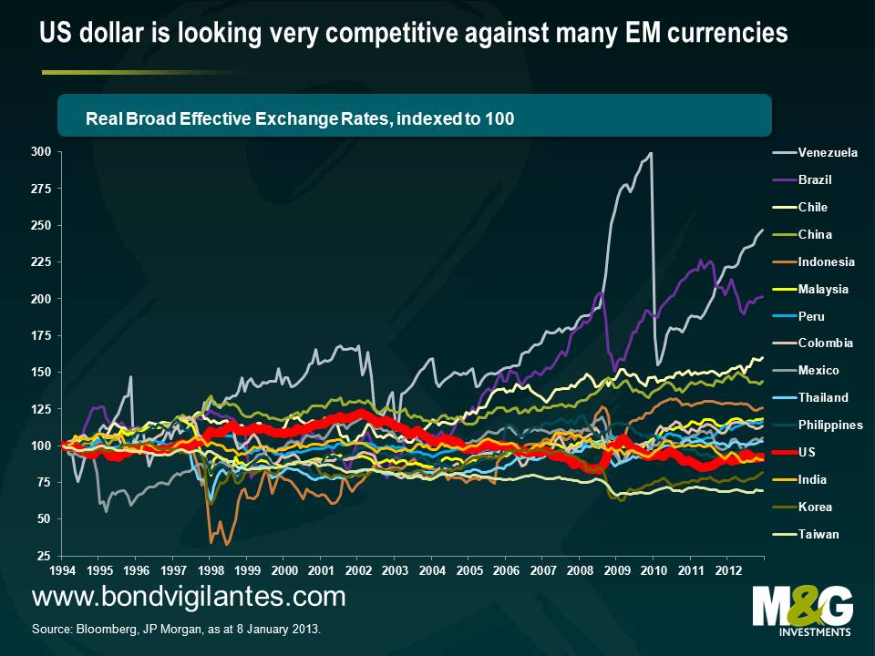
Another plus point for the US dollar is that the horrendous performance of the currency over the last decade has left the US economy looking competitive. Last February I wrote about how some manufacturers were moving operations from China to Mexico to take advantage of the dramatic increase in Mexico’s relative competitiveness (see here). I’ve since heard a number of anecdotes – admittedly the weakest form of evidence – about manufacturers also relocating back to the US.
The conclusion from the chart below is that such behaviour makes a lot of sense. It shows the relative performance of real effective exchange rates, which is a measure of a country’s trade weighted exchange rate adjusted for inflation. Real effective exchange rate measurement is imprecise since inflation data can be unreliable (eg Argentina) and calculations can vary depending upon the particular measure of inflation used (eg CPI, PPI, export price indices, core inflation, unit labour costs). The starting point can also make a lot of difference when using a time series – I’ve chosen 1994, which is immediately after China’s 50% devaluation*, but before the Latin American and Asian financial crises.
But while the absolute level of some of the exchange rates in the chart below need to be treated with a pinch of salt, the direction of travel should give a relatively unbiased view. The US dollar (thick red line) is looking very competitive versus the majority of emerging market currencies.
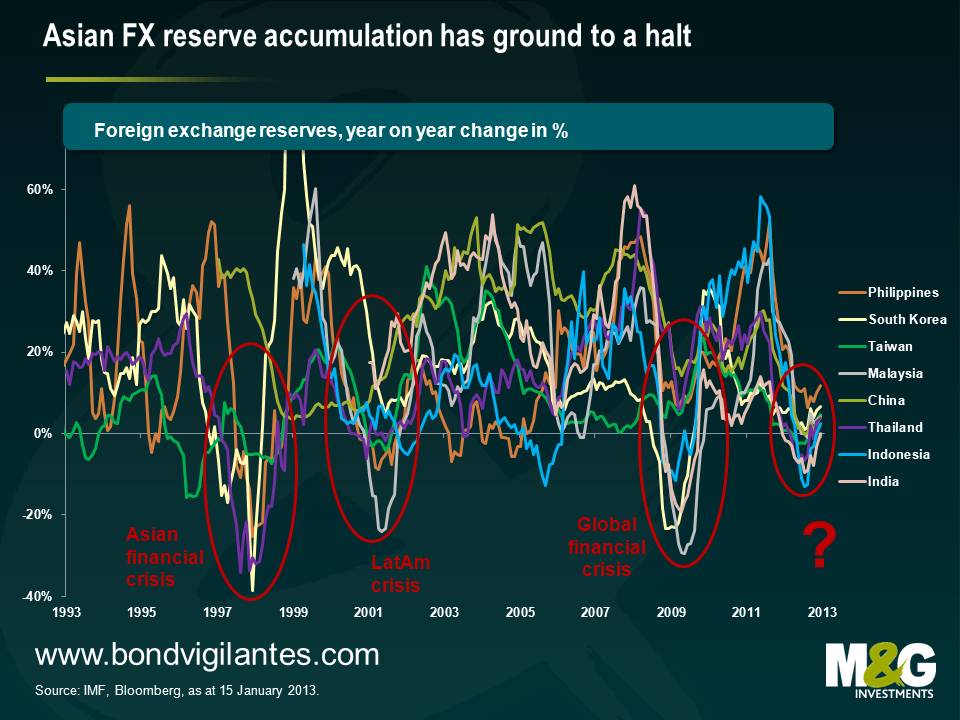
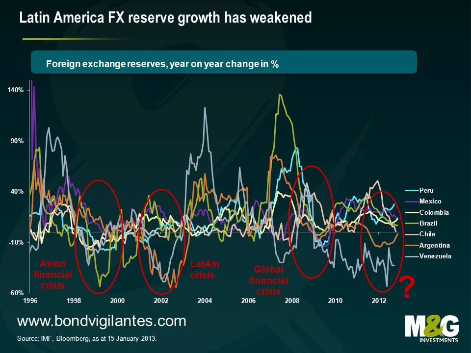
Meanwhile a surprising – and worrying – aspect of the last year has been that emerging market FX reserve growth appears to have stalled. Part of this can be explained by weaker global demand resulting in weaker EM exports. Part of this can be explained by EM countries gradually rebalancing their growth models away from exports and towards domestic consumption, the result of which means a narrowing of the global current account imbalances.
However, lower FX reserve growth is not at all consistent with EM countries continuing to receive large Foreign Domestic Investment (FDI) and record portfolio inflows – you’d expect to see reserves jump. And neither is lower FX reserve growth consistent with the US dollar’s performance over the past year – a slowdown in FX reserve accumulation is typically synonymous with US dollar strength because FX reserves are typically measured in US dollars, and non-US dollar denominated assets would fall in value when measured in US dollar terms. Yet the US dollar has been broadly flat and if anything weaker over this period.
It is a very dangerous combination to have flat or falling export growth (see previous blog) combined with flat or falling FX reserve growth combined with a significant appreciation in real effective exchange rates. In a study of prior academic literature, Frankel and Saravelos (2009) find that measures of FX reserves and real effective exchange rates stand out as easily the most important lead indicators of financial crises. Note that other lead indicators with strong predictive powers were found to be credit growth, GDP and current account measures, and a number of EM countries are looking shaky on these measures too.
Concerns around stalling FX reserve growth are tempered by the fact that reserves in many countries are at or close to record highs. But while high levels of FX reserves do act as a cushion for the individual country during a crisis, FX reserve accumulation can also have significant downside risks for the individual country (eg real estate bubbles, credit bubbles, misallocation of domestic banks’ lending – sound familiar?). Much has also been written about the risks to the global financial system** as a whole and I’d recommend this 2006 ECB paper for a good overview. I’d add that while countries with high levels of FX reserves allow countries to weather crises better, they don’t make countries immune to crises; despite high levels of FX reserves, Taiwan still saw its currency slump 20% against the US dollar in 1997.
When is the US dollar likely to appreciate, or EM currencies depreciate? EM debt crises since the 1980s have tended to follow periods of rising Fed Funds rate and/or US dollar strength, so this would suggest it’s not imminent. However I was presenting at a conference last month and found a kindred spirit in CLSA’s Russell Napier, who has near identical concerns about EM debt, and his view is that there have been many examples where bubbles have burst before the risk free rate rises – domestic overinvestment, lending to poor credits, commodity price declines and capital exodus can cause debt crises independent of external factors.
Either way, the reason that EM FX reserves are not increasing (see charts below) at a time when EM currencies aren’t strengthening seems most likely to be because EM currencies are at best no longer cheap, and at worst have become overvalued. Which is another reason to like the US dollar right now.
* China’s devaluation in 1994 is widely cited as being one of the triggers for the 1997 Asian financial crisis. If you consider that Japan is currently more important to many Asian countries’ trade now than China was in 1993, could a big yen devaluation wreak havoc on the region in the same way? A counterargument could be that a big yen sell off would encourage Japanese savings to flood into its trade partners’ capital markets – capital controls meant this wasn’t possible following China’s devaluation.
** Ben Bernanke’s global savings glut hypothesis argues that excess global savings have been responsible for lower government bond yields. The fact that EM FX reserves have stalled suggests that these countries have not been net buyers of US Treasuries in the last year. The baton had been taken on by countries such as Switzerland and Denmark, whose FX interventions to maintain their respective currency pegs resulted in rapid FX reserve increases and strong support for core government bonds, but upwards pressure on these countries’ exchange rates has recently greatly reduced and their reserves are no longer growing either. That really just leaves the GCC countries, whose FX reserves are largely a function of the oil price. Yields on core government bonds would presumably therefore be significantly higher were it not for large scale domestic central bank purchases.
I read in The Times last week that the Shadow Monetary Policy Committee (a panel of economists and Bank of England alumni) thinks that the Bank of England should announce a freeze on UK rates for an extended period of time. The Federal Reserve also had this policy (now replaced by even more explicit guidance about the unemployment rate and inflation levels), as did the Bank of Canada. In the past few years the Fed has spent weeks debating its communications strategy. Elsewhere we get monthly press conferences (including in Trichet’s time as head of the ECB the use of the explicit codewords “strong vigilance” which meant “rates going up next month”). We also get Inflation Reports and Financial Stability Reports, fan charts and GDP forecasts from which market economists pronounce that the Bank’s two year ahead projection means no more QE just yet. I wonder though whether we’re being given too much information, and that in telling us exactly what they are going to do, central banks risk either a) having to not change their policy even if economic circumstances mean that they should (for example if economic growth comes back strongly yet they’ve promised to keep rates on hold for years), or b) lose face, credibility and trust with the market by going back on their promise. Each of these actions has a cost, and should lower an economy’s potential GDP rate.
Is the promise of low rates forever fuelling the return of those Four Horsemen of the Bondocalypse – CLOs, PIK notes, CCC rated high yield issuance, and mega – LBOs? Does it lead to complacency in investment? To schemes that can only survive if rates don’t ever rise? Is current central bank policy generating asset bubbles? And what are central bankers left with, without the ability to surprise and shock? Worse still, what if “low rates forever” has the opposite effect than intended? Does it say “doomed, we’re all doomed”? Perhaps central bankers should realise that keeping us guessing is their most powerful tool (OK maybe QE Infinity is their most powerful tool, but still).
The clip below is of Diego Maradona, scoring against England in the Mexico World Cup finals in 1986.
I was reminded of it when I picked up a copy of Steve Hodge’s autobiography The Man With Maradona’s Shirt in the sales. Maradona was fortunate enough to swap shirts with Nottingham Forest legend Hodge after that game. Anyway, back in 2005 Bank of England Governor gave a speech in which he said the most interesting thing a central banker ever said.
“The great Argentine footballer, Diego Maradona, is not usually associated with the theory of monetary policy. But his performance against England in the World Cup in Mexico City in June 1986 when he scored twice is a perfect illustration of my point. Maradona’s first “hand of God” goal was an exercise of the old “mystery and mystique” approach to central banking. His action was unexpected, time-inconsistent and against the rules. He was lucky to get away with it. His second goal, however, was an example of the power of expectations in the modern theory of interest rates. Maradona ran 60 yards from inside his own half beating five players before placing the ball in the English goal. The truly remarkable thing, however, is that, Maradona ran virtually in a straight line. How can you beat five players by running in a straight line? The answer is that the English defenders reacted to what they expected Maradona to do. Because they expected Maradona to move either left or right, he was able to go straight on. ”
If Maradona had put out a press release and a booklet explaining exactly what he was going to do, it could never have happened. But by keeping the England team guessing and by shifting his weight from left to right (the footballing equivalent of raised eyebrows) he scored the greatest goal of all time.
As investors, the majority of our time is spent pricing risk with an increasing amount of that spent trying to value optionality. We’ve always had to price the optionality inherent in owning certain bonds. For instance what’s the likelihood of a call option sold to a bond issuer being exercised? What’s the likelihood of an early refinancing, or perhaps a change of control? These and other options are both risks and opportunities that credit investors will regularly have to consider and reconsider.
Some of the more recent options that credit investors have been forced to consider are those embedded within contingent capital notes or CoCos. These aren’t entirely new securities with Lloyds having exchanged bonds for CoCos back in 2009. Simplistically these ‘first generation’ CoCos are designed to behave like a traditional bond until a pre-defined trigger is breached. When triggered, first generation CoCo holders are forcibly converted into equity at pre-determined pricing, aiding the bank with its recapitalisation efforts. These instruments have found favour with the regulator not least because traditional subordinate capital instruments proved themselves almost entirely ineffective in providing loss absorbing capital.
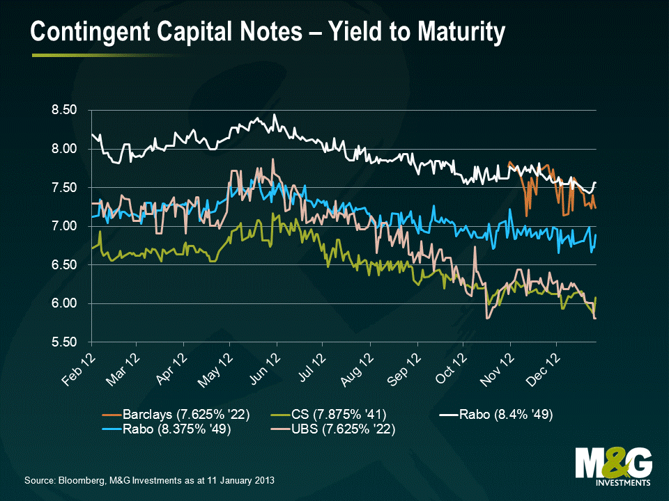
However, since the issuance in 2009 the market has moved on somewhat and a new breed of CoCo has since emerged. Many of these newer instruments (see chart above) are designed to be written off entirely in the event of a trigger without the conversion into equity discussed above. This optionality has two obvious implications. Firstly, given that investors are written down to zero without equity conversion, any prospect of participating in a future recovery becomes null and void. Secondly (with the caveat that the quantum of issuance remains small for now), the prospect of a bond essentially performing the role of a non dilutive emergency rights issue has to be positive for all other stakeholders in the bank, not least common shareholders. And don’t forget that the majority of these instruments will see their coupons paid before tax, further enhancing the relative value of said issuance.
Selling all this optionality does have its price, as do most things in life, but the current exuberance in credit markets may yet see CoCo investors fail to exact an adequate premium.
Today has seen the release of the decision by the National Statistician about what to do with the Retail Prices Index. We were told of the consultation in September last year, and were presented with 4 options, ranging from 1) to do nothing, to 4) to make RPI as much like CPI as possible.
Our view was always that the consultation arose as a result of the desire to correct an error made in the clothing component of RPI in January 2010 see blog. This change had seen the ‘wedge’ between RPI and CPI anomalously and erroneously increase by close to 1% following its implementation. We therefore believed that it was perfectly appropriate for the National Statistician to correct this error, and so we were expecting to see Option 2 materialise, which most closely targeted correcting this source of the wedge.
UK linkers had noticeably underperformed other markets since the announcement of the consultation. The market had initially started to price in a 30 to 50 basis point reduction in the wedge of RPI over CPI in expectation of Option 2’s intention to rectify the error. However, as Judgement Day approached nervousness increased in the linker market as people started to worry that the more severe options could be implemented.
Were Option 4 to have been recommended today, the wedge of RPI over CPI would have been reduced by approximately 100 basis points. This would have been a severe and brutal change for the index linked bond market. All else remaining equal, this change would have seen breakevens on index-linked bonds fall by approximately 70 basis points (allowing for 30 basis points of underperformance already priced in). To put it another way, this would have see the price of the longest index-linked gilt, the UKTi 0.375% 2062s, fall from 107.7 to about 85, a fall of 21%. Today, things really could have got nasty!
But the decision today has been Option 1. No change. Whilst highlighting that “the RPI does not meet international standards” and recommending that a new index be published, Jil Matheson “also noted that there is significant value to users in maintaining the continuity of the existing RPI’s long time series without major change, so that it may continue to be used for long-term indexation and for index-linked gilts and bonds in accordance with user expectations”. For the release, go to this link.
All the lobbying that we – and some others – have been doing behind the scenes has been worth it. In the Financial Times today, Chris Giles (who was on the Consumer Prices Advisory Committee) stated that the ONS rejected the committee’s advice in the face of ‘overwhelming opposition to changes in the calculation of the RPI’. The market has recently opened, and is removing the expected reduction of 30 basis points or so from Option 2. Breakeven inflation rates at the moment are up by 37 basis points at the 10 year part of the curve and by 22 basis points at the long end. The 2062 index-linked gilt is up by 12 points in price terms, and the whole linker market is rallying in the relief that no change is being made…
…for now! We will soon see the creation of a new RPI index, called RPIJ. This effectively makes RPI equal to CPI through making the older RPI index more modern by removing arithmetic mean and replacing it with geometric mean. This will be run in parallel with the old, untouched index. But it suggests that this debate is not over forever. We could again see recommendations to move from RPI to RPIJ, but more likely, we will soon start to debate moving the index-linked corporate bond market from RPI linkage to CPI linkage. The creation of RPIJ does seem a little irrelevant, where a new index has been created that few people will care about given that inflation linked bonds will continue to be linked to RPI and the government is clearly dedicated to linking other forms of government compensation to CPI.
Ultimately, though, even if we had seen a brutal reduction in RPI today, I still think that the strong case could be made to want to own UK index-linked bonds over the medium and long term. And changing the calculation to option 4 could have saved the Treasury a whopping £3bn per year, so while the decision to make no change has been great for inflation linked bond holders, it’s not so great for the UK’s coffers. Finally, the strong opposition to the RPI changes gives you a good idea of how hard it will be to implement austerity measures, and if we aren’t going to get out of this debt crisis through austerity, then the likelihood of us getting out of it with the help of inflation has just increased a bit!
“The Chinese use two brush strokes to write the word ‘crisis’. One brush stroke stands for danger; the other for opportunity. In a crisis, be aware of the danger – but recognise the opportunity.”
John F Kennedy
2012 was a very good year for the European high yield market, total return coming in at 27.2% . Whilst we do not expect to see the same magnitude of performance in 2013, there are still some interesting pockets of value in the market. One of these is the “peripheral” region of Europe. In line with JFK’s sentiment above, we think it’s very important to engage pragmatically with Spanish, Italian, Greek, Irish and Portuguese companies. There is little doubt that the “periphery” is a major source of risk in these uncertain and austerity-bound times, but is also a good source of opportunity. So how can investors navigate these dangerous waters? When it comes to trying to pick out the better opportunities within the periphery, we think the following guidelines can be useful:
 Example – Fage Dairy Industry SA is a Greek yoghurt manufacturer with significant domestic operations. However, over the past few years, the business has made major investments in the fast growing US market with a plant based in upstate New York. The US business now accounts for the majority of the group’s cash flow.
 Example – Bormioli Rocco is an Italian glass packaging and tableware business. The company has had some poor operating results in recent quarters. This has resulted in the Net Debt to EBITDA increasing from around 2.5x to around 3.5x over the space of a year, a negative move but from a low starting point and in our view still manageable.
| Bond | Yield | |
| Guala Closures | EUR 9.375% 2018 | 7.5% |
| Fage Dairy Industry | USD 9.875% 2020 | 8.0% |
| Bormioli Rocco | EUR 10.000% 2018 | 8.6% |
| Ono | USD 8.875% 2018 | 8.3% |
| European Currency High Yield* | – | 5.3% |
| US High Yield* | – | 6.0% |
*Bank of America Merrill Lynch European Currency High Yield Index and US High Yield Index
Source: Bloomberg / M&G as of 27/12/12
Full disclosure: M&G has an interest in the bonds issued by the companies mentioned
Any blog that begins with the words “Smaug the dragon is typically viewed as a fiscal phenomenon…” has immediately got my attention. Please read The Macroeconomics of Middle Earth by Frances Woolley. Woolley compares the size of the dragon’s hoard with a picture of the gold reserves at the Bank of England – although it is likely that Smaug is the beneficial owner of his gold, rather than a custodian of gold for richer dragons elsewhere in Middle Earth. He concludes by suggesting that the peoples of Middle Earth should have abandoned the gold specie standard and adopted paper currency to reduce the deflationary drag that Smaug’s monetary tightness produced. Unfortunately though “the lack of a central bank, or indeed any but the most rudimentary monetary institutions, was a major obstacle to currency reform”. The comments are worth reading too – was Middle Earth an Optimal Currency Area? Before Smaug arrived, were the the Dwarves running Middle Earth like a petro-state?
*SPOILER ALERT* So Smaug dies in the end, and the gold was released into Middle Earth’s money supply. Was there hyper-inflation as a result? Or did Nominal GDP return to trend (i.e. the “catching up” theory that has been talked about by Central Bankers like Mark Carney lately) without longer term inflation problems? If there was hyper-inflation perhaps the political instability that resulted allowed the rise of Sauron as a leader, and the subsequent world war between Men and Elves, and Orcs?


Sign up to the Bond Vigilantes mailing list to ensure you never miss a great article from our expert Bloggers. We will email all new articles to your inbox, meaning you can stay on top of the world of Bonds.
I confirm that I would like to receive information about Bond Vigilantes and products and services from M&G Securities Limited.
We will use the email address and personal data you have shared with us to send you this information. For existing customers, submitting your contact details and requesting to receive this information from us, will replace any earlier choices you have made in respect of marketing information.
You can unsubscribe from marketing at any time, at which point we will not send any further marketing information to you, by selecting the unsubscribe link in all communications.