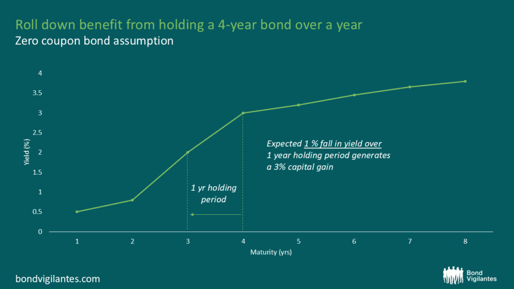
Rolldown
A dispatch from the number crunchers – Yield curve rolldown
By Matthew Russell
15 April 2026

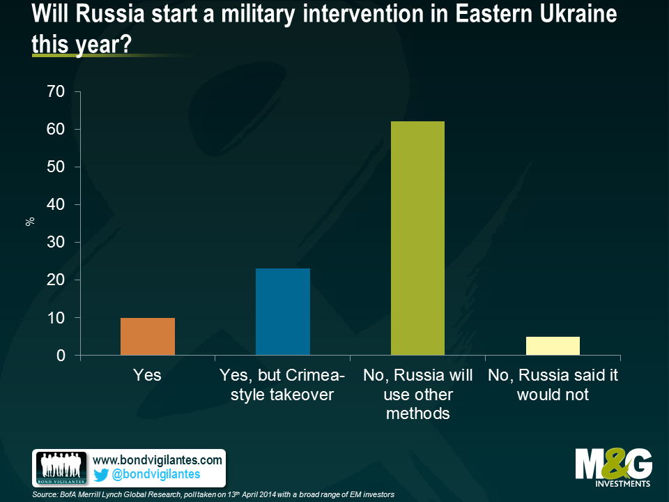
The Russia and Ukraine geopolitical tensions have driven their asset prices since February. As the below research courtesy of BofA Merrill Lynch shows, investors’ base case scenario is that a major escalation of the conflict, in the form of a direct Russian invasion of parts of Eastern Ukraine, is unlikely. The possibility of an invasion seems analogous to Russian roulette, a low probability but high impact game.
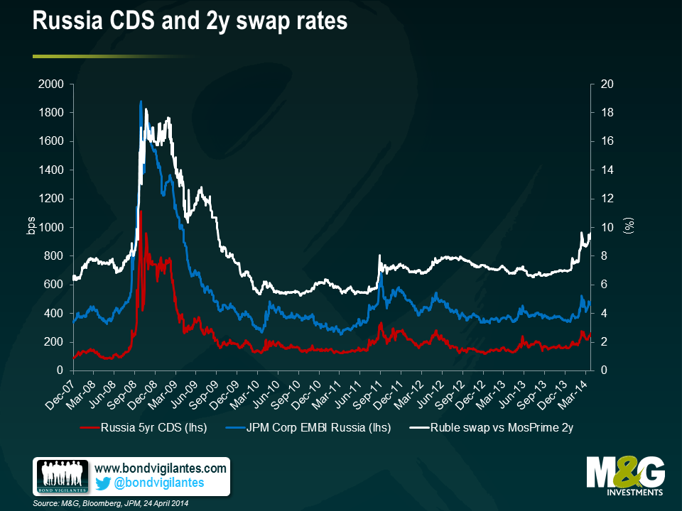
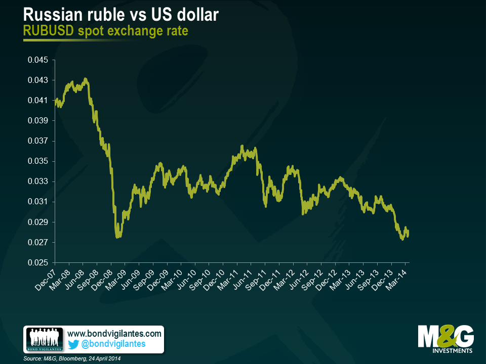
I just returned from a trip to Moscow. You would not know there is the possibility of a war going on next door by walking around the city, if you didn’t turn to the news. Its picture perfect spring blue skies were in stark contrast to the dark clouds looming over the economy.
The transmission mechanism of the political impact into the economy is fairly predictable:
All these elements are credit negative and it is not a surprise that S&P downgraded Russia’s rating to BBB-, while keeping it on a negative outlook. What is less predictable, however, is the magnitude of the deterioration of each of these elements, which will be determined by political events and the extent of economic sanctions.
My impression was that the locals’ perception of the geopolitical risks was not materially different from the foreigners’ perception shown above – i.e. that a major escalation in the confrontation remains a tail risk. The truth is, there is a high degree of subjectivity in these numbers and an over-reaction from either side (Russia, Ukraine, the West) can escalate this fluid situation fairly quickly. The locals are taking precautionary measures, including channelling savings into hard currency (either onshore or offshore), some pre-emptive stocking of non-perishable consumer goods, considering alternative solutions should financial sanctions escalate – including creating an alternative payment system and evaluating redirecting trade into other currencies, to the extent it can. Locals believe that capital flight peaked in Q1, assuming that the geopolitical situation stabilizes. Additional escalations could occur around 1st and 9th of May (Victory Day), as well as around the Ukrainian elections on 25th of May.
The table below assigns various CDS spread levels for each of the scenarios, with the probabilities given per the earlier survey. The weighted probability average is still wider than current levels, though we have corrected by a fair amount last week. I used CDS only as it is the best proxy hedge for the quasi-sovereign and corporate risk. Also, the ruble would be heavily controlled by the CBR should risk premia increase further, and may not work as an optimal hedge for a while, while liquidity on local bonds and swaps would suffer should the sanctions directly target key Russian banks.
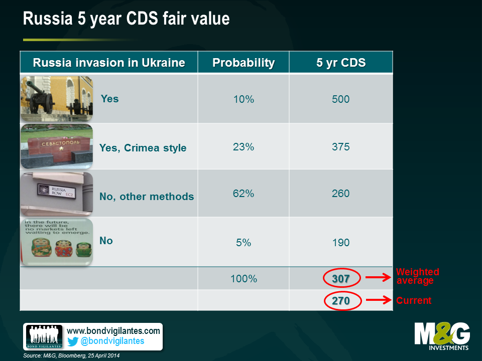
The risk-reward trade-off appears skewed to the downside in the near term.
The ECB has already demonstrated an unusually, and perhaps worryingly, high tolerance of low inflation readings, with no additional action having been taken despite Eurozone HICP at 0.5% year-on-year as inflation continues to fall in many countries.
Why might this be? One reason might be that while it is very concerned about deflation, at this point in time the ECB does not have a clear idea of what the right tool is to relieve disinflationary pressure, or how to implement it. Another reason might be that it is not particularly concerned about the threat of disinflation and so is happy to wait for the numbers to rise.
With regards to the latter of these possibilities, Mario Draghi discussed the low inflation numbers in January in Davos as being part of a relative price adjustment between European economies, and as being an improvement in competitiveness. One implication from this argument has to be that the lowest inflation numbers are being seen only in the periphery, and that as a result the much needed price adjustment between periphery and core is starting to take place. The other implication from this argument is that the ECB is happy to let this adjustment happen.
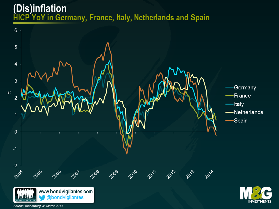
The chart below, however, shows inflation in Germany, France, the Netherlands, Spain and Italy (which together make up around 80% of Eurozone GDP) in terms of constant tax rates on a headline basis. This is important because fiscal reforms can have significant impacts on inflation numbers, when perhaps these should be stripped out as being temporary and artificial. The most obvious example of this would be a country implementing a hike in VAT, in which case inflation will jump upwards for a period until the base effect is removed some time later. This chart, alarmingly, shows that Spain, Italy and the Netherlands are now all experiencing deflation on a constant tax basis. It also shows that France is close to the precipice, with inflation on this basis at 0.2% year on year.
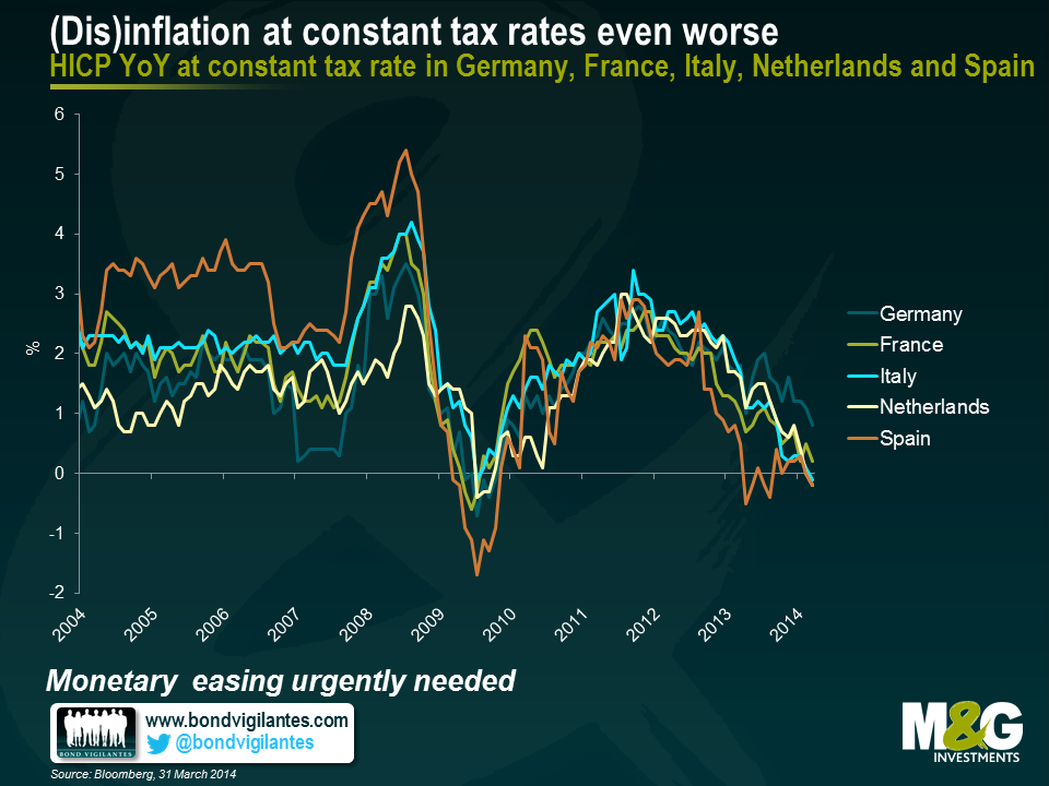
A further concern from the above two charts ties in to the ECB’s argument that the low inflation numbers in the periphery are a temporary phenomenon on a path to important and desirable internal adjustments to competitiveness. This argument might hold if the periphery is seeing low inflation, while the core is seeing stable, on-target or slightly above-target inflation that brings Eurozone inflation as a whole, to close to but below 2%. However, both the above charts show that the trend of disinflation is affecting more than just the periphery in isolation, and this calls Draghi’s competitiveness argument into serious question. The ECB might be well advised to get ahead of this worrying trend and act soon.
I recently visited Hong Kong and Singapore to attend some conferences and meet clients in the region. While travelling, I put together a short video to share some of our views on Asian emerging economies and emerging markets in general.
As recently reported in Claudia’s Panoramic outlook here, following both the 2013 sell-off and the recent EMFX volatility experienced earlier this year, investors’ attitudes towards emerging markets have changed. Volatile capital flows, unsustainable growth models, a deterioration in current accounts, excessive credit growth and currency depreciation are key concerns for local and global investors. Some trends have become unsustainable and a rebalancing process has started. Emerging market economies will need to adjust to lower capital flows, with this adjustment taking place on various fronts over several years.
While adjustments take place, new opportunities present themselves. But not all emerging markets are equal. As emerging economies are on diverging paths, especially in Asia – some are deteriorating (eg China) while others are improving (eg Philippines or Sri Lanka) – asset allocation and stock selection will be key. Watch the video to find out our preferences.
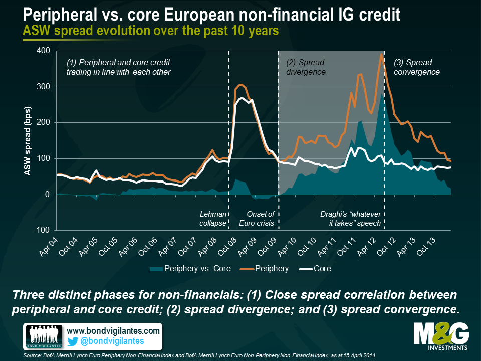
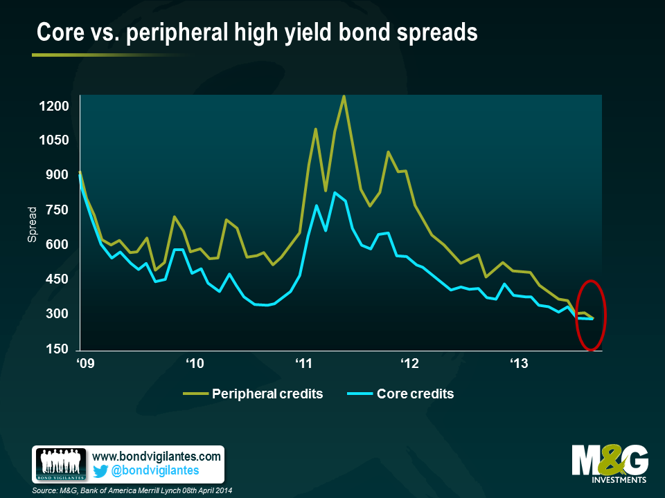
Are investors still compensated adequately for investing in peripheral rather than core European debt, or has the on-going convergence eroded debt valuation differentials altogether? In his latest blog entry, James highlighted five signs indicating that the bond markets consider the Eurozone crisis resolved. Inter alia, James pointed out that risk premiums for peripheral vs. core European high yield credit had essentially disappeared over the past two years. Here I would like to extend the periphery/core comparison by taking a look at investment grade (IG) credit and sovereign debt.
First, let’s have a look at the spread evolution of peripheral and core European non-financial (i.e., industrials and utilities) IG indices over the past 10 years. In addition to the absolute asset swap (ASW) spread levels, we plotted the relative spread differentials between peripheral and core credit. The past ten years can be divided into three distinct phases. In the first phase, peripheral and core credit were trading closely in line with each other; differentials did not exceed 50 bps. The Lehman collapse in September 2008 and subsequent market shocks lead to a steep increase in ASW spreads, but the strong correlation between peripheral and core credit remained intact. Only in the second phase, during the Eurozone crisis from late 2009 onwards, spreads decoupled with core spreads staying relatively flat while peripheral spreads increased drastically. Towards the end of this divergence period, spread differentials peaked at more than 280 bps. ECB President Draghi’s much-cited “whatever it takes” speech in July 2012 rang in the third and still on-going phase, i.e., spread convergence.
As at the end of March 2014, peripheral vs. core spread differentials for non-financial IG credit had come back down to only 18 bps, a value last seen four years ago. The potential for further spread convergence, and hence relative outperformance of peripheral vs. core IG credit going forward, appears rather limited. Within the data set covering the past 10 years, the current yield differential is in very good agreement with the median value of 17 bps. Over a 5-year time horizon, the current differential looks already very tight, falling into the first quartile (18th percentile).
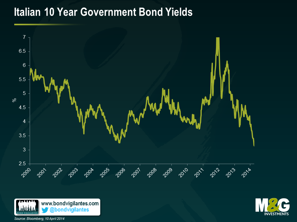
Moving on from IG credit to sovereign debt, we took a look at the development of peripheral and core European government bond yields over the past 10 years. As a proxy we used monthly generic 10 year yields for the largest economies in the periphery and the core (Italy and Germany, respectively). Again three phases are visible in the chart, but the transition from strong correlation to divergence occurred earlier, i.e., already in the wake of the Lehman collapse. At this point in time, due to their “safe haven” status German government bond yields declined faster than Italian yields. Both yields then trended downwards until the Eurozone crisis gained momentum, causing German yields to further decrease, whereas Italian yields peaked. Once again, Draghi’s publicly announced commitment to the Euro marked the turning point towards on-going core/periphery convergence.
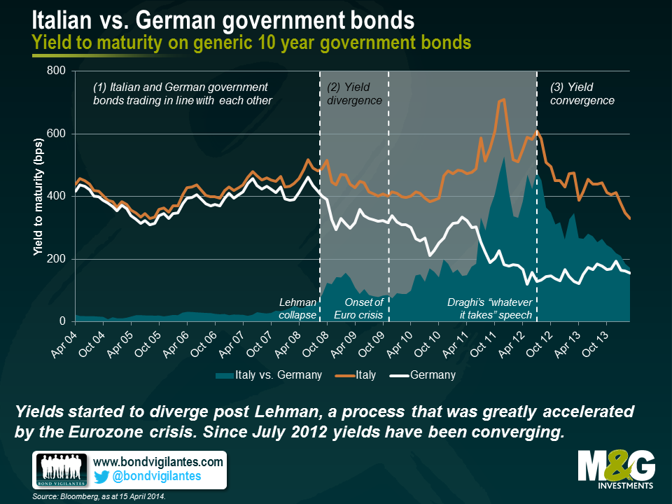
Currently investors can earn an additional c. 170 bps when investing in 10 year Italian instead of 10 year German government bonds. This seems to be a decent yield pick-up, particularly when you compare it with the more than humble 18 bps of core/periphery IG spread differential mentioned above. As yield differentials have declined substantially from values beyond 450 bps over the past two years, the obvious question for bond investors at this point in time is: How low can you go? Well, the answer mainly depends on what the bond markets consider to be the appropriate reference period. If markets actually believe that the Eurozone crisis has been resolved once and for all, not much imagination is needed to expect yield differentials to disappear entirely, just like in the first phase in the chart above. When looking at the past 10 years as a reference period, there seems to be indeed some headroom left for further convergence as the current yield differential ranks high within the third quartile (69th percentile). However, if bond markets consider future flare-ups of Eurozone turbulences a realistic scenario, the past 5 years would probably provide a more suitable reference period. In this case, the current spread differential appears less generous, falling into the second quartile (39th percentile). The latter reading does not seem to reflect the prevailing market sentiment, though, as indicated by unabated yield convergence over the past months.
In summary, a large portion of peripheral to core European risk premiums have already been reaped, making current valuations of peripheral debt distinctly less attractive than two years ago. Compared to IG credit spreads, there seems to be more value in government bond yields, both in terms of current core/periphery differentials and regarding the potential for future relative outperformance of peripheral vs. core debt due to progressive convergence. But, of course, on-going convergence would require bond markets to keep believing that the Eurozone crisis is indeed ancient history.
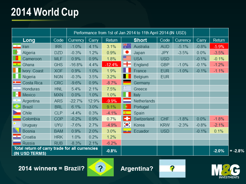
With just under two months to go to the opening match and tensions already mounting within our team (we have 8 different participating countries covered – Australia, Brazil, England, France, Germany, Italy, Spain and USA), we thought it was time for a World Cup themed blog. Our prior predictor of the 2010 World Cup winner proved to be perfectly off the mark. Based on expected growth rates in 2010, we predicted that Ghana would win and Spain would come last – and we know what happened subsequently. However, in defence of the IMF, Ghana were the surprise package of 2010, only failing to reach the semis thanks to a Luis Suarez handball.
However, despite the tradition of ‘lies, damned lies, and statistics’, I still believe in analysing data and making predictions. Was it coincidence that the team that was not part of our predictions (North Korea), given the lack of available economic data, ranked last? Would Argentina have made it to the quarter-finals had it not been altering its inflation statistics?
Historically, the World Cup has been won 9 times by an emerging country and 10 times by a developed country. Will an emerging country win and tie the score this year?
We present two currency trading strategies associated with the World Cup:
We test our World Cup carry trade performance during the last 2 World Cups between January 1 (a clean start date once the 32 qualifying teams became known) and the start dates for each tournament.
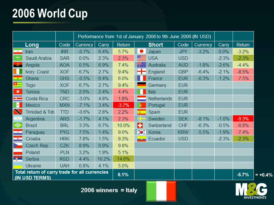
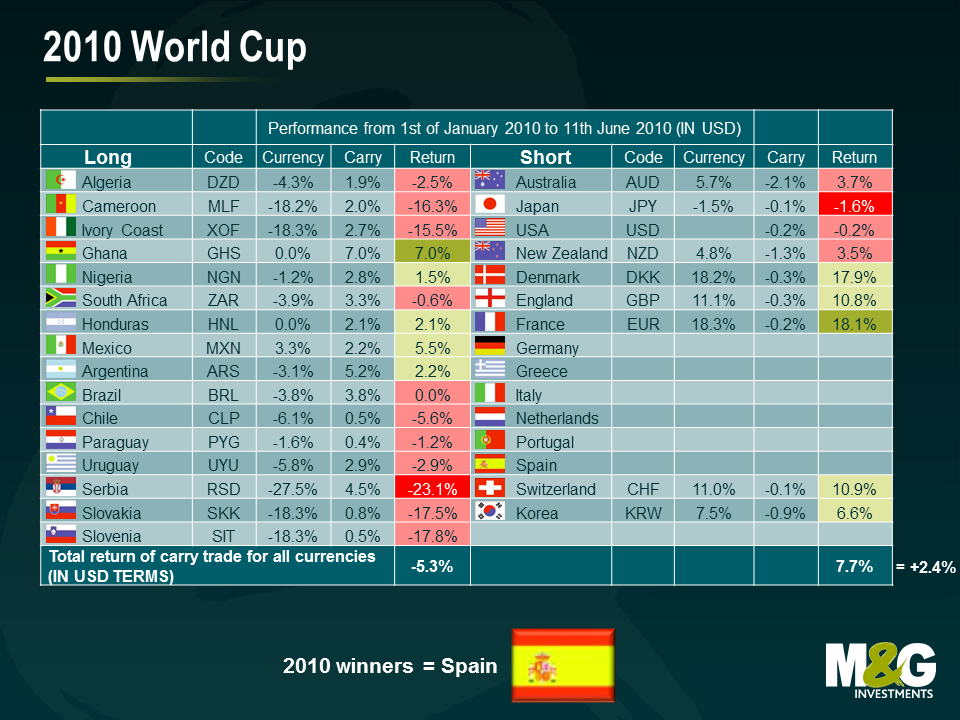
The EM vs DM FX carry trade posted a small profit in 2006 (+0.4%) and was a clear winner in 2010 (+2.4%)2 . On the football field, however, emerging market lost to developed market in both instances (Italy and Spain won). Ahead of the upcoming cup, the carry total return points to a loss on the EM carry trade so far (-2.8% to the 11th of April). On this basis, I predict that an EM team will win the cup in Brazil.
1For an empirical discussion of emerging market carry trades, see http://www.nber.org/papers/w12916.pdf?new_window=1.
2For simplicity reasons, we have omitted bid-offer transaction costs from the calculations. Given that some of the smaller EM currencies are less liquid and have higher costs (in this case, one buy and subsequent sell), the results slightly overstate the returns of the EM long side. On the short side, we only included the Euro once, to maintain a “diversified” basket of developed currencies.
Regardless of your opinion on the merit of the ECB’s policy, there is little doubt that the efficacy of Mario Draghi’s various statements and comments over the past 2 years has been radical. Indeed there are several signs in the bond markets that investors believe the crisis is over. Here are some examples:
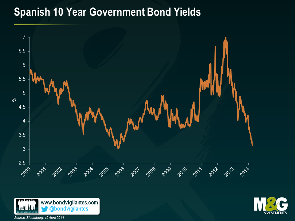
1) Spanish 10 yr yields have fallen to 3.2%, this is lower than at any time since 2006, well before the crisis hit, having peaked at around 6.9% in 2012. This is an impressive recovery, almost as impressive as …
2) The fall in Italian 10 year bond yields, which have hit new 10 year lows of 3.15%, lower than any time since 2000. The peak was 7.1% in December 2011. To put this in context, US 10 year yields were at 3% as recently as January this year.
3) Last month, Bank of Ireland issued €750m of covered bonds (bonds backed by a collateral pool of mortgages), maturing in 2019 with a coupon of 1.75%. These bonds now trade above par, with a yield to maturity of 1.5%. The market is not pricing in any material risk premium relating to the Irish housing market.
4) There is no longer any risk premium within the high yield market for peripheral European risk. The chart below (published by Bank of America Merrill Lynch) shows that investors in non-investment grade corporates no longer discriminates between “core” and “peripheral” credits when it comes to credit spreads.
5) Probably the biggest sign of all, is that today Greece is re-entering the international bonds markets. The country is expected to issue €3bn 5 year notes with a yield to maturity of 4.95%.
In last year’s Panoramic: The Power of Duration, I used the experience of the US bond market in 1994 to examine the impact that duration can have in a time of sharply rising yields. By way of a quick refresher: in 1994, an improving economy spurred the Fed to increase interest rates multiple times, leading to a period that came to be known as the great bond massacre.
I frequently use this example to demonstrate the importance of managing interest rate risk in fixed income markets today. In an investment grade corporate bond fund with no currency positions, yield movements (and hence the fund’s duration) will overshadow moves in credit spreads. In other words you can be the best stock picker in the world but if you get your duration call wrong, all that good work will be undone.
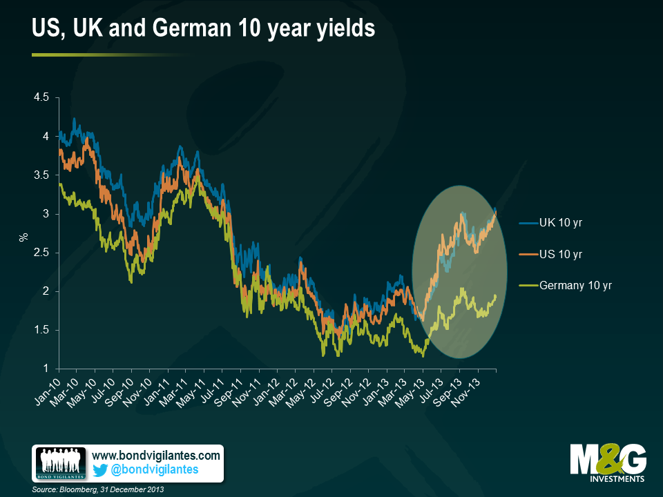
We now have a contemporary example of the effects of higher yields on different fixed income asset classes. In May last year Ben Bernanke, then Chairman of the Fed, gave a speech in which he mentioned that the Bank’s Board of Governors may begin to think about reducing the level of assets it was purchasing each month through its QE programme. From this point until the end of 2013, 10 year US Treasuries and 10 year gilts both sold off by around 100bps.
How did this 1% rise in yields affect fixed income investments? Well, as the chart below shows, it really depended on the inherent duration of each asset class. Using indices as a proxy for the various asset classes, we can see that those with higher durations (represented by the orange bars) performed poorly relative to their short duration corporate counterparts, which actually delivered a positive return (represented by the green bars).
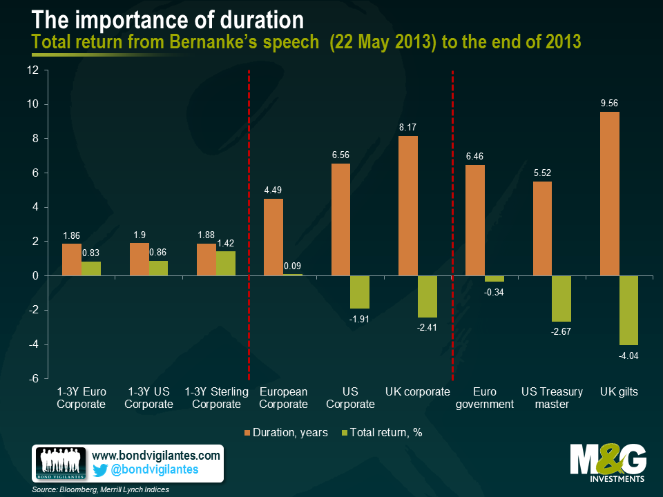
While this is true for both the US dollar and sterling markets, longer dated European indices didn’t perform as poorly over the period. There’s a simple reason for this – bunds have been decoupling from gilts and Treasuries, due to the increasing likelihood that the eurozone may be looking at its own form of monetary stimulus in the months to come. As a result, the yield on the 10-year bund rose by only 0.5% in the second half of 2013.
Whatever your view on if, when, and how sharply monetary policy will be tightened, fixed income investors should always be mindful of their exposure to duration at both a bond and fund level.
Over the past year, investors’ perception towards emerging market bonds changed from viewing the glass as being half full to half empty. The pricing-in of US ‘tapering’ and higher US Treasury yields largely drove this shift in sentiment due to concerns over sudden stops of capital flows and currency volatility. For sure, emerging market economies will need to adjust to lower capital flows, with this adjustment taking place on various fronts over several years.
Some emerging market countries are more advanced than others in the rebalancing process, while others may not need it at all. Also relevantly, the amount of rebalancing required should be assessed on a case-by-case basis, as the economic and political costs must be weighed against the potential benefits. Generally, the necessary actions include reducing external vulnerabilities such as large current account deficits (especially those financed by volatile capital flows), addressing hefty fiscal deficits and banking sector fragilities, or balancing the real economy between investment and credit and consumption.
In our latest issue of our Panoramic Outlook series, we examine the main channels of transmission, policy responses and asset price movements, as well as highlight the risks and opportunities we see in the asset class. Our focus in this analysis is on hard currency and local currency sovereign debt.
2013 saw a record year for new issue volumes in the European high yield market. A total of $106bn equivalent was raised by non-investment grade companies according to data from Moodys. Whilst this is beneficial for the long term diversification and growth of the market, there have been some negative trends. Given the intense demand for new issues, companies and their advisors have been able to perpetuate the erosion various bondholder rights to their own advantage. What form has this erosion taken and why are they potentially so costly for bondholders? Here we highlight some of the specific changes that have crept into bond documentation over the past 2 years and some examples that demonstrate the potential economic impact for investors.
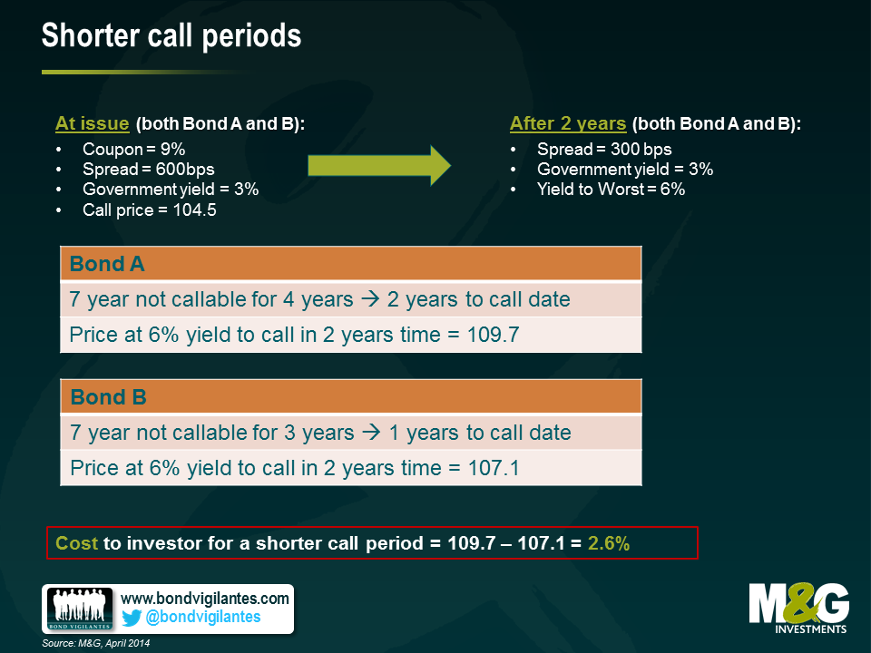
1) Shorter call periods – high yield bonds often contain embedded call options which enable the issuer to repay the bonds at a certain price at a certain point in the future. The benefit for the issuer is that if their business performs well and becomes less financially risky, they can call their bonds early and re-finance at a cheaper rate. The quid pro quo for bond holders is that the call price is typically several percentage points above par, hence they share in some of the upside. However, the length of time until the next call is important too. The longer the period, the higher the potential capital return for any bond holder as the risk premium (credit spread falls). The shorter the call period, the less likely the issuer will be locked into paying a high coupon. Take for example the situation below: reducing the call period has an associated cost to the investor of 2.6% of capital appreciation.
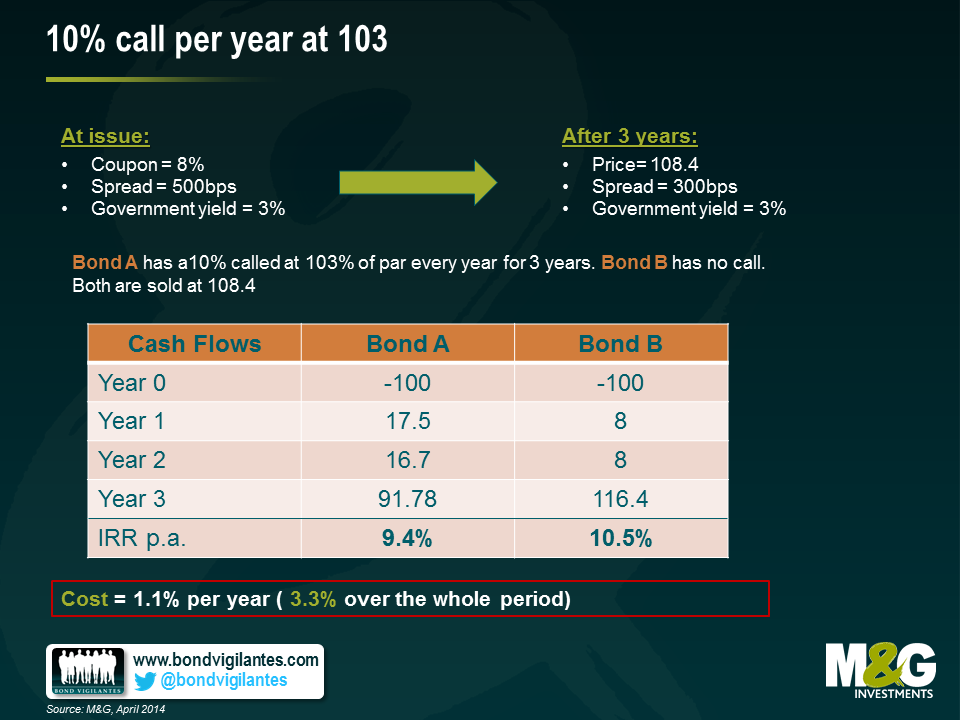
2) 10% call per year at 103 – Similar to the example above, the ability to call a bond prior to maturity has the impact of reducing potential upside to investors. One innovation that favours issuers has been the introduction of a call of 10% of the issue size every year within the so called “non call” period, usually at a preset price of 103% of par. So assuming a 3 year “non call” period, almost 1/3rd of an issuers bond can be retired at a relatively limited premium to par. Take for example the counterfactual scenario below. Here we see the inclusion of this extra call provision has reduced the potential return to bondholders by 3.3% over the holding period.
3) Portability – One of the most powerful bondholder protections is the so called “put on change of control”. This gives the bondholder the right but not the obligation to sell their bonds back to the issuer at 101% of face value in the event the company changes ownership. Crucially, this protects investors from the potential re-pricing downside of the issuer being purchased by a more leveraged or riskier entity. For the owners of companies, this has been a troublesome restriction as the need to refinance a complete capital structure can be a major impediment to any M&A transaction. However, a recent innovation has been to introduce a “portability” clause into the change of control language. This typically states that subject to a leverage test and time restriction, the put on change of control does not apply (and hence the bonds in issue become “portable”, travelling with the company to any new owner removing the need to potentially re-finance the debt). With much of the market trading well above 101% of par, the value of the put on change of control is somewhat diminished so some investors have not seen this as an egregious erosion of rights. The owners of the issuers on the other hand enjoy a much higher degree of flexibility when it comes to buying and selling companies. There are costs to bondholders, however. In particular, as and when bonds trade below face value, this option can have significant value. In the example below we see that the inclusion of portability has an associated cost of 2.4%

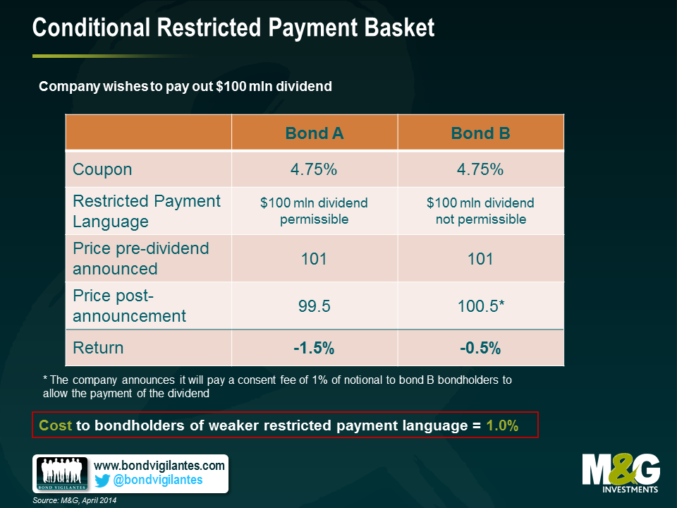
4) Conditional Restricted Payment Basket – Another protection for high yield bondholders has been the restrictions on dividends. This prevents owners of businesses from stripping out large amounts of cash leaving behind a more leveraged and riskier balance sheet. If a company was performing very well and the owners wished to take out a large dividend, they would usually be forced to re-finance the debt or come to a consensual agreement with bondholders to allow them to do so. Consequently, the call protections would apply and the bondholders would be able to share in some of the success of the issuer’s business. However, another recent innovation has been the loosening of this “restricted payments” provision to allow a limitless upstreaming of dividend cash out of the business subject to a leverage test. This limits the ability of owners to load up the balance sheet with debt at will, but without the need to re-finance the bonds bondholders loose some of their bargaining power and once more are likely to lose out in certain situations. In this example, we see an impact of 1.0%
What can investors do to cope with these unwelcome changes? Some sort of collective resistance would probably be the most effective tool – bondholders need to be prepared to stand up for their rights – but this is difficult to maintain in the face of inflows into the asset class and the need to invest cash. Until the market becomes weaker and negotiating power swings back toward the buyers of debt rather than the issuers, the most pragmatic course of action is for investors to asses any change on a case by case basis, then factor these in to their return requirements. This way investors can at least demand the appropriate risk premium for these changes and if they deem the risk premium insufficient they can simply elect to abstain. In the meantime, the old adage holds as true as ever – caveat emptor.


Sign up to the Bond Vigilantes mailing list to ensure you never miss a great article from our expert Bloggers. We will email all new articles to your inbox, meaning you can stay on top of the world of Bonds.
I confirm that I would like to receive information about Bond Vigilantes and products and services from M&G Securities Limited.
We will use the email address and personal data you have shared with us to send you this information. For existing customers, submitting your contact details and requesting to receive this information from us, will replace any earlier choices you have made in respect of marketing information.
You can unsubscribe from marketing at any time, at which point we will not send any further marketing information to you, by selecting the unsubscribe link in all communications.