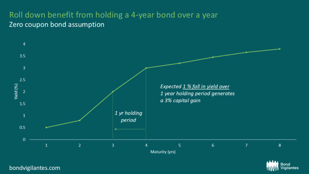
Rolldown
A dispatch from the number crunchers – Yield curve rolldown
By Matthew Russell
15 April 2026

After the ‘taper tantrum’ of 2013, many commentators predict that the catalyst for a sell-off in fixed income assets could be the ending of quantitative easing by the US Federal Reserve later this year. In the latest issue of our Panoramic Outlook series, I present an alternative view to this consensus thinking, analysing a number of dynamics in bond markets that have surprised investors during this period of extraordinary monetary policy. My emphasis is on what I view as three key ‘yield-dampeners’ at work that investors should be aware of:
Given these influences, it’s very much possible that those looking for yields to rise back to pre-crisis levels when QE ends may be disappointed. Not only are these yield-dampening forces at play in the US Treasury market, but they could also easily be applied to the UK or European government bond markets, potentially providing a useful lesson for the future path of yields. This will impact the attractiveness of other fixed income assets such as investment grade and high yield corporate bonds. Arguably, ultra-low cash rates and a stable interest rate environment for government bonds would provide a solid base for corporate bond markets as investors continue to seek positive real returns on their investments. The full analysis is located here.
The Baltic Dry Index (BDI) is a daily priced indicator of the cost of shipping freight on various trade routes for dry bulk carriers, based on data submitted by shipbrokers to the Baltic Exchange in London. Since March this year the index has fallen by over 50%, and this has made economists worry that the fall reflects a generalized slowdown in global trade – dry bulk goods include cement, coal, ore as well as food stuffs like grain. A lot of it is the stuff that China imports to support its investment led growth model, so a collapse in demand for the ships that carry bulk dry goods to China might be telling us that China is slowing rapidly. And that obviously has significant impacts on those economies which are reliant on exporting to China for their own growth – for instance Australia, Chile, South Africa and South Korea all have between 21% and 36% of their exports going to China.
Obviously though demand for space on ships is only half of the equation. As expectations grew that the Great Financial Crisis was behind us, and as China kept publishing high single digit growth rates, there was a significant expansion in shipbuilding. Since 2010 annual growth in Dry Bulk supply has been anywhere from 5% to over 15% year on year – in most periods outstripping demand growth, and certainly depressing prices. It’s not just dry bulk, there’s also big excess supply in container ships. Shipping companies are trying to manage these supply problems – the average age of ships when scrapped has fallen from 28 years in 2011 to 21 years in Q1 2014, 4% of the fleet is “idle”, ships are “slow steaming” (going slowly to save fuel and costs of being idle at port) and shipping companies are cancelling future orders for new ships (in 2013 32% of orders were not delivered as planned and were either postponed or cancelled). But for 2014 and 2015 at least the excess supply problem gets worse, not better.
So is the Baltic Dry Index telling us anything about global trade and growth? We started off from a position of scepticism – there used to be a good relationship (we wrote about it here in 2011), but since the massive shipping supply boom maybe it had lost its power as in indicator? But it turns out that the correlation between world trade and the BDI is EXTREMELY good. The CPB Netherlands Bureau for Economic Policy Analysis produces the monthly CPB World Trade Monitor. It’s clear from these global trade data that the volume of trade has been weakening since the end months of 2013. Trade actually fell in May, by 0.6% month on month, although due to volatility and seasonals, a rolling 3 month versus previous 3 month measure is preferred. The chart below shows that after some strong momentum in global trade in 2010 it’s fallen to a much more stagnant growth level in the past couple of years, and a brief recovery in mid 2013 has tailed away. In Q1 this year, world trade momentum turned negative. We have shown the Baltic Dry Index against this measure of world trade – it doesn’t just look like a strong relationship optically, but it has a correlation coefficient of 0.74 (strong) with a t value of 7.83 (statistically significant at an extremely high level).
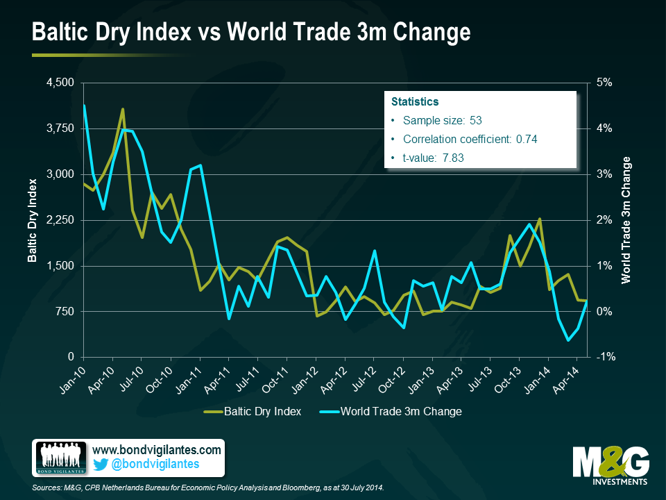
When we last wrote about the Baltic Dry Index we pointed out that it appeared to be a good lead indicator for 10 year US Treasury yields, the theory being that a fall in the BDI presaged falling GDP and therefore justified lower rates. And indeed the fall in the BDI in early 2011 did nicely predict the big Treasury rally 3 months later. There is still a relationship today, but sadly for us bond fund managers the better relationship is with UST yields predicting movements in the BDI (so ship-owners please feel free to make money on the back of this). Nevertheless, over the same time period as the earlier chart there is still a decent correlation if you use the BDI as a leading indicator and push it forward by 3 months, so it does appear to have some predictive powers.

So we’ll keep looking at the Baltic Dry Index for the same reason that we like the Billion Prices Project for inflation. When you can find a daily priced, publically available measure or statistic that comes out a month or more ahead of official data and is a strong proxy for that data it’s very valuable.
Higher agricultural commodity prices at the start of the year raised concerns about the impact these could have on retail food prices, should the trend prove persistent. Fortunately, the price of soft commodities (coffee, sugar, wheat etc) appears to have decoupled from that of hard commodities (gold, silver, platinum etc) in recent months. Indeed, data from the last seven quarters indicate that the price of many agricultural commodities have actually fallen, as the chart below shows.
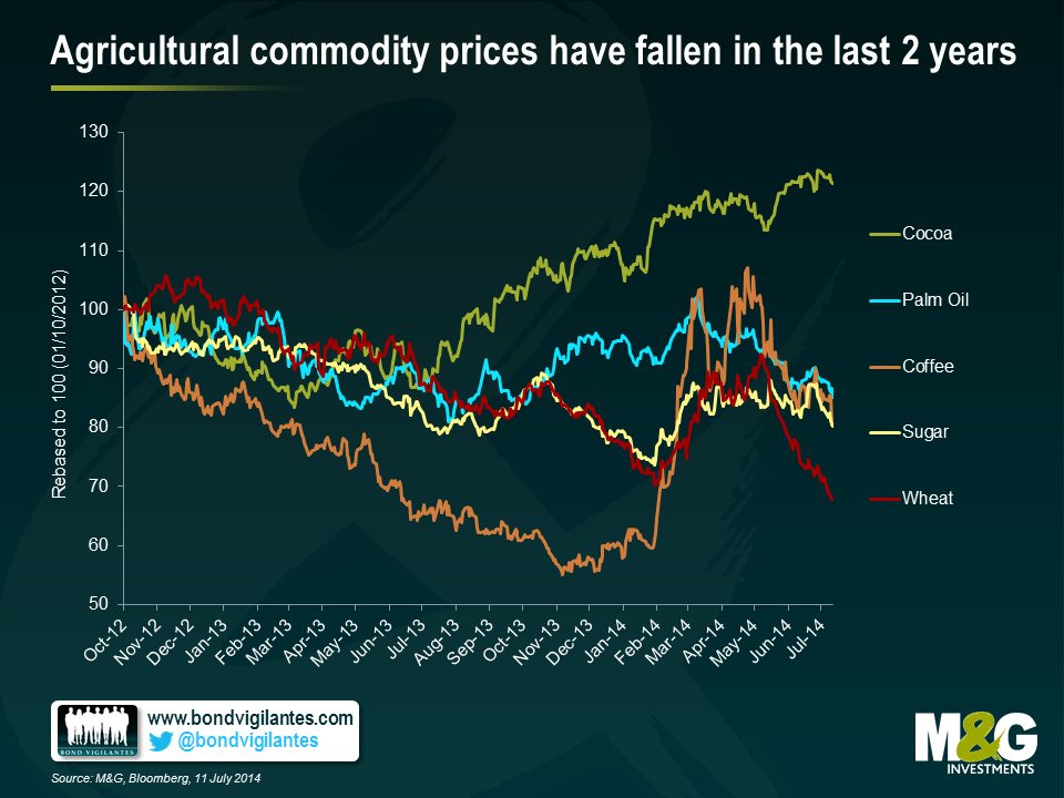
Coffee prices are now at a five month low, after fears of a shortage of coffee beans from Brazil have receded. The supply of sugar has increased year-on-year, while wheat prices have also fallen due to increased harvests and easing crop concerns.
In order to gauge the collective effect of these changing agricultural commodity prices and how they could potentially feed through into UK inflation, I have constructed a simple cake index, teaming up Global Commodity Price data with some basic recipes from the BBC Good Food website. Given that sponge and individual cakes are two of the representative items included in the CPI 2014 basket of goods – and that food and drink items make up 11.2% of the overall CPI index – combining the commodities in this way gives an indication of how future changes might affect the average consumer.
The graph below shows the results of the cake index, demonstrating the change in various cake costs (since October 2012) versus the UK CPI (yoy %). What’s interesting is the generally downward trend of all cake indices in the last seven quarters. Sponge cake and plain scones look particularly good value in recent months, owing to the high proportion of wheat in their recipes. Apple cake unsurprisingly provides a price signal for its key ingredient (the price of apples has fallen 4% YTD), while coffee cake gives a less pronounced but similar effect. The good news – particularly for lovers of chocolate cake – is that despite the persistent increase in the cost of cocoa, the price of other cake constituents such as sugar, wheat and palm oil (used as a proxy for butter) have all fallen sufficiently to offset this, bringing the price of chocolate cake lower in recent months.
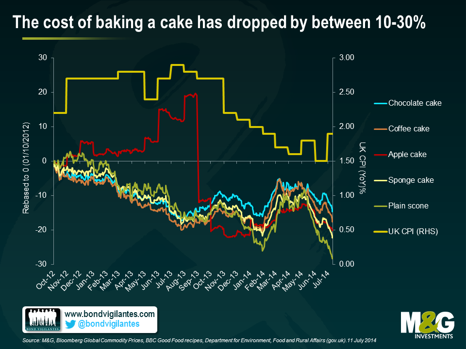
Despite the recent June increase in CPI to 1.9% yoy, due to the lag between raw commodity prices and their general price level, we should perhaps expect to see deflation feeding into cake prices and the overall food constituent of CPI in the coming months. Therefore although it is unclear who exactly was the first to declare “let them eat cake!”, this person may have been on to something. Personally, I’d recommend the (relatively cheap) scones.
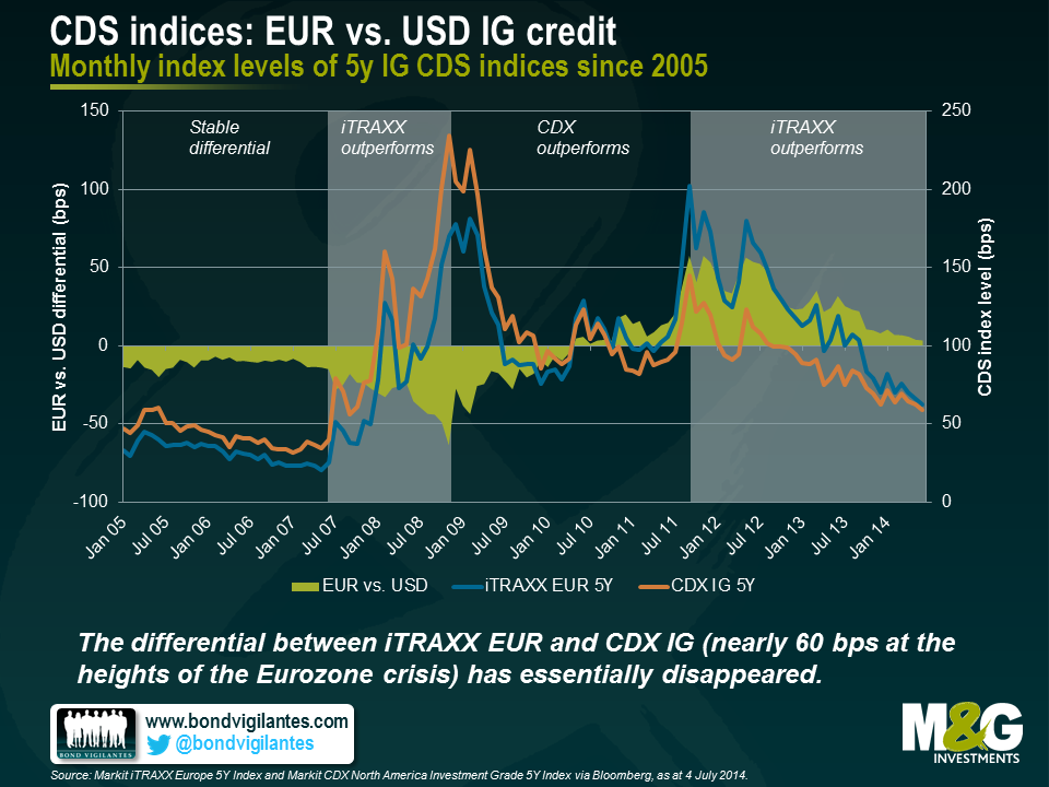
There is more than one way to skin a cat for credit investors. Those looking for credit exposure can do so through either owning the debt issued by an issuer or by selling credit default swap (CDS) protection for the same issuer. The differential in price between the corporate bond and CDS contract can mean the difference between outperforming and underperforming in a world of tight credit spreads and low yields. Additionally, it is possible to do this for the whole investment grade or high yield market, allowing bond investors to gain credit exposure in their preferred geographical region (for example, the U.S., Europe, or Asia). U.S. and European credit spreads have compressed substantially and are now at levels last seen before the Lehman Brothers collapse. Given this convergence, the question for global IG bond investors today is which market is relatively more attractive from a valuation perspective?
Let’s first take a look at EUR versus USD credit. The easiest way to do this is by using two credit default swap indices. These indices (also known as CDI) represent 125 of the most liquid five-year credit default swaps on investment grade (IG) entities in Europe (iTRAXX EUR 5Y) and North America (CDX IG 5Y). Looking at the historical performance of both indices, the differential between both index levels remained basically flat until the onset of the financial crisis in the second half of 2007. During this period, iTRAXX EUR traded around 10-15 basis points (bps) tighter than the CDX IG. During the crisis, the absolute levels of both indices increased substantially but iTRAXX EUR outperformed CDX IG, with the North American index moving up to a peak level of around 230bps in late 2008. In the following three years, with the easing of the U.S. recession and the emergence of the Eurozone crisis, CDX IG outperformed iTRAXX EUR by around 120 bps.
Starting from its minimum of -64 bps in November 2008, the index differential turned positive in May 2010 and reached its peak value of 57 bps in November 2011. With the Eurozone crisis calming down, iTRAXX EUR has once again outperformed CDX IG. Today the index differential has virtually disappeared (4 bps), and both indices have tightened to around 65bps by the end of May, a level not seen since the end of 2007. iTRAXX EUR continued to tighten in June and temporarily traded through CDX IG for the first time since March 2010.
Selling CDS protection for a company creates a credit risk exposure that is essentially equivalent to buying a comparable bond of the same issuer. Hence, from a fixed income investor’s point of view, it is worth comparing the CDS spread and the credit spread of the cash bond. The difference between these two is often referred to as the CDS basis. Positive values (i.e., CDS spread > bond Z-spread) indicate a higher compensation for taking the same credit risk through the CDS of a company rather than owning the bond of a company, and vice versa for a negative basis.
Drawing a direct like-for-like comparison between CDS and corporate bond indices can be tricky. For example, it is impossible to find appropriate outstanding cash bonds for all the companies that are in the CDS indices. Furthermore, CDS indices comprise contracts with a certain maturity (e.g., five years) and roll every six months, whereas cash bonds approach a predefined maturity and are eventually redeemed, assuming they don’t default or are perpetual instruments.
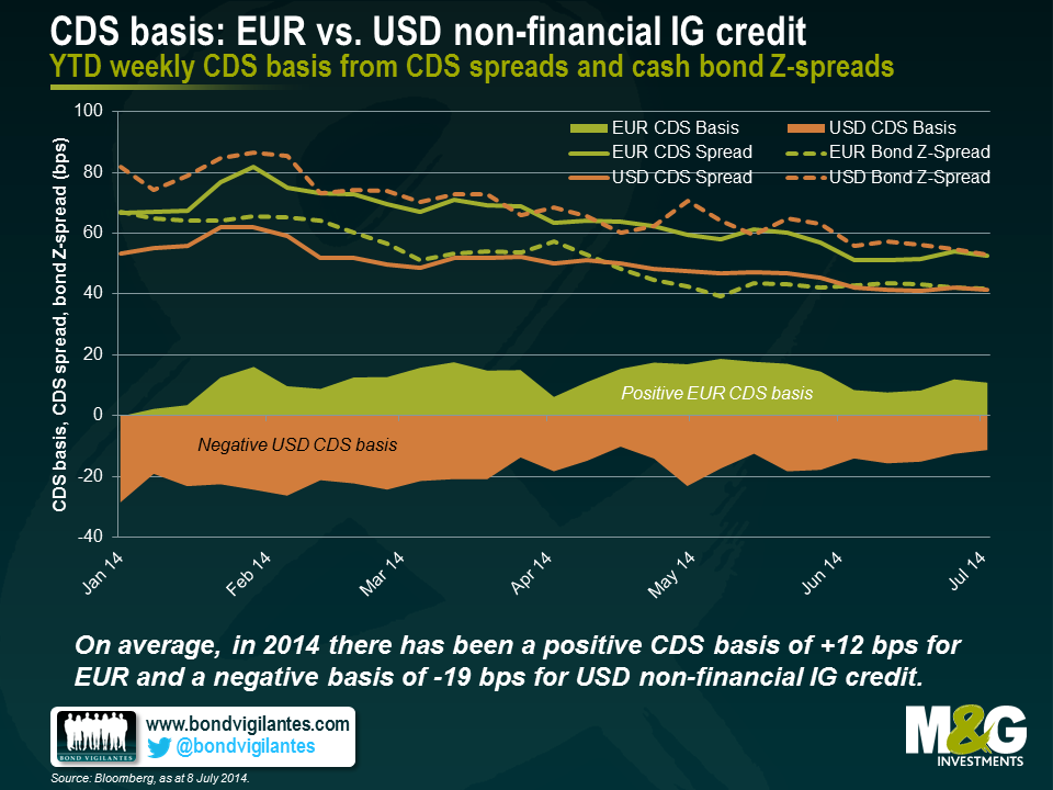
We approached the problem by constructing our own equally-weighted non-financial CDS and cash bond indices, both for U.S. and Eurozone issuers. In terms of EUR issuers, we started from the current iTRAXX EUR roll, ranked the constituent entities by total debt outstanding and selected the top 20 Eurozone non-financial issuers with comparable outstanding bonds (c. five years until maturity, senior unsecured, vanilla, reasonable level of liquidity, etc.) for our CDS and bond indices. We then compared the year-to-date evolution of weekly CDS and cash bond spreads as well as the CDS basis, averaged over the 20 index members. For our USD indices we applied the same strategy, selecting a subset of 20 US non-financial issuers from the current CDX IG roll.
The chart below shows CDS spreads, bond Z-spreads and CDS bases both for our EUR and USD indices. Throughout the year, all four non-financial IG index spreads have been grinding tighter. The CDS basis for USD non-financial IG credit has been consistently negative (-19 bps on average). In absolute terms the negative USD basis has receded, moving from between -30 and -20 bps in January to -11 bps in the first week of July. In contrast, except for the first week of January which might be distorted by low trading volumes, the EUR non-financial IG CDS basis has been positive (+12 bps on average) and amounts to +11 bps for the first week of July.
Several reasons have been put forward to explain the contrast between EUR and USD CDS basis values, including supply/demand imbalances within European cash bond markets adding a scarcity premium to bond prices and thus suppressing bond spreads. It has also been argued that in Europe CDS contracts were predominantly used for hedging purposes (i.e., to reduce credit exposure by buying the CDS contract) driving up CDS spreads, whereas the use of USD CDS contracts was more balanced between increasing and decreasing credit risk exposure.
In the current market environment characterised by low yields and tight credit spreads, CDS basis values do matter. The choice between a cash bond or a credit derivative is another lever fixed income investors can use to exploit relative value opportunities. By carefully selecting the financial instrument, cash bond vs. CDS contract, a spread pickup of tens of basis points can be realised for taking equivalent credit risk. A positive basis indicates that the CDS looks cheap relative to the cash bond, and vice versa for a negative basis. For instance, at the moment it often makes a lot of sense for us to get exposure to EUR IG credit risk through CDS contracts rather than through cash bonds, when we see attractive positive CDS basis values.
Liquidity in credit markets has been a hot topic in recent months. The Bank of England has warned about low volatility in financial markets leading to excessive reaching for yield, the FT suggested that the US authorities are considering exit fees for bond funds in case of a run on the asset class, and you’ve all seen the charts showing how assets in corporate bond funds have risen sharply just as Wall Street’s appetite for assigning capital to trade bonds has fallen. But why the worry about corporate bond market liquidity rather than that of equity markets? There are a couple of reasons. Firstly the corporate bond markets are incredibly fragmented, with companies issuing in multiple maturities, currencies and structures, unlike the stock markets where there are generally just one or two lines of shares per company. Secondly, stocks are traded on exchanges, and market makers have a commitment to buy and sell shares in all market conditions. No such commitment exists in the credit markets – after the new issue process you might see further offers or bids, but you might not – future liquidity can never be taken for granted.
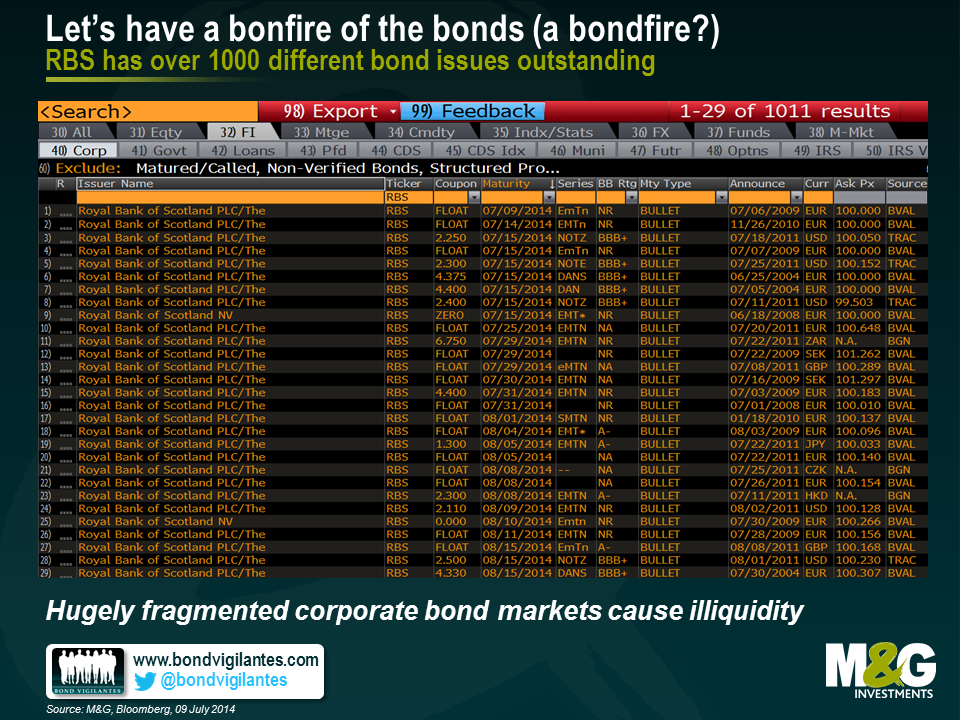
So how can we make liquidity in corporate bond and credit markets as good as that in equity markets? First of all let’s consider fragmentation. If I type RBS corp <Go> into Bloomberg there are 1011 results. That’s 1011 different RBS bonds still outstanding. It’s 19 pages of individual bonds, in currencies ranging from the Australian dollar to the South African rand. There are floating rate notes, fixed rate bonds with coupons ranging from below 1% to above 10%, maturities from now to infinity (perpetuals), inflation-linked bonds, bonds with callability (embedded options), and there are various seniorities in the capital structure (senior, lower tier 2, upper tier 2, tier 1, prefs). Some of these issues have virtually no bonds left outstanding and others are over a billion dollars in size. Each has a prospectus of hundreds of pages detailing the exact features, protections and risks of the instrument. Pity the poor RBS capital markets interns on 3am photocopying duty. The first way we can improve liquidity in bond markets is to have a bonfire of the bond issues. One corporate issuer, one equity, one bond.
How would this work? Well the only way that you could have a fully fungible, endlessly repeatable bond issue is to make it perpetual. The benchmark liquid bond for each corporate would have no redemption date. If a company wanted to increase its debt burden it would issue more of the same bond, and if it wanted to retire debt it would do exactly the same as it might do with its equity capital base – make an announcement to the market that it is doing a buyback and acquire and cancel those bonds that it purchases in the open market.
What about the coupon? Well you could decide that all bonds would have, say, a 5% coupon, although that would lead to long periods where bonds are priced significantly away from par (100) if the prevailing yields were in a high or low interest rate environment. But you see the problems that this causes in the bond futures market where there is a sporadic need to change the notional coupon on the future to reflect the changing rate environment. So, for this reason – and for a purpose I’ll come on to in a while – all of these new perpetual bonds will pay a floating rate of interest. They’ll be perpetual Floating Rate Notes (FRNs). And unlike the current FRN market where each bond pays, say Libor or Euribor plus a margin (occasionally minus a margin for extremely strong issuers), all bonds would pay Libor or Euribor flat. With all corporate bonds having exactly the same (non) maturity and paying exactly the same coupon, ranking perceived creditworthiness becomes a piece of cake – the price tells you everything. Weak high yield issues would trade well below par, AAA supranationals like the World Bank, above it.
So your immediate objection is likely to be this – what if I, the end investor, don’t want perpetual floating rate cashflows? Well you can add duration (interest rate risk) in the deeply liquid government bond markets or similarly liquid bond futures market, and with corporate bonds now themselves highly liquid, a sale of the instrument would create “redemption proceeds” for an investor to fund a liability. And the real beauty of the new instruments all paying floating rates is that they can be combined with the most liquid financial derivative markets in the world, the swaps market. An investor would be able to swap floating rate cashflows for fixed rate cashflows. This happens already on a significant scale at most asset managers. Creating bigger and deeper corporate bond markets would make this even more commonplace – the swaps markets would become even more important and liquid as the one perpetual FRN for each company is transformed into the currency and duration of the end investor’s requirement (or indeed the company itself can transform its funding requirements in the same way as many do already). Investors could even create inflation linked cashflows as that CPI swaps market deepened too.
So what are the problems and objections to all of this? Well loads I’m guessing, not least from paper mills, prospectus and tombstone manufacturers (the Perspex vanity bricks handed out to everyone who helped issue a new bond). But the huge increase in swapping activity will increase the need for collateral (cash, government bonds) in the system, as well as potentially increasing systemic risks as market complexity increases. Collateralisation and the move to exchanges should reduce those systemic risks. Another issue regards taxation – junky issuers will be selling their bonds at potentially big discounts to par. Tax authorities don’t like this very much (they see it as a way of avoiding income tax) and it means that investors would have to be able to account for that pull to par to be treated as income rather than capital gain. Finally I reluctantly concede there might have to be 2 separate bond issues for banks and financials. One reflecting senior risk, and one reflecting subordinated contingent capital risk (CoCos). But if we must do this, the authorities should create a standard structure here too, with a common capital trigger and conversion. Presently there are various levels for the capital triggers, and some bonds convert into equity whilst others wipe you out entirely. There is so much complexity that it is no wonder that a recent RBS survey of bond investors showed that 90% of them rate themselves as having a higher understanding of CoCos than the market.
Addressing the second difference between bonds and equities, the other requirement would be for the investment banks to move fully to exchange trading of credit, and to assume a market making requirement for those brokers who lead manage bond transactions. This doesn’t of course mean that bonds won’t fall in price if investors decide to sell en masse – but it does mean that there will always be a price. This greater liquidity should mean lower borrowing costs for companies, and less concern about a systemic credit crisis in the future.
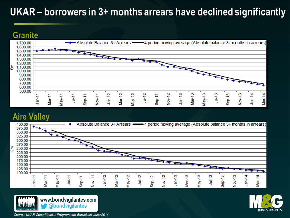
U.K. Asset Resolution (UKAR) was established in late 2010 as a holding company for Bradford & Bingley (B&B) and the part of Northern Rock that was to remain in public ownership (NRAM). Unlike other rescued institutions – RBS and Lloyds – whose progress we are kept well abreast of in the media, UKAR has flown under the radar somewhat. To give an idea of scale of the rescue; despite neither entity issuing a mortgage since 2008, UKAR is still the 7th largest mortgage lender in the UK today with a balance sheet of £74bn. About a third of assets on UKARs balance sheet are the legacy securitised RMBS deals of the two firms; B&B’s Aire Valley and the Granite complex from Northern Rock. A further 26% and 22% of assets are unencumbered mortgages and covered bonds respectively.
So, how well have they been using our tax money? And, are we likely to receive a return on our cash?
We met with management last week and they laid out their broad strategy going forward. They told us they are very focused on trying to help those able to refinance their mortgages elsewhere at a better rate. They also detailed how processes for collections and dealing with arrears have improved. This trend can be observed below, as the number of borrowers in the two securitised deals who haven’t made a mortgage payment for over 3 months has decreased significantly.
More specifically, UKAR has a three pronged strategy for dealing with each of the three groups of assets (RMBS, unencumbered mortgages and covered bonds):
Along with lowering arrears, UKAR has been successful in achieving these objectives whilst turning a decent profit. Clearly this profit is where we as tax payers (or the government) extracts value. Unlike the cases of RBS and Lloyds in which the government took an equity position, here they fully nationalised the institutions and extended a loan. Last tax year UKAR paid back £5.1bn of debt and £1.1bn in interest, fees and taxes to the government.
One further, slightly more technical point to note is the RMBS structures have hit a non-asset trigger. The trigger specifies that the notes issued out of UKAR have to be paid back sequentially – in order of seniority – until the whole deal is paid off. At this point there will be a slice of equity that will become available to the Treasury, roughly £8bn in total.
So, yes, I do think that they are doing a good job of looking after the tax payers’ investment. I also think commercial liability management exercises and portfolio whole loan sales will continue to maximise value. And of course, helping to keep people in their houses is a pretty good deal as well.
So now we know what the Bank of England intends to do about the UK’s housing market, a market that Governor Carney has previously referred to as the biggest risk to financial stability and therefore to the economic expansion (the IMF and the EC had similar warnings).The answer, in short, is not much at the moment – while Carney is not “happy” with the buoyant UK housing market, he is willing to “tolerate” it.
Before wondering what to do – and what not to do – about the housing market, it’s worth asking whether the UK housing market is in a bubble. It’s not as crazy a question as you might think – in real terms (i.e. adjusting for inflation), UK house prices rose by just +1.2% per annum from 1974 to the end of 2013, and by 2.2% per annum from 1974 to the end of 2007. It was the early noughties when things got crazy, as UK real house prices saw double digit returns in four consecutive years from 2001-2004 – strip out these years, and UK real house price growth has actually been negative in the last four decades*. But even including 2001-04, if you consider that the UK’s productivity growth since the mid 1970s has averaged about 1% per annum, and that UK population growth has averaged 0.3% per annum over this period, then small positive real house price growth doesn’t appear hugely alarming.
That said, 40 year average price changes don’t tell the whole story. The performance of the housing market in the past year is remarkable – UK house prices were up 11.1% in nominal terms in the year to May according to Nationwide, which is still a long way short of the 2001-04 bubble years, but is the fastest pace since then. Meanwhile data from the ONS shows that nominal London house prices rocketed 18.7% in the year to April. These rates of growth are well in excess of inflation, and well in excess of wage growth.
What is causing the recent jump higher in house prices? By definition the answer is an excess demand versus a lack of supply, although almost all commentary on the UK housing market seems to focus primarily on the latter rather than the former. Public debate about UK housing has been strongly influenced by then MPC member Kate Barker’s government commissioned 2004 review of housing supply, where she argued that ‘the long-term upward trend in house prices and recent problems of affordability are the clearest manifestations of a housing shortage in the UK’, and that the UK needed to build up to 260,000 new homes per year to meet demand. In the decade since the report was published, less than half this figure has been built, suggesting a shortfall of 1 million houses has accumulated.
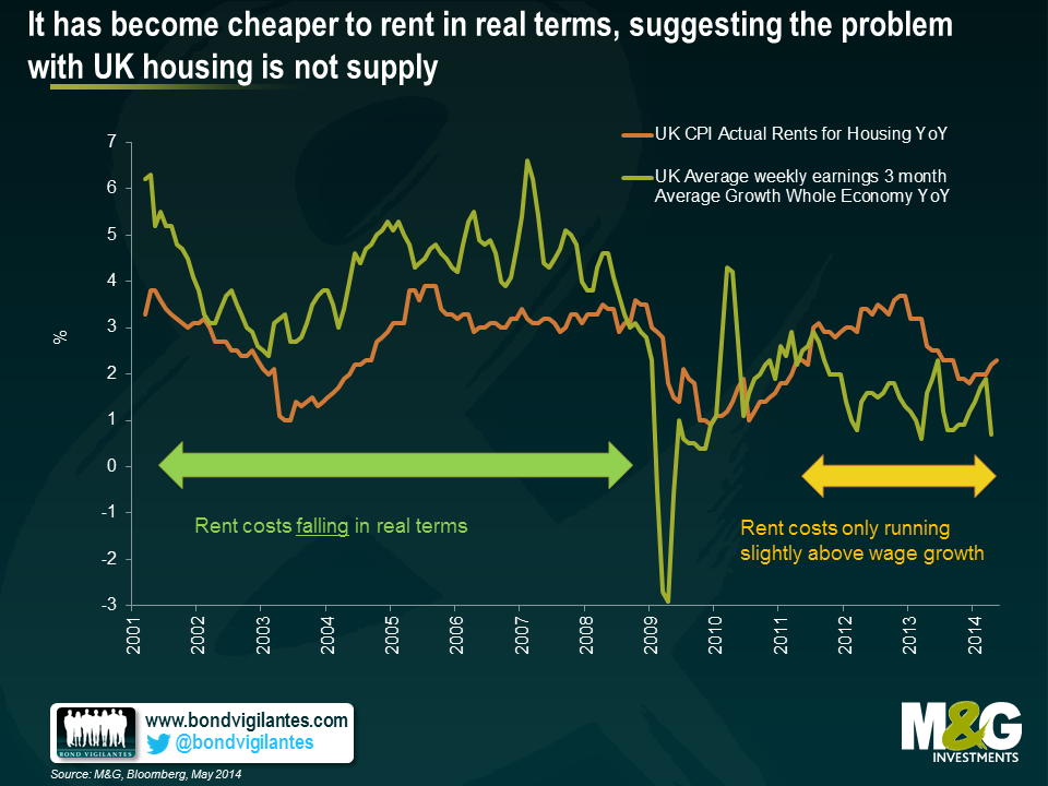
But is the spike in house prices really all down to supply? As Fathom Consulting have pointed out, if there was a housing shortage then why haven’t real rent costs jumped higher? The chart below plots nominal wage growth versus UK rent costs back to 2001 – rent costs were actually increasing at a slower pace than wages pre-2008, and have only been running fractionally above wage growth more recently. If there was a supply shortage, then we would expect to see real rent costs increasing quite sharply as people become forced to spend more on housing as a percentage of their income, but this isn’t the case.
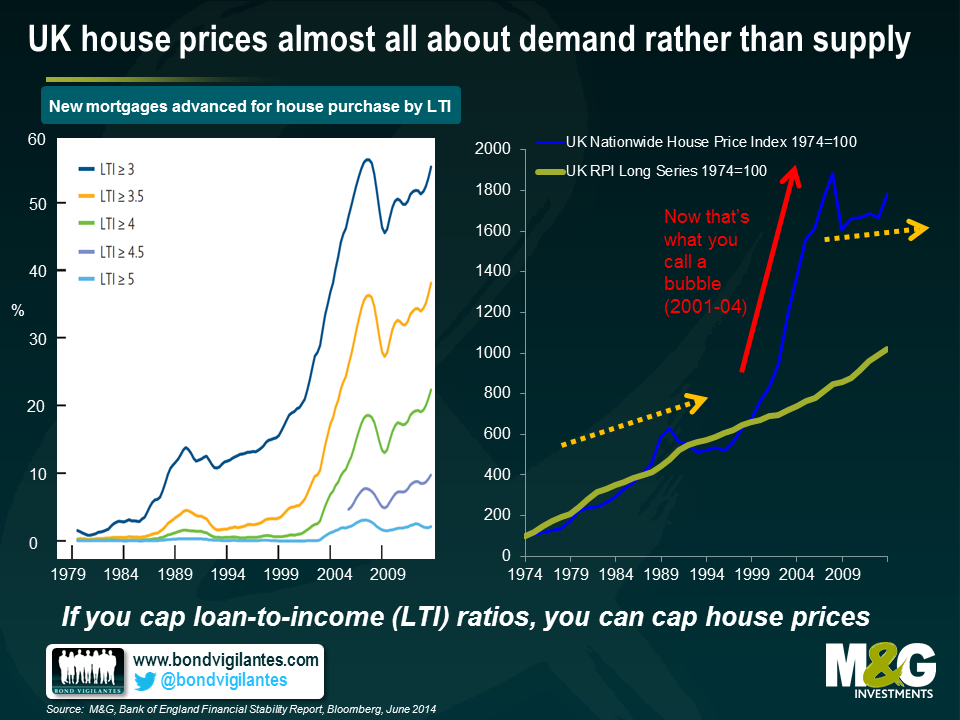
The next chart suggests that the pick-up in house prices that began last year is much more likely (as always) to have had more to do with demand, namely lower mortgage rates and easy mortgage availability. The left hand chart is from the Bank of England’s recent Financial Stability Report, and shows the loan to income ratio on new mortgages advanced for house purchase. Around 10% of new mortgagees are now borrowing at a loan to income ratio at or in excess of 4.5 times income. Over half of home buyers are now having to borrow at 3+ times income, which is a ratio about 5 times higher than immediately before the UK housing market crash of the early 1990s. It’s striking how closely correlated loan to income ratios (left chart) are with house prices (right chart). It suggests that limiting loan to income ratios will also serve to limit house price appreciation, although the correlation doesn’t necessarily imply causation. It could be that a jump higher in house prices forces buyers to take on more debt, since only additional debt will make it possible to get onto the bottom rung of the housing ladder**.
The other growing source of demand for UK property is likely to be overseas investors. When sterling collapsed post the 2008 crisis, the assumption was that the UK would see an export-led recovery thanks to a huge improvement in its competitive position. Unfortunately, this didn’t really happen, because the UK’s big export – financial services – was in little demand post crisis. UK exports did initially pick up, but today are only 10% higher than at their peak in 2008, and have moved sideways since 2011. Spain’s exports, in contrast, are almost 30% above 2008 levels in euro terms, despite the euro strengthening against sterling over the period.
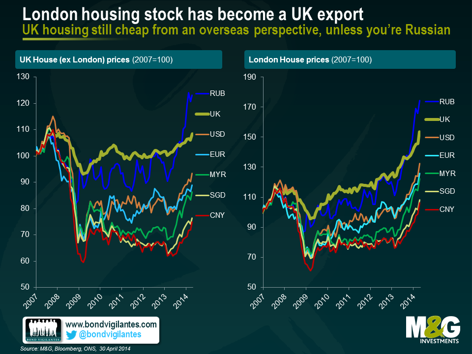
Sterling depreciation may not have resulted in a surge in exports of UK goods and services, but it does appear to have led to a pick-up in a new kind of export – London’s housing stock. Savills, an estate agent, estimates that overseas equity into just prime London residential property was above £7bn in 2012, and presumably it was higher still in 2013. Overseas buyers have always been involved in London property thanks to market transparency, liquidity, political stability, a clear rule of law, decent education, and low taxes versus countries such as France or Spain, but the 2012 inflows were twice the amount seen in 2008 or 2009, and about a third higher than in 2006.
It’s easy to see why overseas buyers have taken a shine to UK property from the chart below. British houses feel far from cheap in local currency terms, but they look considerably cheaper from the perspective of all the traditional foreign buyers, with the exception of Russians. From the perspective of Chinese investors, London house prices are still 17.5% below their 2007 highs when measured in Chinese Yuan.
The Bank of England’s strategy for reducing domestic demand for UK housing via macro-prudential measures such as limiting loan-to-income ratios should be the primary way to tackle the destabilising effects of housing related indebtedness, and the Bank of England arguably could have done more. Stemming foreign flows into the UK housing market is much more attractive politically, but could be very unwise.
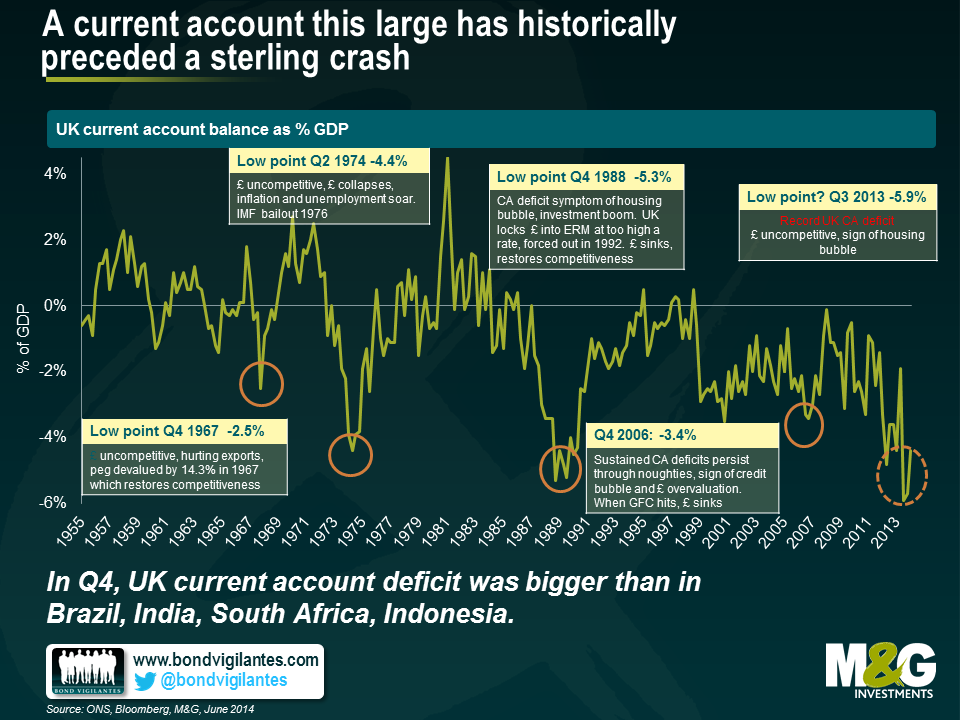
Data from last week showed that the UK’s current account deficit improved slightly in Q1 2014, but Q4 2013 was downwardly revised to 5.7% of GDP and Q3 2013 to 5.9%, a worrying new record. Of the so-called ‘Fragile 5’ emerging market countries, only Turkey had a bigger deficit in Q4.
A current account deficit is a broader measure of a country’s trade balance. The UK’s large deficit can be attributed to various factors (e.g. a sustained trade deficit, a deteriorating income balance which may partly reflect an increase in foreign companies taking over British companies, and sustained budget deficits), but generally speaking a chronic current account deficit is indicative of competitiveness problems. The chart below shows that a large and deteriorating UK current account balance has historically preceded a sterling crisis, where a sharp depreciation in sterling subsequently restored the UK’s competitiveness, and hence its current account balance. If you consider that foreigners buying new build houses in London is little different to foreigners mass buying Scotch Whiskey in terms of its effects on the national accounts, then proposals to tax foreign buyers of London property is the equivalent to taxing your own exports! Not a very clever thing to do with such a precarious current account balance. Note that taxing exports is considerably worse than protectionism, which typically involves taxing imports.
Macro prudential controls are a positive step and should help curb some of the local mortgage excess that has built up over the last couple of years. However, those pointing to supply-side factors as the primary reason for higher prices aren’t viewing the whole picture. UK property is cheap from an overseas perspective and will likely remain in demand to foreign buyers looking for solid returns in a low-yielding world. And beware the clamour of calls to stem foreign inflows into the UK housing market, which is turning into one of the UKs most in-demand exports. Of course, if macro prudential measures fail to take some of the heat out of the market, the Bank of England could always raise interest rates (if only they could remember how to….)
*This is calculated using UK RPI and the UK Nationwide House Price Index. Given there are methodological issues with both RPI and Nationwide data, it’s worth treating the calculation slightly cautiously – for example, UK RPI has averaged 0.9% higher than UK CPI since 1989, so real house prices appreciation is an additional 0.9% p.a. on a CPI basis.
**The recent nudge higher in both house prices and the move higher in first time buyer loan to income ratios is likely to have been assisted by the help to buy scheme (or the ‘help to sell scheme’, as we called it at the time), although given that as at the end of May, only 7313 houses were sold under the scheme with the total value of mortgages supported by the scheme at £1bn, there are other forces at play.


Sign up to the Bond Vigilantes mailing list to ensure you never miss a great article from our expert Bloggers. We will email all new articles to your inbox, meaning you can stay on top of the world of Bonds.
I confirm that I would like to receive information about Bond Vigilantes and products and services from M&G Securities Limited.
We will use the email address and personal data you have shared with us to send you this information. For existing customers, submitting your contact details and requesting to receive this information from us, will replace any earlier choices you have made in respect of marketing information.
You can unsubscribe from marketing at any time, at which point we will not send any further marketing information to you, by selecting the unsubscribe link in all communications.