Rolldown
A dispatch from the number crunchers – Yield curve rolldown
By Matthew Russell
15 April 2026

(blog originally posted on www.bruegel.org)
Euro area consumer price inflation, as measured by the HICP, continues to undershoot the ECB’s target of “close to, but below 2%”, currently at -0.1% in March. While it is still too early to tell if the ECB QE programme launched on March 9 will manage to bring back inflation towards the target in the medium term, a look at market- and survey-based inflation expectations data allows us to get a sense of how inflation expectations have been evolving in the last few months.
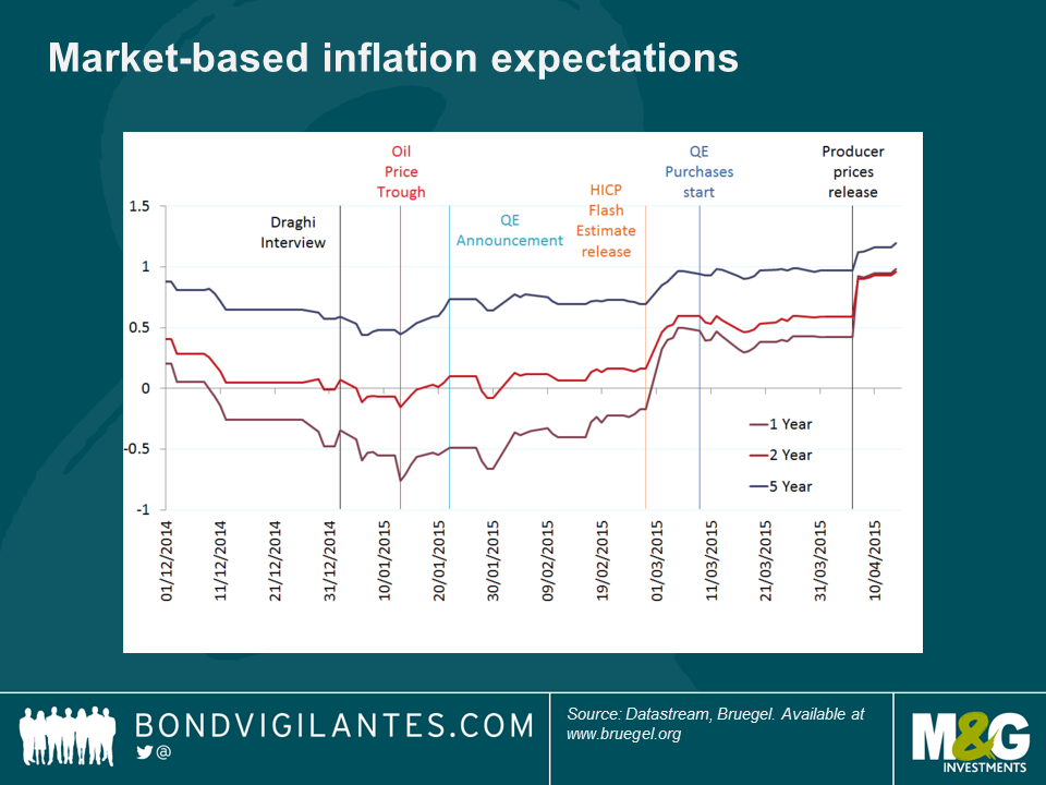
The chart below plots the HICP (in green), and market-based measures of average future inflation, based on zero-coupon swaps, which show the expectations over the periods from 1 to 10 years ahead.
The first observation is that market inflation expectations have been sliding continuously from 2012 to January 2015 (see the lines from blue to bright yellow), matching the sharp and steady collapse in headline HICP inflation that took place during that period, and prompting the ECB to act further and launch sovereign QE at its 22 January 2015 Governing Council meeting.
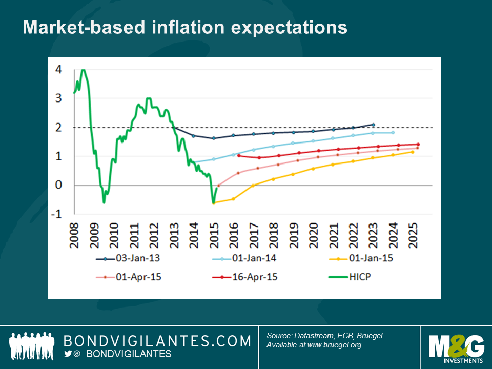
However, since the beginning of February we can see some positive developments at the shorter horizons of 1 to about 5 years. This is shown by the upwards shifts in the dotted-lines, from lows of below zero at 1-year forward in January this year (light orange), up to nearly 1% as of last week (red). Even though inflation in the eurozone is still expected to miss its target in the next ten years (with expectations of inflation only averaging 1.4% from now to 2025), this is nevertheless a positive development and a welcome turnaround after the dis-anchoring of inflation expectations observed in the last couple of years.
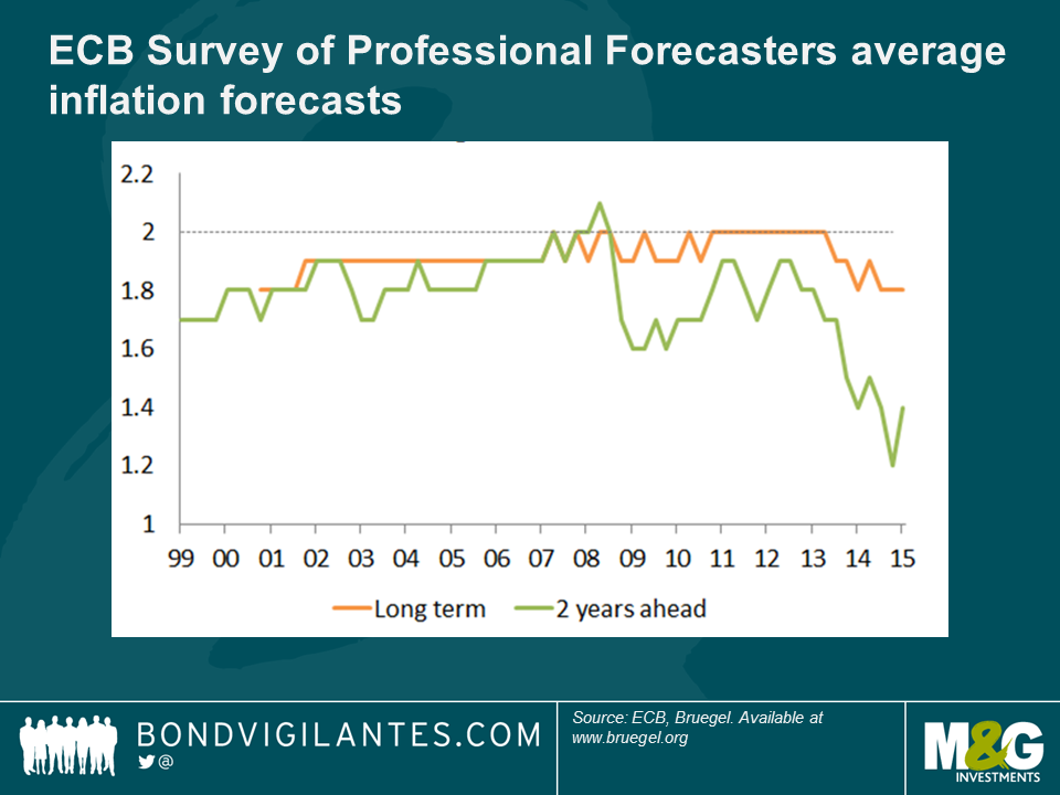
This turnaround is also visible in the ECB’s Survey of Professional Forecasters. Its latest edition published last week shows a slight rebound, with two-year ahead inflation average expectations rising from 1.2% to 1.4%, while long term expectations seem to have stabilised at 1.8%.
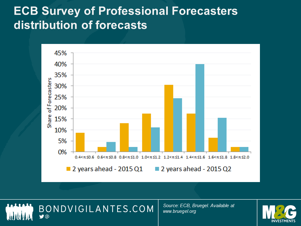
Another way to look at this survey is from the perspective of the distributions of forecasts. For the 2 year ahead forecasts, the share of higher forecasts has increased substantially in the new survey compared to the one published during the first quarter of 2015. There was also a noticeable narrowing of the variance of responses, suggesting a decrease of uncertainty concerning the inflation outlook for the next two years.
It is difficult to disentangle the main reasons behind the recent increase in expectations, but 3 main explanations immediately come to mind: 1) the ECB QE programme, 2) the stabilisation of oil prices, 3) some positive data releases.
The charts below depicting the evolution of daily market inflation expectations can help us identify what could be driving the recent improvements.
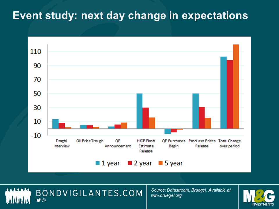
The first possible event is an interview of Mario Draghi by the German newspaper Handelsblatt (2nd January, in which he suggested that the ECB was gearing up for an asset purchase programme) – this had the mild effects of moving expectations up by 13.4, 7.6 and 1.8 basis points.
A change in direction of developments in oil prices (Brent Crude reached its trough on 13th January) contributed 5.0, 4.5 and 2.4 bps respectively.
Thirdly, it’s interesting to note that market measures of inflation expectations haven’t moved much at the QE announcement date. The 1-, 2-, and 5-year swap rates increased by 2.6, 5.4 and 8.5 basis points respectively. Of course, markets had been anticipating QE for a few months and were probably already pricing in some effect on inflation of the QE programme, so the absence of a large step-shift on the day of the announcement is not totally surprising.
Leading on from this, the actual implementation of the QE program did not steer swap rates much (-7.9, -5.3, 1.6)
More significantly, the two main drivers behind the upticks in the market measures, especially at shorter horizons, seem in fact to have been the releases of two inflation measures:
On 2nd March the HICP flash estimate for February came in higher-than-expected. The day-to-day change in expectations were 49.6, 29.7 and 15.6 bps respectively, an order of magnitude larger than any of the previous events studied. This idea of a positive inflation surprise is backed up by the responses of the economists participating in the Bloomberg survey who were predicting an even lower level of inflation in February (-0.4%) than what was actually observed (-0.3%).
The second surprise came in the positive producer price inflation data published by Eurostat on 7th April – again day-to-day changes were much larger than the other events – 49.9, 30.9, 14.9 bps respectively.
While the ECB QE programme and the stabilisation of oil prices are certainly playing a role in shaping inflation expectations on the upside, we find that the developments between December 2014 and April 2015 in market- and survey-based measures of future inflation are still mainly concentrated in the short-term and appear to come essentially from positive surprises in inflation data releases. Unsurprisingly, the surprise in inflation led to a change in inflation expectations. Whether the surprises in inflation data were themselves driven by improvements related to QE, and in particular to the recent euro exchange rate decline, or by other factors (e.g. more downward price stickiness than anticipated), remains for future research.
It has been a while since we have discussed the economics of the single currency, but once again the issue of its suitability for all its members is at the forefront of economic concerns, as Greece faces some difficult decisions.
The financial crisis has taught us a number of lessons: fiscal policy works, monetary policy works, better regulation is beneficial for the financial sector, confidence is key, and importantly exchange rates matter.
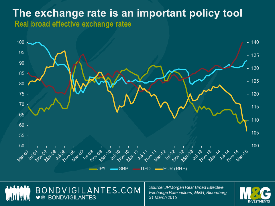
Throughout the crisis, one of the economic mechanisms that aided the economies in most stress was the exchange rate. This can be seen with the collapse in sterling in 2007 on a trade weighted basis, the weakening of the dollar from 2009 until 2011, the yen in 2013 onwards, and the euro of late, see chart below. At the heart of these fx moves lie the currency vigilantes, as we discussed here in 2010.
These external foreign exchange rate moves are a textbook play in terms of making labour cheaper and therefore helping economic recovery. However, as we know, in the Eurozone this mechanism does not exist, due to the creation of monetary union. I think exchange rates have become relatively more important in determining national economic outcomes and this is particularly relevant now to Greece.
The three main macro-economic levers are monetary policy, fiscal policy, and the exchange rate. Fiscal policy is still in the hands of politicians and therefore can be used to provide a strong impetus when required to differentiate national outcomes (although less so in Europe). Monetary policy has basically approached the zero bound in the main G7 economies, which means short rates have become hugely correlated. Without room to differentiate economic outcomes by cutting rates, national economic flexibility has been reduced, which means the exchange rate has to play a more important role than has historically been the case.
This is working between the main economic blocks. However, as the need for this most famous “invisible hand” has become greater, it has not been available within the Eurozone. This means that Greece has to somehow adjust with no fiscal room, no monetary room, and no exchange rate flexibility.
It would take at least a generation for Greece to solve its problems via structural reforms given the constraints it sits with. The short term solution is therefore for Greece to be bailed out via fiscal transfers directly, or in a quasi manner by allowing a Greek default. These are obviously hard to achieve given the political dilemmas many countries would face in providing this relief.
Greece has faced difficulties before, however we now have further pressure to find a solution as the economic policy options outlined above become more focused on the exchange rate conundrum, and the political environment in Greece points to a government more willing to take radical measures in the face of a great depression. The ability of Greece to provide for its citizens is damaged like the famous Venus de Milo statue. It could well be that politicians recognise the invisible hand of the exchange rate is still an important tool, and a free floating Drachma, the “Expulso” solution (see 2011 blog), though painful, might be the best shot at providing an economic solution given the extent of Greece’s problems.
When in past years I have fielded calls from bankers faintly like Chad ‘Ace’ Jefferson III (A Brave New World: Zero Yield Corporate Bonds) requesting any potential interest in new index-linked corporate bond issues, I have often begun my feedback by pointing to an old maxim. This well-known dogma posits that an index-linked corporate bond should price 25 basis points or so wider than a comparable nominal corporate bond.
So, for instance, were I to have been shown an offer by Ace in the Heathrow 3.334% 2039 index-linked corporate bond at, for example, the beginning of 2012, I would have looked for a comparable Heathrow nominal corporate bond spread, and as a first step checked that we were being paid at least 25bps more for the linker. At this time, the comparison I would have looked at would have been Heathrow’s 5.875% 2041 nominal bond. The spread at this point in time was approximately 255 basis points over the gilt, and Ace was probably showing me the offer at around 270 basis points over for the Heathrow linker. At only a 15 basis point pick up into the linker, the conversation would very likely have ended there with no purchase made.
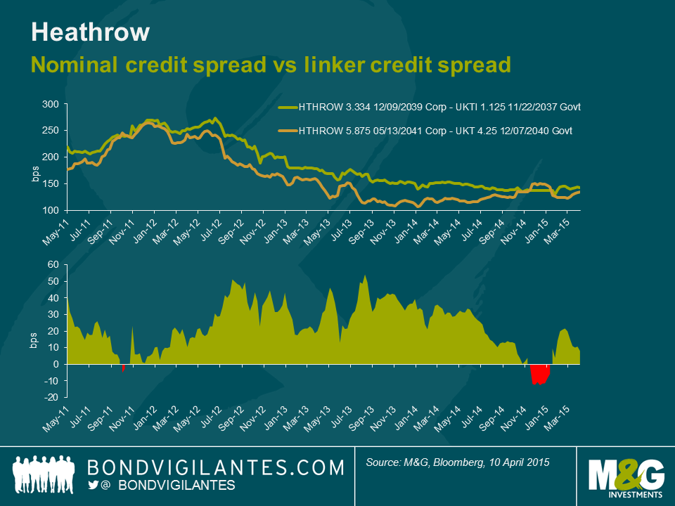
Had I got a subsequent offer in the same Heathrow linker at the end of 2013 though, on comparison of spreads between the same bonds I would have been offered the linker on a spread of 150 basis points, when the nominal 2041 bond was offered at about 110 basis points over the gilt. So I was being offered an additional 40 basis points of spread for owning the Heathrow linker versus the nominal. This time, through applying the mentioned dogmatic valuation framework, I would have been much more likely to buy the index linked bond.
Why might investors seek a higher credit spread for buying the linker over a corporate? First and foremost the additional spread compensates for the relative illiquidity of index-linked corporate bonds compared to nominal corporate bonds. Issue sizes tend to be smaller, owned by a more limited pool of investors, with the majority of corporate bond funds’ major investment types being nominal bonds rather than index-linked ones. It is this liquidity premium that gave rise to the desire to receive 25 basis points more than for nominal bonds when buying index-linked corporates, over the long term. Another important factor that could be cited could be that corporate linkers often carry greater default risk, or in particular loss given default risk (the probability of default of the Heathrow linker is identical to the nominal Heathrow bond). As inflation is accrued in the corporate bond, the price rises or the inflation compensation amount grows. But in a default, the investor’s claim is the same as a nominal corporate bond investor’s – a claim on par. This additional risk needs compensating through additional spread.
So, I am unlikely to buy linkers when I am not being compensated for the relative illiquidity compared to nominal bonds, and I am more likely to buy when the spread over nominal bonds is wider than 25 basis points, such as when the Heathrow linker was paying as much as 50 basis points more than the 2041 nominal. The above chart also shows, if the pricing history is to be believed, that earlier this year the linkers were trading with tighter spreads than the nominal. In episodes like this, we should be more inclined to sell. After all, investors were effectively paying a premium for illiquidity!
However, secondary factors can drive this premium up or down over time, such as inflation expectations and the related headline levels of inflation, and perhaps this explains the relative tightness in the comparison in early 2012 compared to the divergence in spreads in late 2013. After all, in early 2012 RPI was close to 4% and had only a few months earlier been close to 6%. Wind the clocks forward to late 2013 and RPI was back down to 2.7%, and investors were less concerned about the threat of inflation.
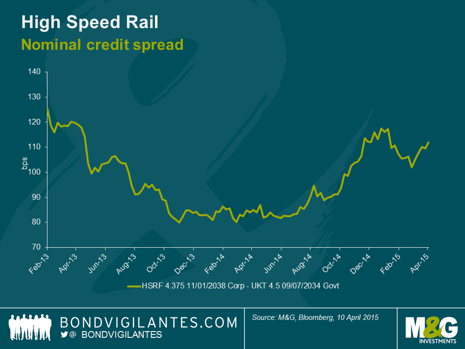
This week, on 14th April 2015, High Speed Rail Finance, which runs the concession on the high speed rail link between St Pancras and The Eurotunnel, brought a tap of its index-linked corporate bond. In February 2013 the entity issued its first corporate and index-linked corporate bonds. Its £610m nominal bond came at 150 basis points over the gilt, and its £150m index-linked bond came at 175 basis points over the index linked gilt. So, the linker was 25 basis points back of its larger nominal comparable: ring any bells? Yesterday’s tap, though, of the linker came at a credit spread of 107 basis points. And as the chart below shows, this is actually pretty much in line with the spread of the larger nominal bond, and so is close to the extreme tights of the linker-nominal relationship.
So what might we learn from all this?
Firstly, as the Heathrow chart showed, the spread pick up from selling nominal corporates into linker corporates has been coming down since the start of 2014. And yesterday’s tap also suggests that investors are eager to add long inflation protection. One could also cite record lows on long dated index-linked gilts as further evidence of strong demand for inflation protection, even at low yields. This could be driven by fears of higher inflation in the future, but it could also be driven by expectations that index-linked bonds will do better than nominal bonds, on a relative basis (or in other words, that UK breakevens are too low).
Secondly, it could also be that investors want to remove the uncertainty of higher inflation in the future: if you buy and hold the 30 year gilt linker until maturity, you will get RPI-1% (so you will receive CPI, near enough); whereas if you buy the 30 year gilt, your yield will worsen (improve) if inflation rises (falls) over the next 30 years.
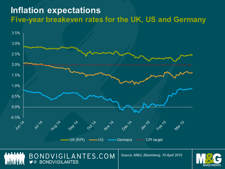
Finally, it could be that investors have taken notice of significant reflation moves in breakevens in the US and in Europe so far in 2015, and are looking for UK linkers to stop lagging and play catch up. 5 year bund breakevens have rallied 100bps more and 5 year TIP breakevens have rallied 60bps more than UK RPI breakevens in 2015 so far.
One should mention the possibility that the strength of the inflation-linked bond market, across both gilts and corporates, could be being driven by liability driven investing strategies, who are relatively price insensitive. LDI is certainly playing a part in driving the inflation market in the UK. However, this just adds a technical tailwind to the already supportive arguments I have made. In my opinion, breakevens in the UK look relatively good value, and would justify the early evidence of improving demand for inflation protection.
We’ve been worried for years about the prospect of a sharp slowdown in China and the knock on implications for those countries and companies that have grown reliant on a strong China over the last decade, namely commodity exporters, some emerging markets, and particularly emerging market commodity exporters (eg see If China’s economy rebalances and growth slows, as it surely must, then who’s screwed?). Weak trade data over the weekend, together with mixed readings on loan growth and FX reserves earlier this morning, have done little to alleviate these fears.
But potentially the biggest effect that a China slowdown is having on the rest of the world may be in the collapsing inflation rates we’re seeing almost everywhere. It was only a few years ago that most strategists were arguing that an overheating China with its rocketing wages and strengthening Renminbi was set to export inflation to the rest of the world. These forecasts have turned out to be entirely wrong, and instead China seems to be exporting substantial deflation, and that’s over and above the effect that a slowing China is having on commodity prices.
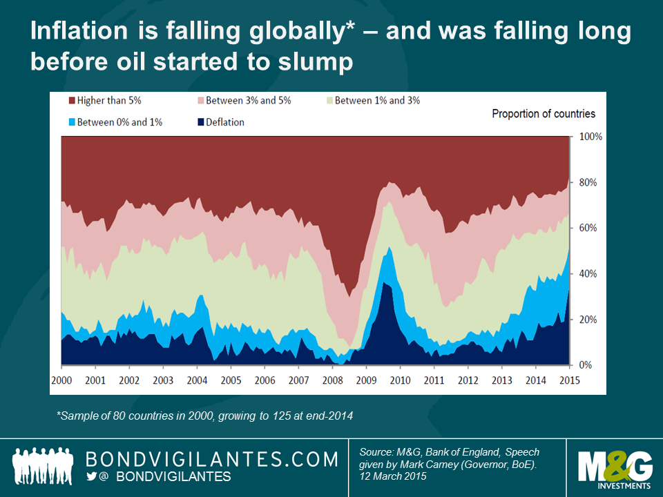
Before getting onto China specifically, the first point to make on global inflation is that, as everyone is aware, global inflation rates have slumped. This has accelerated since commodities fell off a cliff last summer, but inflation rates were already on a downward trend well before this point, as was nicely illustrated in a chart accompanying Bank of England governor Mark Carney’s speech last month (chart reproduced below).
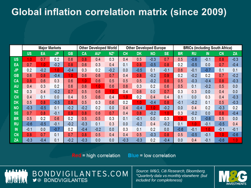
The second thing to note is just how synchronous plunging inflation rates have been. Globalisation, and the economic interconnectedness that this has brought, has meant that domestic factors have withered in importance in determining countries’ domestic inflation rates (for more on this see the appendix to Carney’s speech linked in previous paragraph). Falling inflation rates are not solely a Eurozone or developed market phenomenon either – China’s inflation rate has been highly correlated to all major countries bar the BRICS and Japan, although the lack of correlation of the BRICS and Japan to anyone else probably has a lot to do with the extreme volatility in these countries’ currencies. Jamie Searle and team at Citi Research have elaborated on Carney’s final appendix chart and split out correlations across countries, and as shown in the chart below, Chinese headline inflation has had a correlation of +0.8 with the US, and +0.7 with the UK and the Eurozone since 2009.
So it’s pretty clear that there is a correlation between China’s inflation rate and those of other countries around the world, but is there causation? Chinese Premier Li Keqiang argued last month that there isn’t, but a study by the Bank for International Settlements (BIS) in 2014 suggested that there is, where they found that a common factor lay behind a bulk of the variation in inflation of a selection of developed economies, and this is statistically mostly explained by Chinese non-commodity export prices (see p54-55) .
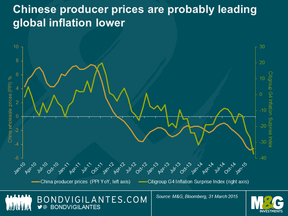
The BIS’s findings are supported in the chart below, where I have compared annualised China producer prices (PPI) to Citigroup’s G4 Inflation surprise index, which measures how far above or below inflation data in the main developed countries has come in versus forecasters’ prior expectations. Chinese producer prices are in rampant deflation, with PPI falling 4.6% in the year to March, the 37th consecutive negative month (orange line, left axis). Meanwhile, Citigroup’s inflation surprise index slumped to the lowest level last month since data began in 1999 (green line, right axis). Eyeballing the chart below suggests that China PPI slightly leads developed country inflation surprises, and this chart will understate causality if you consider that PPI is a year on year release and is therefore incorporating data that is up to a year old, whereas Citi’s inflation surprise index is a monthly calculation*.
Why are Chinese inflation rates so low and will this trend continue? The deflationary forces leaking out of China stem from the Chinese authorities’ response to the 2008 crisis, where they embarked on huge infrastructure and investment spending. As previously argued on this blog, the investment bubble has become frighteningly inefficient. The consequence of China’s overinvestment was to create excess supply and overcapacity, which has proven disinflationary, but now China has to also contend with stagnating domestic demand. It’s tricky to see how this dynamic can be reversed over the short to medium term – indeed the Chinese authorities still seem addicted to falling back on infrastructure and investment spending in the face of weaker growth, which is unlikely to help. And if China resorts to depreciating its currency, then global deflation will get a whole lot worse.
In the long term, China needs to substantially boost consumer demand, but people have being saying that for years and it’s proving very difficult to change its economic model. And it is not just China that needs a new policy prescription – the developed world needs to do the opposite, i.e. more investment and infrastructure spending, and probably less consumption, but here too it is proving tricky to change economic models. These problems, in a nutshell, lie at the heart of the stubborn ongoing global imbalances, which while reduced are very far from being eliminated.
* Citi G4 Inflation Surprise Index is an equally weighted measure of headline CPI, PPI and wage shocks in the US, Eurozone, UK and Japan. Interestingly, Citi have found that lagged commodity prices have been an important factor in predicting inflation surprises, with energy and agricultural commodity prices explaining more than half the volatility in the index. This suggests that the consensus forecasts that markets so heavily rely upon have been hopeless in correctly factoring in changes in commodity prices to subsequent changes in headline inflation rates.
Richard Koo popped by our office a few weeks ago to discuss his most recent book The Escape from Balance Sheet recession and the QE Trap. You can see the interview here. We asked who was the Japanese prime minister in 1997 who oversaw arguably Japan’s biggest policy error post the collapse of Japan’s debt fuelled bubble, and the answer was Ryutaro Hashimoto.
It is perhaps a little harsh to imply that Mr Hashimoto was primarily to blame for Japan’s errors, given that Japan was only implementing policies in accordance with the so-called ‘Washington consensus’ prevalent at the time. It took the subsequent Asian and Russian crises for this market-based neoliberalist approach to be seriously questioned, and then questioned further still post 2008. But as described in the Economist’s typically excellent obituary in 2006, whatever Mr Hashimoto’s shortcomings, he was not someone to be messed with.

We had over 60 correct answers, the books are in the post, and the ten people drawn at random are below. I hope you enjoy it.


Sign up to the Bond Vigilantes mailing list to ensure you never miss a great article from our expert Bloggers. We will email all new articles to your inbox, meaning you can stay on top of the world of Bonds.
I confirm that I would like to receive information about Bond Vigilantes and products and services from M&G Securities Limited.
We will use the email address and personal data you have shared with us to send you this information. For existing customers, submitting your contact details and requesting to receive this information from us, will replace any earlier choices you have made in respect of marketing information.
You can unsubscribe from marketing at any time, at which point we will not send any further marketing information to you, by selecting the unsubscribe link in all communications.