Rolldown
A dispatch from the number crunchers – Yield curve rolldown
By Matthew Russell
15 April 2026

I spoke to Adair Turner last week about his new book, “Between Debt and the Devil”. You can see my interview with him below.
Early in 2012, as the UK struggled to escape recession, I asked the question “if the government simply cancelled the £300 bn+ of QE gilts held by the BoE, who would be unhappy?”. Would that have really let an inflation genie out of the bottle? I argued that even if inflation did return, the central bank still had plenty of ways of tightening monetary policy. The biggest argument for not cancelling the QE gilts in my view was that it would be regarded as Zimbabwean, and therefore have a damaging impact on credibility. Adair Turner’s excellent book argues that whilst you can point to Zimbabwe or Weimar Germany as examples of money printing going bad, there are some successful and credible examples too. The new economic literature argues that it is necessary in an over-indebted world to print money if the alternative is high unemployment. Additionally, Turner’s book is very critical about the reliance of debt to fuel modern rates of growth – debt is, in his view, a pollutant that should be taxed and managed just as we would manage industrial waste. Finally at the end of my interview you can see what Lord Turner had to say about Jeremy Corbyn’s “People’s QE”.
Now, our competition. We have 10 copies of “Between Debt and the Devil” to give away to randomly selected winners who can answer this question:
The idea that governments can, and should, print money to stimulate economies rather than tolerate high unemployment comes from the theory known as MMT. What does MMT stand for?
To enter, email your answer to bondteam@bondvigilantes.co.uk
The closing date is Wednesday 2nd December at midday UK time. Good luck.
This competition is now closed.
Guest contributor – Jean-Paul Jaegers CFA (Senior Investment Strategist, Prudential Portfolio Management Group)
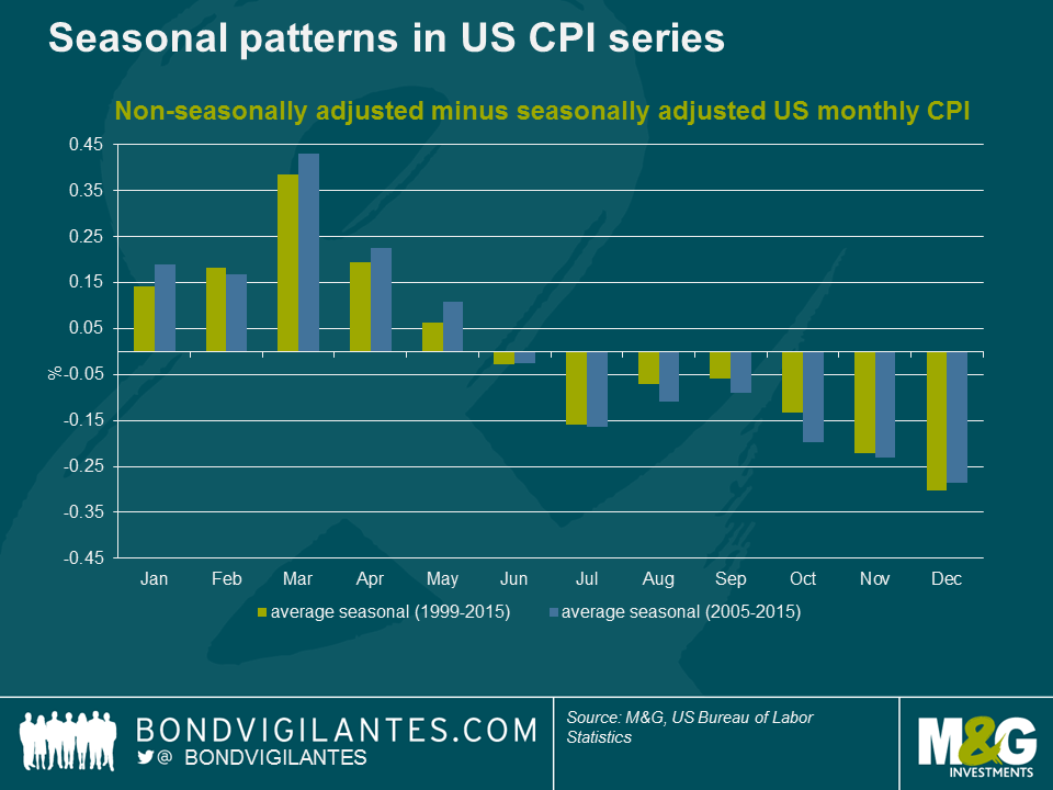
One asset class where seasonality matters hugely is inflation linked fixed income. This makes a lot of sense, as inflation is the underlying macro variable, and inflation by its nature is very seasonal. For example, post Halloween sales or Holiday packages tend to happen in regular periods. As a result, seasonality becomes predictive and obfuscates the underlying trend. Therefore, institutions like statistics bureaus publish seasonally adjusted series for consumer prices (CPI).
When we compare seasonally adjusted and non-seasonally adjusted CPI series published by the US Bureau of Labor Statistics and look at the average seasonal factor they have applied over the past 10 and 15 years, we see a pattern as shown in the chart below. In the first half of the year consumer prices tend to rise, whereas in the second half of the year consumer prices tend to fall. This is a very persistent pattern.
It is one thing to observe a pattern in macro variables, but the more crucial element is whether it matters for financial markets. Purely rational investors should anticipate seasonal patterns and therefore seasonality should be a non-profitable strategy. For example in inflation swaps, the forward curve includes seasonal factors, thus opening an inflation swap in December and closing this in June does not result in gains if inflation prints come in according to the normal seasonal pattern. For cash products this becomes a little bit more difficult as there is not a forward curve, there are lagged cash flows, and it requires arbitrage as there are two assets involved.
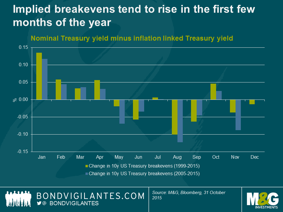
One way to look at cash products would be to look at the implied breakeven, that being the nominal yield of a regular government bond minus the yield on an inflation linked bond of the same maturity, issued by the same government. The result is the inflation compensation and an inflation risk premium implied in nominal bonds. Thus looking at this differential between nominal bonds and inflation linked bonds we can get a sense of how the inflation component that is priced-in for nominal bonds behaves. Below we can see that in the period when inflation ‘seasonally’ tends to rise, implied breakevens on average tend to rise. We see implied breakevens on average tend to fall in August, September and November, which also coincides with the period inflation ‘seasonally’ tends to be weak. As an aside, the ECB and the Fed in recent years (http://www.federalreserve.gov/econresdata/notes/feds-notes/2014/residual-seasonality-in-core-consumer-price-inflation-20141014.html ) also have made the observation that seasonality in consumer prices has become stronger, some of which is due to changes in methodology/measurement.
Why does this matter?
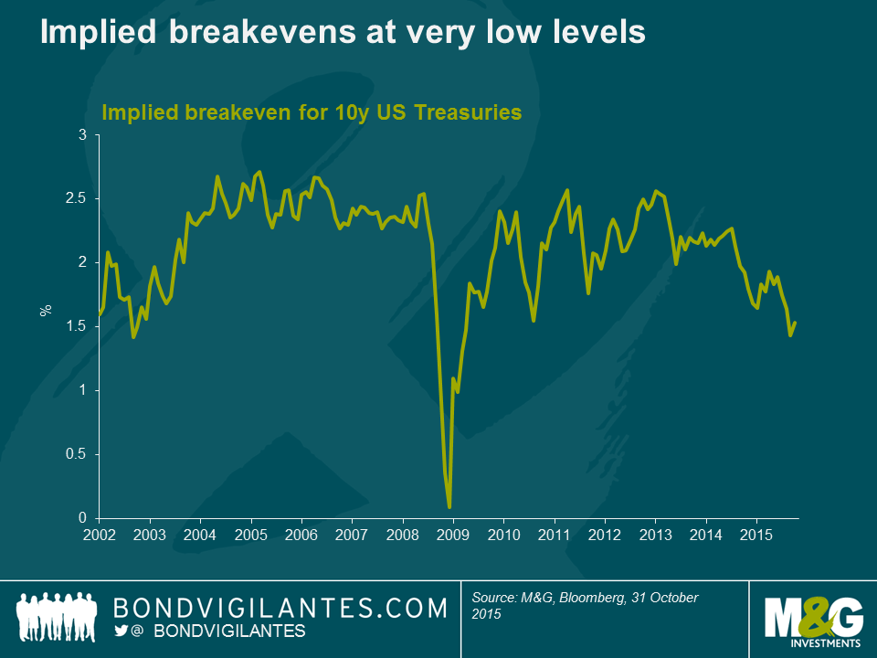
In the below chart we can see that the priced-in inflation compensation (ie implied breakevens) is very low at the moment, as consensus struggles to see what could be a catalyst for inflation, and given the supply/demand dynamics in energy, energy is expected to remain weak. However, we should keep in mind that the implied breakeven includes an inflation risk premium. This of course varies over time and is very hard to measure, but academics estimate it to be somewhere between 40-75 basis points. Thus when we observe 1.5% for the next 10-years, it actually is probably closer to pricing an investor compensation for inflation of somewhere around 1% for the next 10 years. Moreover, inflation is a rate-of-change concept, thus base effects are important and roll out after a 12 month period (ie for inflation to remain constant, prices have to keep on falling/rising at the same pace as in the prior 12 months). Thus with some tailwind from seasonals in the first half of next year, in combination with the base effect of energy rolling out, there could be scope for breakevens to drift higher.
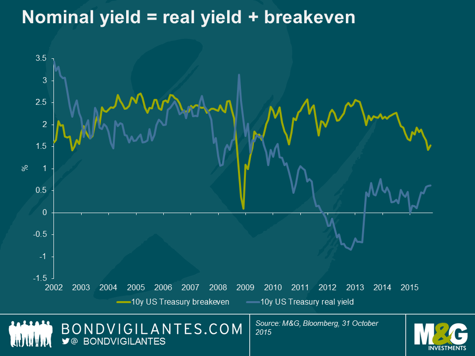
Financial repression by central banks pushed real yields down (preferably into negative territory to be most effective), but with the US economy normalising it would most likely be that real yields will be allowed to stay at current levels or even drift a bit higher at a measured pace (otherwise it would tighten conditions too much). Here we have seen some recovery from the 2012 bottom.
If we have a situation where the Federal Reserve hikes in December just as the base effects of energy start to fall out of the inflation numbers (compare headline at 0.2% with Core at 1.9%), coupled with the fact that implied break-evens tend on average to rise in the first few months of the year due to seasonally stronger rises in consumer prices, this could potentially provide quite some headwind for Treasuries over the next six months.
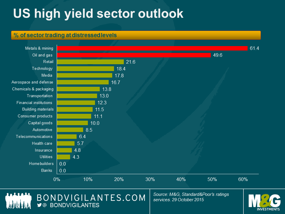
The fact that commodity-related sectors, like metals & mining and energy, are the highest-yielding and worst performing sub-sectors this year in the broader high yield Index is no surprise. There is a high degree of distressed credits in these sectors suffering on the back of the current low commodity price environment. S&P recently released its summary of sectors with the highest distressed ratios (or the percent of each sectors’ issuers whose bonds have option-adjusted spreads (OAS) greater than 1,000) and, unsurprisingly, metals & mining and energy are on top of the list with distressed ratios of 61.4% and 49.6% respectively.
What might surprise some is that the retail sector comes in third place, with a 21.6% distress ratio, despite the US economy being in decent shape with job creation and lower gas prices freeing up more disposable income.
This is mostly due to a number of highly distressed individual names skewing the picture, because the balance of the sector trades at levels closer to, or even within, the broader high yield index. The table below provides a snapshot of a few of the “haves” and “have nots” within the sector and illustrates the importance of avoiding potential pitfalls.
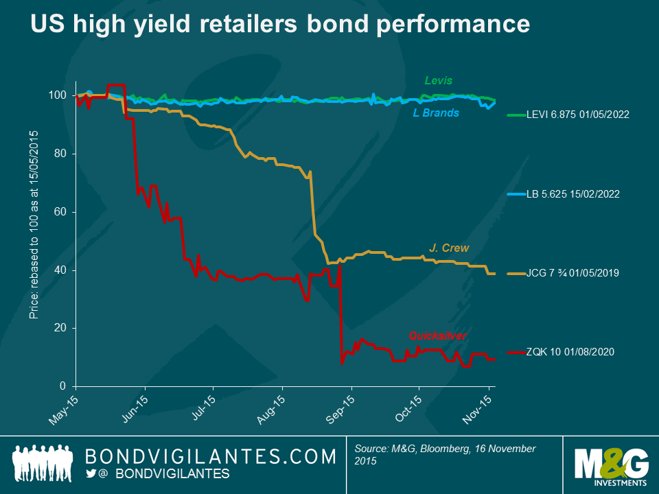
It’s true that the move to e-commerce has played a role in hampering retail traffic and sales through the traditional venues, which most of these retailers operate (shopping malls, big box stores etc.), but many of these wounds have been self-inflicted. Some management teams got promotions and/or fashion seasons wrong and others changed their business model in a way that alienated their customers.
Men’s Wearhouse, a specialty retailer focused on men’s suits and accessories, is the latest example of the latter. The company’s stock has plummeted nearly 50% since October and its 7%, 2022 bond dropped approximately 20 points following the company pre-announcing disappointing Q3 results, which took the market by surprise.
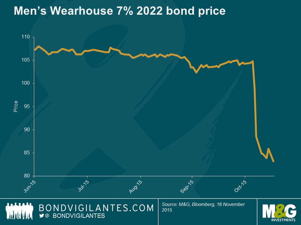
The culprit was lower-than-expected sales of its Jos A. Bank (JAB) label, which Men’s Wearhouse acquired last year for around $1.5bn. JAB was famous for a promotion where customers could buy one suit and get three free. Upon acquiring JAB, Men’s Wearhouse pledged to do away with the promotion. The size of the resulting drop in sales caught management, by its own admission, by surprise. In a classic example of a company getting away from what its core customer demands: the three-for-one promotion was more vital to JAB’s prospects than management recognized.
More examples include J Crew Group (JCG), which suffered by making changes to its core style, leaving its existing customer base alienated; or in retail parlance, it committed a “fashion miss”.
In the case of Quiksilver (ZQK), management lost control of its wholesale channel, leading to deep price discounting and brand damage. Plus, ZQK had an unsustainable capital structure (i.e. too much debt) and despite new management efforts, the company filed for U.S. Chapter 11 protection in September.
JC Penney (JCP), a big box department store, was already suffering from structural shifts such as e-commerce when it started altering its core business model by introducing a “store-in-a-store” concept. This meant that individual brands (Martha Stewart is one famous example) were given virtual stores within JCP’s existing stores. Although this concept wasn’t entirely ground-breaking, JCP has been around since 1902, and this concept didn’t strike a chord with its longstanding conservative customer base, who viewed JCP as an old-school, traditional, discount retailer. Opinions remain mixed on the long-term prospects of JCP, but this demonstrates that recovering from strategic mistakes, especially when coupled with structural changes, can take many years.
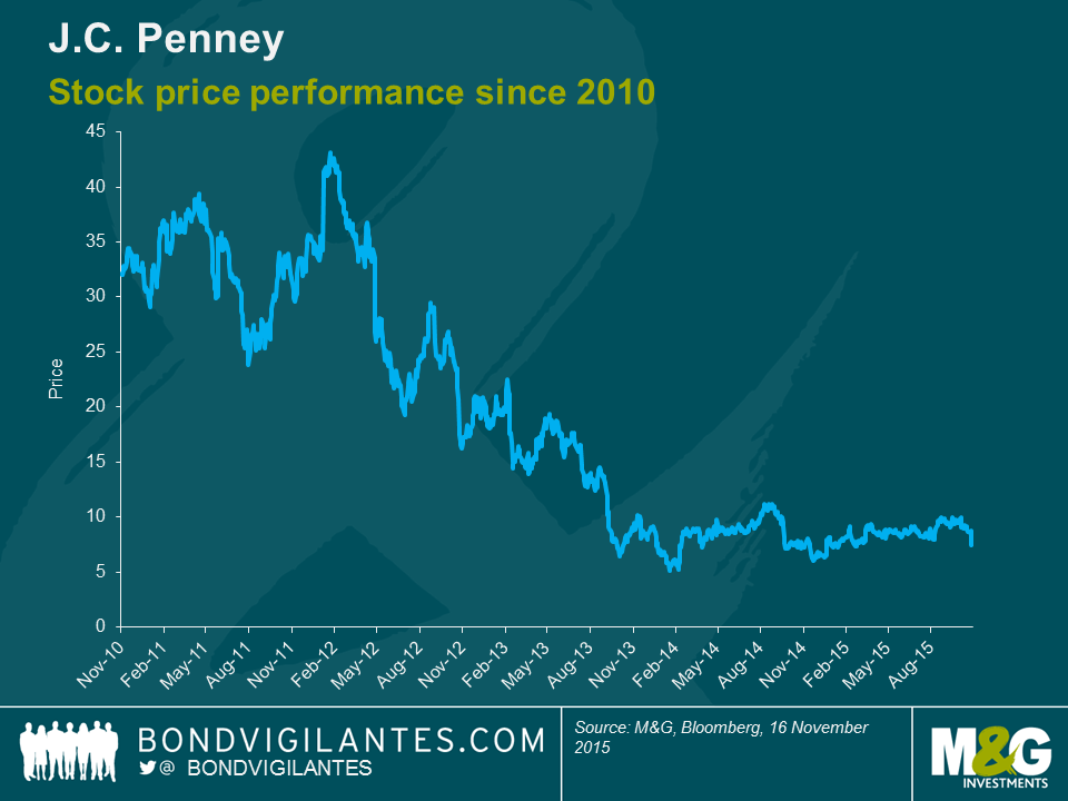
NB we are highlighting JCP’s equity rather than the company’s bonds as the company has re-financed and restructured its capital structure over this time period. Subsequently, the equity performance gives a cleaner illustration of how JCP’s attempts to recover have lingered for years as it tries to repair its brand and regain customers.
And the list goes on. Other distressed retail names with more than $400m in bonds outstanding include BI-LO Holdings, Claire’s Stores, Jo-Ann Stores, The Bon-Ton Department Stores, The Gymboree Corp and Toys R Us.
Men’s Wearhouse’s 2022 bond is now yielding 10.6%, or +872 bps on an OAS basis, as the market is trying to determine/gauge whether the company can recover. So not truly distressed as per S&P’s definition, but not a million miles away.
Now, Men’s Wearhouse may rebound quickly, which means this sell-off could represent a buying opportunity if one believes in the company’s prospects and its ability to regain customers. Or its troubles may linger as sales and customers erode further, in which case investors need to be prepared for the long haul and assess if they are being adequately compensated for the elevated risk of the business going forward and how likely they consider the possibility of a debt restructuring.
In either case, this example highlights the peril of strategic mistakes damaging what was otherwise a well-performing business. It also highlights a theme we have commented on frequently – the importance of credit research and stock selection, as investors need to be cognizant of not just credit risk profiles and credit ratios, but also idiosyncratic and business model risk profiles.
Disclosure: M&G funds hold L Brands 5.625 2022 and Levis 6.875 2022 bonds and JC Penney equity
Following another sell off, the US high yield market has once again touched the psychologically important 8% yield level today. This is an important valuation signal that has helped to tempt investors back into the market in recent months. However, the last move up in yields has been driven in part by a renewed downdraft in commodity prices, not least with WTI pricing in the low $40’s. Energy issuers make up a not insignificant 12.7% of the US high yield market so such moves cannot be easily shrugged off. Hence, the most common rejoinder to any assertion that “US high yield is cheap” when yields hit these levels, is that it’s “cheap for a reason”.
Is there a way around this? Can investors benefit from headline yields in the high single digits without taking on the heightened commodity risk of buying the bonds of financially levered oil and gas producers?
Well the short answer is “kind of”. You can benefit from high single digit yields, but not without some compromise. Here are 4 potential ways to do it:
| Yield | % of US HY Market | |
| US High Yield | 8.0% | 100% |
| US High Yield Energy | 12.3% | 12.7% |
| US High Yield Steel | 10.8% | 1.6% |
| US High Yield Metals & Mining | 14.8% | 3.2% |
Source: BofA Merrill Lynch, Bloomberg
As is so often the case, there is no free lunch here – if investors want the 8% yields on offer, they have to be exposed to the more volatile sectors and take on associated default risks. Nevertheless, as we can see from the above, there are several ways in which relatively attractive yields can be achieved whilst minimising some of the underlying commodity risk.
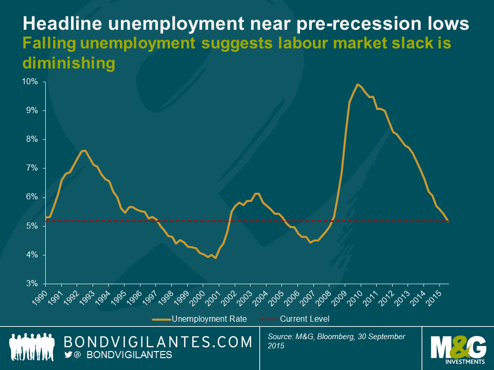
We have often blogged about the current tightness in the US labour market; in particular the initial jobless claims number as a percentage of the working age population being at all-time lows. The Fed too has recently produced indicators to tell a similar tale; looking at unconventional unemployment proxies – such as the insured unemployment rate in this recent post – suggests that labour market slack has diminished to multi-decade lows. However it’s well known that whilst the unemployment rate has fallen to levels that might be expected to cause wage inflation, we’ve also seen a significant fall in the participation rate. There remains a debate about the reasons for this fall (from more than 67% at the start of this millennium to just over 62% now), although most believe it is not just cyclical (reflecting the damage done by the 2008 Global Financial Crisis) but also structural (demographics etc.). An enduring criticism of the improving labour market story is therefore that it has been a low-quality recovery with discouraged workers ceasing their job search or retiring early due to their skills mismatch. These searchers fall out of the unemployment rate, which paints an improving, yet distorted, picture. Indeed, the chart below shows that the headline unemployment rate is approaching its pre-recession lows.
Adjusting the headline unemployment for the falling participation rate and assuming that the actual unemployment rate is the sum of the headline number of unemployed and the percentage of non-participants over time, gives an alternate proxy for the US labour market. In other words, this shows what the US labour market would look like if we adjusted the unemployment rate to effectively add back in those who have left the labour force.
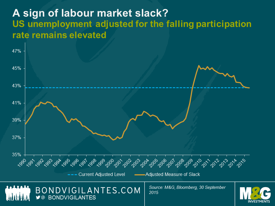
As you can see, the graph above indicates that the adjusted measure of available labour is 43%, compared to the 40% average over the period. You would need a large further fall in the headline unemployment number (or a similar rise in participation rates) to return US labour market tightness to its pre-recession levels, on this adjusted measure. The US Employment Cost Index has been stuck around 2% since the end of the recession – a period where we have had this huge “reserve army of labour” available for capital to utilise. The falling participation rate has overwhelmed the impact of falling headline unemployment and could make significant wage growth difficult to achieve.
Part of the ABC of Latin American debt series (see here for views on Argentina and here for Brazil)
During my recent trip to Latin America it was funny (but not surprising) to hear the locals worrying about Colombia becoming the next Brazil. In turn, Brazilians are worried about becoming Argentina (though I believe the Argentinean problems are much more solvable in the near term than Brazil’s) and Argentineans believe they are a world apart from Venezuela (still true, but if they get four more years of policy inaction, it will go that route as well). It reminds me of the height of the Eurozone crisis when the Portuguese were telling us they were not Greece, Spain was not Portugal and so on.
Colombia’s starting point is much healthier than Brazil’s in terms of debt levels, fiscal position and the political environment. However, it does have some similarities that, if not addressed within the next few years, could put the country into a difficult position. Both countries (and Argentina as well) have fiscal challenges and little additional space to raise taxes. Any fiscal improvements will need to come through spending cuts from politically-sensitive earmarked items, as discretionary spending and infrastructure spending has already been reduced to minimum levels. Approximately 1-2% GDP is needed to replace the shortfall in oil-related revenues and large scale tax reforms will need to be approved by the middle of next year, before the next electoral cycle kicks in. The social security system also needs reform. Infrastructure (roads, public transport, etc.) in the region is very poor (Colombia ranks particularly poorly here) and most countries are hoping for public-private partnerships to help fill the gap.
A rebound of growth in the medium-term will also help, but in the short-term growth is under pressure from various shocks: terms of trade and the oil price decline, supply-side inflation pressures (especially if El Nino turns out to be a strong one), a much weaker currency, which is acting as the shock absorber, and potential tax hikes. On the positive side, the peace process between the Colombian government and the FARC could deliver a 0.3-0.5% increase in potential growth over the medium to long term.
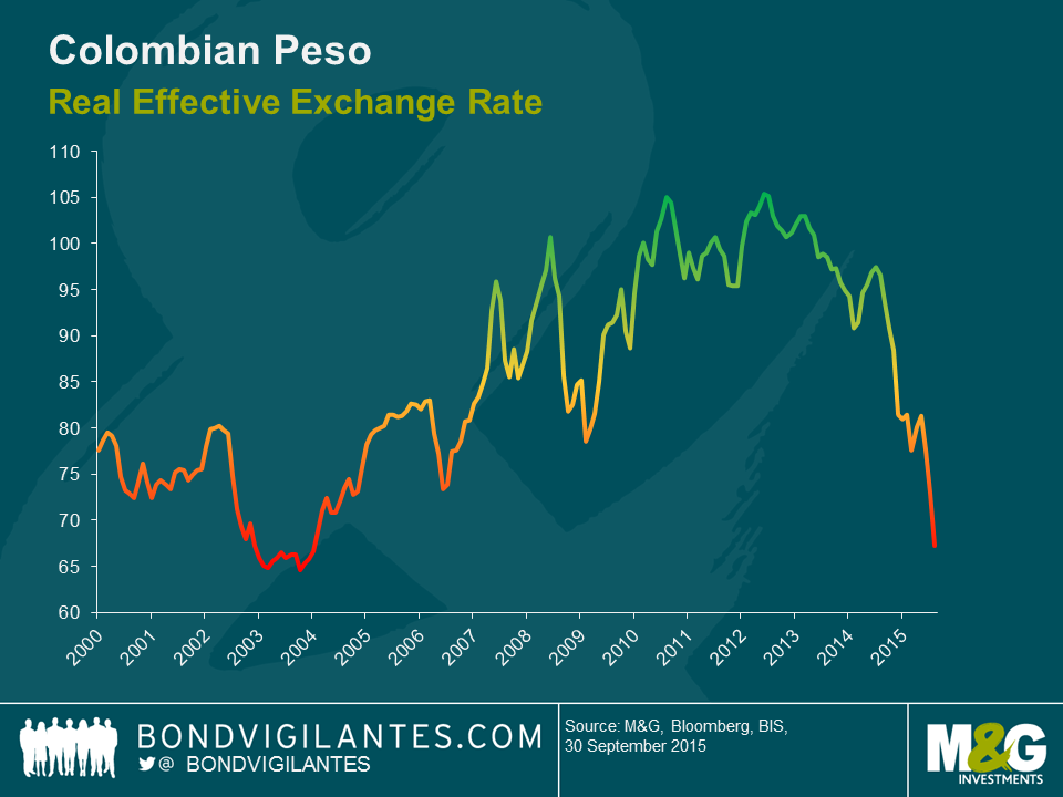
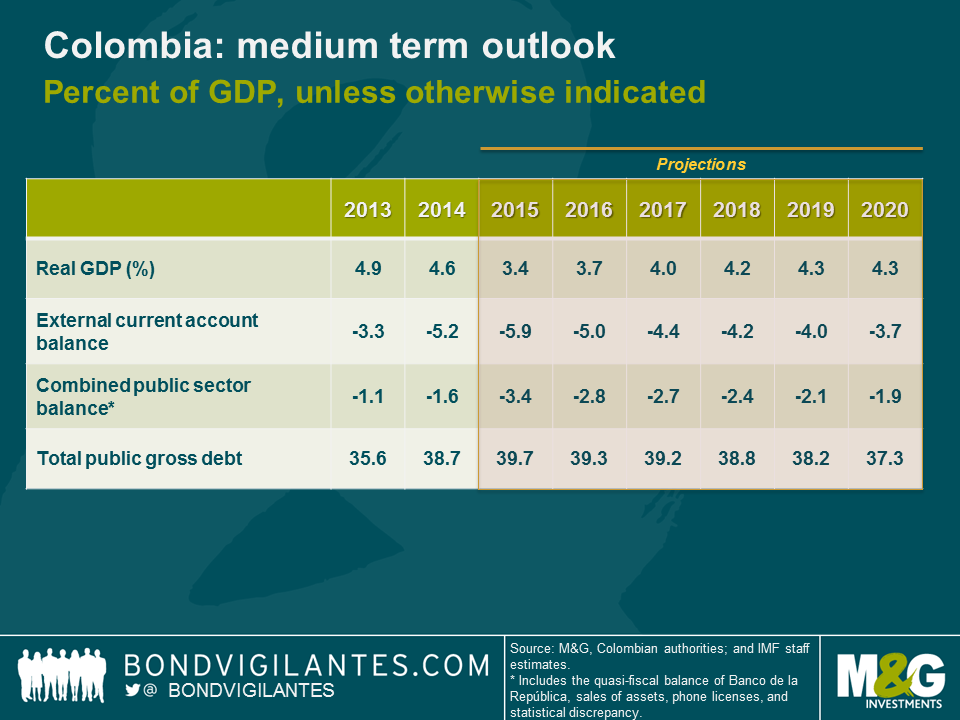
I returned from my trip more cautious than the authorities and the IMF on their near term assessment (see chart above). I see downside growth risks coming from falling consumption as purchasing power declines over the next 1-2 years. I am also concerned about the structural nature of Colombia’s current account deficit, which even after a large real depreciation of the Peso, is expected to hover around 4% of GDP. Unlike Brazil, where I see it as one of the few bright spots, Colombia’s non-traditional exports have a high share of imported content and high transport costs, so the currency depreciation will help to revive exports by much less than I expected. Additionally, exports to its main trading partners (Ecuador and Venezuela) continue to fall. The bulk of the adjustment will need to come from lower imports as a result. With only about 50% of the current account deficit financed by foreign direct investment, the rest will likely need to be financed by sovereign external borrowing. The authorities are expecting that the forthcoming 4G infrastructure concessions will bridge a large share of the investment gap and the upcoming privatization of energy company ISAGEN will be closely watched, as the proceeds will help to leverage the infrastructure concessions. Consequently, there are downside risks to the fiscal outlook as well, which means debt levels will be increasing further. As a result, I expect the rating agencies to change the country’s outlook to negative, with a downgrade to BBB- should the tax reform disappoint and the infrastructure concessions be lower than expected.
It has been a while since we last uploaded a video from one of our U.S. research trips. The question we asked in March as to whether the Fed would hike interest rates this year or not has still not been conclusively answered. Although a 2015 hike is not completely off the table, as we are entering the final two months of the year it seems a lot less likely than it did back then. Nonetheless, from a macro-economic point of view, the U.S. economy has since continued to recover. We are particularly focused on the labour market at this point in time, which is painting a more benign picture of the U.S. economy than many other areas. On the credit side, USD denominated investment grade corporate bonds as whole now offer distinctly more attractive credit spread levels than in the first quarter of the year.


Sign up to the Bond Vigilantes mailing list to ensure you never miss a great article from our expert Bloggers. We will email all new articles to your inbox, meaning you can stay on top of the world of Bonds.
I confirm that I would like to receive information about Bond Vigilantes and products and services from M&G Securities Limited.
We will use the email address and personal data you have shared with us to send you this information. For existing customers, submitting your contact details and requesting to receive this information from us, will replace any earlier choices you have made in respect of marketing information.
You can unsubscribe from marketing at any time, at which point we will not send any further marketing information to you, by selecting the unsubscribe link in all communications.