Rolldown
A dispatch from the number crunchers – Yield curve rolldown
By Matthew Russell
15 April 2026

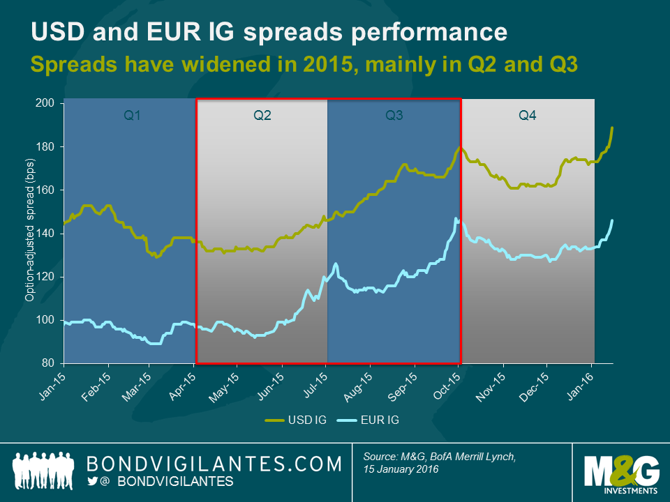
We recently blogged about the uninspiring performance of many fixed income asset classes in 2015. Investment grade (IG) corporate bonds certainly had a tough year as credit spreads trended wider, both in the USD and the EUR market. Taking a look at option-adjusted spread (OAS) levels, USD IG credit (+29 bps) marginally outperformed against EUR IG credit (+36 bps) in 2015. In both cases periods of spread compression in Q1 and Q4 were short-lived and failed to offset substantial spread widening in Q2 and Q3 (see chart below).
The sell-off in Q2 and Q3 was caused by a combination of heavy new issue volumes and subdued demand for corporate bonds, as investors rushed into safe-haven assets after a string of “risk-off” episodes, mainly the Greek referendum, worries about China and other emerging markets and weakness in commodity prices. The latter two themes have so far been dominating news headlines in 2016 as well, and consequently IG OAS levels have gapped wider again in the first half of January (+16 bps for USD IG and +13 bps for EUR IG).
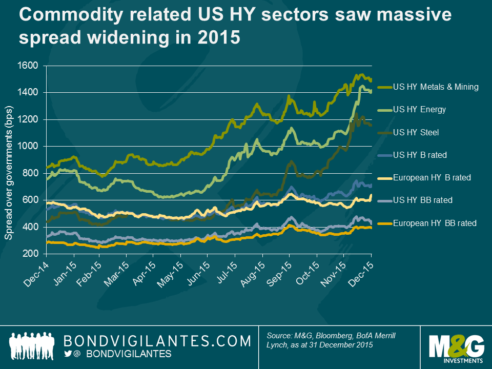
But is it fair to say that IG corporate bonds as a whole are now more attractively valued than at the end of 2014, or have overall bond index levels merely been driven wider by extreme spread moves within the commodity complex? To answer this question, we have to deconstruct bond indices into industry sectors (see chart below).
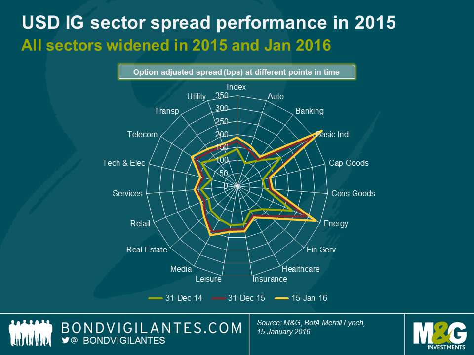
Unsurprisingly, the worst performing sectors in the USD IG universe have been energy and particularly basic materials which have widened on an OAS basis by 101 bps and 191 bps, respectively, from the end of 2014 until mid-January 2016. While these moves are certainly large, it is important to highlight that other sectors have sold off significantly over the same period as well, e.g., media (+72 bps), automotive (+67 bps) or financial services (+54 bps). In fact, the only sector that has widened by less than 20 bps is banking (+18 bps), which reflects that US banks are well-positioned in a rising rates environment. These numbers show that an across-the-board spread widening has taken place affecting every sector within the USD IG universe, albeit to varying degrees.
Just like in the case of USD IG credit, every sector in the EUR IG space (see chart below) has widened from the end of 2014 until mid-January 2016 on an OAS basis, with basic materials being by far the worst performer (+190 bps). This makes basic materials currently the widest sector in the EUR IG universe, even ahead of insurance (+70 bps), which used to trade at distinctly elevated spread levels compared to the rest of the index due to its high share of subordinated bonds and uncertainties around Solvency II legislation. The automotive sector has been the second worst performer (+82 bps), being hit by a slowdown in the Chinese market and the fallout from VW’s “diesel-gate” emissions scandal.
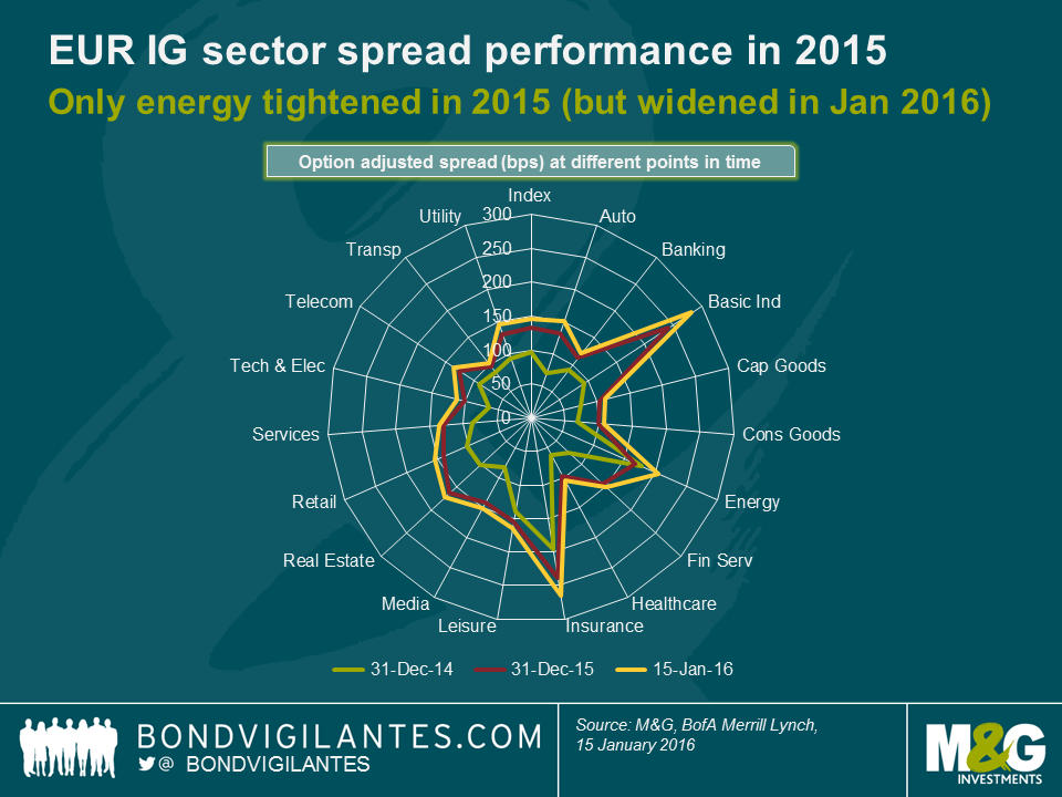
Interestingly, the EUR IG energy sector has performed very well (+27 bps) relative to its USD counterpart (+101 bps) from the end of 2014 until mid-January 2016. In 2015, it was in fact the only sector in both IG indices that exhibited OAS compression (-10 bps)! The reasons for this are twofold: First, EUR IG energy started 2015 at an already very high spread level (178 bps) relative to the EUR IG index (97 bps), from where it tightened meaningfully when the oil price temporarily rebounded in March and April last year. Second, the average credit rating of EUR IG energy is relatively high as it is dominated by AA and A rated issuers and contains far fewer BBB names than the USD IG energy sector. Thus, the widening of EUR IG energy spreads during the risk-off episodes in Q2 and Q3 2015 was dampened by a “flight to quality” of investors preferring higher- over lower-rated IG credits.
As described above, after a broad-based widening across all sectors, USD and EUR IG corporate bonds offer investors much higher credit spreads than at the end of 2014. In certain pockets of the markets, particularly for long-dated USD BBBs, current spread levels are exceptionally high for non-crisis times. So either we believe that recent market turmoil is just the beginning of something bigger, in which case we would expect IG credit spreads to continue to widen, or even to blow out to 2021/12 levels. Or we think that, despite certain global headwinds currently causing a risk-off sentiment across markets, developed economies are not going to enter a full-fledged recession any time soon. In that case EUR and USD IG corporate bond spreads would offer compelling valuations at the moment. Considering the strength of the US economy in general and as Richard wrote yesterday, its labour market in particular, in combination with modest economic improvements and accommodative monetary policy in Europe, we believe that the latter reading is a lot more convincing.
There is currently a lot of concern regarding the US economy and its ability to withstand the collapsing price of oil and mined commodities, the Chinese slowdown, and the recent quarter (yes, quarter) point rate rise – or given the current market mood, its ability to cope with a doubling of the Fed funds rate! Whilst high yield spreads are close to recessionary levels, this is skewed by the energy sector. The manufacturing side of the economy is in clear decline, but the services sector is more significant for US growth and is performing much better (although the non-manufacturing ISM is well off its recent highs). The US yield curve is some way from being inverted, which has historically signalled recession, although it has been flattening and needs to be steeper. We think the Fed remains on track to continue raising rates as it should be focused on the data that points to a strengthening labour market.
If the outlook from an economic and industrial output perspective were grim then companies would be shedding labour in the most traditional manner, by firing people. The graph below shows that the private sector is firing the lowest percentage of the working age population in the past 15 years. This is a sign of continued labour market strength, and the low level of job cuts points to a continuing trend of healthy employment numbers.
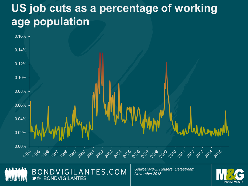
When analysing labour market and economic strength economists talk about the level of natural unemployment. In that context one can imagine there should be a natural rate of job cuts below which the economy cannot go. After all, there will always be some employers in difficulty, and thus requiring to shed labour. From the chart above one could infer that the natural rate is around 0.02%, meaning in this context the US labour market continues to look strong.
If the US economy was going to be pushed into recession then surely we would have had some signs by now, because oil has been in a bear market for more than a year, the Chinese stock market in a bear market for nine months, the mined commodity market in a bear market for two years, and the minor move in rates was fully anticipated (and delayed).
The economic reality is that falling oil prices help the economy, falling commodity prices are a supply rather than a demand issue, the Chinese economy is not a significant input into the US economy, and interest rates and Fed policy remain exceptionally accommodative. The stock markets, commodity markets, and the economy do not always move in tandem. The Fed should not focus on these indicators. Its mandate is not to support the stock market or the commodity market, but to support the labour market. The Fed should therefore remain vigilant, and not get sidetracked by noise that has little effect on the long term outlook for inflation, or the short term outlook for the labour market.
A year ago today the Swiss National Bank (SNB) unexpectedly discontinued its CHF peg against the euro, causing huge moves in the FX markets. On the anniversary of the peg removal I thought it would be interesting to see how the Swiss economy has developed over the past twelve months.
Swiss economy robust, but not immune during 2015
The Swiss economy actually proved to be quite resilient in 2015 with steady growth and low unemployment despite deflation and a strong CHF, which would typically be a major drag for an exporting nation. As the SNB stated in its latest monetary policy assessment, this is also thanks to further strength in foreign demand for Swiss goods and services and ongoing robust domestic demand, which would no doubt have been helped by an increase in real wages.
Looking at Swiss economic data on my Bloomberg screen, not all the numbers show a rosy picture. Whilst we have to be careful to not read too much into the data over such a short time period, some data show signs of weakness since the removal of the peg, indicating potential downside risk to the economy.
Whilst the ECB is doing its utmost to revive inflation in Switzerland’s neighbouring economies, Switzerland itself has been in deflation for much of the past four years. The removal of the peg has compounded the situation by further increasing the purchasing power of the CHF and helping to pull consumer price inflation down lower to -1.3%. Whilst the unemployment rate continues to fall in the eurozone, it has started to pick up in Switzerland, albeit from very low levels, after remaining stable for two years. This was also reflected in the latest consumer confidence survey from the State Secretariat for Economic Affairs (SECO), which indicates lower confidence in job safety. Interestingly, since the currency cap has been removed, confidence has fallen from -6 early last year to -18, and is well below its historic average of -9 points.
Recently published tourism numbers for last summer show a direct impact of the stronger CHF as well. According to the Swiss Federal Statistical Office, overnight stays from European travellers fell by 741,000 or -10.9% compared to 2014. German tourists were responsible for much of the drop, declining by 358,000, or -15.1%. Increased demand from Asia and the US was not enough to offset this fall from closer to home.
The appreciation of the Swiss franc vs the euro in January 2015 didn’t just make it more difficult to attract visitors from the Eurozone – it also meant that the Swiss started to spend more of their money abroad. Switzerland is well connected with its surrounding countries, not just in terms of a strong relationship, but also thanks to open borders, and traveling to neighbouring countries often takes less than an hour, and can be done comfortably by train. Not surprisingly, the stronger currency made shopping abroad more attractive, leading to an 8% increase in foreign purchases, according to Credit Suisse. Domestically, real retail sales fell by -2.1% for the year to November 2015.
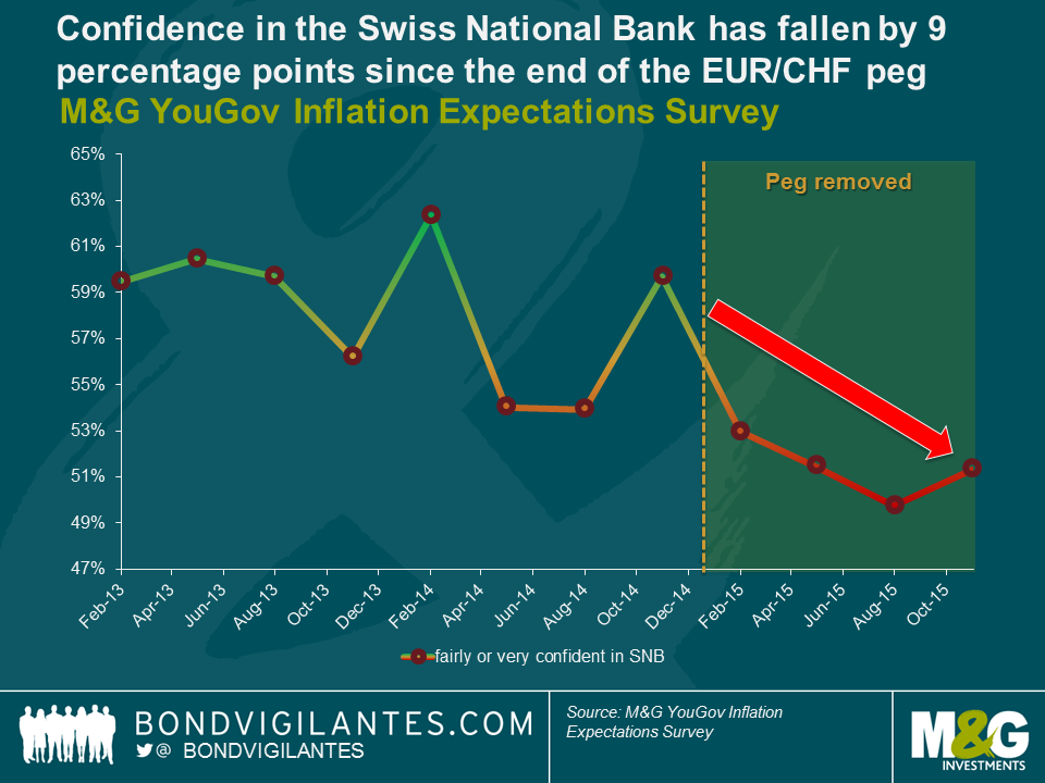
Lower confidence in the SNB
The latest results from the M&G YouGov M&G Inflation Expectations Survey in which we also ask consumers about their confidence in central banks, indicates deteriorating confidence in the SNB. Confidence in the SNB’s policy is 9 percentage points lower than it was a year ago, a clear sign that Swiss consumers are realising the pressure on the shoulders of SNB president Thomas Jordan and his team.
The recently posted record loss of CHF 23bn, almost entirely due to losses on the bank’s foreign currency positions, won’t help boost confidence either. Still, the SNB was able to pay a dividend and a CHF 1bn profit distribution to the Confederation and the cantons thanks to accumulated reserves. Going forward, there is a big question mark around these profit distributions as the bank’s reserves are almost depleted, and further losses as a result of market interventions are certainly possible. Given that roughly 90% of the SNB’s balance sheet is foreign currency investments, even small currency moves can cause considerable impacts on its profits.
Pressure remains
Johann Schneider-Ammann, the newly elected Federal President has addressed the importance of strong Swiss companies in his New Year speech. In my view this can only be achieved with a competitive Swiss franc. As I wrote in a recent blog, achieving that will be challenging, as I expect ongoing pressure and further stimulus from the ECB in 2016, particularly if oil prices continue to drag inflation numbers down.
We recently blogged about the marked effect the collapse in commodity prices, particularly oil and energy, have had on global inflation rates across the world. Headline inflation rates in major western economies have been in, or have flirted with, deflation throughout the year in spite of ongoing economic growth and a steady recovery in labour markets.
An interesting issue is whether this, seemingly, temporary cost-push type of deflation (i.e. a drop in prices caused by lower commodity prices, fiscal easing or cheaper imports) could have a more long-lasting impact on actual inflation and inflation expectations which could, itself, influence consumption and wage-setting decisions? Central banks should be mindful of any early signs of consumer inflation expectations becoming unanchored.
The results of M&G YouGov Inflation Expectations Survey fielded in Q4 2015 show that UK consumer inflation forecasts have, once again, edged down over both one- and five-year terms. The median consumer gauge of inflation for the year ahead has lowered from 1.5% to 1.0%, which is the lowest level recorded since the inception of our survey. Over five years, expectations have slid by -0.1% to 2.5%. Furthermore, our analysis shows that expectations for net income in Britain have taken a positive shift in recent months with 22% of UK consumers expecting a rise in take home pay over the next twelve months.
Within Europe, quarterly inflation expectations appear to have stabilised in Germany, Austria and Italy but have slipped in Spain and Switzerland, the only two EU countries to have experienced six consecutive quarters of zero or negative inflation. Nevertheless, we find that over the long-term all surveyed countries still expect inflation to run at or above 2% suggesting European consumers remain broadly confident that central banks will deliver on their price stability mandates.
In Asia, Singapore inflation expectations tick down on both the short- (3.1% to 3.0%) and medium-term (4.5% to 4.0%) reversing the upward move registered in the previous quarter. In contrast, expectations in Hong Kong remain unchanged and remarkably well-anchored with the 5-year forecast holding up steadily at 5% for the sixth consecutive quarter.
The full report and data from our Q4 2015 survey is available here.
I blogged in 2014 with good news for cake lovers; falling soft commodity prices indicated that the cost of baking cakes was getting cheaper. Unfortunately (and in contrast to hard commodity prices, notably oil recently hitting new post global financial crisis lows), the final quarter of 2015 depicted a reversal in trend with soft commodity prices on the rise.
In September we discussed the potential impacts of the El Niño weather phenomenon here. Just a few months later and we’re beginning to get a clearer picture as its impact spreads through key crop-growing regions worldwide. Indonesia (globally the largest palm oil producer) and Africa (supplier of cocoa) have experienced droughts, while Brazil (dominant sugar and coffee producer) has been hit by heavy rainfall and the worst flooding in 50 years; all of which has been attributed to El Niño. As a result of weather-induced supply fears and constraints, prices for sugar, palm oil, coffee and cocoa increased by 42%, 18%, 8% and 2% respectively in Q4 2015.
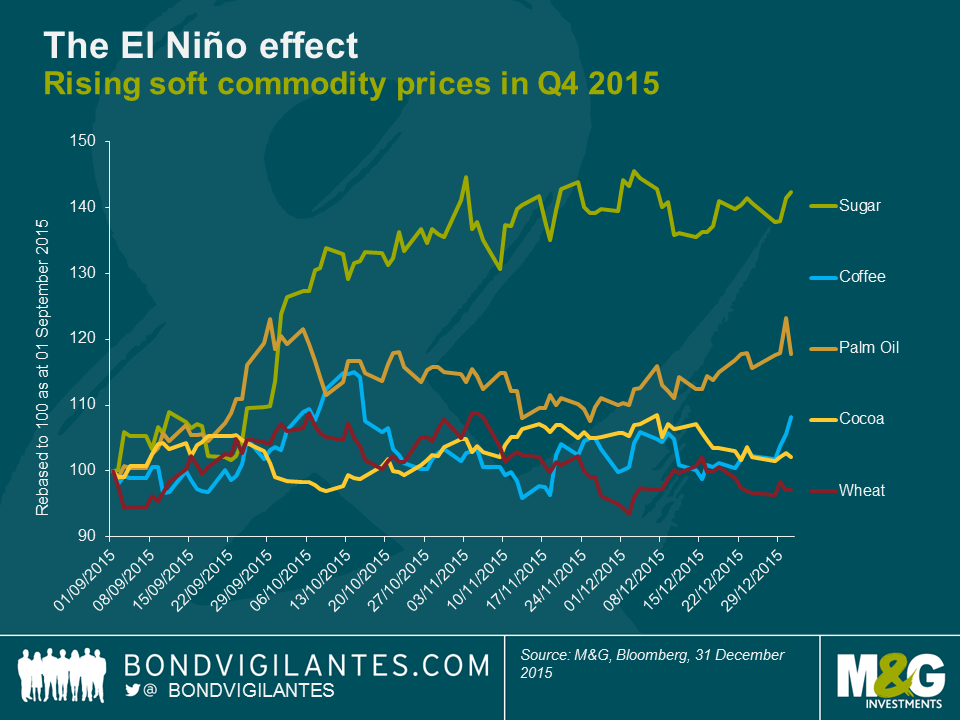
So how does this feed into the M&G cake index?
Due to the surge in soft commodity prices in the final quarter of last year, I have refreshed the M&G cake index. This teams global commodity price data with some basic recipes from the BBC Good Food website, roughly constructing a basket of soft commodities in order to demonstrate the changing cost of baking cakes (palm oil is used as a proxy for butter).
Given that the price of sugar has increased significantly – and that this is the key component of most cakes – it is not surprising that all cake prices have increased. The offsetting impact of wheat however (which has fallen in price) acts to alleviate this, which explains the breakaway of flour-based sweets such as scones and sponge cake. The cocoa and coffee commodity price appreciation thus acts in the opposing direction. It should however be noted that chocolate cake is not simply a proxy for cocoa – for its recipe basket carries the greatest amount of sugar – which explains why chocolate cake is more expensive than coffee cake on this measure, despite the coffee commodity experiencing a greater price increase. Bad news all round for New Year cake consumption and those wanting to see their post-Christmas pennies go further.
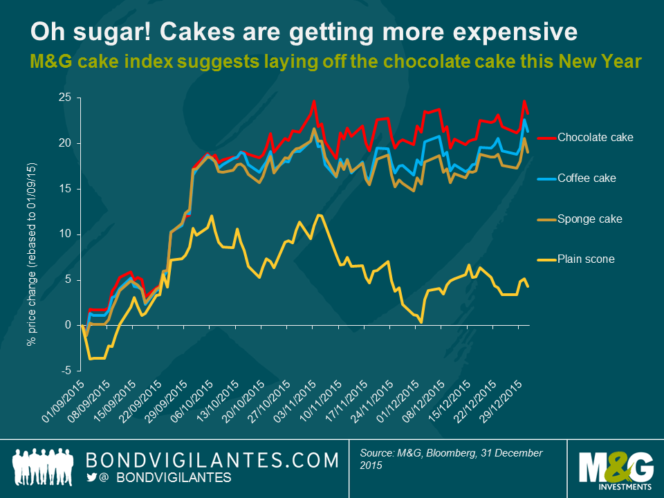
In contrast to the above, last week’s United Nations Food and Agriculture Organisation data release demonstrated a fall in its overall food price index for December. This index weights five soft commodity groups: meat, dairy, cereals, vegetable oils and sugar, while the M&G cake index weights only the final two. The decline in the food price index suggests that the El Niño effects are not yet driving or generating headline food price inflation. Weather forecasters have however warned that the current El Niño is the strongest since 1998 and has not yet passed. Though this may or may not ultimately feed through and cause the overall basket of food prices to rise, we’ve certainly witnessed inflation baked into the cake in recent months.
Oil price moves and their impacts on emerging markets will continue to be a hot topic in 2016. It is true that economies which rely heavily on oil exports and fiscal revenues, such as Saudi Arabia, Russia or Venezuela, have been facing an extremely challenging macro environment with the decline in oil prices. But, overall, there are more net oil importers than exporters amongst the developing economies. Moreover, at the corporate bond level, the Oil & Gas sector accounts for a relatively small share of emerging market corporate bonds, according to various hard-currency bond indices. So why are sliding oil prices consistently dragging emerging market asset prices down?
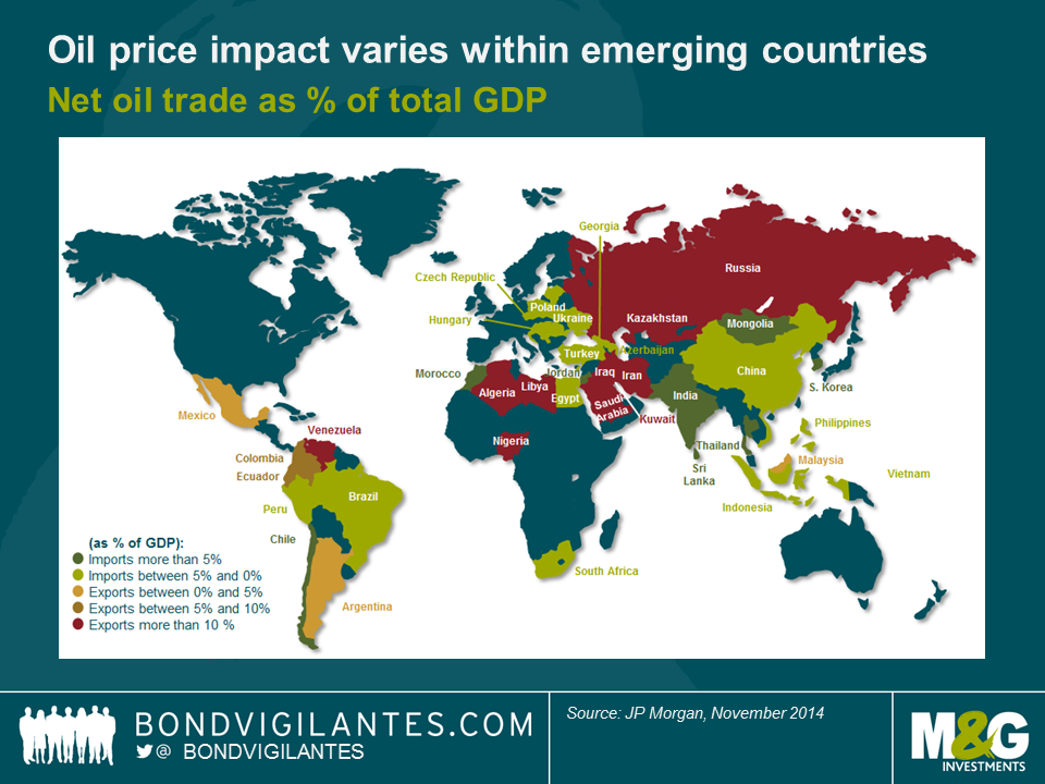
A large number of developing economies directly benefit from lower oil prices.
Asia is the biggest winner of this new oil price environment, with the exception of Malaysia which is a net exporter, as can be seen in the above chart. Within the region, India, China, Thailand and South Korea are likely to benefit the most, notably via cheaper oil imports, reduced input cost, lower fuel subsidies and/or increased consumer spending. Outside of Asia, some other large developing economies are net oil importers, e.g. Turkey, South-Africa and Brazil. Eastern European countries, in particular Hungary, Poland and Czech Republic, also benefit from lower oil (and gas) prices. Finally, it is arguable that the Caribbean and Central America indirectly take advantage of boosted US consumption through lower oil prices.
Energy names account for 13.6% of the most widely used EM corporate bond index.
Quite counter-intuitively, albeit very much in line with the fundamentals of developing economies, the Oil & Gas sector accounts for only 13.6% of the most widely used EM corporate bond index (JPM’s CEMBI BD index). However, the macro factor needs to be taken into consideration because for example financials in the Middle-East are likely to suffer from lower oil prices. Therefore, when looking at oil exposure investors must add another filter to their investment process: looking at corporate bonds that are exposed to countries with oil exposure. According to our calculations, EM corporate bonds in net oil exporting countries account for 30.3% of the index. This leaves two thirds of the index potentially immune to oil volatility… in theory.
Commodities and currencies are the main channels of contagion.
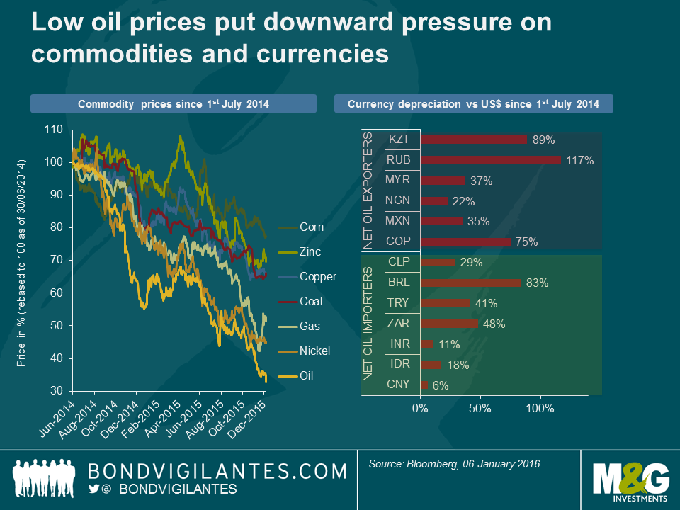
Despite the fact that there are more net oil importers than exporters in the developing economies, falling oil prices continue to drag emerging market asset prices down because commodities ex-oil and currencies act as channels of contagion.
When oil prices started to collapse, countries relying to a large extent on oil revenues saw their currencies depreciating sharply, sometimes by way of devaluations (eg Kazakhstan). The first effect was (and continues to be) technical, with a negative sentiment spillover to all emerging market currencies, as well as commodities. The second effect, more fundamental, was twofold:
(i) oil as a significant input cost influences the breakeven cost of producing metals and food; in an environment of slowing growth and commodity overcapacity, low oil prices therefore put downward pressure on other commodity prices;
(ii) the side effect of currency depreciation was that the oil-exporting countries improved their competitiveness in other commodities exports, e.g. Russia with fertilisers. This resulted in increased pressure on currencies of the non-oil exporting countries as their metal or agricultural commodities had become less competitive.
Oil is everywhere. But what matters most are the idiosyncratic stories.
Within this context, it is fair to say that an emerging market bond portfolio is unlikely to be fully immune to oil. Looking into 2016, this is good news if you are bullish oil: any significant oil price increase will in most cases drive a rally in emerging market assets. If you are bearish oil, you may still find interesting investment opportunities: the Oil & Gas sector in emerging markets generated a negative return of -3.0% in 2015 but the dispersion of corporate bond returns was huge and not necessarily correlated to oil prices. For instance, the fall in Petrobras bonds was more driven by the ongoing corruption scandal in Brazil and the group’s debt levels than the actual decline in oil prices. On the other hand, despite their country exposure, PDVSA (Venezuelan state-owned oil company) or LUKOIL (Russia-based oil producer) bonds had double-digit total returns in 2015. In what might be a good lesson for 2016, it shows that in emerging markets, in many cases, macro and credit idiosyncratic stories matter more than oil.
Following on from Gordon’s review of the best and worst performing fixed income asset classes last year, I wanted to take a more in depth look at how emerging markets performed in 2015 and what to look out for in 2016.
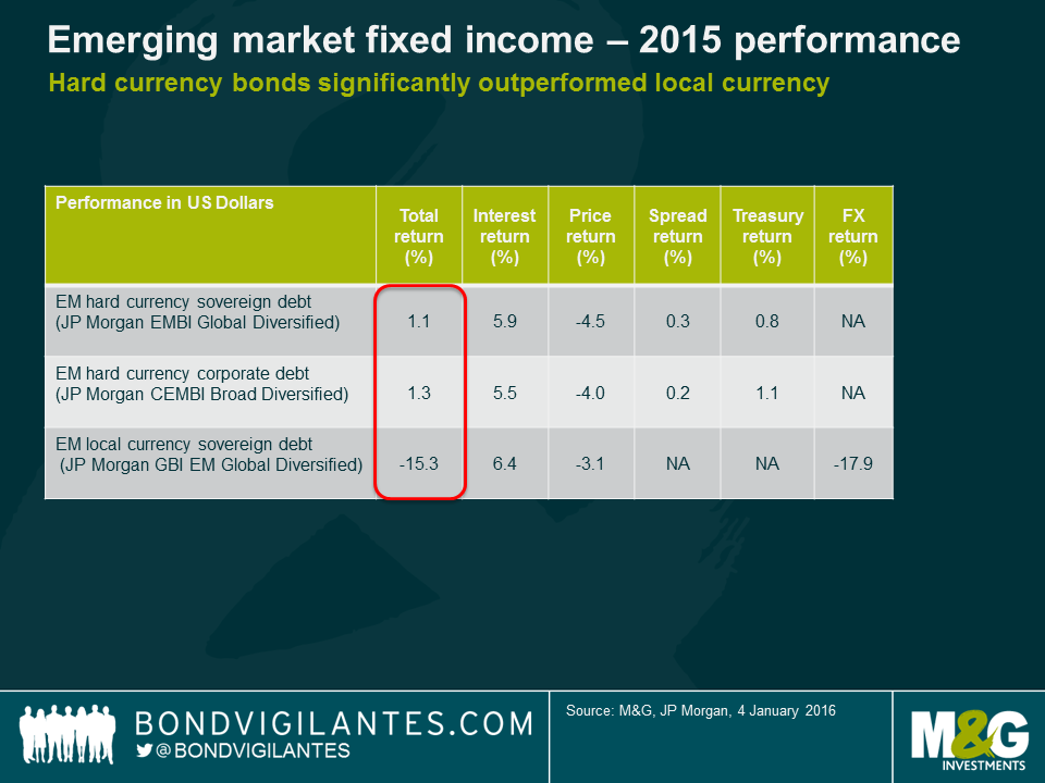
Some themes that drove the market in 2015 were the same themes than drove it in 2014. Once again, asset allocation was critical. Local currency debt, for the third year running, has underperformed hard currency debt. Within hard currency, sovereigns and corporates performed roughly in line at the broad index level.
However, as I wrote a year ago, return dispersion did increase in 2015 and avoiding the tail-risk underperformers was key. These were the main themes from 2015:
Although the Fed has finally started tightening US monetary policy, 10-year Treasury yields ended 2015 just marginally higher, as the market had long been expecting, and pricing in, such a move. As long as the Fed delivers what is currently priced in by the markets in 2016 (i.e. 50-75 bps tightening), I expect emerging markets to be able to cope considering they have already been adjusting to this for a few years through weaker currencies, reduced capital inflows and more expensive funding costs.
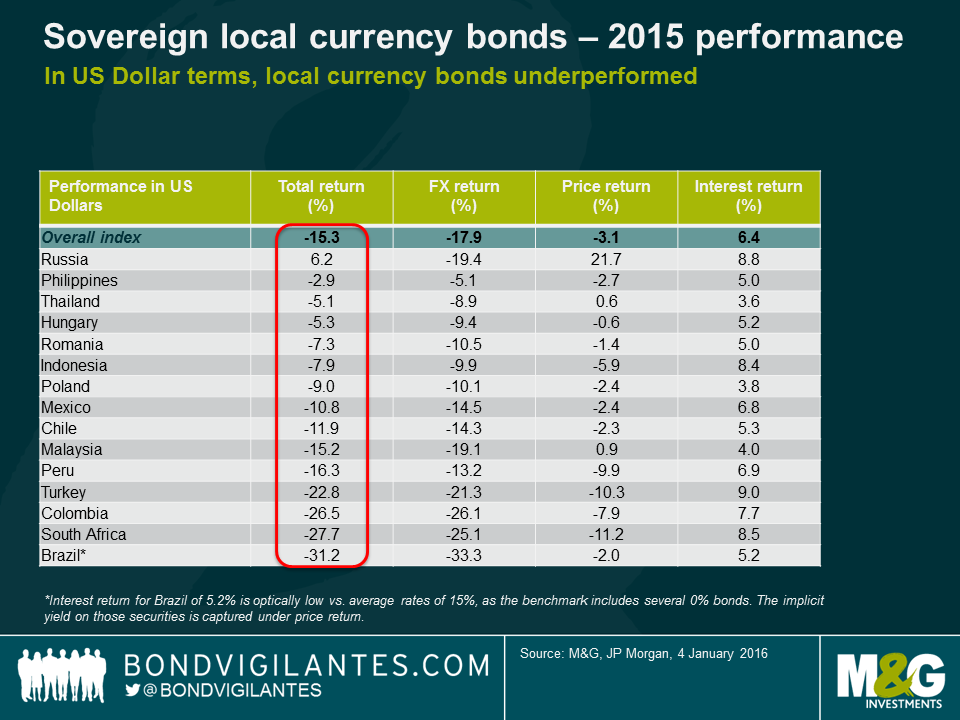
As the table above illustrates, much of the underperformance in local currency debt came from currency moves, though some of this is still about USD strength and not necessarily an emerging market move in itself. In other words, many EM currencies performed in line or even better than major currencies such as the euro or commodity currencies such as the Australian (AUD) and Canadian Dollar (CAD). I expect the USD to start stabilizing in 2016, based on past Fed tightening cycles when a large part of the USD appreciation happened before the first hike. This year’s local currency underperformance suggests that many EM currencies are no longer overvalued and, in cases such as the Polish Zloty, the Hungarian Forint or the Chilean Peso, has led to an improvement of current account balances or will allow for an ongoing adjustment such as in the case of Brazil. Fixed and heavily managed currencies, however, remain vulnerable to low oil prices (i.e. GCC pegs, Nigerian Naira). Perhaps the most critical of all is the Renminbi, where Chinese authorities face a difficult trade-off between maintaining the status quo of low volatility and some degree of overvaluation or allowing a faster devaluation that risks a disorderly spill-over into Asian and commodity-related currencies.
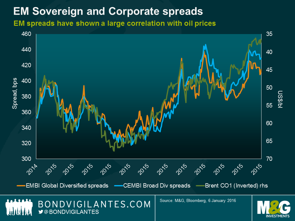
Like 2014, spread performance was again a tale of two halves. As the chart below illustrates, even though many EM countries are actually net commodity importers, overall spreads have shown a relatively high correlation to commodity and oil prices this year (Charles will explore this in greater depth in another blog to be published shortly). Overall, I believe that spreads are already reflecting a large part of the credit deterioration that we have seen in recent years but do not expect them to tighten as it is unlikely that we see any major credit improvements in the near term. However, that could change if we were to witness a rebound in commodity prices, or the Fed signalled that the tightening cycle will be very shallow.
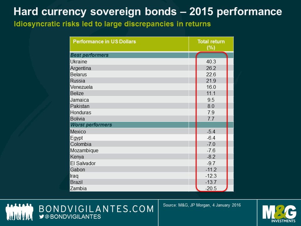
Several of the top performing countries in 2015 are distressed credits that avoided defaulting (i.e. Venezuela, Belarus). Ukraine’s returns benefitted from a benign restructuring, Russia recovered from the oversold levels of 2014 as the conflict with Ukraine did not escalate and Argentina rallied on the prospect of a more market-friendly Macri government. Most of those cases, however, are unlikely to be the main outperformers in 2016 as the trigger for additional good news is less likely and valuations are also more expensive after the 2015 rally. Venezuela remains a binary credit; it will either be one of the top performers this year if they do not default, or one of the worse, if they do. The opposition victory in the recent assembly elections is positive, but not enough to remove large uncertainties over the country’s economic policy direction under low oil prices.
In terms of the worst performers, Brazil will be one of the key calls for 2016. As discussed in a prior blog entry, I remain cautious on the credit given the large political headwinds, which will make an economic and fiscal recovery more difficult. Sub-Saharan Africa remains under pressure from low commodity prices and a debt burden that is increasing rapidly in most countries given their large fiscal deficits and, in some cases, large currency depreciations. While there is little debt roll-over risk in 2016, that will start rising in a few years’ time when I would expect to see some credit events. The willingness to adjust and pay will be tested and we do not have a long track record of bonded debt repayment and recovery values as most bonds have been issued over the last few years.
In sum, I expect asset allocation between hard and local currency to remain a smaller driver in 2016, as currency depreciations finally stabilize. Sovereign and corporate credit selection within the hard currency space will remain critical as I expect return dispersion to become high. Finally, avoiding the tail-risk underperformers and corporate defaults will be a key call for emerging market investors in 2016.
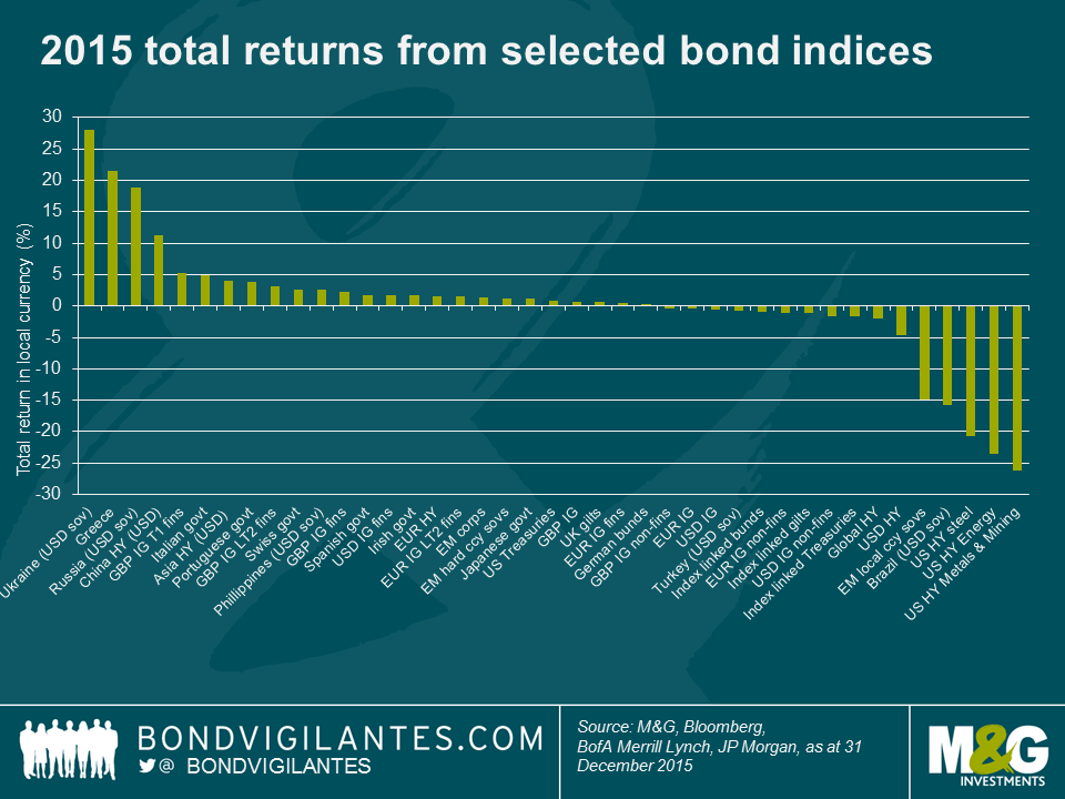
Looking back over the past year it’s evident that decent returns were much more difficult to achieve than in 2014. Within my sample of 85 different Bank of America Merrill Lynch bond indices (and as you can see from the smaller sample in the chart below) most indices fell within the -5% to 5% total return range for 2015, whereas most fell within the 5% to 15% range in 2014.
In 2014 though, most fixed income asset classes were well supported by a relentless rally in government bond yields that saw 10y Treasury and gilt yields fall from 3% to 2.2% and 1.8% respectively, and 10y bund yields drop from 1.9% to a record low at the time of 0.5%. That supportive backdrop wasn’t really there in 2015, but it was actually far from a nasty bear market in core government bonds. Low inflation, bouts of risk aversion and still plentiful central bank liquidity gave government bonds a lifeline, as the Fed waited until the last possible moment to raise interest rates and the ECB announced large scale government bond buying. That didn’t prevent volatility though, and arguably added to it, as 10y bund yields reached an intra-day low of just 0.05% a month or so after the ECB began its public sector purchase programme in March, but then rose to 0.98% less than eight weeks later, leaving investors that bought at the lows in yield nursing some nasty losses.
By year end, 10y government bond yields were around 10bps higher in the US and Germany at 2.27% and 0.63% respectively and 20bps higher in the UK at 1.96%. In contrast, 10y JGB yields finished the year 6bps lower at just 0.26%.
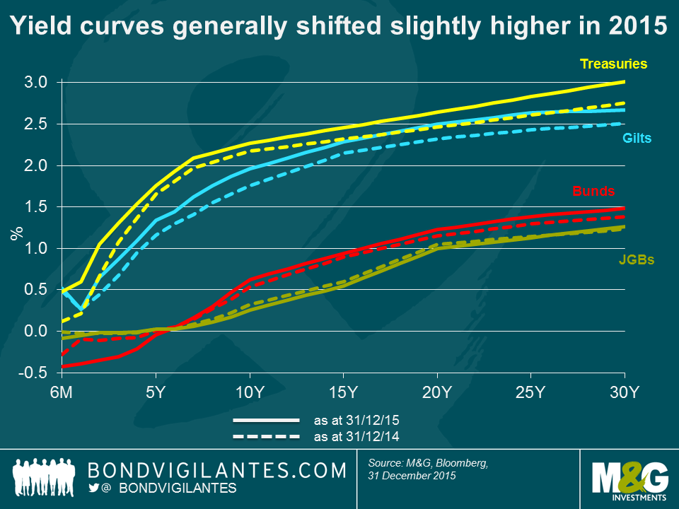
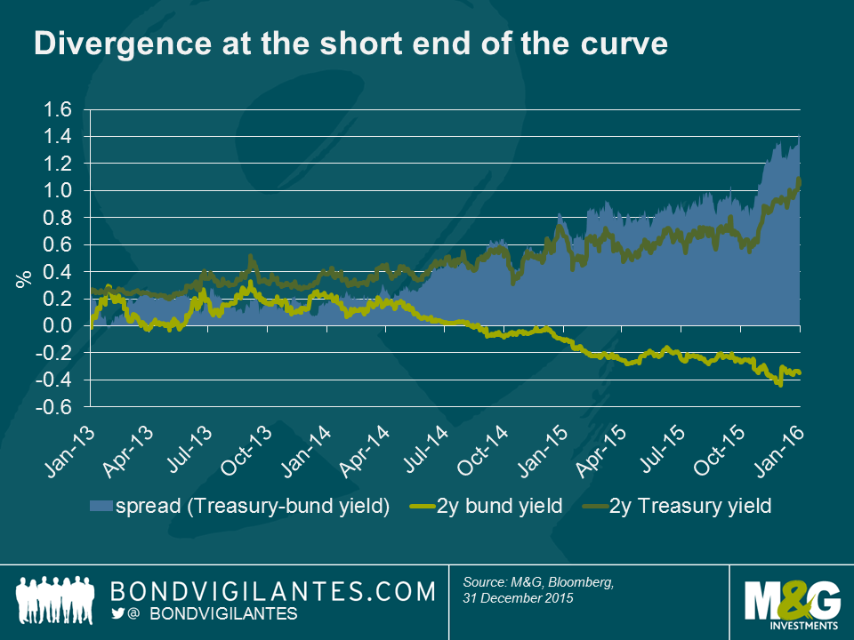
Whilst core government bond yields generally shifted higher across the curve as seen in the chart above, divergence in the monetary policy outlooks of the US and Eurozone led to some stark differences at the short end. For example, 2y yields in the US had been trending higher since the ‘taper tantrum’ in 2013 and this accelerated in 2015 as the likelihood of a hike in US short rates became greater. Two year bund yields were already negative at the start of 2015, but as the market priced in further easing and more was announced, yields continued to fall further into negative territory. This meant the spread between 2y bunds and 2y Treasuries widened to around 140bps by the end of the year, which was the widest since the middle of 2006.
These relatively small moves higher in most government bond yields translated into positive total returns as modest price falls were more than compensated for by interest income. The bund market as whole returned +0.3%, gilts gained +0.6%, Treasuries +0.8% and JGBs returned a very respectable (compared to many other asset classes) +1.2%.
Staying within the developed market government bond space, we saw further spread compression of peripheral European government bond yields vs bunds. For example 10y Italian government bond yields tightened by around 40bps vs 10y bunds, ending the year 30bps lower at 1.6%, securing BTPs a place near the top of the 2015 rankings with a total return of 4.8%. Portuguese government bonds were not too far behind with a 3.9% return. Spanish and Irish governments also posted better than average returns of 1.7% each. Of the peripheral European government bond markets, Greece was far and away the best performer and one of the best performing of all fixed income markets in 2015 with returns of 21.5%, although it was a bumpy ride with the average price of Greek debt falling from 58 at the start of the year, to the 30s in the summer, before rallying to 67 by year end.
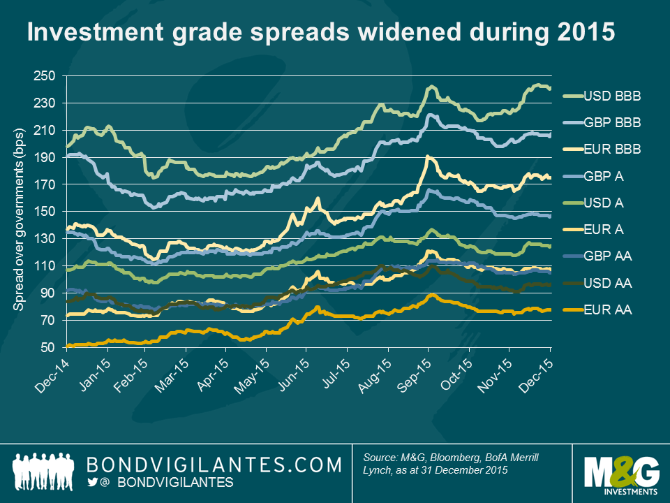
2015 saw credit spread widening across most markets despite European assets getting support from the ECB and despite a backdrop of a reasonably healthy domestic economy for US assets. The moves wider were fairly modest in the investment grade space over the year as a whole, but spreads finished some way off their tights reached in the first quarter – USD BBB spreads for example widened 43bps from 198 to 241, but reached a low of 175bps in March. Record issuance volumes in the US as a result of M&A activity and companies trying to get ahead of the Fed and lock in low rates were no doubt responsible for some of the widening. Investment grade bonds as a whole therefore produced pretty disappointing returns with EUR and USD markets making losses for the year of -0.4% and -0.6% respectively, and GBP investment grade faring relatively better at +0.6%. Within this, financials outperformed corporates and subordinated financials outperformed senior debt. Lower Tier 2 IG bonds for example returned 3.1% in the GBP market and 1.6% for EUR bonds. Going further down the capital structure, GBP investment grade Tier 1 banks ranked highly within our sample, returning 5.2%, although it should be noted that the sector is very small, containing only 10 bonds.
It was in the high yield markets that the full effect of the continued decline in oil and other commodity prices was felt. This had the greatest impact in the US due to the relatively large exposure of the index to energy and metals and mining credits of close to 20% (according to Bank of America Merrill Lynch indices) at the start of 2015. The USD high yield index as a whole was one of the worst performing asset classes, returning -4.6%. Clearly the index level return was dragged down by the steel, energy and metals and mining sectors, which had awful years, returning -20.7%, -23.6%, and -26.2% respectively, and with it earning the dubious honour of being the worst performing fixed income assets of 2015.
Finally, and just as they did last year, EM government bonds occupied the top spot and also came near the bottom of our rankings for 2015. This highlights the idiosyncratic risk in the asset class and that ‘EM’ cannot be lumped together as one entity as so often seems to be the case. For an in depth review of returns across EM fixed income in 2015 and an outlook for 2016, make sure you keep an eye out for Claudia’s blog, which we will publish soon.
Thanks very much for another bumper stack of entries to the annual Christmas quiz. This year’s winner, and new reigning champion is Jake Lewis of Morgan Stanley. Congratulations, we will be in touch to see where you’d like the £100 charity donation to go. You also win the Morrissey novel, as do the following brave runners up. Gary Callow of Investec, (2014 champion) Marton Huebler of Fidelity Investment Management, Francis Sutch of Julius Baer International, and Guy Cullen of Barclays.
Happy New Year from all of us here on the bond team. Here are the answers.


Sign up to the Bond Vigilantes mailing list to ensure you never miss a great article from our expert Bloggers. We will email all new articles to your inbox, meaning you can stay on top of the world of Bonds.
I confirm that I would like to receive information about Bond Vigilantes and products and services from M&G Securities Limited.
We will use the email address and personal data you have shared with us to send you this information. For existing customers, submitting your contact details and requesting to receive this information from us, will replace any earlier choices you have made in respect of marketing information.
You can unsubscribe from marketing at any time, at which point we will not send any further marketing information to you, by selecting the unsubscribe link in all communications.