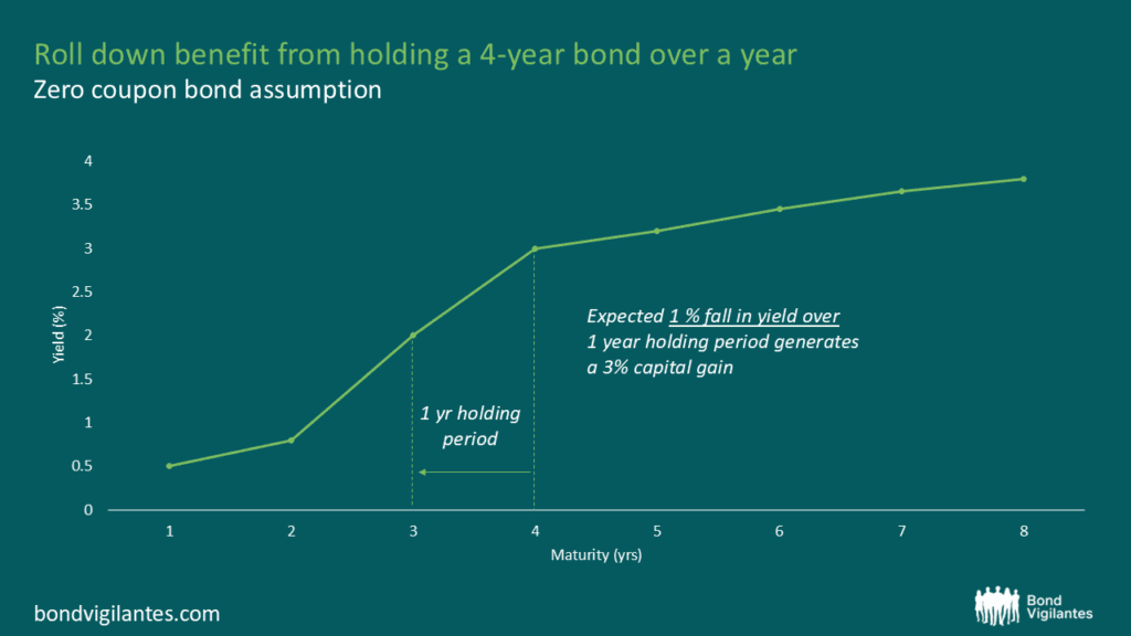
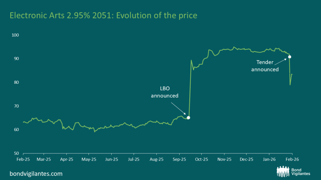
Rolldown
A dispatch from the number crunchers – Yield curve rolldown
By Matthew Russell
15 April 2026

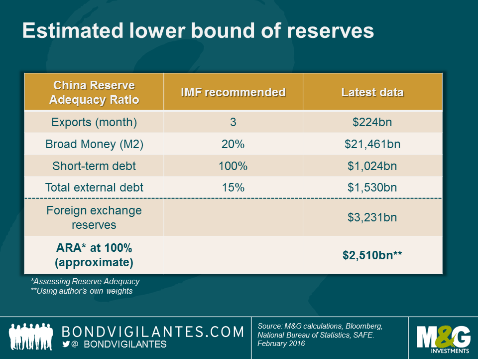
Much has been discussed on the topic of the optimal level of foreign exchange reserves. One of the common methodologies is the IMF’s ARA (Assessing Reserve Adequacy) metric, which essentially provides a range based on a country’s trade, broad monetary aggregates and external liabilities. How much weight should be given to each factor varies according to the economic structure of each country, including whether it is a relatively open or closed economy in terms of trade and capital flows and whether the exchange rate is floating or not. Based on past EM crises, the IMF has recommended a range which is normally expressed in terms of 100-150% of the metric. The ongoing pressures on the Renminbi and China’s attempt to smoothen its depreciation through currency intervention beg the question of how much firepower China has, given declining reserves.
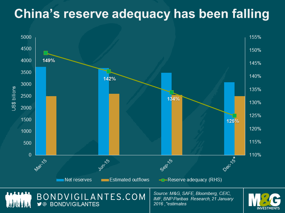
Using the IMF’s standard framework, we calculate that China has approximately 6-7 months until it reaches the lower bound of the recommended range (100%). Arguably, this includes several large assumptions, including that the ongoing capital flight and reserve loss (at around $100 billion per month) and current account surplus remain at the same pace. We also do not know how much intervention there actually has been in the currency forward market, and some data, like debt stocks, are reported only quarterly with a lag (the last data is from September).
Any policy response from the authorities is likely to aim for faster depreciation of the Renminbi than we have seen so far, though we do not expect a large one-off move. That would require a strong coordination with global central banks to minimise financial contagion, given China’s systemic impact on global markets, and we do not think we are there yet. Tighter capital controls for residents have been gradually adopted and this is the most likely policy option in the near term, but is never 100% effective. Higher rates and tighter domestic liquidity would be problematic, given China’s large domestic debt levels.
In the spirit of the Chinese New Year – and wishing all our readers a rally monkey – we hope that our calculations are wrong and China has far more time than 6 months. For one, the number 6 is thought to be an unlucky number in Cantonese – it has a similar pronunciation to that of “lok6” (落, meaning “to drop, fall, or decline”), quite apropos.
Guest contributor – Jean-Paul Jaegers CFA (Senior Investment Strategist, Prudential Portfolio Management Group)
Getting a sense of when recessions are about to happen is a near impossible task, as evidenced by official institutions that often fail to forecast recessions, and organisations like the NBER (National Bureau of Economic Research) that specialises in dating US business cycles, dating recessions only with a number of quarters of hindsight.
Accepting that it is a complex task however, we can attempt to gauge potential contractions through the use of economic data sets that are cyclical and timely. There is no flawless measure and economies are rather complex, hence we choose to look at a selection of time series that measure economic conditions from different angles. Some measures used are from a business perspective, some from the labour market and some from consumers.
We will apply a technique called a Markov model, which solves for two-states – a high-state and a low-state (ie it estimates two distributions that best describe the aggregate distribution). It takes the most recent observation and assigns a likelihood for currently being in each of those two states. This approach is often used for detecting turning points. Our assumption here is that the low-state is representative of a recession or economic contraction. For this exercise we show the probability of the low-state (ie recession). In addition, as the measure can indicate a high likelihood of recession more often than actually happens in practice, we also list some measures on accuracy.
In the charts below the grey-shaded periods are recessions as defined by the NBER, and the green line is the probability as estimated by the Markov model.
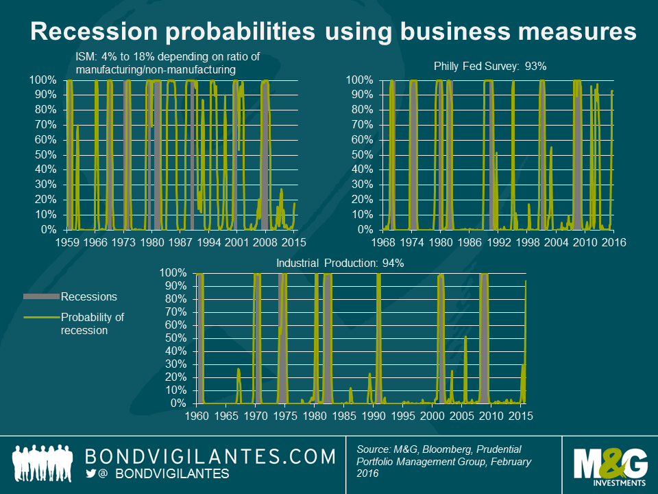
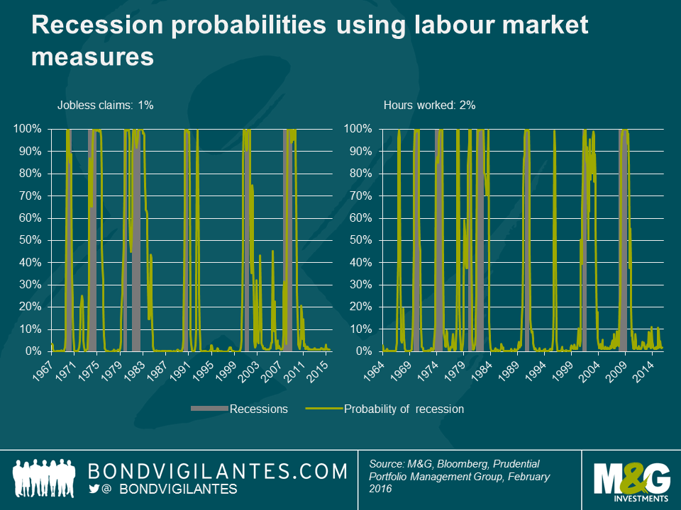
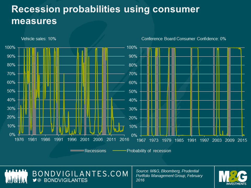
We can see that industrial production has historically been a very accurate predictor of recessions, having predicted all 8 recessions since the 1960’s, whilst also giving few, if any, false signals. Industrial production has been weak recently, and based on this measure, the likelihood of recession is currently very high at around 94%.The Philadelphia Fed Business Outlook Survey, which questions manufacturers in Pennsylvania, southern New Jersey and Delaware about their view of business conditions, is also indicating a high probability of recession. It too has a fairly decent track record, although it has given some false signals in the recent past. Set against this however, using different combinations of ISM manufacturing and non-manufacturing tells the opposite story. Whilst ISM manufacturing data has been very weak, non-manufacturing (although also weakening recently) has been stronger, and a combination of the two currently indicates a meaningfully lower likelihood of recession. One of the bright spots of the US economy in recent times has been the labour market and unsurprisingly, when we use labour market measures, we find a very small probability of being in a recessionary environment of just 1% to 2%. Consumer confidence is riding high at the moment, helped by the strong jobs market and falls in gas prices, and consumer based measures also suggest low likelihoods of being in a low-state at this moment.
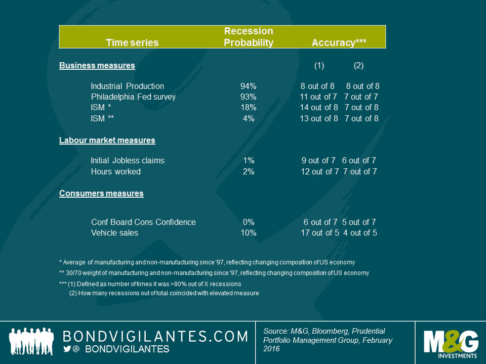
So an assessment of a quantitative technique on a range of time-series does currently not give a widespread indication of worryingly high likelihoods of recession. The disturbing element however, is the signal from industrial production, which has historically had a good success rate at accurately predicting recessions.
It’s pretty clear that the pressure is on the European Central Bank (ECB) to come up with some form of policy response at their next Governing Council meeting in March. Take, for example, the 5-year, 5-year EUR inflation swap rate (i.e., the swap market’s estimate of where 5-year inflation rates might be in five years’ time), which has taken a nose dive to 1.5% (see chart below). This is remarkable as the current number implies that the market expects the ECB to still be failing quite miserably to bring medium-term inflation close to 2% even in five years, despite negative interest rates and quantitative easing (QE). Not exactly a strong vote of confidence in the ECB’s policy tools, I’d say.
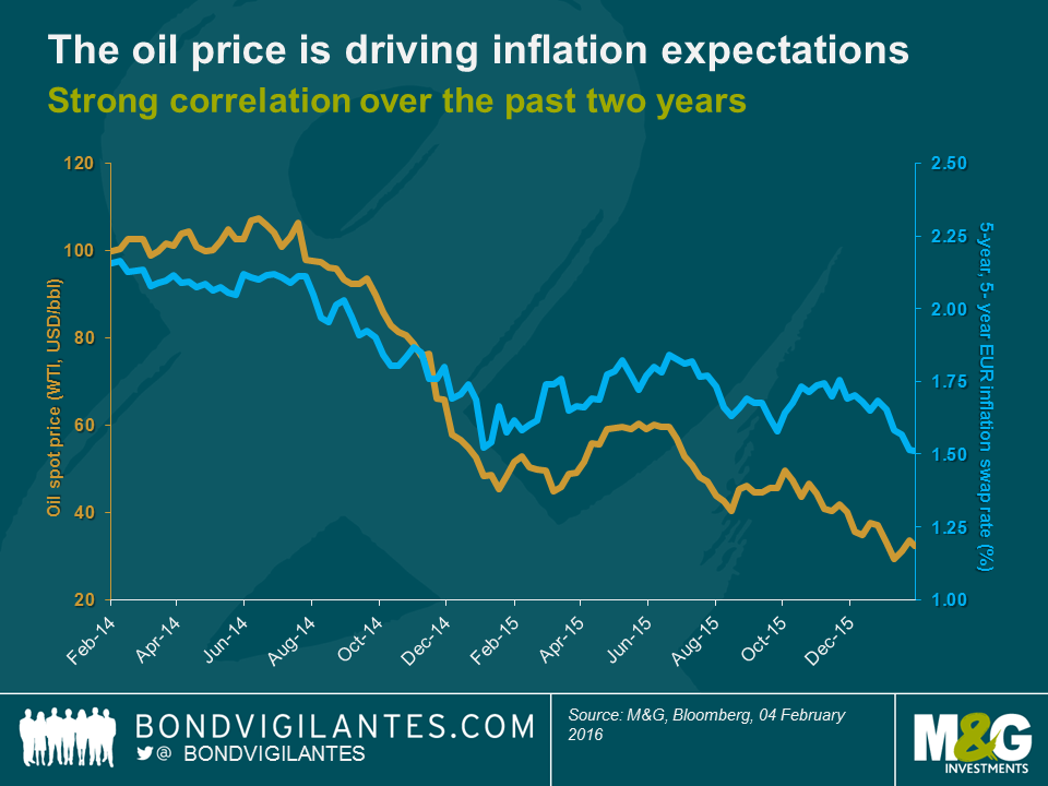
It seems that monetary policy is taking a backseat, whereas the oil price is driving market expectations of the future path of inflation rates. This follows some logic, of course, as a drop in oil price has direct deflationary effects on the energy component (and indirectly via lower transportation costs on other components) of the price index. One could argue however that a nearly perfect correlation (+0.9 over the past two years) between the oil spot price and expectations of 5-year inflation rates in five years’ time seems excessive. We have, for example, written about base effects (see Jim’s panoramic) and the diminishing downward pressure on petrol prices of any further oil price declines going forward (see Richard’s blog). In the past, the correlation between both data series also used to be a lot weaker (+0.3 over the prior two years). Still, market sentiment is pretty unambiguous these days: moves in the oil spot price by and large dictate future inflation expectations.
Adding to the ECB’s inflation woes are turbulences in financial markets. “Risk-off” has been the prevailing sentiment in 2016 so far. The Euro Stoxx 50 equity index has lost more than 13% year-to-date and EUR investment grade credit spreads have widened by c. 20 bps. Again, the oil price appears to be the dominating metric driving risk asset valuations. At this point it doesn’t seem to matter much anymore whether oil plunges due to sluggish demand (which would indeed be a legitimate concern) or because of growing supply. Remember how markets reacted to the Iran sanctions being lifted surprisingly early. The positive effects for the world economy of opening a country with nearly as many citizens as Germany to international trade and investment flows – the planned purchase of more than 100 airplanes from Airbus to modernise Iranair’s fleet is just the tip of the iceberg – were easily outweighed by market expectations of additional crude oil supply.
Markets do not seem to care much either whether a country or an industry is “long” or “short” oil. Germany, for instance, is one of the world’s biggest net oil importers (i.e., short oil) to the tune of around 110 million tonnes of oil equivalents per year, according to the Energy Atlas of the International Energy Agency. Cheaper crude oil lowers expenses for German companies and consumers alike, so that money can be invested or consumed elsewhere. All else being equal, the German economy should benefit from low oil prices. Still, on a day when the oil spot price falls for whatever reason, you can be almost certain that Bund yields rally and the DAX equity index finishes in the red. A similar case can be made for many other countries, too (see Charles’ blog).
The market’s obsession with the oil price is bad news for the ECB which is judged by its ability to deliver inflation close to 2% and promote market stability. So in order to remain credible, the ECB would need to control the oil price. But that’s beyond the capabilities of a central bank, or is it? Maybe the ECB should announce at its March meeting that asset purchases will from now on include crude oil. The ECB currently buys assets worth EUR 60 billion per month, so that’s around EUR 2 billion every day. If only 1% of this amount, a cheeky EUR 20 million, were invested in oil at a spot price of – optimistically – USD 35 per barrel (bbl), this would translate at an exchange rate of 1.1 USD per EUR into just shy of 630k bbl of sweet, sweet crude per day. The ECB would thus more than offset the proposed 500k bbl per day of additional supply with which Iran is spooking the market.
It wouldn’t be the first time either that a European institution props up goods prices by buying up excess supply. Just think about the infamous “butter mountains” and “wine lakes” of the 1980s under the framework of the European Union’s Common Agricultural Policy programme. Still, storage of large quantities of crude oil might prove challenging. Let’s assume the ECB kindly agrees to convert its shiny new Frankfurt headquarters into a giant strategic oil reserve. We all have to make sacrifices, eh? Applying some basic geometry to the numbers from the ECB’s factsheet we can approximate the storage volume: 350k cubic meters for both towers combined, give or take. This reservoir could hold around 2.2 million bbl of oil – not bad. But sadly not good enough as the ECB would run out of storage space after only 3.5 days of oil purchases. Fortunately, there is still the derivatives market. Instead of physically buying crude oil at spot, the ECB might want to consider buying oil futures to intervene in the oil market.
Of course, none of this will happen in reality. But all proponents of the “low oil is always bad” mantra should exactly push for such a, shall we say, unorthodox solution. If you truly believe that falling oil prices will forever squeeze inflation prospects and destroy asset valuations, you should urge Mr Draghi to fill his boots with the unloved commodity.
There has long been a well-known ‘wedge’ in the UK index linked bond market, since the bonds pay RPI and the Bank of England targets CPI. The wedge is the difference between these two price indices, and over the long term is thought to be approximately 1%. So over the long term, and with all sorts of caveats, RPI will be around 1% higher than CPI. The reasons for the wedge are essentially that they are different baskets of goods and services, calculated differently. It is worth pointing out in passing, though, that given the significantly higher proportion of housing related costs in RPI (both prices and mortgage interest payments), the wedge should perhaps be expected to go higher still if house prices continue to rise and / or if interest rate rises do indeed ever come.
In the US, there is the similar risk of a wedge developing. This owes to the same feature of the UK market, namely that TIPS pay CPI as the inflation compensation index, and yet monetary policy makers target 2% not in CPI, but in PCE. Once again, these are different baskets, calculated differently, with different weights, and so they will seldom give you the same inflation number. Historically, the wedge has been approximately a quarter of a percent. It is worth keeping in mind that PCE measures spending by and on behalf of the personal sector, whilst CPI attempts to measure out of pocket spending by households.
Housing costs and medical care costs look set to see the wedge between CPI and PCE rise above today’s 0.1% in the not-too-distant future. These relate in part to the formula effect, but also to the differences in weights in the two indices. Housing makes up 42% of CPI and 27% of PCE. Thus, when the housing market is strong and vacancies are low, CPI should be expected to increase at a faster pace than PCE. Medical care costs (6% of CPI and 22% of PCE) are also going to drive the wedge upwards, but in a different way. Medical inflation is set to be kept extremely low for at least the next 10 years given the prices being fixed for these costs by the government with regards to Medicare and Medicaid. CPI medical costs are not being state administered and so will not be held so low.
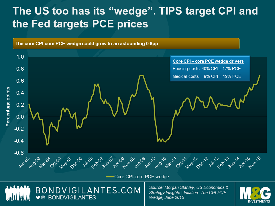
The chart shows how significant the wedge could become in terms of core prices, where it looks like the wedge could reach 0.8% and possibly go further. But as bond investors, we are most interested in the headline numbers as they define our inflation compensation in TIPS and the inflation target the Fed is striving towards. Morgan Stanley estimates that the headline wedge could become 0.5%, on account of the housing and medical cost differences. So if you believe, as I do, that the Fed is serious about its inflation target, then if PCE is 2%, CPI could be 2.5%. As a holder of TIPS, that extra 25% inflation compensation is only a good thing.
The labour market appears to be tighter in the US than in the UK or Europe at the moment, with less spare capacity and a greater likelihood of wage growth coming through this year. That is one reason an investor could prefer TIPS to index linked gilts or European linkers. Another reason for preferring TIPS is that the base effects from oil have been more severe on the way down in prices in the US than in the UK and Europe, and so will be more positive if the oil price stabilises or even rises. To these two positive reasons for investing in TIPS we can now add a third, that for the Fed to hit its 2% inflation target, CPI is going to be significantly higher.


Sign up to the Bond Vigilantes mailing list to ensure you never miss a great article from our expert Bloggers. We will email all new articles to your inbox, meaning you can stay on top of the world of Bonds.
I confirm that I would like to receive information about Bond Vigilantes and products and services from M&G Securities Limited.
We will use the email address and personal data you have shared with us to send you this information. For existing customers, submitting your contact details and requesting to receive this information from us, will replace any earlier choices you have made in respect of marketing information.
You can unsubscribe from marketing at any time, at which point we will not send any further marketing information to you, by selecting the unsubscribe link in all communications.