Markets
Gold prices: beyond inflation and real yields
By Robert Burrows
25 April 2024

It’s that time of year again. US elections? No – something even scarier. This Halloween, we’ve found no shortage of spooky charts. Here are our top seven, showing some of the most frightening spectres lurking below the surface of financial markets… don’t read them before bedtime.
One of the scariest aspects this year is the huge disconnect between asset prices and macro fundamentals with the impact Covid-19 has had. These are certainly spooky times.
Happy Halloween!
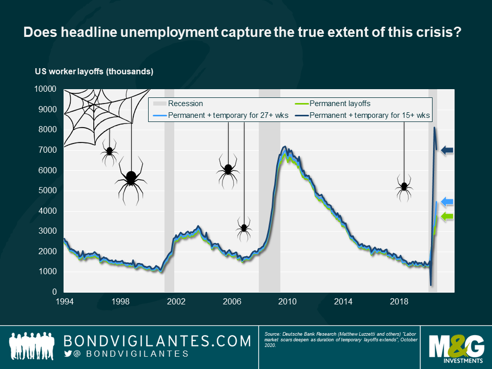
Reading the latest unemployment statistics, there has been no shortage of scary numbers and charts this year. Fortunately, government support and furlough schemes have provided much-needed support to many workers in developed markets, keeping both households and the economy afloat. But this brings with it a scary corollary: how many workers are unemployed and don’t know it yet? In other words, what will happen when furlough and other support schemes come to an end?
We think this chart may be even scarier than headline US jobless claims. It illustrates current unemployment figures with the addition of those who classify themselves as temporarily unemployed. If one includes workers on temporary leave for at least 15 weeks, the number of “unemployed” workers is around double the reported number.
2. Households appear better off… for now
Have we really seen the full effect of this downturn? This is a strange recession for many reasons but one of its strangest features has been that, in many developed countries, household incomes have increased, as in turn did savings rates during lockdowns.
But now that economies are reopening, consumer expenditure is back on the rise, partly funded by those savings. Beware the next “taper tantrum” if this support to households is cut off and they begin to run out of savings – this could have some much longer term consequences for the US economy than we have seen this year.

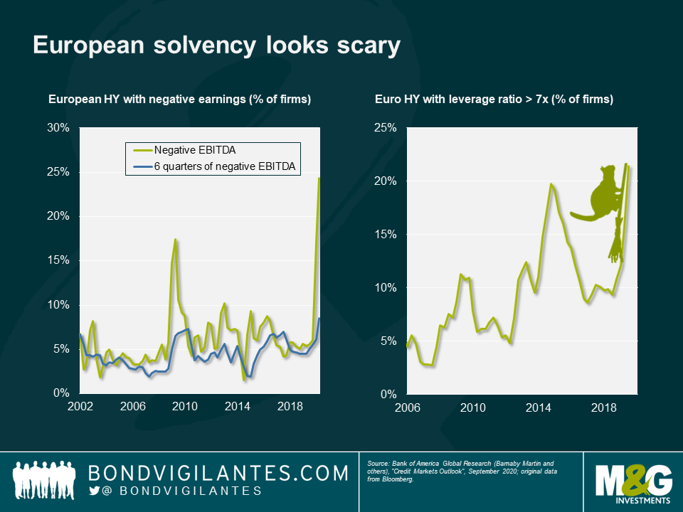
3. European solvency looks scary
Our next spooky chart reveals some worrying signs in European high yield solvency. While many high yield companies have managed to keep up liquidity during this year, balance sheets are looking rather fragile. As lockdown restrictions begin once again to tighten across Europe, poor earnings and high leverage in many companies mean we may not have seen the last of the weakness in European high yield.
Having reached highs in excess of 850bps from its January low of 300bps, the Euro high yield index is now trading with a credit spread in the 400s. Given the shaky fundamental picture that we can see in the chart, this gives a scary indication of just how much asset prices have been boosted by central bank support with a lack of underpinning earnings quality.
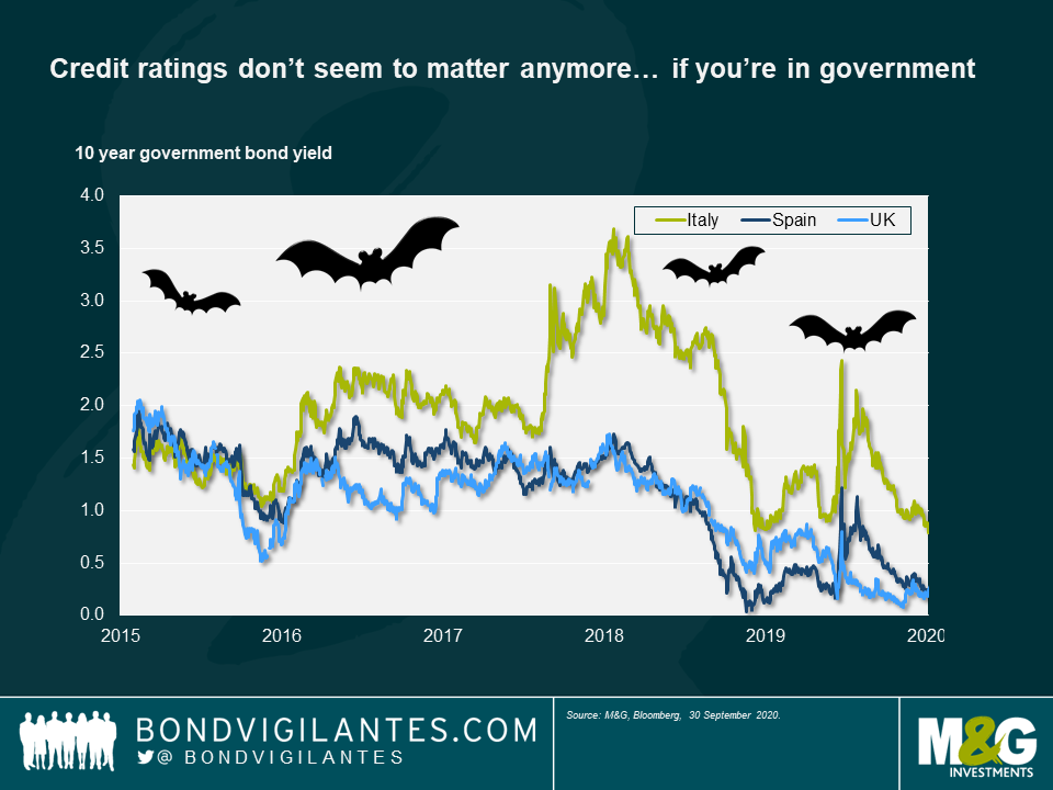
4. Credit ratings don’t seem to matter anymore… if you’re in government
Another scary sight is this comparison between yields offered by Italian debt (rated BBB-), Spanish debt (rated BBB+) and UK gilts (rated, after the recent downgrade, AA-). History tells us that peripheral European debt is a riskier investment than core European debt, and it has therefore delivered higher yields along with solid capital gains for investors as spreads have tightened.
Now we see Spanish bonds trading at the same levels as UK gilts, Italian debt converging on Spain and overall peripheral Europe risk reducing. Do credit ratings matter anymore, or is the market now more focussed on the virus and its spread?
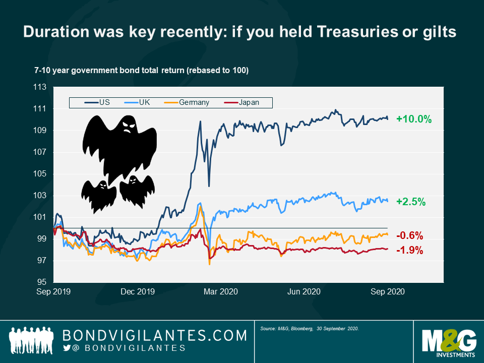
5. Duration was key recently: if you held Treasuries or gilts
This year the cushion provided by falling interest rates meant that holding duration in a bond portfolio was key in protecting investor capital—but only if that duration was in the US or UK. By contrast, Japanese and European duration posted negative returns for investors.
Why the difference? The answer is simply that the Fed and BoE had space to cut interest rates; Europe and Japan did not. Now that rates are close to zero in the US and the UK, this begs the question of where investors can go now to get such a risk-off hedge.
6. All-in corporate yields are back to pre-Covid levels
Credit spreads and corporate yields saw big spikes at the start of this year as the market struggled to predict the effect of global lockdowns on issuers’ solvency, and investors rushed to buy safe haven assets. One would expect these levels to have decreased since the height of the liquidity crunch but the extent to which they have now compressed is quite extraordinary and rather scary.
Credit spreads are still elevated versus their pre-Covid levels but take a look at the all-in yield offered to investors for lending money to companies now: in the US and the UK, these yields are unbelievably now lower than before the start of the Covid crunch, despite the clear risks and uncertainty that are still present in the economy.

7. GBP hasn’t traded as a reserve currency
One thing investors can surely bank on in scary times are the big four reserve currencies, right? The dollar, euro, yen and pound all generally provide a safe haven to investors in market downturns. But this year, one of those currencies did not behave at all as one might expect. We are of course talking about the pound sterling.
Looking at this chart, the risk-return profile of the pound looks closer to various emerging market currencies than developed ones. This gives a clear picture of the extent to which sterling is trading simply on sentiment at the moment – what does this, the UK’s recent credit rating downgrade by Moody’s and the approach of Brexit, mean for its traditional position as one of the big four reserve currencies?

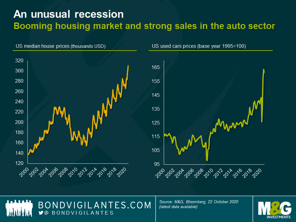
The 2020 recession is a direct result of global government policy aimed at protecting populations from the virus outbreak. This has curtailed global growth dramatically, though in a very different way to previous recessions. In this blog we will explore the continuing implications of this and look forward to 2021.
This time is different
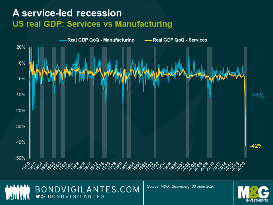
This recession is primarily a service-led recession: looking at the collapse in services versus manufacturing, it is clear how unique it is in nature (see chart below). This is not surprising. Service consumption requires human interaction, and this is currently discouraged. In economic textbook terms, this would be categorised as a recession caused by trade barriers: service sector trade has been barred or discouraged, and this barrier to trade has caused a recession.
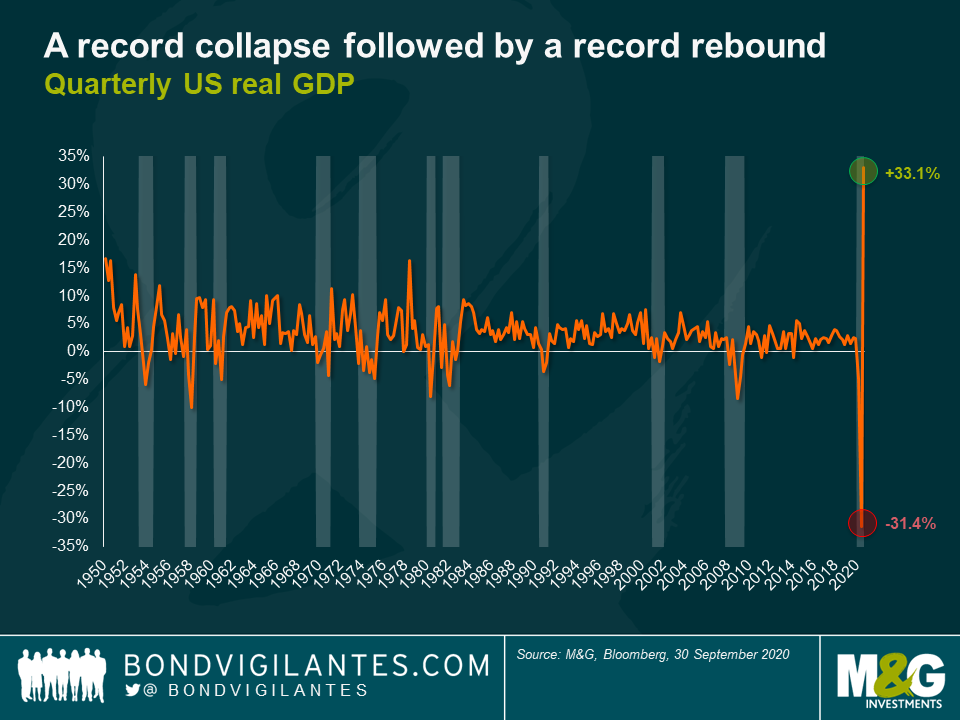
The magnitude and unique nature of this slowdown is evident in total US GDP output: we see a record collapse and now the start of record rebound (see chart below). This bungee-jump economy is something I have touched on before (here and here).
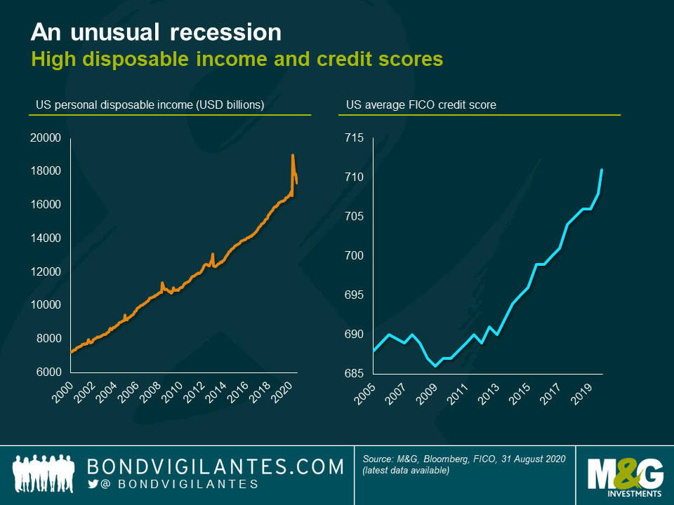
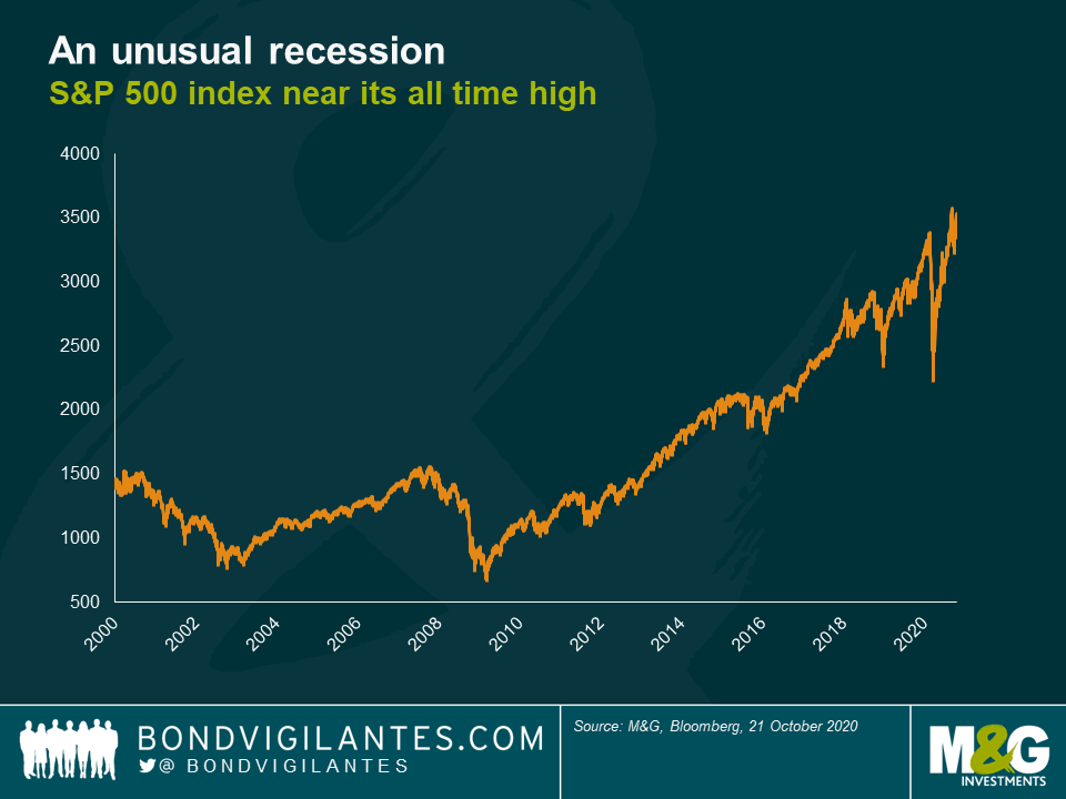
These trade barriers to services are hugely effective in reducing GDP. Fortunately, the response of governments around the world to this recession has been phenomenal. This has resulted in a huge transfer of wealth from the public to the private sector. These two factors make this recession very different from previous episodes. Looking at the following charts, would you be able to identify that we were in a recession?
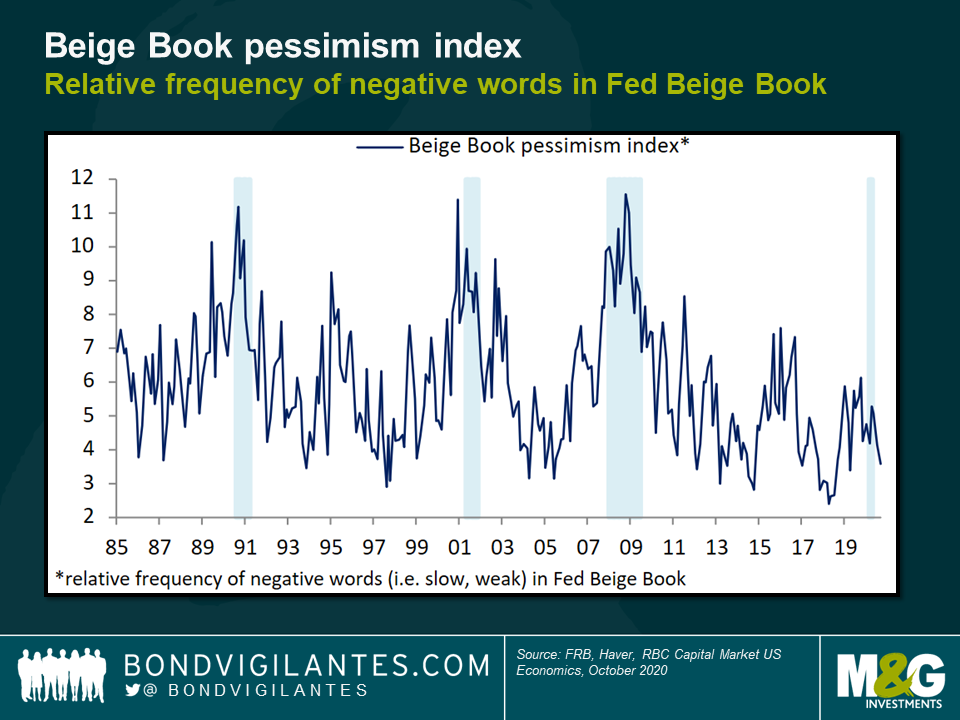
All of these charts show the effectiveness of the public sector in mitigating the economic impact of the virus policy. The Fed’s characterisation of the economy has also remained optimistic compared with previous recessions, based on its biquarterly “beige book” commentary (more formally called the Summary of Commentary on Current Economic Conditions). The chart below plots the relative frequency of negative words (e.g. “slow”, “weak”) in the Fed’s reports, which is much lower than in past downturns.
Recession or depression?
The collapse in GDP this year has been phenomenal. Its sheer scale means that maybe we should be talking about a depression rather than a recession. A depression is generally accepted to be a collapse in GDP of at least ten percent over two years. We have already seen GDP collapse by more than ten percent on an annualised basis so far this year. Looking over a longer horizon, are we in a depression?
The probability of depression is simple to diagnose: it is a function of the tapering of public policy intervention on the service industry. The timing of this is likely to be driven by vaccine development, hospital care, seasonal effects and the virus’s potency. Progress is being made on the first two while, like other similar events in the past, it is reasonable to assume that the virus will eventually come to a natural end aided by human intervention to mitigate and control it. What kind of economy will we have post virus?
The post-Covid economy
I think it is reasonable to believe that the economy will boom as restricted activities become permitted. Unlike in previous recessions, the general consumer’s balance sheet has not been as damaged as one might expect. In fact it has improved in some cases as a result of government income support (see chart below). As we enter 2021, not only will the previous year’s GDP collapse work its way out of the numbers but also governments will hopefully remove the trade barriers that they imposed this year. Additionally, with huge debt burdens and little appetite for austerity, it seems unlikely that governments and central banks will seek to tighten financial conditions, or be as concerned with controlling fiscal deficits and inflation as they have been in the past. This, combined with a surprisingly robust private sector that has large savings and a desire to consume, will result in what looks like a large economic boom in the short term. Therefore a depression is unlikely.

One interesting question is whether actual real GDP will get back to where it was before the recession. I think that in the first six months after the eventual changes in public policy it will. Excess savings, a liberated consumer and governments in no hurry to impose austerity all point to an outcome of high growth and record consumption.
Over the last few years there has been a desire to eradicate the boom and bust economy. This time round, let’s hope the cycle goes from bust to boom: a t-shaped recession.
Energy transition pathways — the move from fossil fuel-based to zero-carbon energy — involve long time-horizons and are highly uncertain, with divergent outcomes based on assumed scenarios. The Coronavirus pandemic dented oil demand and has potentially brought forward peak global demand, if it hasn’t happened already. Against that backdrop, European International Oil Companies (IOCs) have over the past year increasingly converged on Net Zero 2050 CO2 emission targets. It appears that, in today’s world, having a Net Zero by 2050 target provides a social licence to operate.
Not all Net Zero targets are born equal
It has also become clear that not all Net Zero by 2050 targets are the same. Firstly, the most robust targets include scope 3 emissions (the widest commonly-accepted scope, which includes not only direct but also all indirect emissions in a company’s value chain) for the entire business. It is in this scope that some 85-90% of all emissions in the sector fall. Robust targets will also have absolute as well as intensity-based targets, will include elements of short, medium and long term targets to catalogue the transition journey and will be linked to executive compensation. The most stringent will also have a transparent policy on lobbying that is aligned to those targets, backed up with Task Force for Climate-related Financial Disclosures (TCFD) aligned reporting and supported by Science Based Targets (SBT).
Companies like Total fall short in that they target Net Zero by 2050 in Europe alone, rather than across their global operations. BP excludes their stake in Rosneft from their target. Shell and Equinor do not have absolute targets, relying rather on intensity-based measures. OMV’s target covers Scope 1 (direct) and 2 (indirect via purchased energy) emissions only. The US IOCs Exxon and Chevron don’t even have Net Zero by 2050 targets. Perhaps a Biden presidency will wake the US IOCs from their climate slumber. National Oil Companies (NOCs) such as Saudi Aramco, Petrobras and Pemex also lag in the quality of their climate strategies. Taking these considerations into account, as well as others including disclosure and physical climate vulnerability, it is possible to rank the companies based on their energy transition credentials.
A farewell to oil
A common theme of energy transition strategies, notably highlighted by BP’s aim to become an integrated energy company, has been a move away from oil. BP sees oil production declining by 40% to 2030, whilst ENI is working towards a production plateau by 2025 and ‘flexible’ profile from 2025, implying a managed decline thereafter. Such strategies typically lean towards gas as a transition fuel, with a focus on lower production cost, low carbon composition remaining oil reserves and rising capex allocation for building portfolios of low carbon technologies including renewables (in particular offshore wind and solar) and bioenergy. Companies are also positioning themselves in the emerging Hydrogen and Carbon Capture, Utilisation and Storage (CCUS) value chains, whilst building gas/electricity customer portfolios and increasing digitalisation and electric vehicles charging infrastructure.
Preparing balance sheets for Net Zero
New business structures that separate traditional upstream operations from energy transition ones have already been announced and are being implemented. Short term, this does not imply that a full spin-off is the end game, not least as IOCs need their upstream cashflows to fund their energy transition investments in renewables and clean energy. Longer term, a split-up of the two entities is a possibility. The most likely scenario would be the spin-off of the low-carbon business through an IPO or minority stake sale. In that context, assuming the low-carbon business has reached a critical regulated asset base, its debt capacity may be higher than the upstream petroleum part. A debt transfer would not be automatic, and investor consent may not be that easy to obtain. Regardless, both entities would need solid investment grade ratings for business and financial reasons.
Delivering on energy transition involves companies preparing their asset bases for the economic reality of Net Zero. This has meant adjustments to internal oil price assumptions, triggering impairment charges against property, plant and equipment (PPE) on the balance sheet and asset write-offs of exploration intangibles. In accounting terms, this has increased gearing through the reduction in equity (E) in the gearing ratio net debt to net debt plus equity: (ND)/(ND + E).
Impairments are writing down the size of the asset base but the stranded asset debate continues: will companies end up holding oil reserve assets which become worthless as energy transition takes place? The answer depends on the type of oil reserve. These can broadly be split into two categories: proved reserves, and probable/possible reserves. The truth is that much of the balance sheet asset value reflects proved reserves from producing fields. Since proved reserve asset lives (typically 8-12 years) typically sit inside the energy transition timeframe, much of it will be produced before 2050. Not so for the probable and possible reserves, where more of the stranded asset risk resides. With a significant value of energy infrastructure still in place, and likely acceleration of transition in years ahead, it will not be a surprise to see further asset impairments. This puts increased focus on projects awaiting final investment decision today. The barrier for such a project making the grade from a return and emission perspective has never been higher.
Pressure on oil and gas companies’ cost of capital is likely to increase
An increasingly stringent regulatory backdrop, rising ESG scrutiny, climate/environmental litigation and increasing investor/bank exclusions will put pressure on oil and gas companies’ cost of capital. It seems unlikely that the recent credit rating downgrades in the sector will be reversed in haste by the agencies given pressures on cashflows from shareholders (despite the announced dividend cuts such as Shell and Equinor by two-thirds and ENI by circa 60%) and the need to reposition portfolios toward low carbon activities (where returns may be lower). And all whilst managing an orderly decline in the core carbon business from which the majority of cashflow still comes.
Like other corporates, IOCs issued significant debt during the Coronavirus disruption to improve liquidity, leaving large gross debt balances as a result. With gearing already elevated by the oil price collapse of 2020, and IFRS-16 impact on leverage calculation (the updated accounting regime requires firms to capitalize leases, leading to higher leverage ratios across the board), it was no major surprise this year that first BP, and soon after ENI, made their inaugural entry to the hybrid bond market to seek 100% equity accounting treatment and 50% rating agency equity treatment for hybrid debt raised. ENI claims the hybrid instrument will complement the financial framework over the longer term to allow ENI to pursue their transition strategy. Companies differ in their debt tenor profiles over the horizon of the transition, leaving bond investors with choice over how to position with respect to changing business profiles (see chart below).
Calculating a transition risk premium will be essential for investors
Whilst the equity market punished the oil and gas sector, it is difficult yet to calculate a meaningful transition risk premium, independent of term and cyclical factors, in the bond market. The chart below shows that a 10-30s curve premium (how much more investors demand to lend for 30 years compared to 10 years) exists for oil and gas bonds, but it is modest compared to the index and could in part be attributed to the cyclicality of the sector. We would expect to see higher 10-30s risk premia for credits with deficient transition strategies. Despite this, investors are apparently happy to continue funding companies with arguably weaker transition strategies such as Pemex, which issued $3.8bn 6.95% 2060 bond in January 2020.
Green bonds
Green-labelled debt remains an area the IOCs are likely observing with increasing interest. Repsol stood out in 2017 when they issued their inaugural green bond. Few followed in their footsteps at the time as the market digested the implications of an oil company issuing green bonds. The green-labelled market has, however, continued to evolve at pace since then, accelerated by the Covid crisis along with the growth of sustainability-linked bonds and the emergence of transition-financing bonds. We expect the growth to continue, especially with the ECB’s recent announcement that from 1st January 2021, bonds with coupons linked to sustainability performance targets will be eligible as collateral and for QE purchases, as long as they comply with all other eligibility criteria. In pockets, it is possible to identify instances where green bonds trade inside the conventional bond curve of the same issuer, effectively commanding a ‘Greenium’. Investors will wrangle for green-labelled bond issuers to have a separate account for proceeds to prevent them being mixed with other cash or inadvertently spent on non-eligible (non-green) projects, amongst other structural features. Meanwhile, with some transition strategies now in place and increasing investment in low and no carbon activities, green-labelled bonds may seem an increasingly attractive source of capital, perhaps even alleviating some of the pressures on the cost of capital of companies in transition.
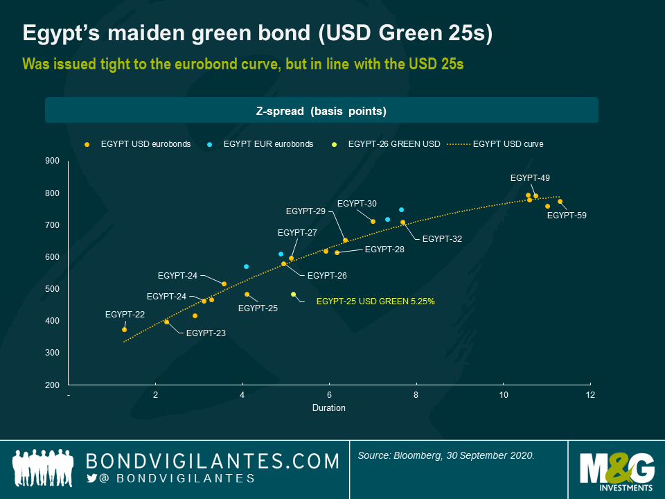
Egypt has just entered the green bond market, pricing a debut $750 million five-year issue. The bonds join a small but growing asset class of emerging market sovereign green bonds. Since Poland issued a green bond in 2016, there’s been growing green emerging sovereign issuance including by Fiji, Nigeria, Indonesia, Hungary and Chile. These have been joined by broader social, sustainable and pandemic bonds, including from Mexico, Ecuador and Guatemala this year.
Egypt’s new issue is the first US dollar sovereign green bond for both Africa and the Middle East, two regions that the country bridges. It counts as Africa’s first: Nigeria’s green bonds were issued in its local currency, and the Seychelles’ $15 million issuance was marketed as a blue bond since it financed projects to protect the archipelago’s oceans. While this is the first US dollar sovereign green bond, there have been numerous Middle East financials issuing in the green space.
More innovative issuance
Egypt’s green bond is part of the country’s innovative debt management strategy that aims to diversify its investor base, while shifting to longer-term borrowing. The plan is for long-term debt to constitute 52% of its borrowing by mid-2022. The government has regularly issued in USD and EUR, and is working to make its local currency debt more appealing and more easily cleared. It has also signalled its intention to soon add sukuks to its portfolio.
The debut green bond was issued at a yield of 5.25%, close to where a standard Egypt USD with similar duration trades. The order attracted a strong book, prompting the government to increase its offering from $500 million to $750 million. There are still too few other pioneers from which to assess where a green bond should trade relative to a country’s standard debt. Chile, which issued Latin America’s first sovereign green bond in mid-2019, suggests that once issued the green bonds get mixed with other standard bonds and trade similarly. Chile’s green bonds due in 2050 currently have a yield of 2.77%, almost the same as the 2.78% yield on a standard USD eurobond maturing in 2047.
Egypt’s green issuance follows its $5 billion of standard eurobond issuance in May 2020 — the country’s largest multi-tranche deal — that helped Egypt finance its Covid-19 response alongside financing from the IMF and other official lenders, plus the return of foreign appetite for Egyptian pound-denominated Treasury bills and bonds. Egypt’s appeal to investors reflects three factors. First is a good economic policy record and IMF-anchored reforms over the past few years. Second are signs of resilience during this crisis. And third is the government’s clear intention to improve environmental outcomes.
Green use of proceeds
The $750 million raised, plus that from future planned green issuance, will contribute directly to the financing of $1.95 billion of public investment projects tagged as green by the government. These projects are split across six eligible categories, each aligned to one or more of the United Nation’s Sustainable Development Goals (SDG). The net proceeds will enter the general treasury account, so there won’t be a separate account for the funds although they will be tracked internally.
The finance ministry, with support from the World Bank, has developed a framework to label and track what is green financing. What should and what shouldn’t count as green activity can be a contentious topic: I survey the main strengths and weaknesses of the framework below.
Strengths of Egypt’s green financing framework
Weaknesses of Egypt’s green financing framework
Conclusion
This is an excellent first move in expressing Egypt’s sustainable credentials. A lot of hard work has gone into the framework, which with experience can be further improved. The clear environmental objectives will help strengthen Egypt’s ESG credentials. Other frontier sovereigns should look carefully at Egypt’s approach, not only in terms of the green bond and financing framework, but also in how efforts are being made to deepen domestic debt markets to reduce debt risks. Hopefully there is more green issuance to come, but more importantly better environment and health outcomes for Egypt as a result of the investment.


Sign up to the Bond Vigilantes mailing list to ensure you never miss a great article from our expert Bloggers. We will email all new articles to your inbox, meaning you can stay on top of the world of Bonds.
I confirm that I would like to receive information about Bond Vigilantes and products and services from M&G Securities Limited.
We will use the email address and personal data you have shared with us to send you this information. For existing customers, submitting your contact details and requesting to receive this information from us, will replace any earlier choices you have made in respect of marketing information.
You can unsubscribe from marketing at any time, at which point we will not send any further marketing information to you, by selecting the unsubscribe link in all communications.